The post Mark Tuckey + Cotton On appeared first on The Home Scene.
]]>Not every one has designer budgets so this collaboration allows effortless design to be accessible to everyone. Unfortunately I wasn’t able to make the media launch this morning but I’m pleased to be able to share with you some beautiful images of whats now available to New Zealand in some select stores and online.
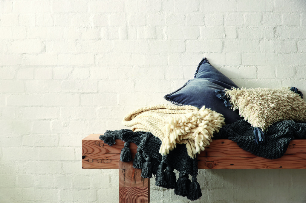
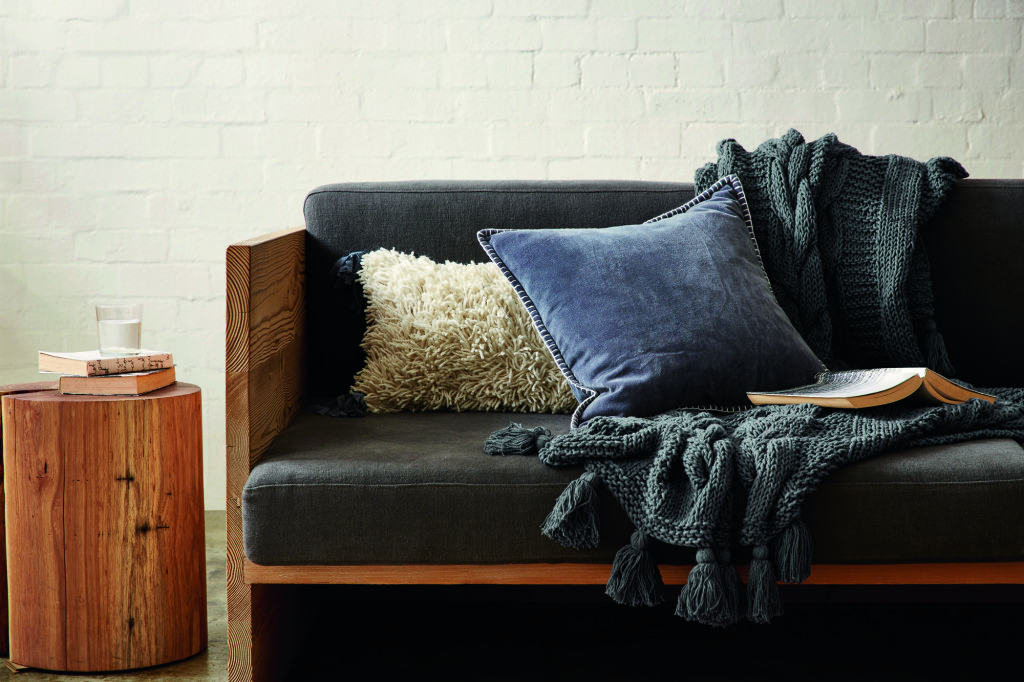
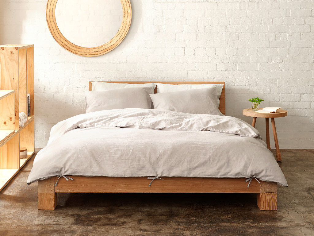
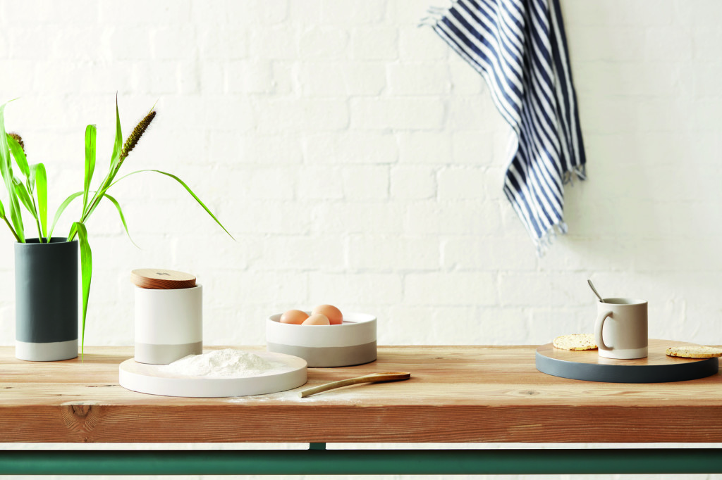
The collection combines optimistic and effortless design with pared-back simplicity and features quality natural materials such as cotton, linen and timber. Here are a few of my favourites from the homewares line.
| Circus tassle blanket | Cable blanket | Shag on a rock cushion |
| Circus tassel blanket | Shag on a rock cushion |
| Sheet set |
| Duvet set |
| Canister set | Round chopping board (White + Charcoal) | Lilly Dog Bowl | Mug set |
| Mug set (2pk) |
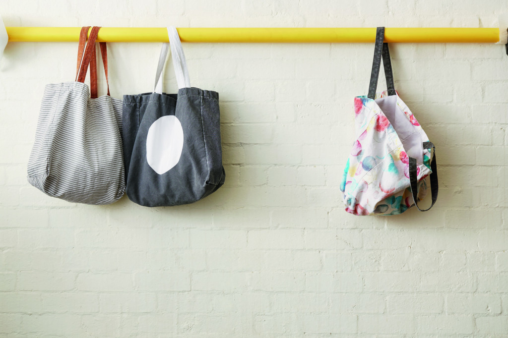
| Tote bag |
Mark and Louella Tuckey describe the concept of the collaboration as “to create products that we love and that we want to live with in our own home. It’s about that same passion. The result is an authentic and honest collection based on a natural palette with pops of colour and a focus on good, clean design at affordable prices”.
The Mark Tuckey + Cotton On collection includes:
- EAT – All things for the kitchen, including wooden bowls, chopping blocks, platters and tea towels
- DRINK – All vessels to drink from, including mugs, glasses and dog bowls
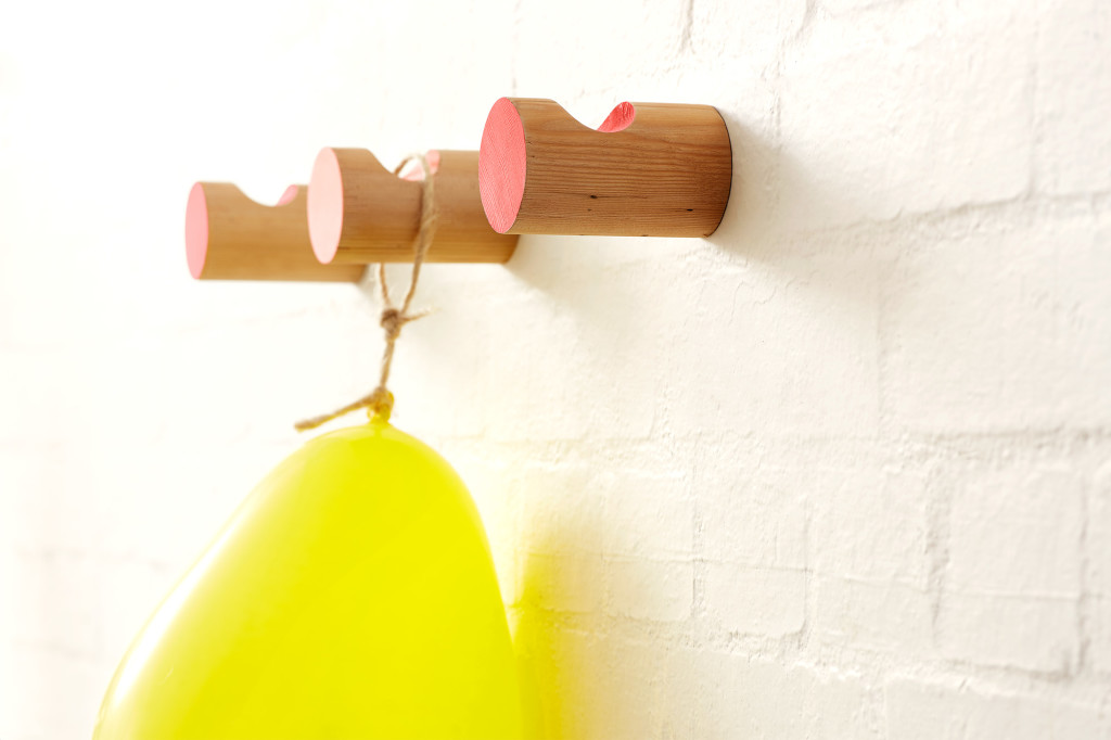
- RELAX – All things that help you create a space to relax in, including blankets and throws, cushions, ottomans and beanbags, scented candles, wall hooks and wooden clocks
- STORE – Everything you need to help get your home in order, including storage jars, laundry baskets, tote bags, overnight bags and storage bags
- BATHE – All things you want in the bathroom, including bathmats and bathrobes
- SLEEP –All things for the bedroom, including duvet sets, sheets and pillowcases, blankets and cushions
– Kelly
The post Mark Tuckey + Cotton On appeared first on The Home Scene.
]]>The post The Summer House appeared first on The Home Scene.
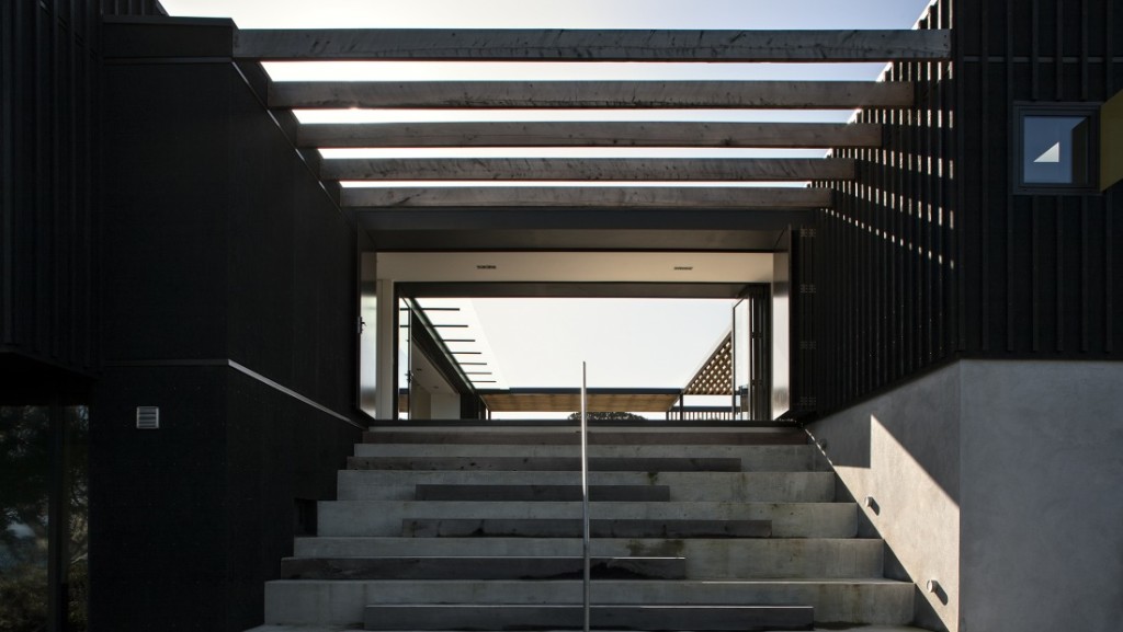
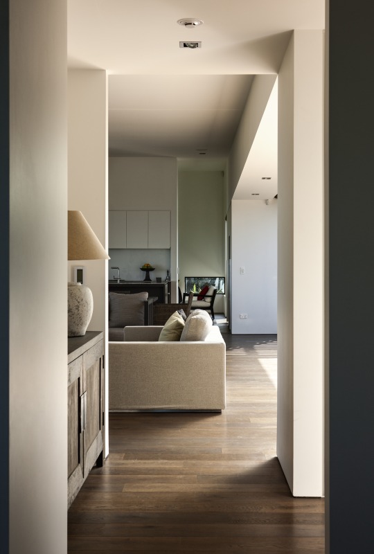
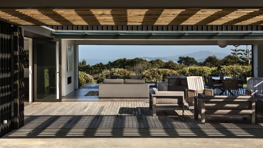
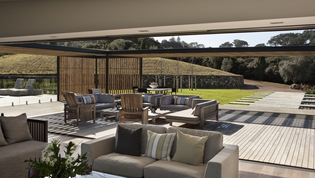
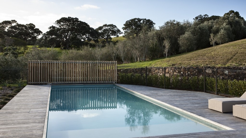
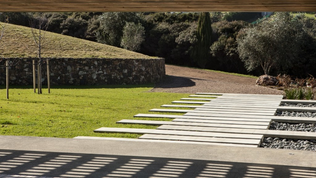
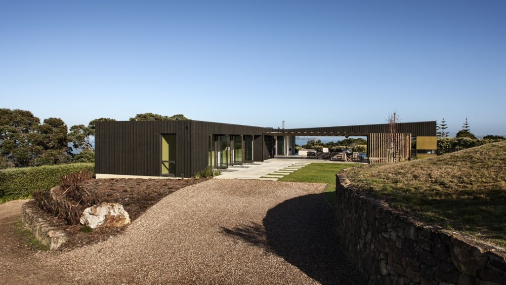
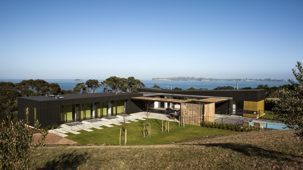
]]>Creating depth in the home, the solid stone walls and plastered concrete blocks anchor the building to its context, while the outdoor living spaces are clad in plywood with vertical and horizontal battens.
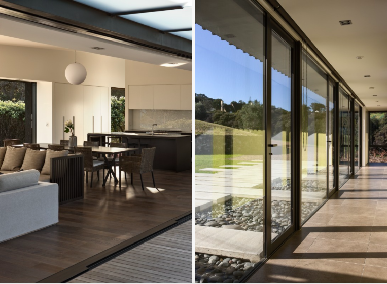
The light filters throughout the home to create a calming, relaxing retreat away from all the hustle and bustle of every day life. The deep colours allow the building to hide amongst the Pohutukawas and the landscaping is minimal so as not to detract from the dominant trees which surround the building platform beautifully.
Happy Monday THS Readers
– Kelly
Details
Source: Archipro | Architect: architex nz
The post The Summer House appeared first on The Home Scene.
]]>The post Icebreaker’s inspiring head office appeared first on The Home Scene.
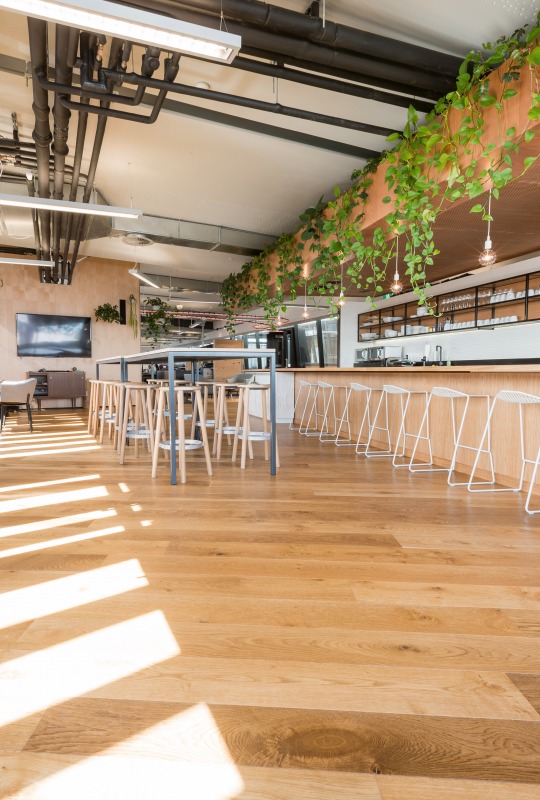
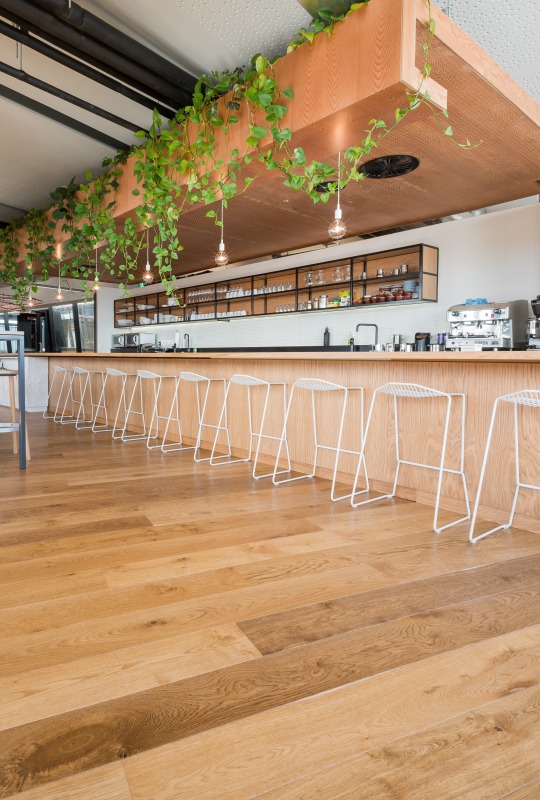
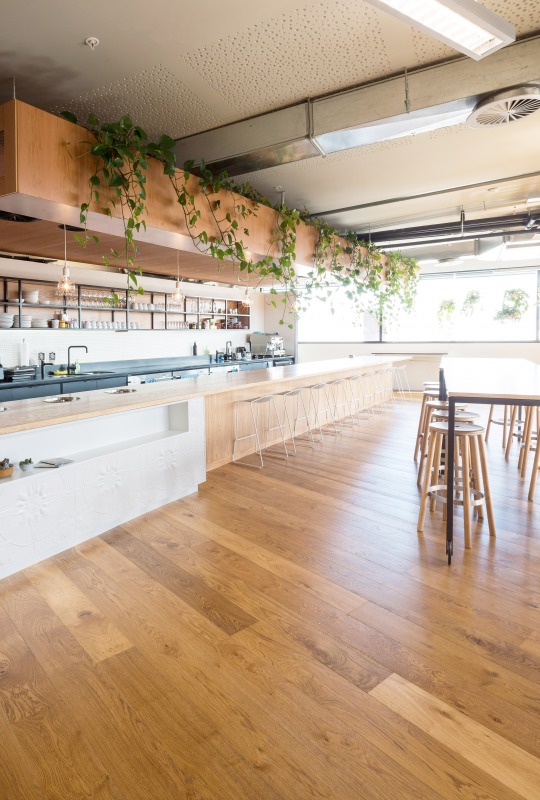
]]>Created with Antique Oak engineered flooring setting the vintage industrial theme throughout, this office has a large dose of charm.
From a business that started as the crazy ambitious goal of developing the world’s first merino layering system for the outdoors, Icebreaker is now a global business in the process.
The over hanging vine draws the eye up to the ceiling, providing colour and life to the open plan office space, offsetting the industrial exposed pipes.
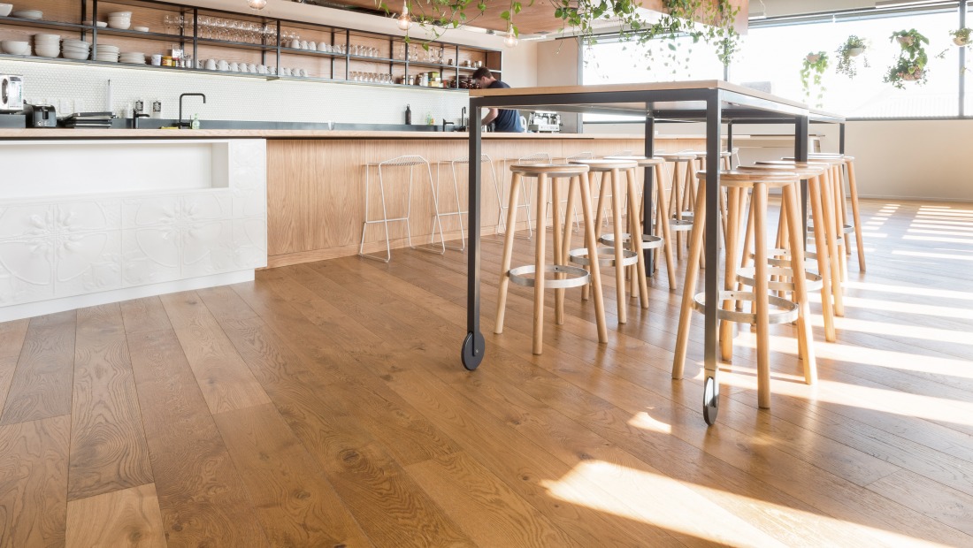
The Baker Stool is perfect for this design, with the ability to mix and match the colours and materials of the seat, legs and foot ring to suit your designated space.
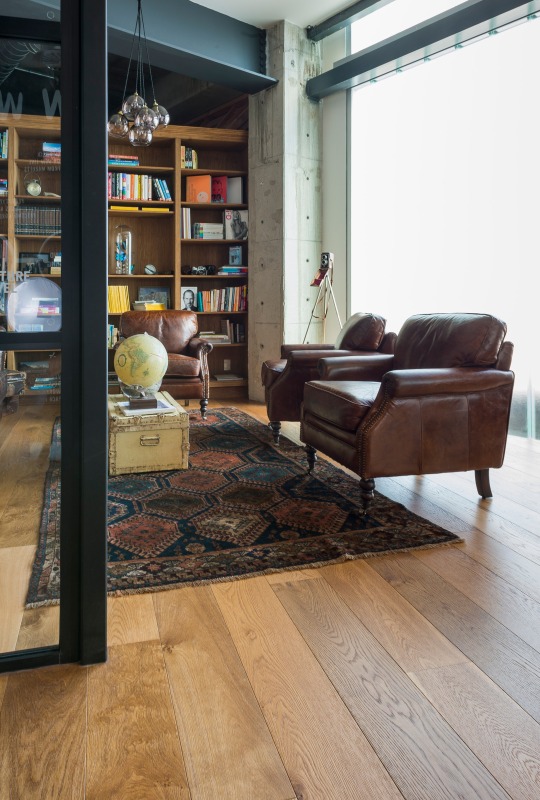
The vintage theme continues through to this separate meeting space, created with comfort in mind. Old leather armchairs combined with the rustic styling of the trunk suitcase, globe and vintage brownie camera perched in the corner on a tripod.
The IMO Kase Table is not only aesthetically pleasing and in keeping with the theme, but provides a wobble free surface for satisfying those morning coffees or late night sketching sessions.
Details: Source: Archipro |
What are your favourite elements from this office that you would love to see in your home?
– Kelly
The post Icebreaker’s inspiring head office appeared first on The Home Scene.
]]>The post Toorak House appeared first on The Home Scene.
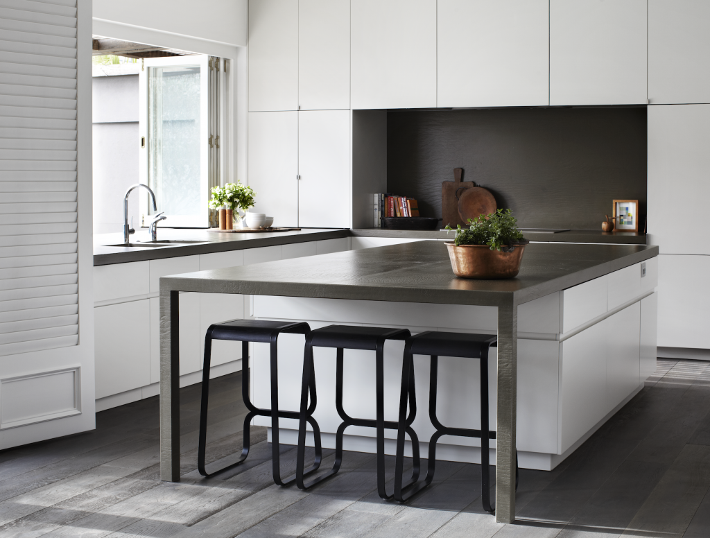
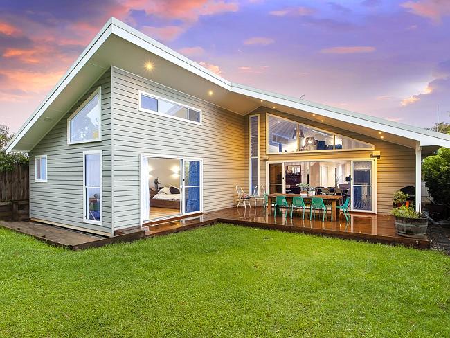
]]>For Toorak house that renovation meant modernising a tired interior and exterior of a large c1934 family house into a light filled, vibrant, clean, classic contemporary home for a busy family of four. Blessed with more than adequate bones, the only structural changes required were to the kitchen and laundry area.
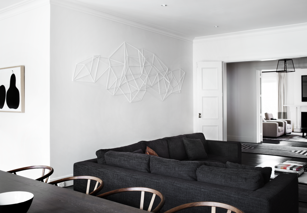
Throughout this beautiful home, architect firm Robson Rak designed and fabricated much of the furniture and furnishings to fit the bespoke brief, which also included a large wall sculpture in the living room by Chris Rak; who’s background in sculpture allows for this multi-disciplinarian approach.
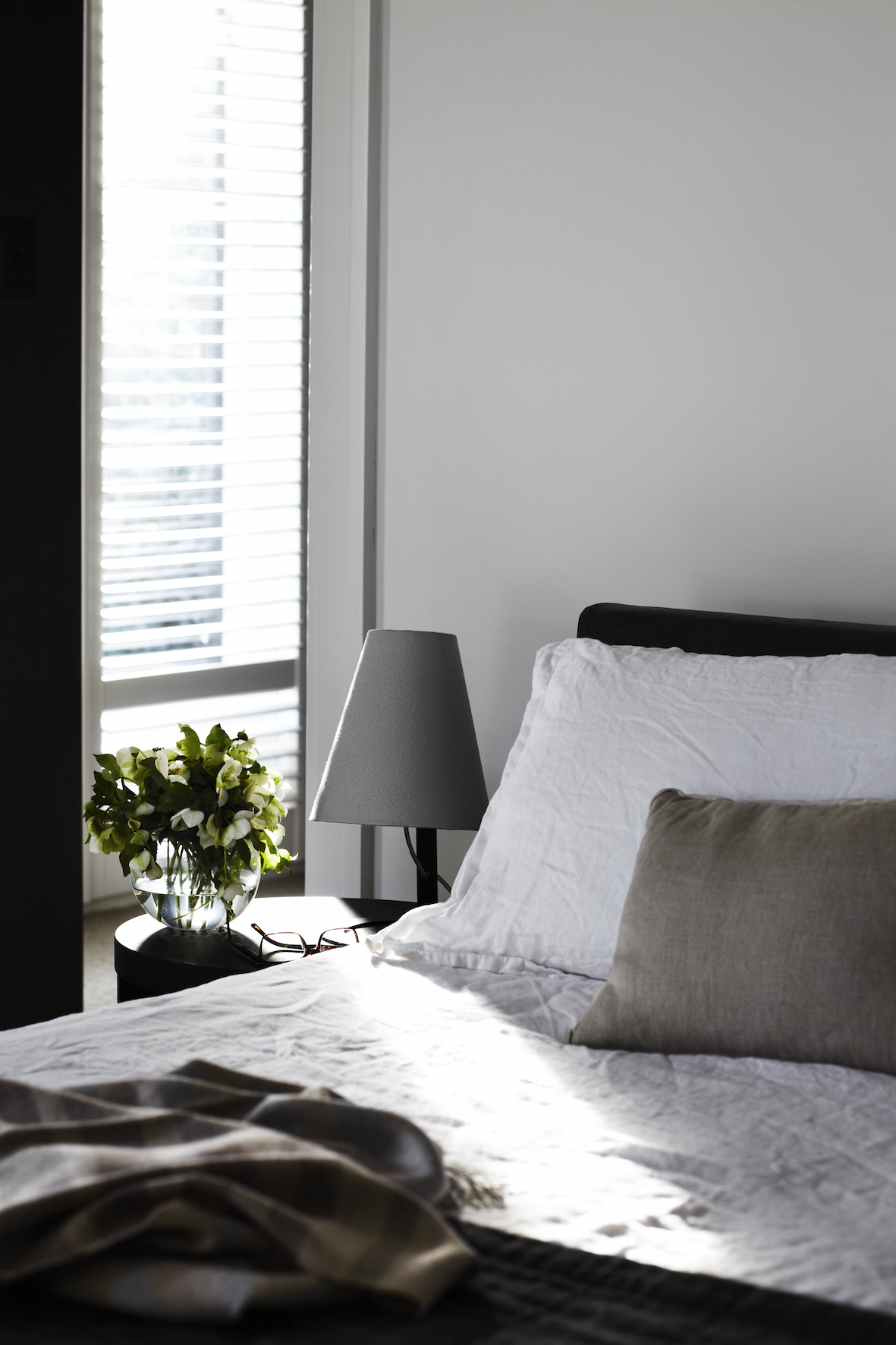
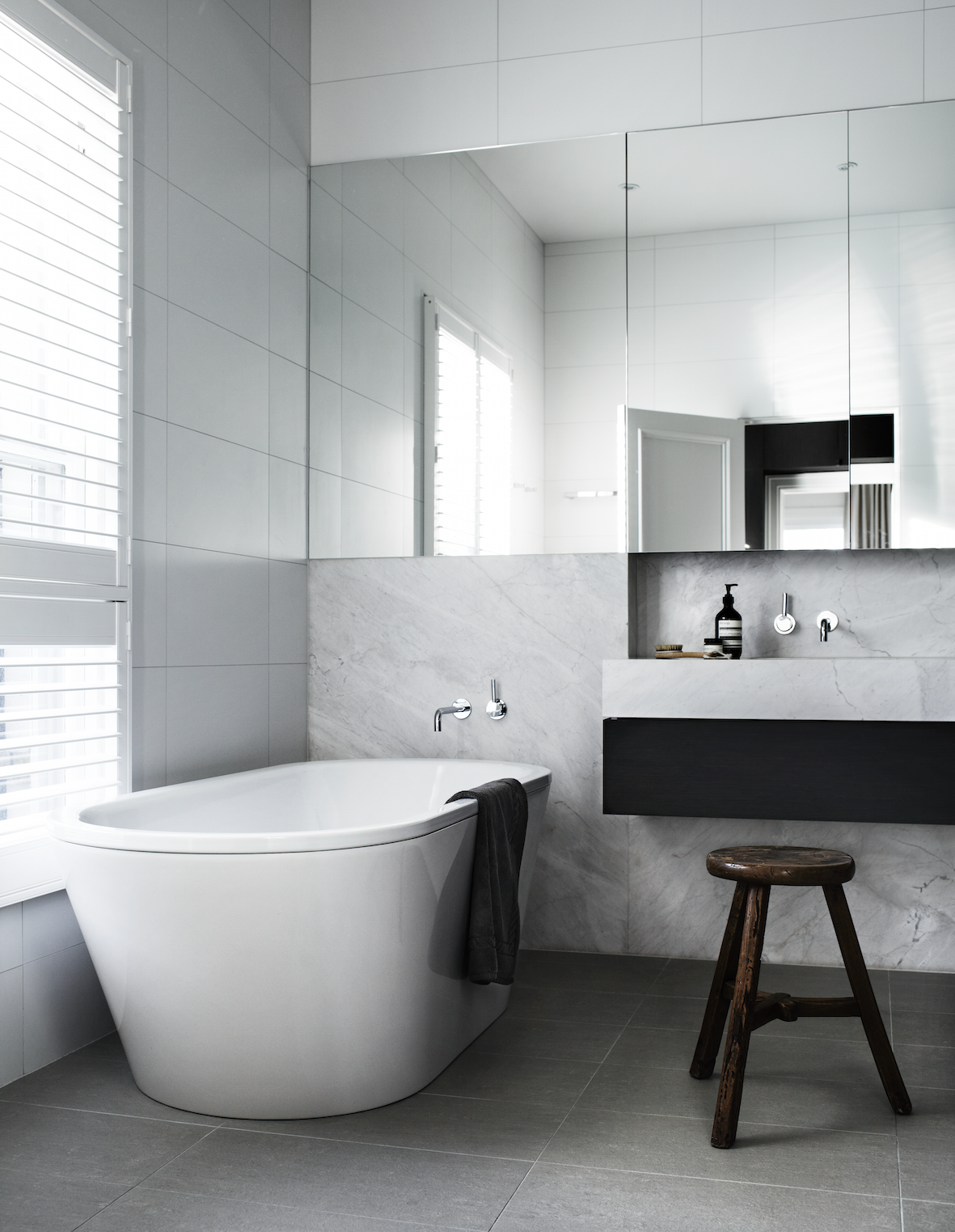
The first floor bedrooms and bathrooms were designed with luxurious materials such as Elba marble vanities and timber joinery and plush woolen carpet to achieve a feeling of quiet sanctuary and luxury.
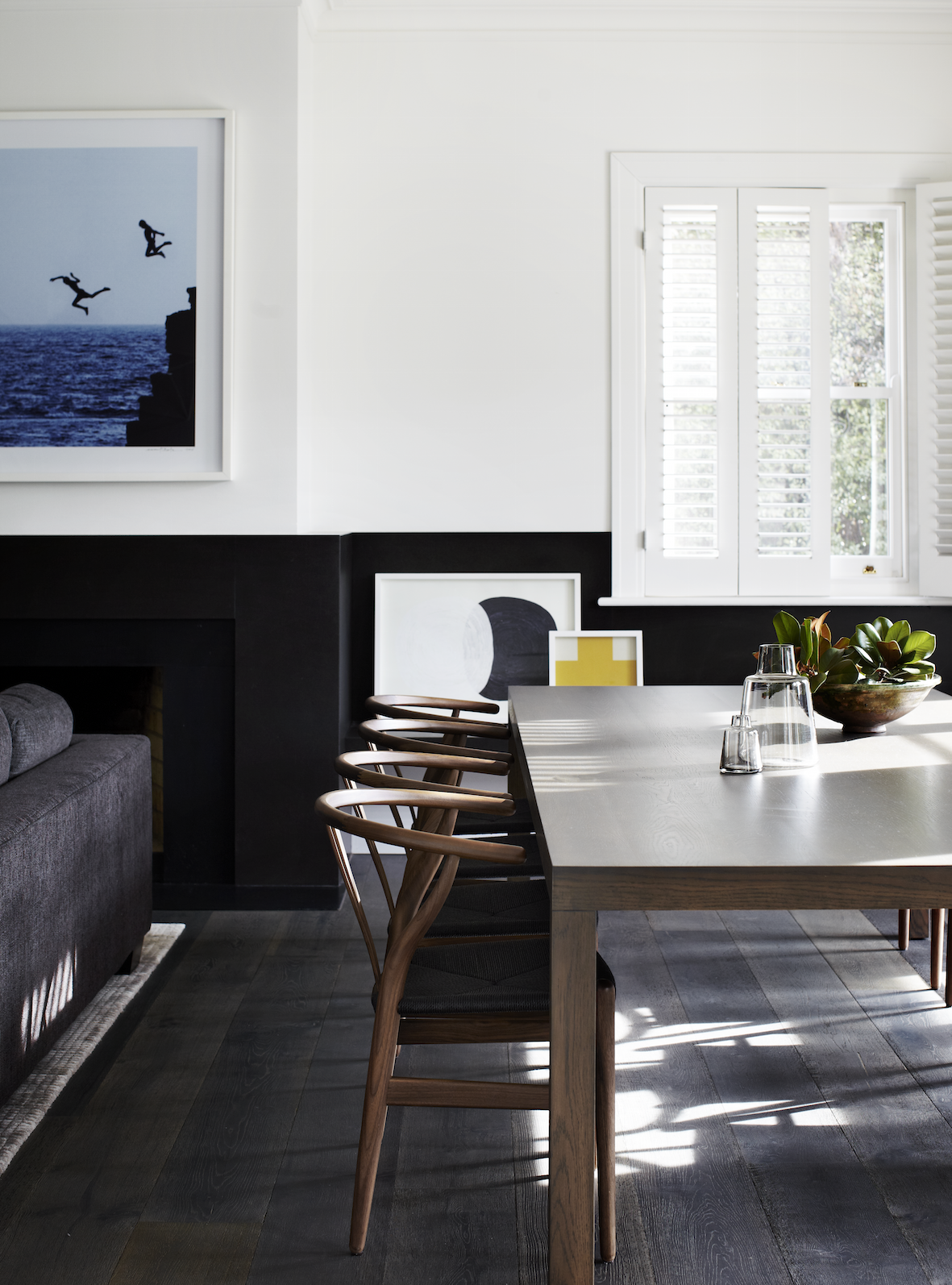
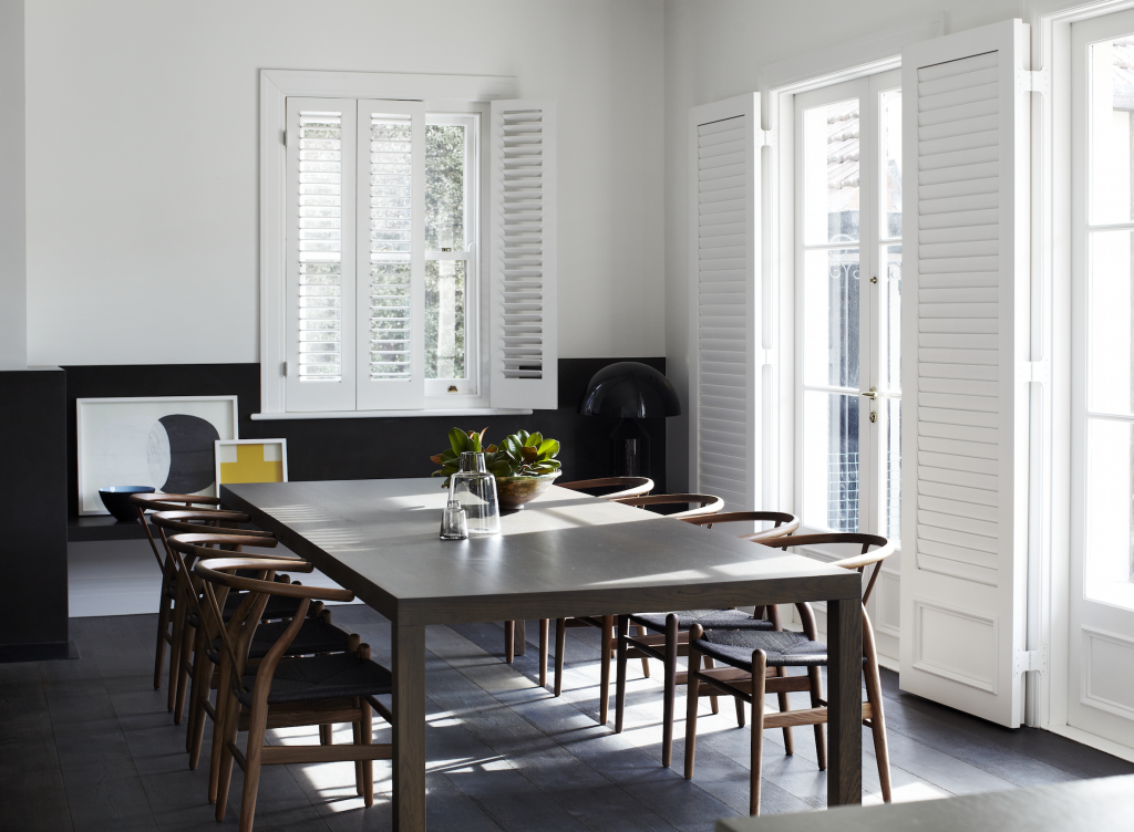
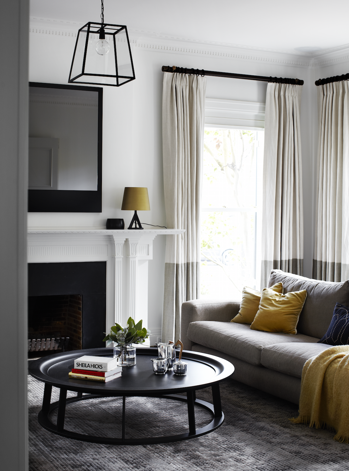
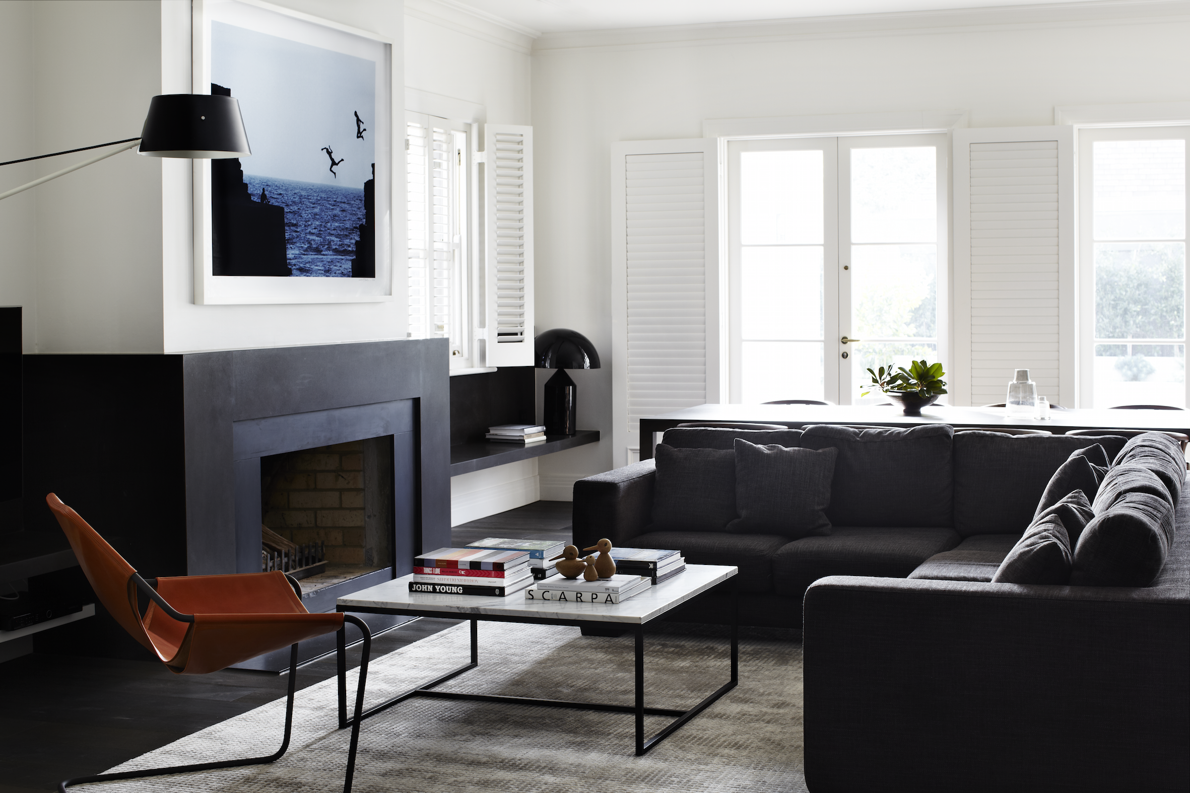
The formal dining/living rooms were kept in their original state, but modernized with the bespoke fireplace mirror, furnishings, and new American oak floorboards.
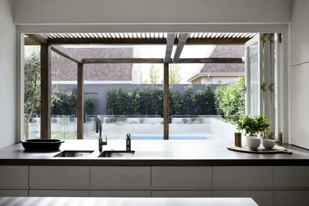
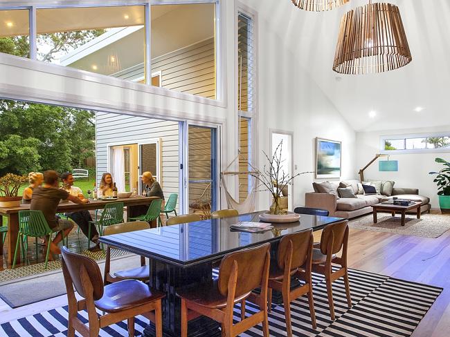
An open-plan kitchen, dining and living area with bi-fold doors open onto a large terrace, revealing a generous outdoor entertaining area framed by a large ‘Sugar Gum’ timber pergola. This act as eaves in summer to keep the sun at bay while in winter the lower sun streams into the house under the slats and the whole living and kitchen area is bathed in northern light throughout the day.
Details: Architect: Robson Rak Architects |
– Kelly
The post Toorak House appeared first on The Home Scene.
]]>The post Room with a view appeared first on The Home Scene.
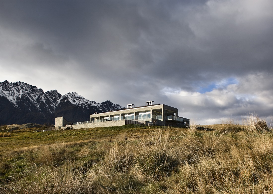
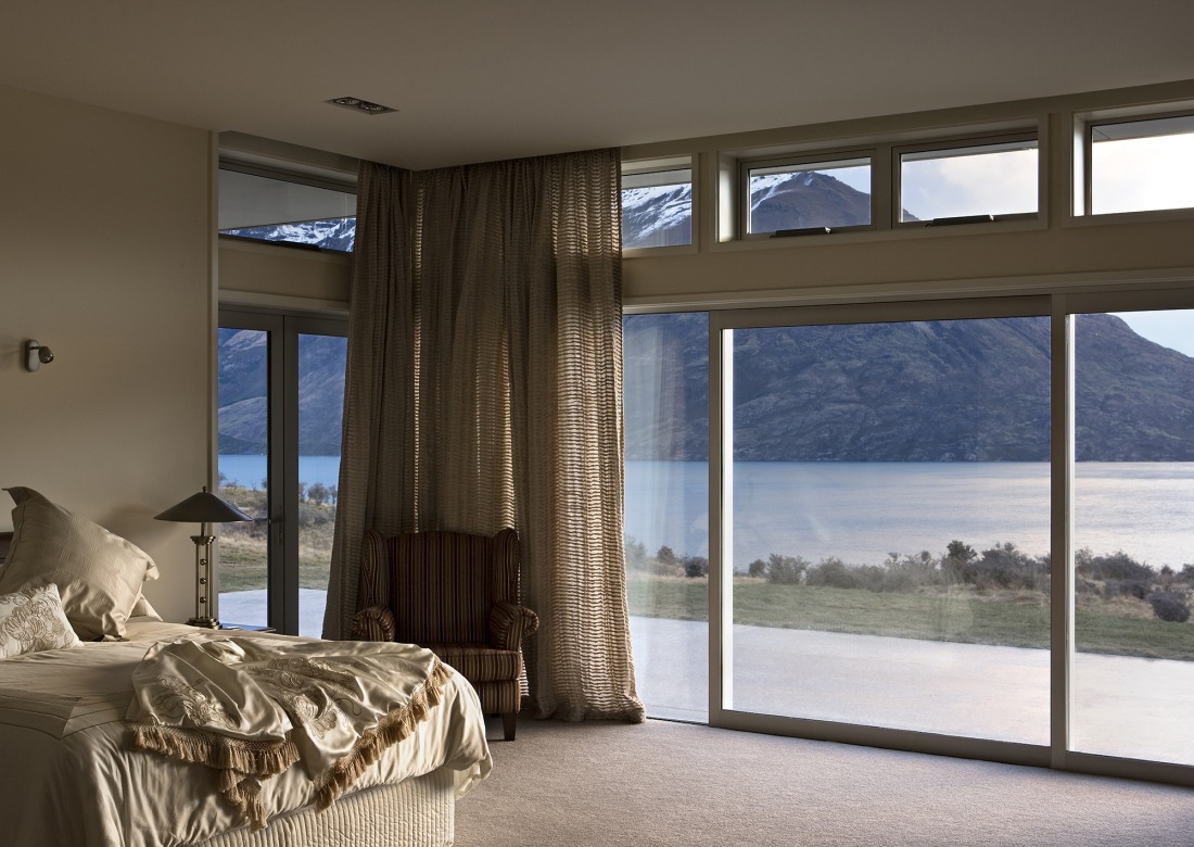
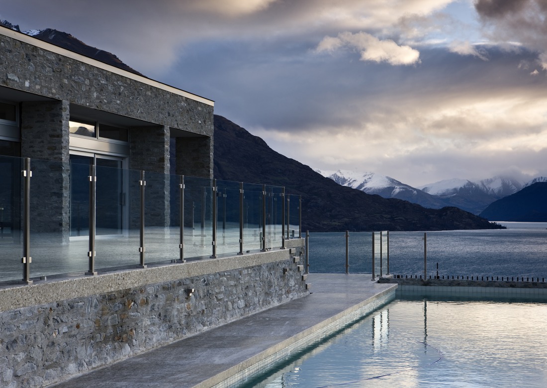
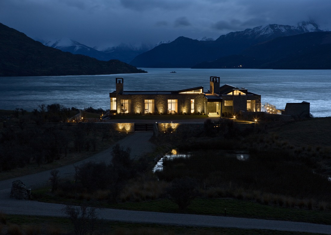
]]>The South Island in all her beauty provides a picturesque backdrop for the lucky homeowners of this Jacks Point property designed by Harris Butt Architecture.
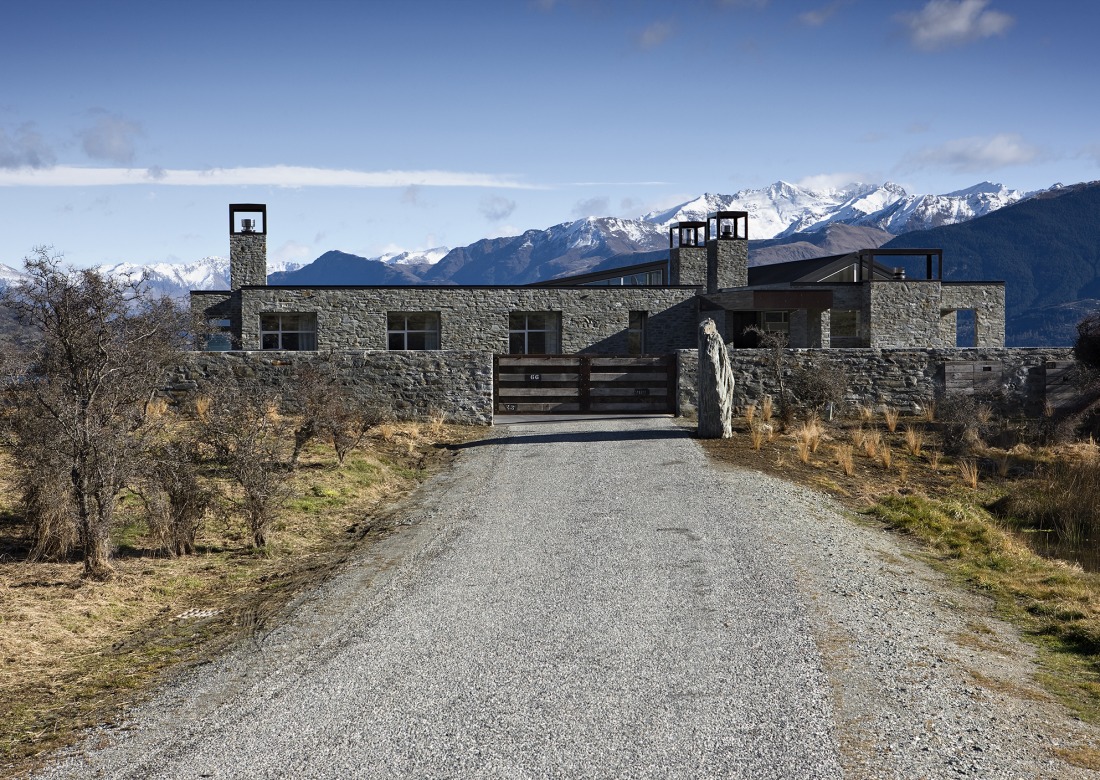
The concept was based on “honest” architecture with crisp, clean lines devoid of decoration, constructed from material extracted from the site and sourced from the region as far as possible.
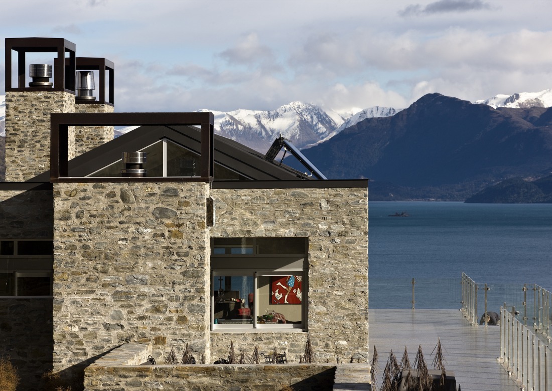
The form of the house remains simple in its concept. Made up of three parts; the living wing, the bedroom area and the linear gallery, north of the living area. Essentially creating two very large rooms – the living room and the kitchen, dining and family room. These open onto an extensive patio area with lap pool, sauna and plunge pool.
The deep recesses to the windows accentuate the solid construction and allowed Harris Butt Architecture to create a connection with the historic buildings of the region and stunning landscape surrounding the building.
Details
Architecture: Harris Butt Architecture | Source (with permission): Archipro | Client: M.Coburn |
The post Room with a view appeared first on The Home Scene.
]]>The post The Super K’s home transformation appeared first on The Home Scene.
]]>The design and styling aesthetic of Kyal and Kara, otherwise known as the Super K’s, is far and above the best. This duo have a clear love affair with timber, bespoke furniture and minimalistic styling – a couple after my own heart. Although the winners of this series haven’t been aired in New Zealand, I won’t ruin the result for those wanting to follow the series.
The clever pair have taken Kyal’s Diverse Carpentry business and verged further into construction, renovation and styling with their company, ‘Diverse Design and Construct.
While their works speaks volumes. I always love to peer into the home of designers to see how they create the space for themselves.
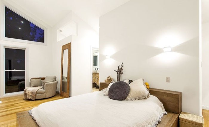
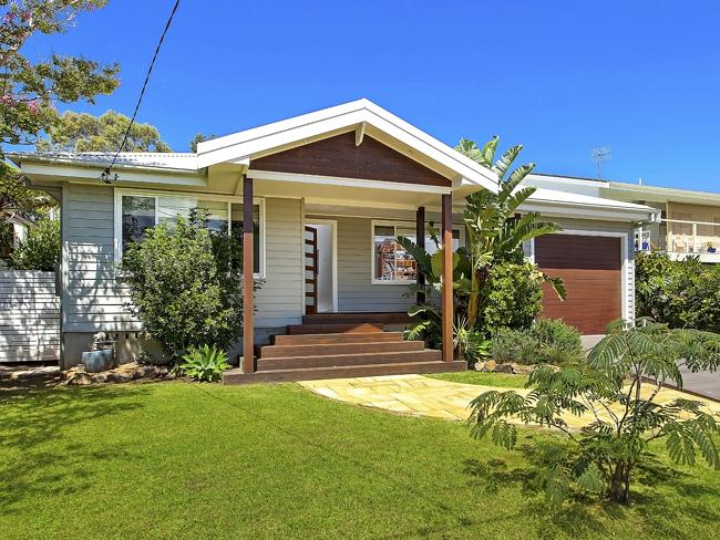
The home the couple purchased in 2008, prior to their The Block debut took three years to renovate and sold for double the median sale price of their area. With soaring high ceilings, light spacious rooms combined with the all important indoor, outdoor entertaining, this four bedroom home received a complete transformation.
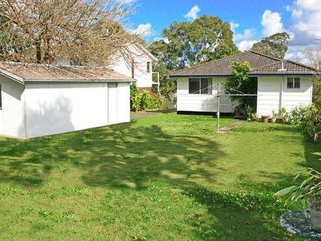
The original transformation…
Kelly
The post The Super K’s home transformation appeared first on The Home Scene.
]]>The post Pegboard Love appeared first on The Home Scene.
]]>
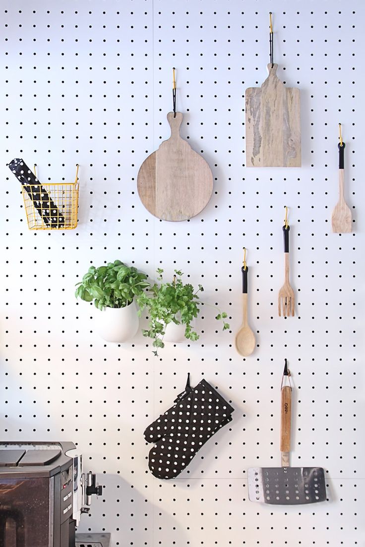
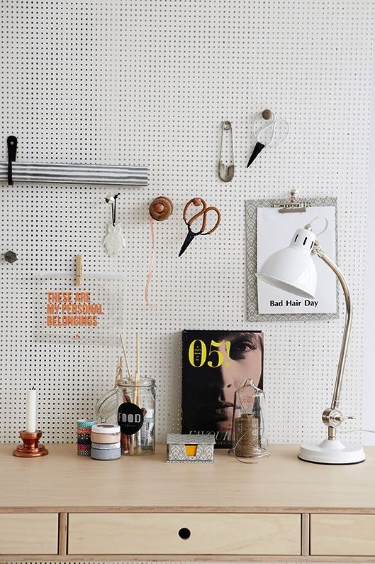
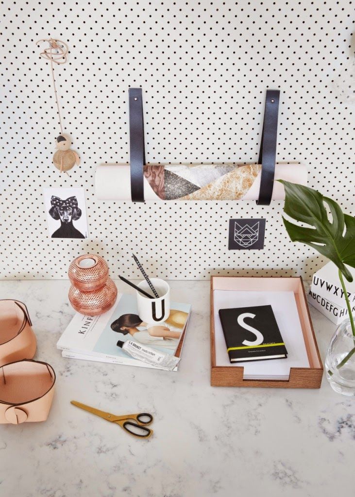
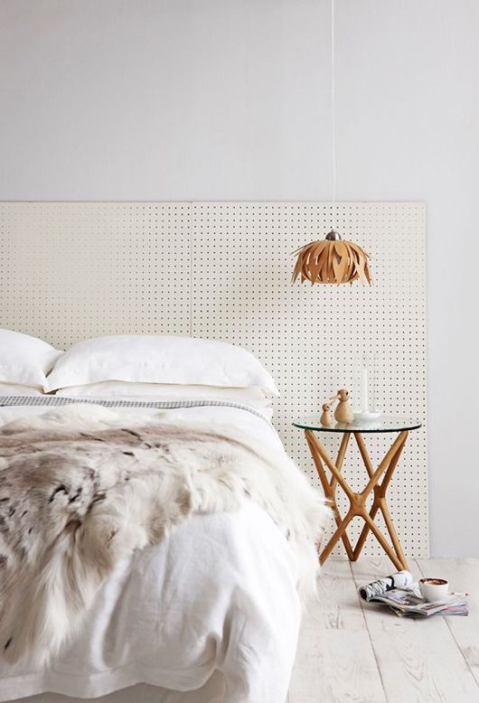
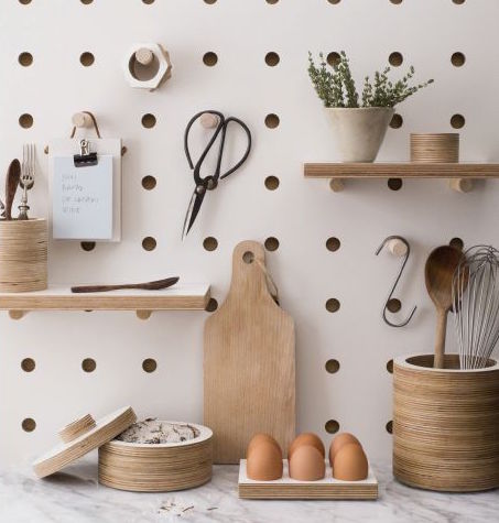
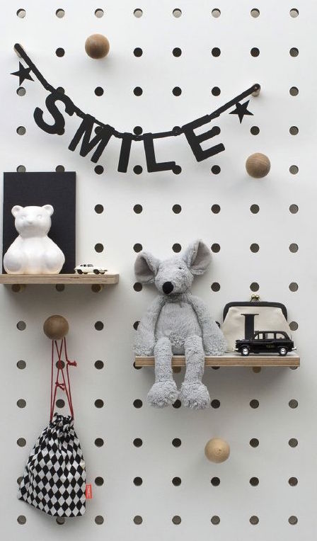
Be creative with where you place pegboard in your home. It doesn’t have to be restricted to an office or garage.
Pegboard can be easily purchased from any local hardware store. I purchased a large sheet for $75.00 from Mitre 10 and had the sheet cut down into the required sizes for no additional costs and ready to put up once home.
Have you introduced pegboard into your home? I’d love to hear and/or see how you’ve added pegboard or other functional materials in your home.
Kelly
The post Pegboard Love appeared first on The Home Scene.
]]>