The post Weekend Reno’s appeared first on The Home Scene.
]]>Over the process of renovating our first home, a lot of planned projects had been put on hold until money was available in the budget. This stems from starting the renovation journey at ages 21 and 22, with entry level incomes, and growing our family.
The kitchen is always an issue with former state homes, and ours was no exception. We completely gutted the kitchen and installed a new streamlined, clean, white kitchen, opening up the space and bringing into the new millennium. After enjoying beautiful exposed Gib walls for nearly a year, it was time to get the tiling ticked and finishing painting this area. Waiting a year with bare walls is simply a by product of my husband travelling a lot with his work as a builder in the army and timing not always being available.
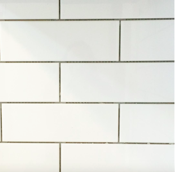
The delay worked out well from a design perspective with a change in our original thoughts of a long glass splash back to tiling. We purchased white subway tiles with a light grey grout from Mitre 10 for their simple design and the fact that they won’t date as quickly, even though they are currently trending. My love of herringbone tiles will have to wait so I’m told, we after all moving on and won’t be here long enough to enjoy them.
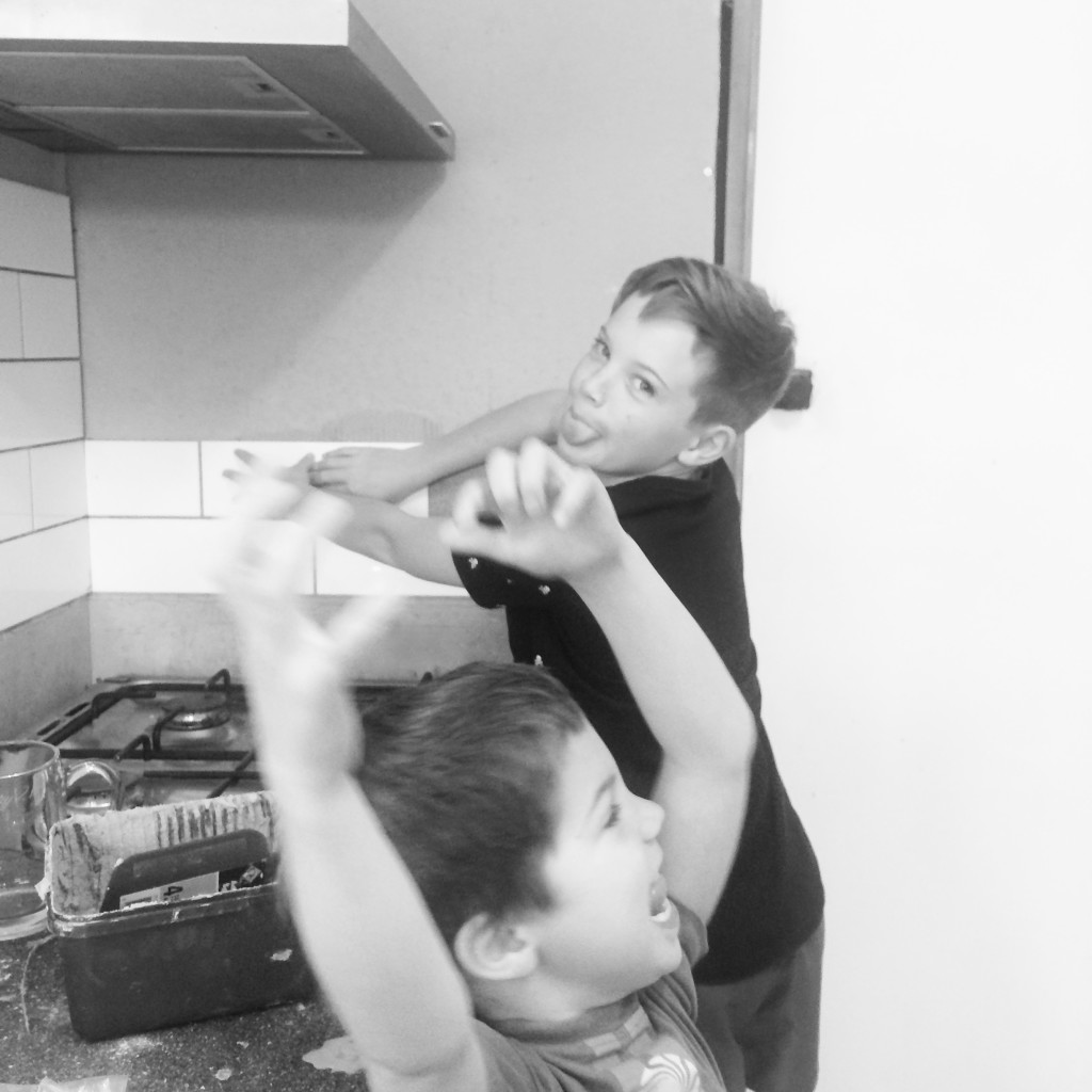
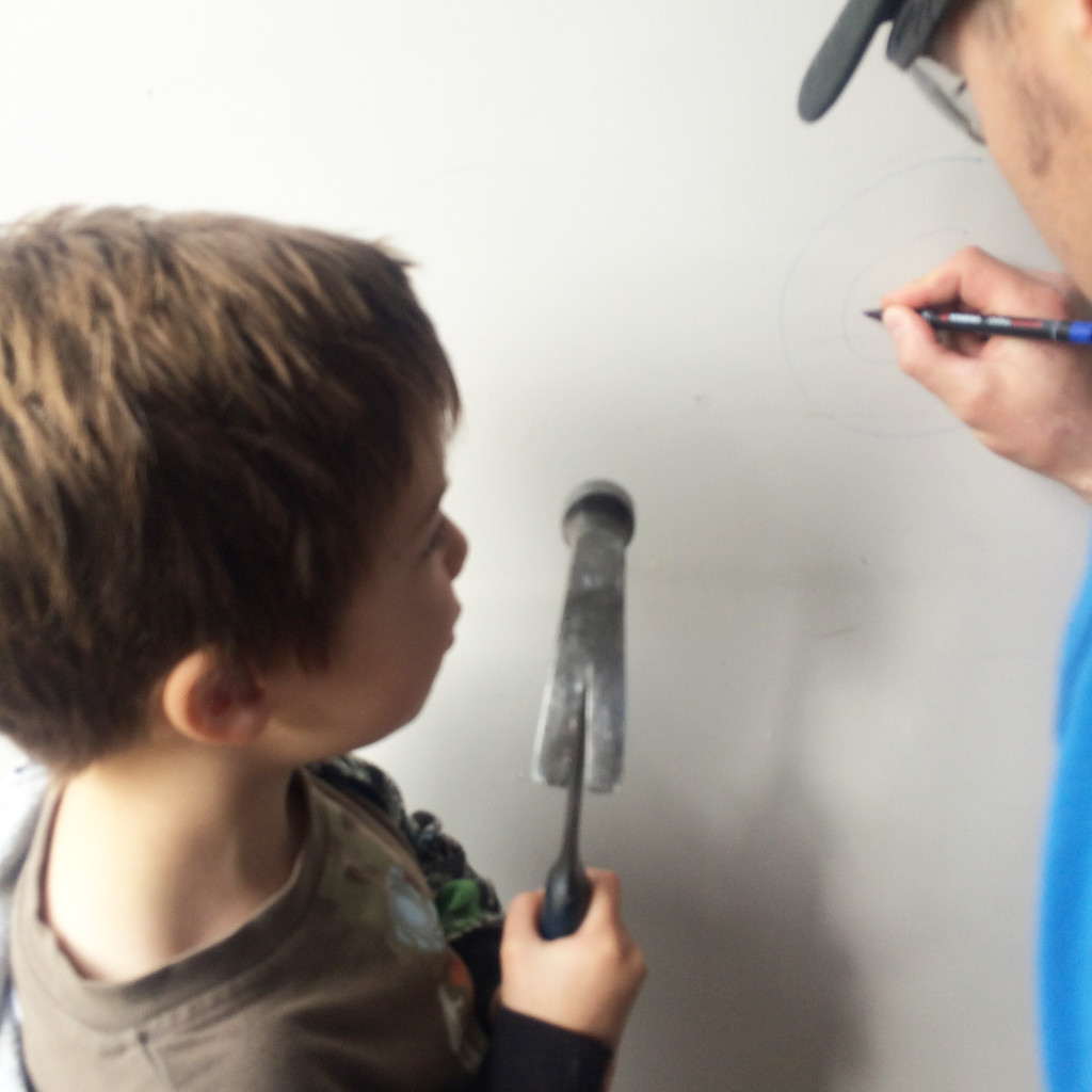
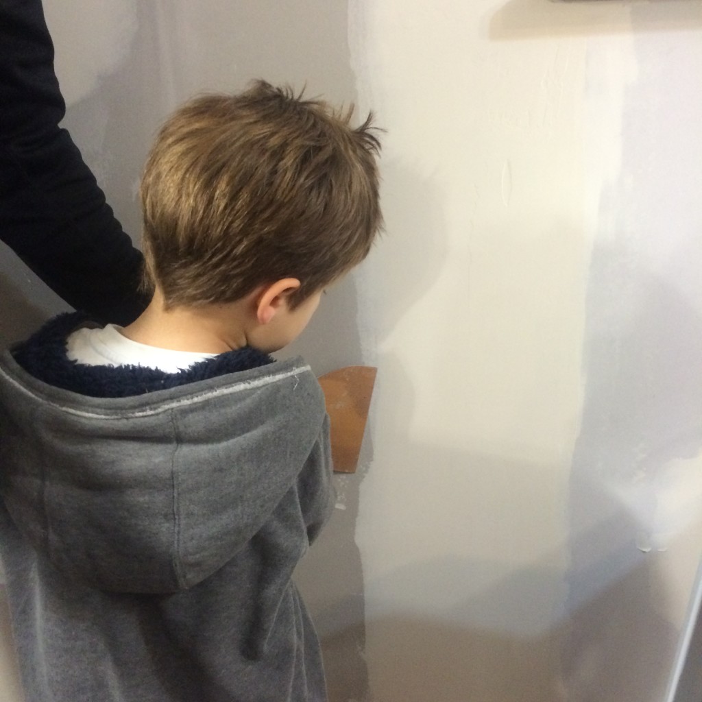
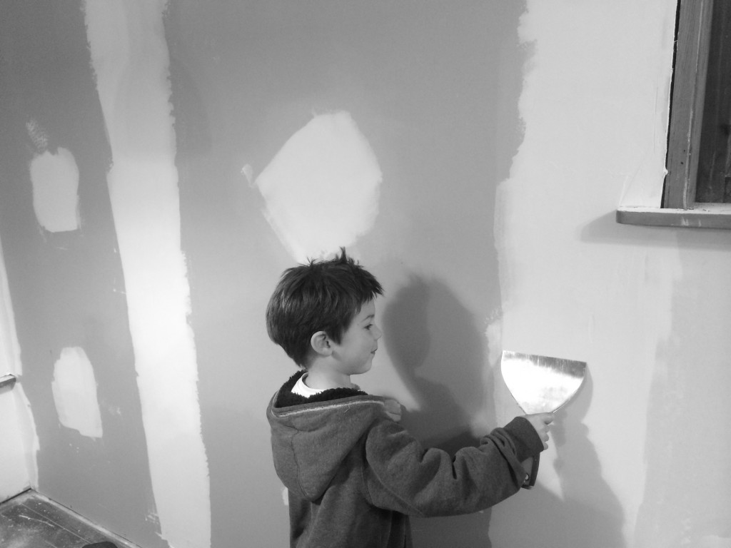
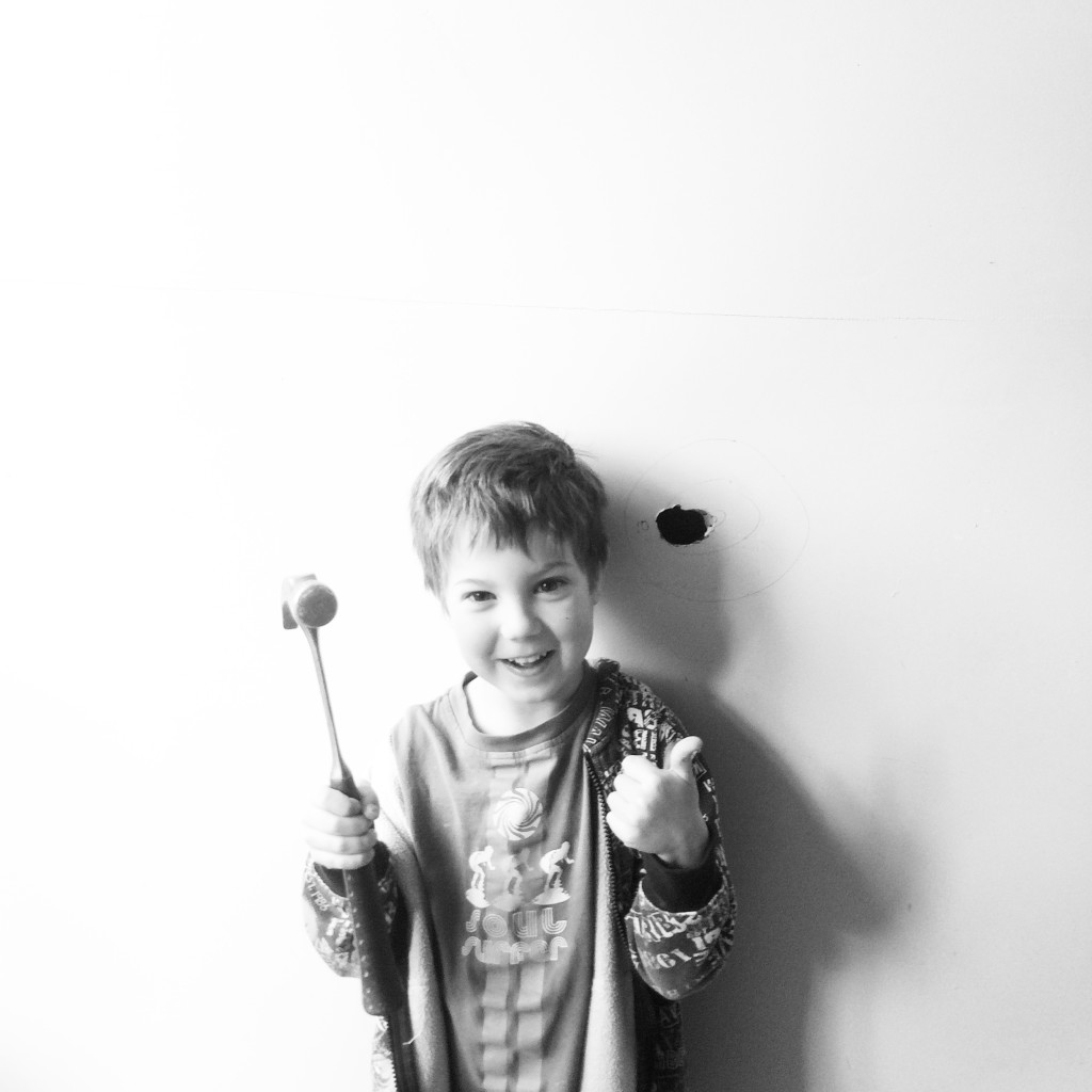
A number of structural renovations were done pre-Jimmy, so while Dylan has had the joy of swinging a hammer through a wall, Jimmy hadn’t before this weekend.
The joy on his face was brilliant. Mind you I was a tad nervous watching him swing that hammer harder each time as it got closer and closer to his head in his swing. It took him a while to break through the wall but he was loving it as you can see.
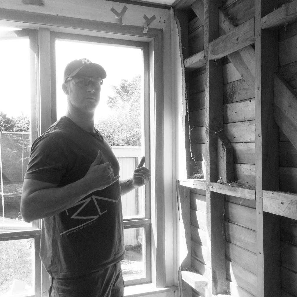
Throughout our renovation process we have taken plenty of before and after photos, creating an album of our first home to be able to look back on as a family (the old school approach). I often take photos of my husband Jeremy whilst saying, ‘this is for the reno album’. Now he’s noticing that they are slowly slipping onto the blog. Say hello Jeremy….
Gib stopping Sunday and after dinner this week to get the walls done and off to choose paint colours this weekend coming. Hilariously in the perils of renovating slowly – we painted our living room four years ago, and well, we created our own shade at the time – not so smart now, as we have no idea how to get the same mix again. I guess we will be painting the living room in the new colour too since its one open plan space.
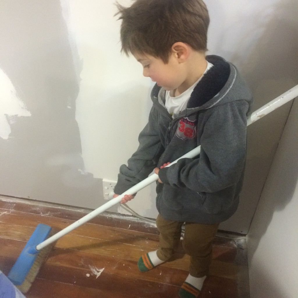
Looking forward to sharing the finished space soon, for now in the words of Jeremy – “a clean site, is a safe site”, plus I think he enjoys having his apprentices at home.
What renovations projects have you been tackling recently or on your to-do list? I’d love to know your working on in your own home.
Kelly
The post Weekend Reno’s appeared first on The Home Scene.
]]>The post Industrial upcyling for your home appeared first on The Home Scene.
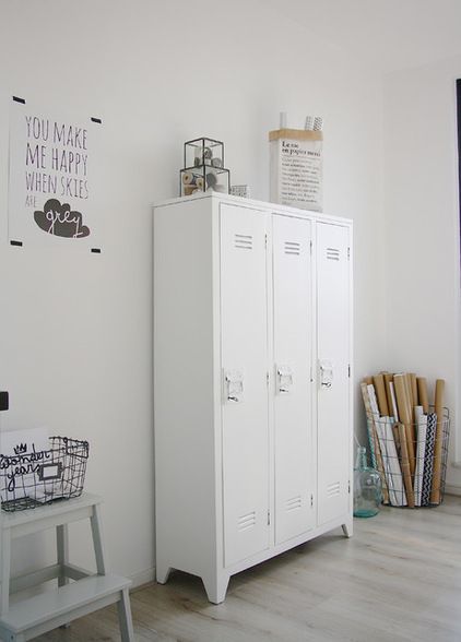
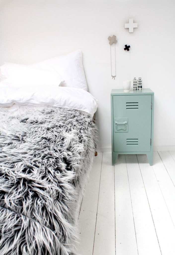
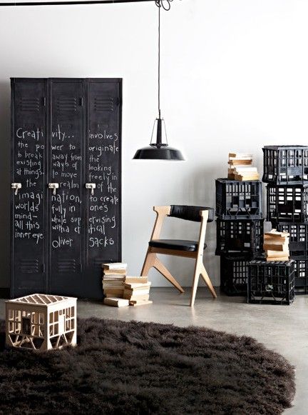
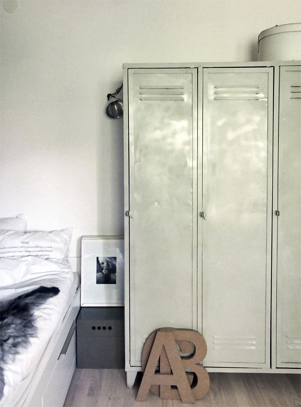
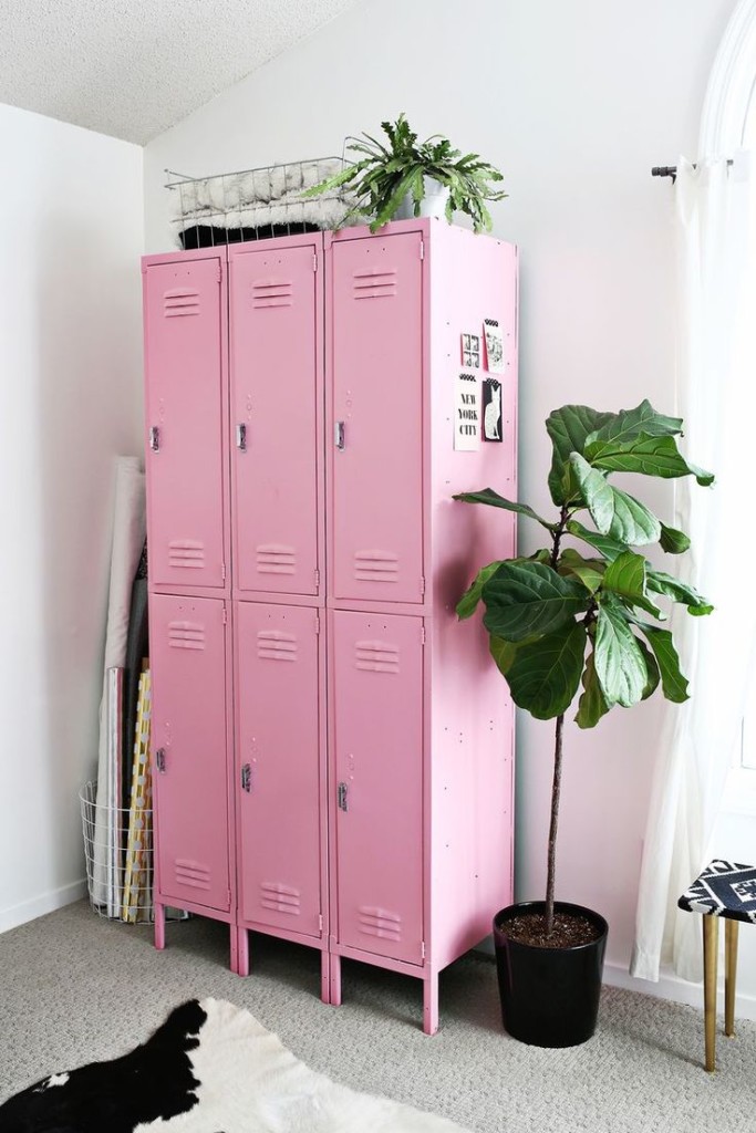
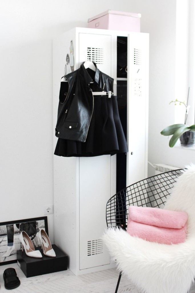
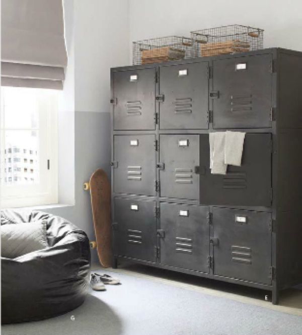
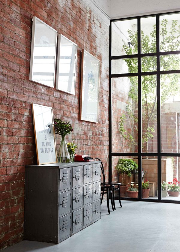
]]>I have been coveting a industrial locker for some time now and not too long ago got my hands on a gorgeous 4 x 2 locker.
In pristine condition, she is sitting in our garage (pride of place and still being very useful) waiting until we move in to our new home next year whereby it can be set up in a dedicated office space for my business; which would in an ideal world be a converted shipping container in the back yard (a blog post for another time).
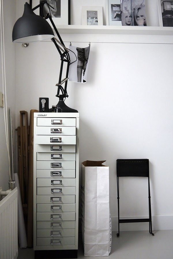
Currently navy, she will be getting a make over in either white or black. Following this is to find an old narrow filing cabinet. In the meantime I’ve sourced some styling inspiration to share with you to see how easy it is to incorporate a locker in your home in a multitude of ways.
Happy hunting – and of course I’d love to see your finds.
– Kelly
The post Industrial upcyling for your home appeared first on The Home Scene.
]]>The post Jimmy’s room appeared first on The Home Scene.
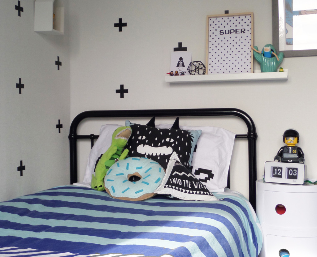
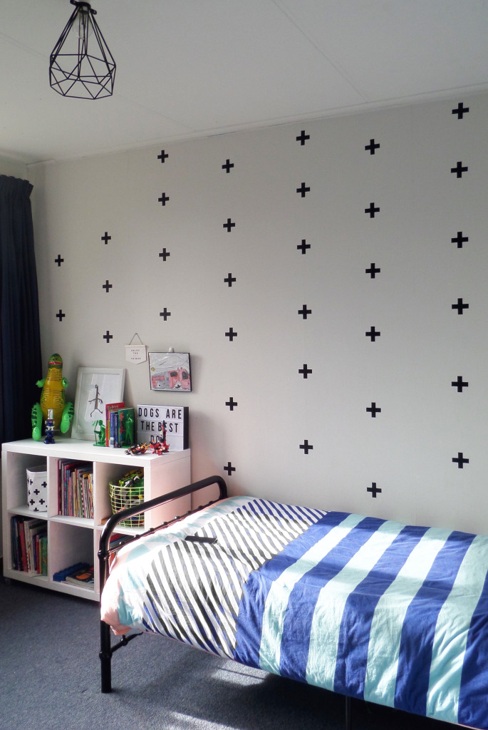
]]>Although we loved the boys sharing a room, as Dylan got older we moved him in to the spare room to give the boys their own space. Rather than a quick makeover, the room was a slow renovation over a few months, earlier this year.
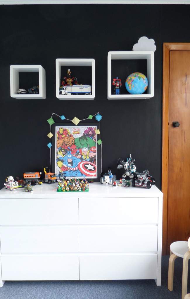
My style aesthetic leans towards monochrome and Scandinavian design, with my love of black, white, neutrals and timber simplicity. For those who aren’t fans of this style (I know there are quite a few….), I do love to incorporate pops of colour throughout our home.
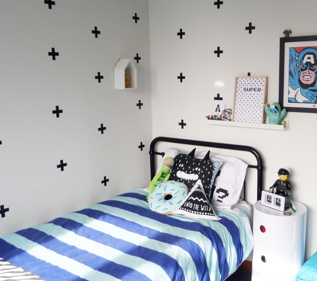
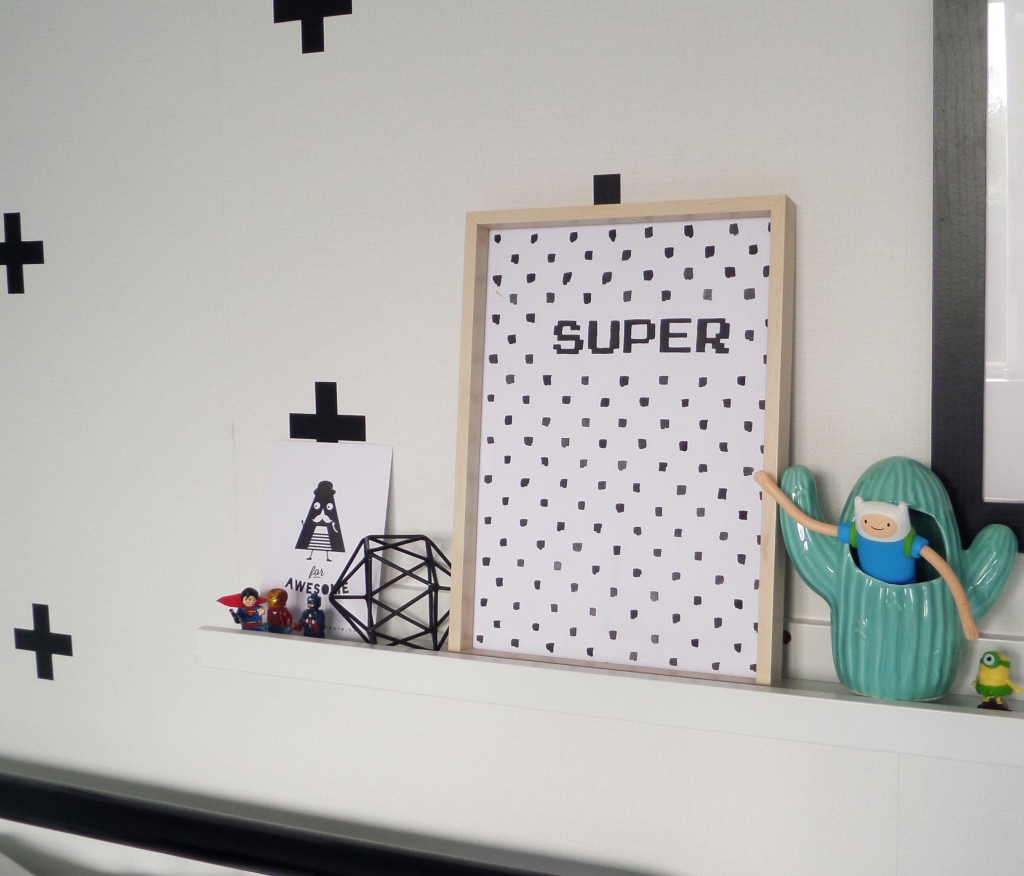
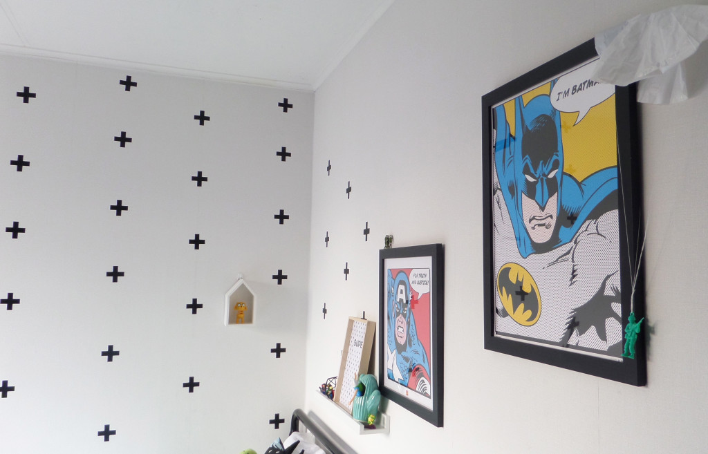
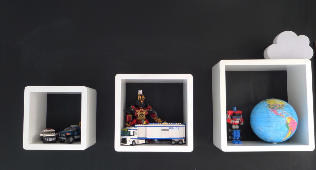
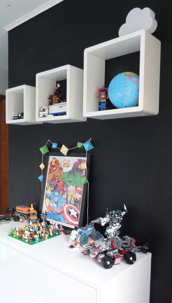
Jimmy loves all things super hero so I wanted to incorporate this in to the design without taking over the space. The newly purchased black Sonata bed from Mocka has replaced the old tired wooden frame and has transformed the room, pulling the look of it altogether.
The Ikea picture ledge positioned above Jimmy’s bed gives him a dedicated space to change and put his favourite things on display.
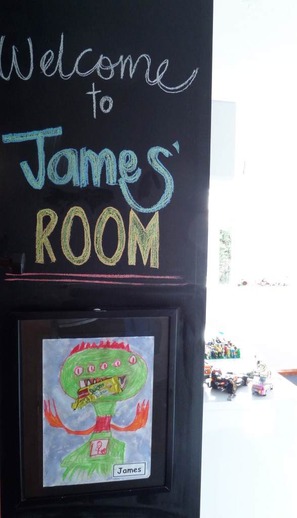
I’m obsessed with Blackboard paint and forever finding new projects to utilise the product. I created the full blackboard wall in the boys shared room 4 years ago. It was a little nerve wracking before that first paint stroke but I loved the effect the strong, black wall had on the space so I extended it in to Dylan’s new room (which I’ll share on the blog soon).
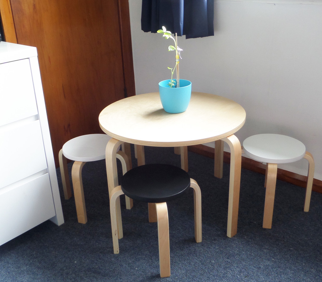
Jimmy loves to sit and draw for hours on end and I wanted to provide him with a quiet space in his room to do this. I added my own touch to the Mocka Hudson kids table and stools by painting the tops of the stools, keeping with the rooms style. We have plants throughout the house and thankfully Jimmy hasn’t developed my skill of killing nearly every house plant. This was one he grew at school and was proud as punch of his effort, he wanted it on display in his room.
This blackboard wall wraps around the corner and behind the door. This wall is left clear of chalk to provide a clean black wall finish and Jimmy is given free reign to draw anything he likes on the two other walls. The geometric garland was one I created myself with the DIY template on the blog.
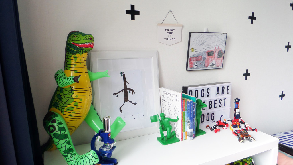
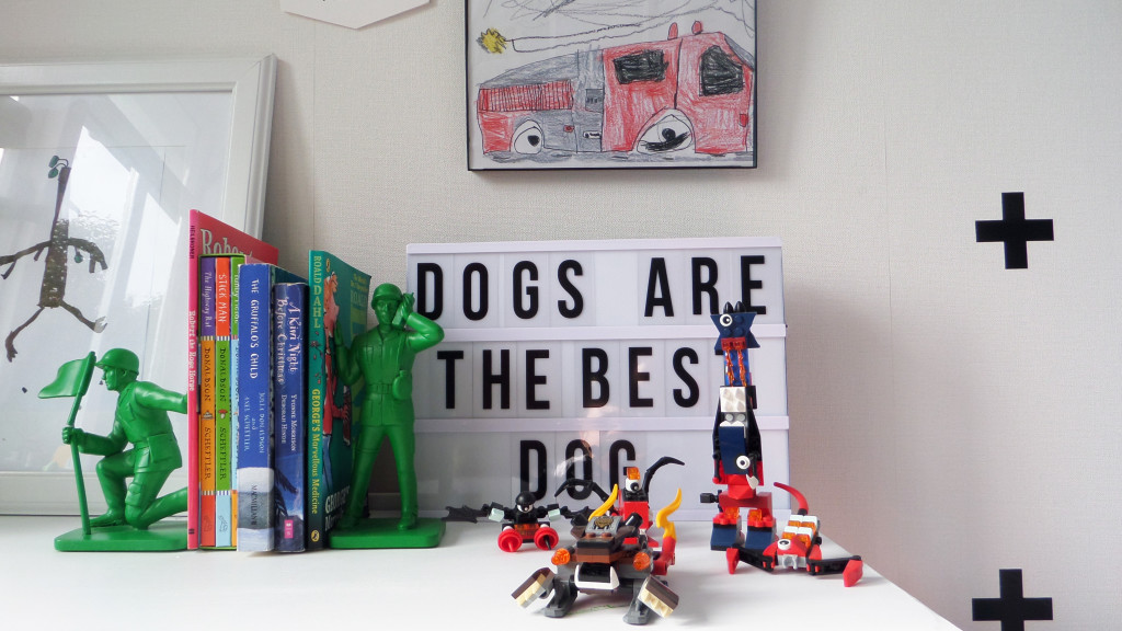
Jimmy’s love of art is on display with this one he drew from the classic book, Stickman and the fire engine he drew from copying an image from a book. He chose the lightbox and loves to change the messages up – currently stating ‘Dogs are the best dog’ (we ran out of enough “s”), too cute.
Part of the full blackboard wall, this space creates a welcoming entrance as you step into the room. Jimmy chose his monster print art work as a way to ‘warn people’ coming in, monsters live here.
There are still a few more touches to go in this room but I’m happy with how it’s come together and of course, the most important thing is Jimmy loves his room.
Happy to share any product details you might love, feel free to comment below and I’ll let you know where they were sourced from.
– Kelly
The post Jimmy’s room appeared first on The Home Scene.
]]>