The post Friends of the Fair launches appeared first on The Home Scene.
]]>Continuing on with its success, Auckland Fair launched today Friends of the Fair, and to celebrate, we’re giving away a membership to one lucky Home Scene reader.
Friends of the Fair was established as a way for the already loyal (and totally rad) community to stay connected to the Auckland Fair, not only during event time, but between each event while they wait for the next Auckland Fair to happen. It enables these little champions, these enablers of ingenuity and good folks to help support the Fair to continue to help the Makers in a practical way providing more resources and allowing the event to grow.
Not only will you be getting all the warm fuzzies of being a pal, but some super sweet deals that will be constantly added to (this is just the beginning!) but you will be helping support the Auckland Fair to keep going and have more time, energy and resources to help the Makers. After all, the Auckland Fair isn’t just an event, it’s a supportive resource for New Zealand’s creative community!
Most importantly, Friends of the Fair isn’t location based. Anyone who wants to be a Friend of the Fair can join and get almost every benefit currently offer, without having to be in Auckland.
Friends cards last for 12 months from the date they are issued and are just $95 each (or 26c a day) for all that value and feel good factor! Plus they make a great pressie for someone near and dear to you.
+ Benefits
- A personalised Friend of the Fair card
- Free entry into the Auckland Fair on the day
- Entry via the priority queue at the main doors.
- A limited edition A5 print from one of 2 artists (Sarah Walden from Tales at Sea and Dane Laugesen from With the Wolves) with designs that are exclusive to the Auckland Fair, printed by The Print Room.
- 10% off hot drinks at all Mojo Coffee cafes.
- Your Home & Garden Magazine very generous subscription discount of $29.99 for 6 issues (saving 37%) or $58.99 for 12 issues (saving 38% off the retail price).
- The first 5 cardholders issued each month will also get a copy of the latest Your Home & Garden, delivered with their Friends pack.
- 15% off at The Bread & Butter Letter, both online and in-store.
- I Love Pies $1 discount voucher on their new Gluten Free pies; redeemable from supermarkets, nationwide.
- An exclusive Friends of the Fair newsletter once a month.
- Early bird registration and discounts on Auckland Fair creative workshops (launching soon.)
- Surprise treats on your birthday
- Special discounts and offers on the day of the Fair from our Makers.
To enter this awesome giveaway, head to our Facebook page. Entries close 12pm, Wednesday 23rd September 2015.
If you miss out on the giveaway we are running, you can still be part of the awesome community by purchasing your own Friends of the Fair membership for $95 (incl GST). Each card will be personalised with the cardholders name, membership number and expiry date and are valid for 12 months from the shipped date.
Auckland Fair 14th June 2015 from Auckland Fair on Vimeo.
The post Friends of the Fair launches appeared first on The Home Scene.
]]>The post Weekend Reno’s appeared first on The Home Scene.
]]>Over the process of renovating our first home, a lot of planned projects had been put on hold until money was available in the budget. This stems from starting the renovation journey at ages 21 and 22, with entry level incomes, and growing our family.
The kitchen is always an issue with former state homes, and ours was no exception. We completely gutted the kitchen and installed a new streamlined, clean, white kitchen, opening up the space and bringing into the new millennium. After enjoying beautiful exposed Gib walls for nearly a year, it was time to get the tiling ticked and finishing painting this area. Waiting a year with bare walls is simply a by product of my husband travelling a lot with his work as a builder in the army and timing not always being available.
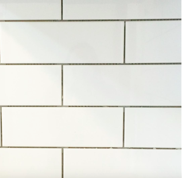
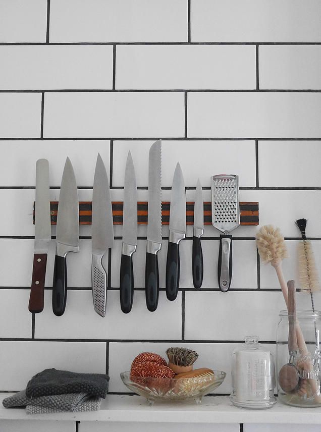
The delay worked out well from a design perspective with a change in our original thoughts of a long glass splash back to tiling. We purchased white subway tiles with a light grey grout from Mitre 10 for their simple design and the fact that they won’t date as quickly, even though they are currently trending. My love of herringbone tiles will have to wait so I’m told, we after all moving on and won’t be here long enough to enjoy them.
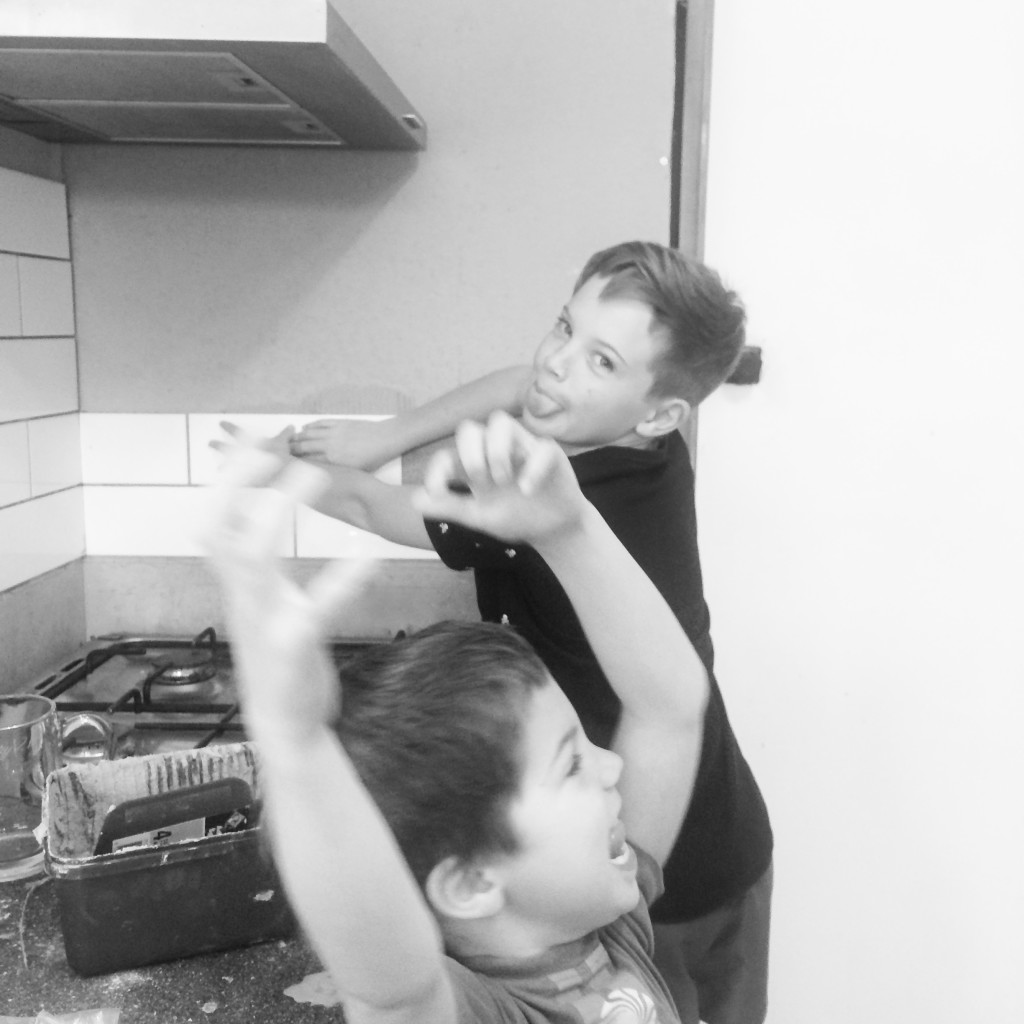
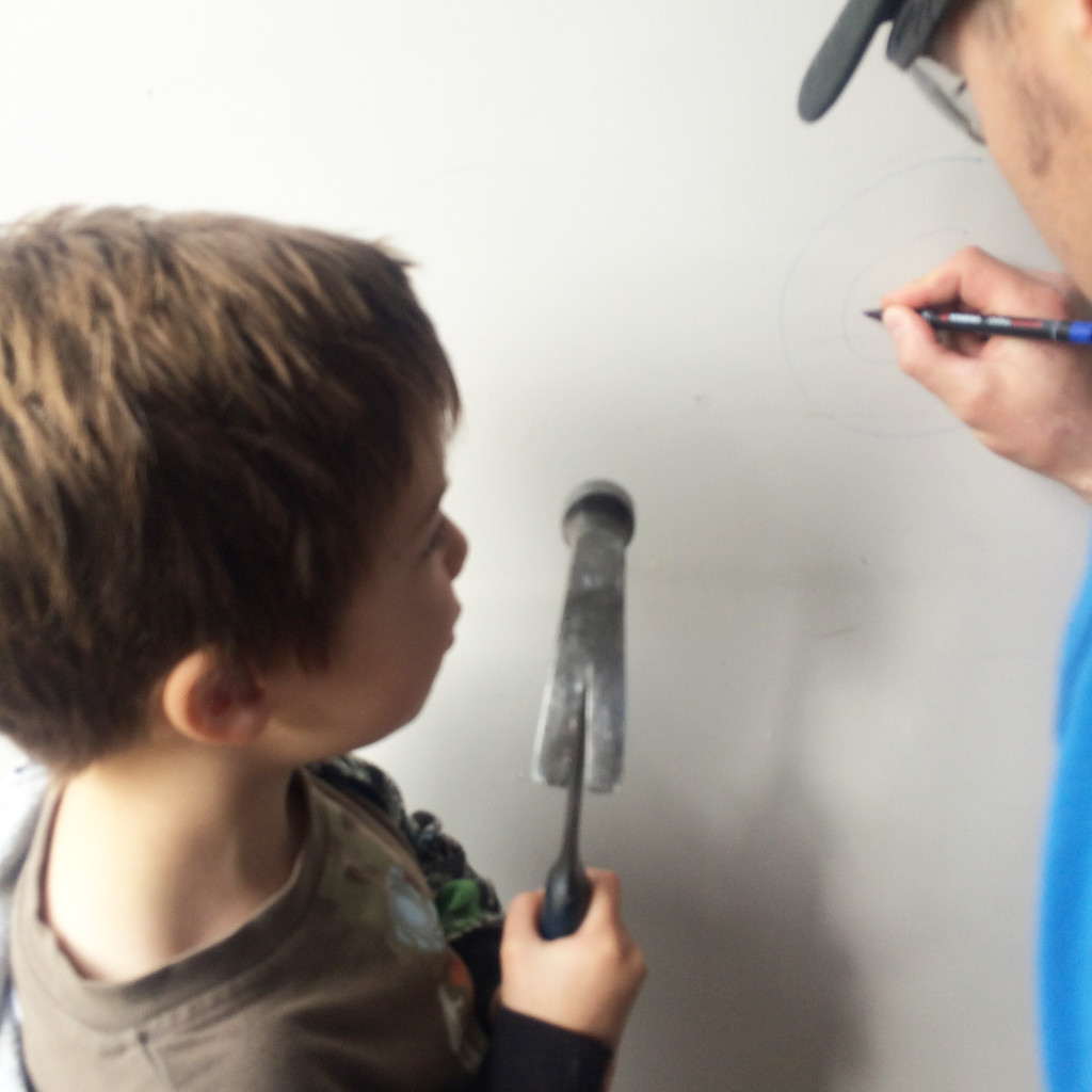
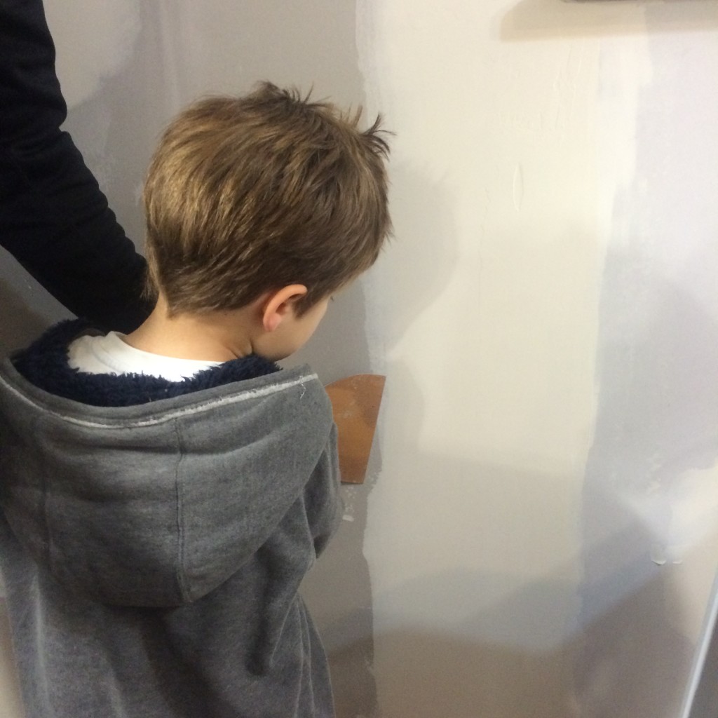
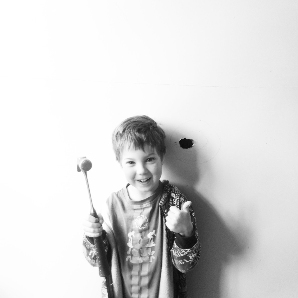
A number of structural renovations were done pre-Jimmy, so while Dylan has had the joy of swinging a hammer through a wall, Jimmy hadn’t before this weekend.
The joy on his face was brilliant. Mind you I was a tad nervous watching him swing that hammer harder each time as it got closer and closer to his head in his swing. It took him a while to break through the wall but he was loving it as you can see.
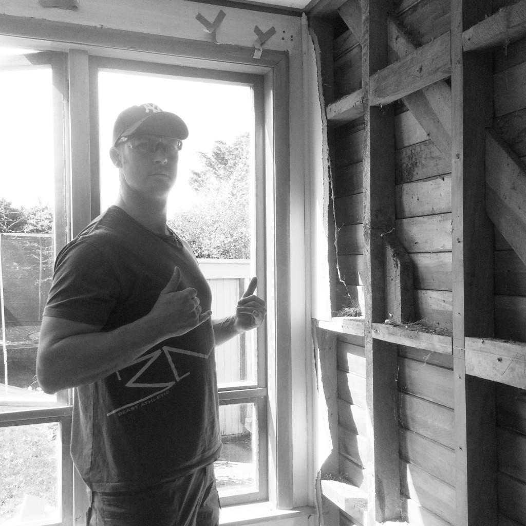
Throughout our renovation process we have taken plenty of before and after photos, creating an album of our first home to be able to look back on as a family (the old school approach). I often take photos of my husband Jeremy whilst saying, ‘this is for the reno album’. Now he’s noticing that they are slowly slipping onto the blog. Say hello Jeremy….
Gib stopping Sunday and after dinner this week to get the walls done and off to choose paint colours this weekend coming. Hilariously in the perils of renovating slowly – we painted our living room four years ago, and well, we created our own shade at the time – not so smart now, as we have no idea how to get the same mix again. I guess we will be painting the living room in the new colour too since its one open plan space.
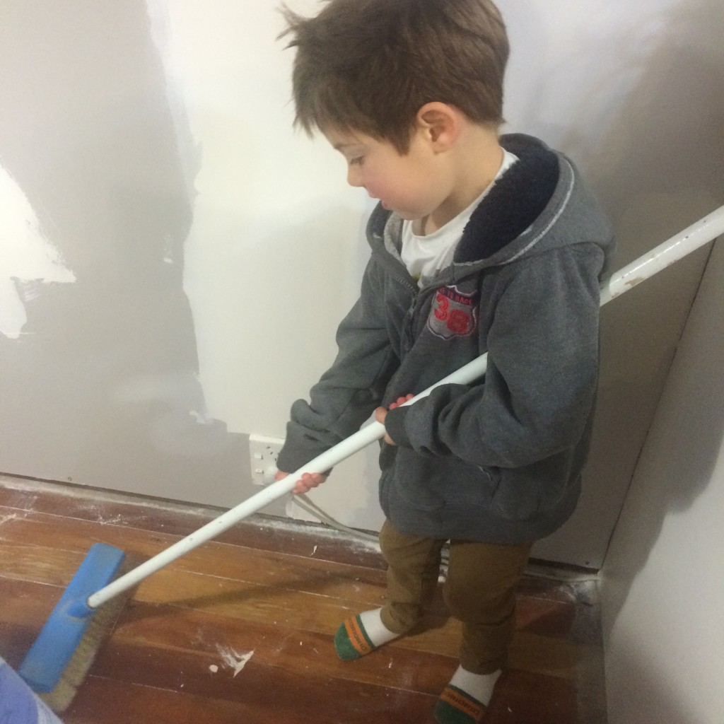
Looking forward to sharing the finished space soon, for now in the words of Jeremy – “a clean site, is a safe site”, plus I think he enjoys having his apprentices at home.
What renovations projects have you been tackling recently or on your to-do list? I’d love to know your working on in your own home.
Kelly
The post Weekend Reno’s appeared first on The Home Scene.
]]>The post My Favourite Room with Unna Burch appeared first on The Home Scene.
]]>A true fan of Unna’s food philosophy and lifestyle, Unna was a natural to be featured in the My Favourite Room series. Here Unna gives a glimpse in to her favourite room and why this space is so special.
+ What is your favourite room in your house?
I love my Kitchen! You knew I’d say that though, ha.
Benjamin and Elise photography and cover image Tim and Nadine Kelly
+ What do you love about this space?
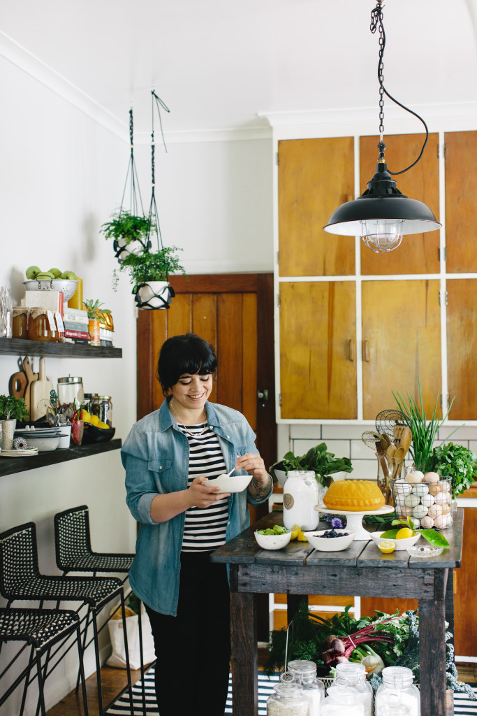
I love that it is a mixture of old and new with a good measure of DIY in there too. My husband is a builder so he sproosed the space up over a few weekends. He made an awesome trolley/island out of an old work bench, added a wooden top, blow torched it in spots to give it a similar character to the existing framing and stained it all. It’s on castor wheels so it can be moved around, the idea was so that I could push it to natural light if I wanted to in the lounge and photograph on it (but I still prefer shooting on white rather than the wood look ATM).
The wooden cupboards I hated when we first moved in, but they have grown on me. They are a pretty iconic Kiwi kitchen feature. I like them now with the white subway tiles around them, it balances out that old and modern feel. The floating shelves I love; a place to store all my favourite kitchen treasures and styling props (and high enough so the kids cant reach haha). I often change the shelf around to give the kitchen a different look. Always on display is my Wundaire ceramic collection, lots of green plants, old tins and my Grandfathers Leica camera. I also love the black retro stools which live under the shelf. We brought them on trade me for $42 for the trio. The kids or when people come over, pull them up to the trolley and sit with me in the kitchen while I’m cooking.
The thing that pulls the room together for me is the light fitting, adding that extra bit of modern. Its a small kitchen, but I like it. My future kitchen will have a lot more storage and a big walk in pantry! (DREAMS!!!!)
Photography: The Forest Cantina
+ How would you describe this room in three words?
Wooden, modern, kiwi.
Photography: The Forest Cantina
Details:
Book: My Garden Kitchen | Website: theforestcantina.com | Instagram: @the_forest_cantina |
The post My Favourite Room with Unna Burch appeared first on The Home Scene.
]]>The post Yorkelee Prints appeared first on The Home Scene.
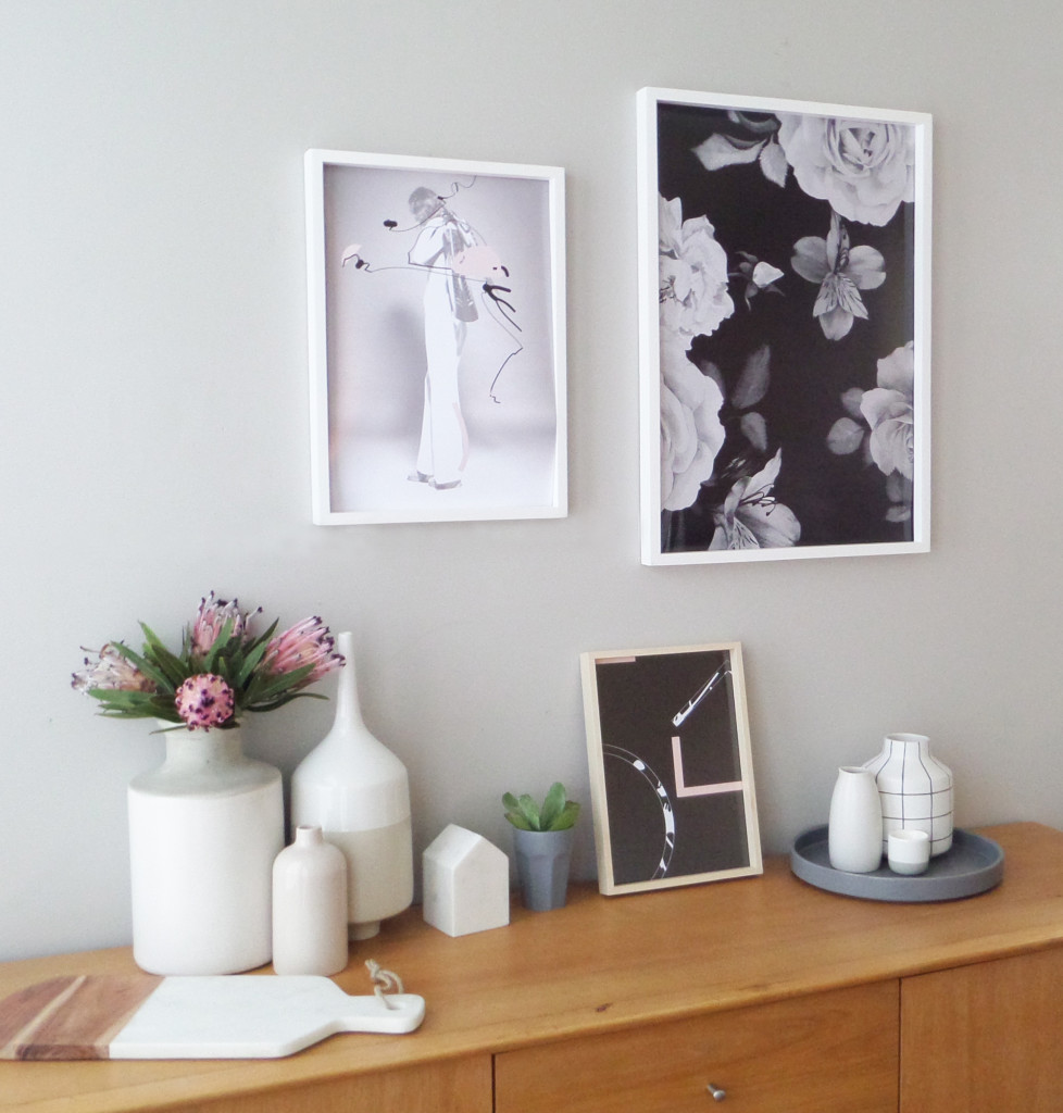
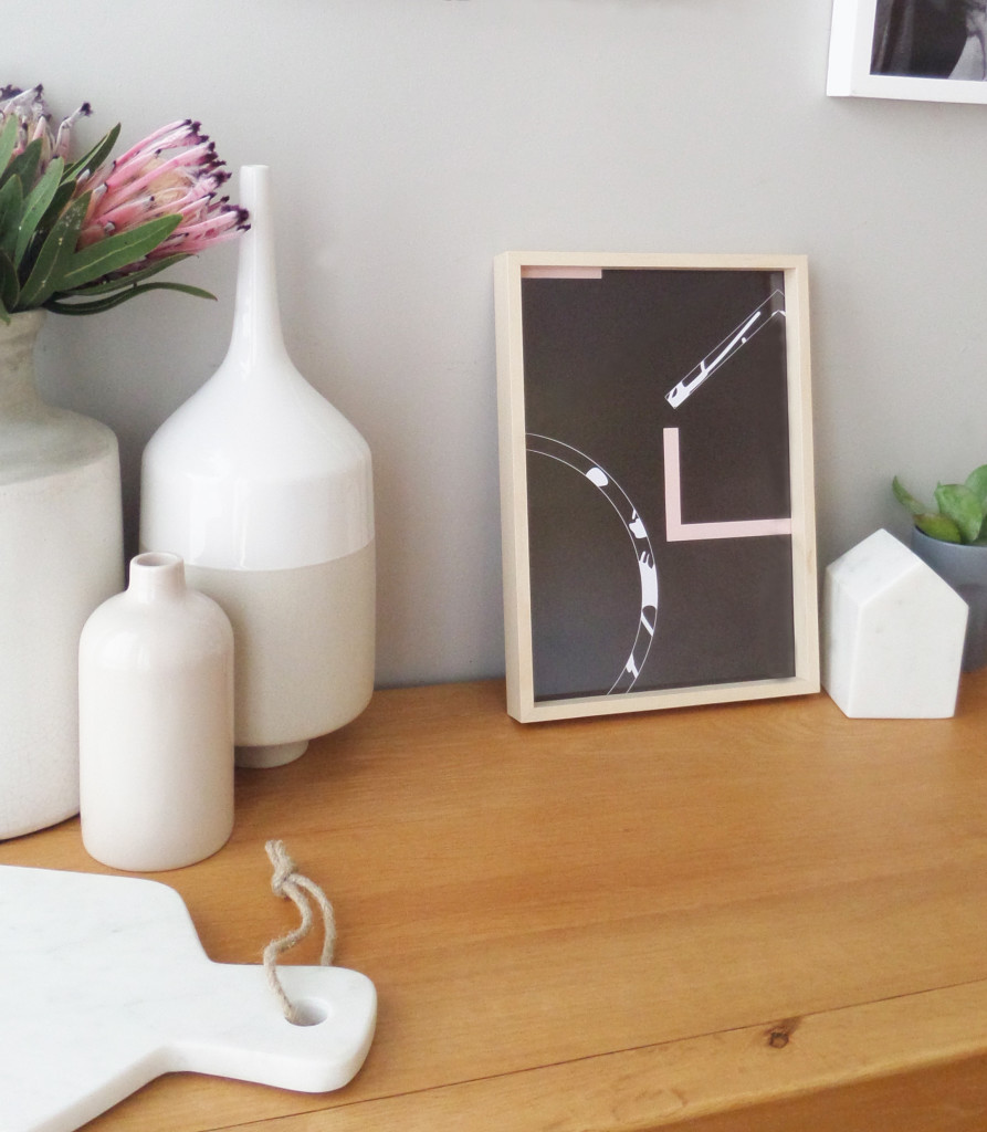
]]>As an extension to the current range, Kate has released three new premium prints and true to her philosophy that everyone deserves to have a stylish interior, these prints are simply stunning. I spoke with Kate on what inspired this new range and had the opportunity to style these prints in my own home.
+ What inspired this new range?
We are all about unique, creative, affordable prints, we have those, lots of them, but our new premium range is about expanding our product offering. This new range comes from wanting to print on higher quality paper stock for some time and my desire to go a little “darker”, designing prints specifically for designers and style enthusiasts.
+ Describe your style aesthetic in three words
Minimalist. Artistic. Refined.
+ What do you love most about what you do?
I love creating and being inspired. I get a real buzz out of designing something people love and it makes my day seeing our designs in customers homes and seeing how happy they are.
+ What might we see in the future from Yorkelee
Lots of collaborations, innovation and creative, progressive designs.
+ How did you got into this business?
I studied graphic design at university for 4 years back in 1999, before moving straight into the advertising industry working for a few different agencies before starting at ZOO Advertising. I worked in various roles at ZOO including Studio Manager and Operations Manager, whilst studying media buying and a diploma of business.
After going on maternity leave from ZOO to have my first child, I feel in love with the relaxed lifestyle of being at home and seeing my little one grow up. I soon wanted more though, after getting bored very easily and always have to be doing something! I started styling our home, it quickly became an obsession and when I couldn’t find the style of prints I wanted at an affordable price, I decided to design my own. It went from zero to a hundred in a matter of months and during this time I realised this was my passion, something I loved and something I wanted to do full time.
Details:
Website: Yorkelee Prints | Instagram: @yorkelee_prints
Yorkelee’s premium prints are available in medium A3 size 297mm x 420mm – $45 AU, large 500mm x700mm – $65 AU, and custom sizes upon request.
The post Yorkelee Prints appeared first on The Home Scene.
]]>The post My Favourite Room with Kyree Meagher appeared first on The Home Scene.
]]>Kyree has been a long time favourite of mine and I was honoured to feature her home in ‘My Favourite Room’ series. Here she gives a glimpse in to her favourite room and why this space is so special.
+ What is your favourite room in your house?
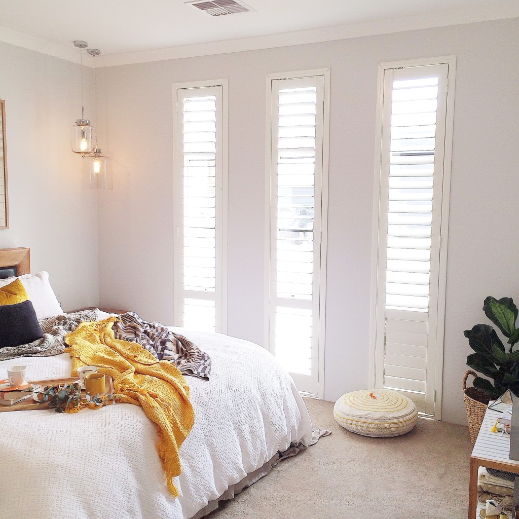
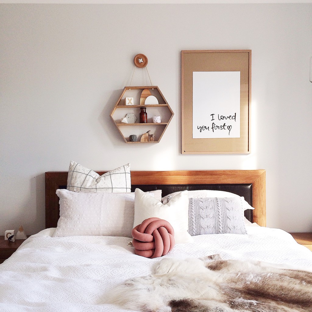
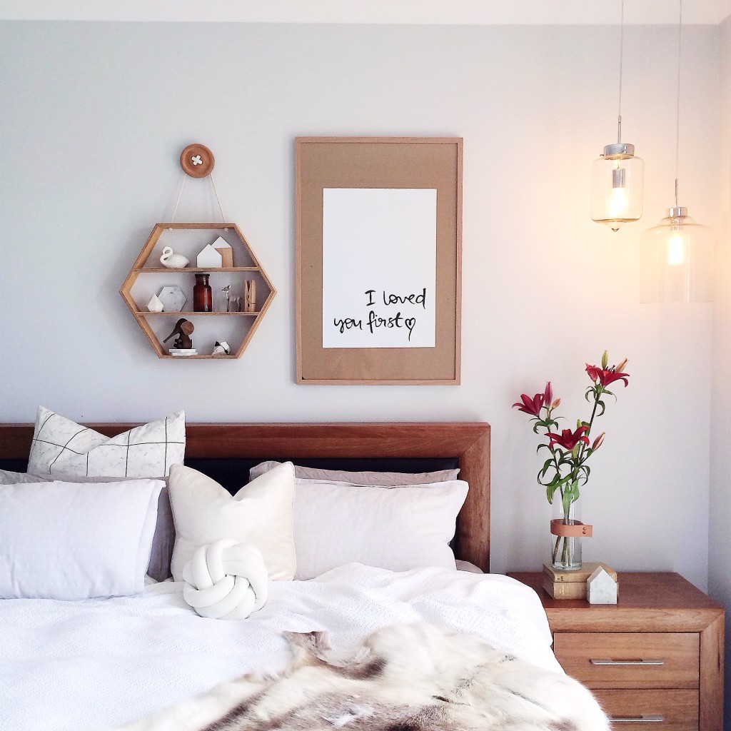
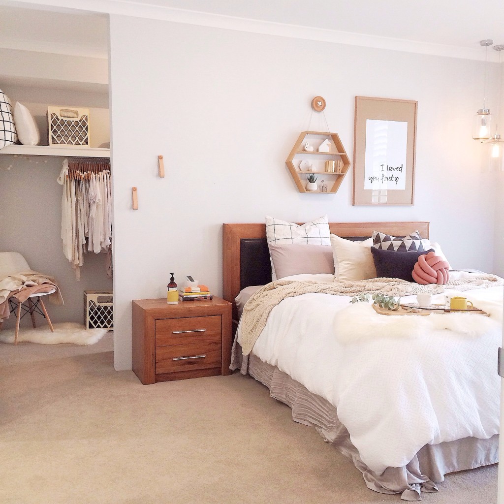
That would be our bedroom. It’s our sanctuary away from our busy hectic lives. This room is where we get to unwind, it’s where I get to talk to my fiancé without any distractions or interruptions.
I love styling our room differently each week because it’s nice to be able to sleep in a splash of stylish luxury. Most people forget about their bedrooms because they are always messy or too boring, but I’ve really focussed on this room and made sure it wasn’t neglected. We chose not to put a TV in this room because we didn’t want that to be it’s sole purpose. It’s nice to escape in here and just be with each other, amongst all the comfort and beauty.
+ What do you love about this space?
I love all the natural light that streams inside the windows in the afternoon, and I adore our white shutters that blocks out the sun when we want to sleep in. Our bedroom is light and bright and always feels fresh. Even if we have clothes thrown onto the floor or over the chair, it still feels like an inviting, stress free environment which is what I crave at the end of a super long day.
+How would you describe this room in three words?
Gosh that’s hard, I’m a lady of many words (getting me to shut up is the problem aha). Three words, ok. Timeless. Classy. Relaxing.
+ How long have you lived here?
We moved into this house after we built it, this April. So not long at all. During this time we have learnt to live in this new space together and spent time decorating, styling and restyling and turning it into a brand new family home. I’ve loved every minute of making this a gorgeous space to live in. We’re really home-bodies and always enjoy being in this space so it’s a real priority to make sure it’s a space we love being in, a space we are happy to live in and home that we will one day bring our babies into.
+ How do you spend your days?
I work a full time office job during the day and work from home, building up my new business, after hours. I have a very hectic, stressful but bittersweet working week. I love photography and being creative and absolutely passionate about styling interiors, so I’m hoping that soon I can focus on my business and make this my full time work.
After we get married in November (3 months and counting eeeek) I would like to make Kyree Interiors my focus. One of my main passions is finding new and unique businesses online and show casing what they have to offer. I believe in supporting small and shopping small and in return I’ve made some beautiful friendships along the way. I take peoples products, style them with a creative flare and photograph them so that they can be used for publicity and marketing. I’m hoping that I can expand and be able to style whole rooms for clients in the near future. Perhaps my first room make over can be the nursery that we hopefully can soon create (soon, hopefully).
I get very emotional and excited about peoples positive reactions over my styling. It really fuels my creativity and gives me that push and encouragement to keep pursuing what I am striving to achieve.
Details:
Website: www.misskyreeloves.com | Instagram: @misskyreeloves
The post My Favourite Room with Kyree Meagher appeared first on The Home Scene.
]]>The post The Factory appeared first on The Home Scene.
]]>
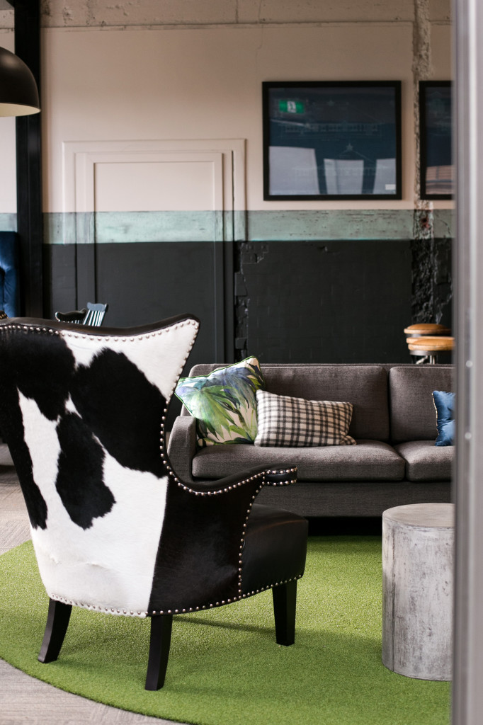
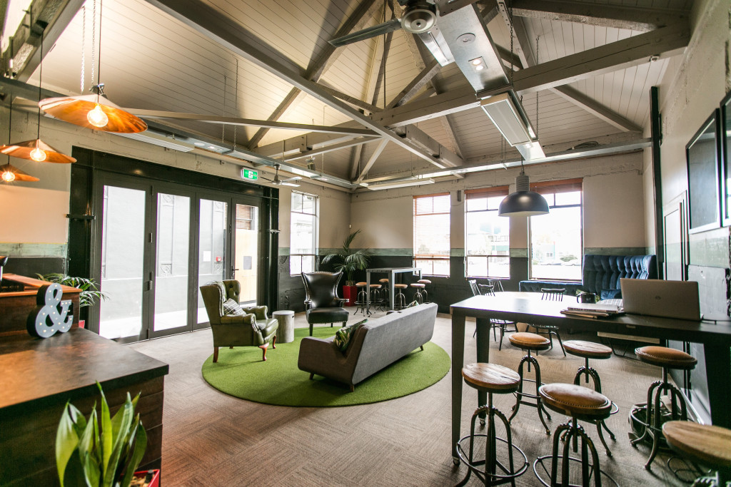
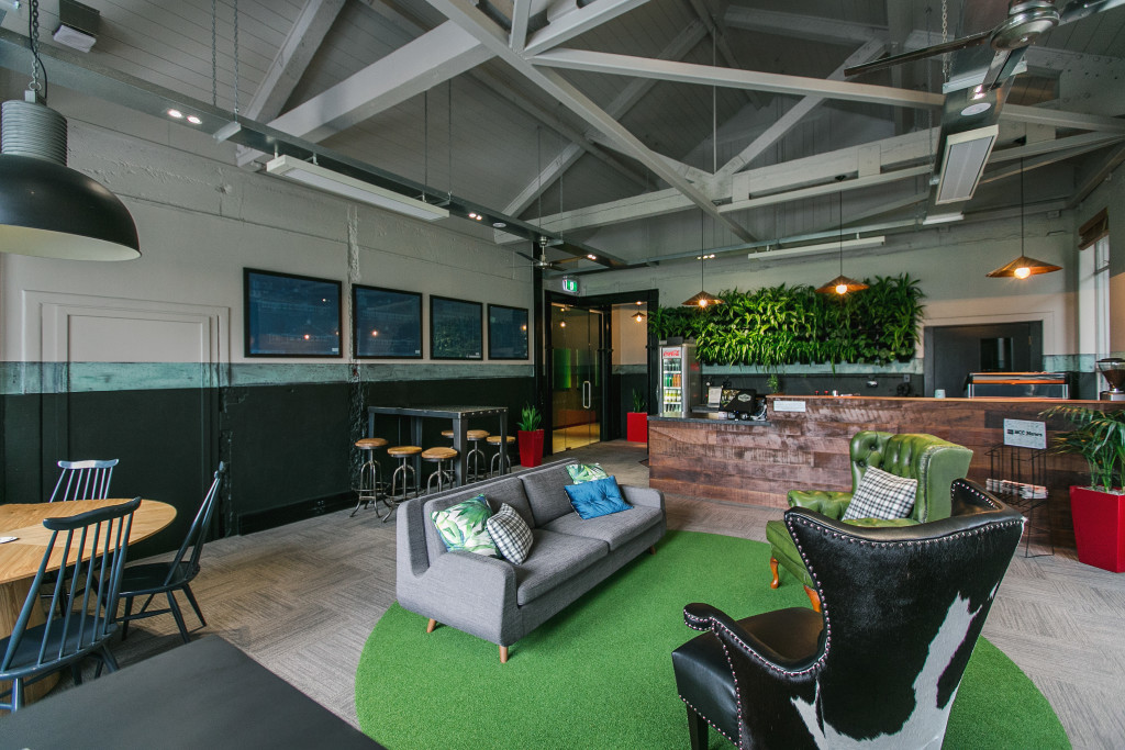
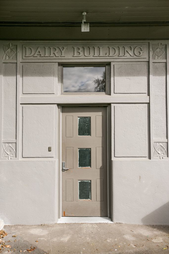
The lounge had a large volume to fill. With it’s high ceilings and the original lighting plans cut at the final stages of completion, the large, industrial Frezolli light over the banquet seating space brings scale to the space.
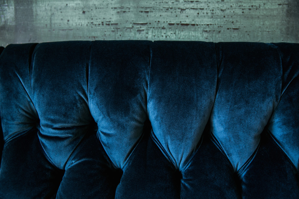
The juxtaposition of textures between the steel legs, concrete base and deep-buttoned velvet all work with the pale elm table, the focal point in the lounge room. Features were tweaked along the way to bring the cohesion of the overall aesthetic in to line.
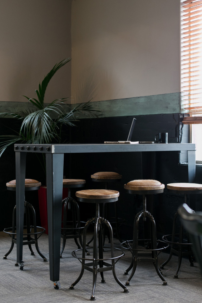
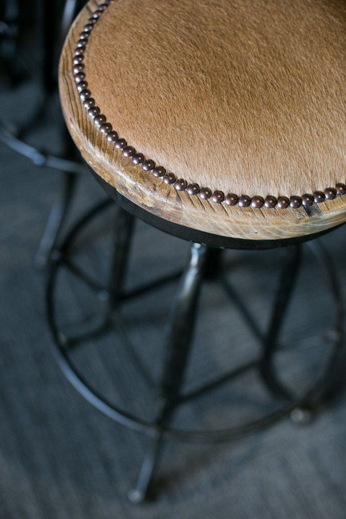
The round artificial turf rug was a budget driven choice that had a great outcome. The cowhide wingback chair pays homage to the milk factory history of the building while the steel bar leaners were custom made for the space by a local engineer with cowhide added to the industrial stools.
While everyone at the Factory has his or her own business to run, the design creates a dynamic and interactive environment. Residents – either those who have walled offices or desks in the open-plan shared space – have access to all areas of the Factory, including breakout rooms, the public lounge and kitchen. Non-residents are welcome to enjoy the lounge area during opening hours and can hire meeting rooms or the lounge for events.
The living wall behind the reception area provides an element of calm. The materials used in the reception-come-coffee making space are also really beautiful. The honed granite bench top was an extravagant but considered worthy addition and works perfectly with the rustic timber frontage.
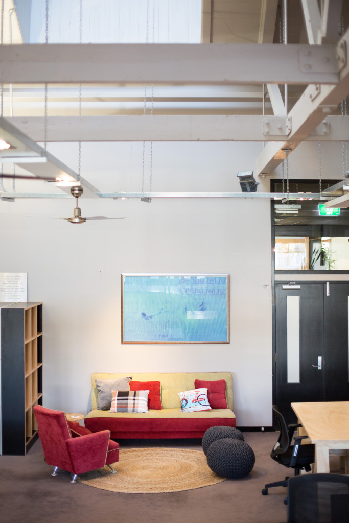
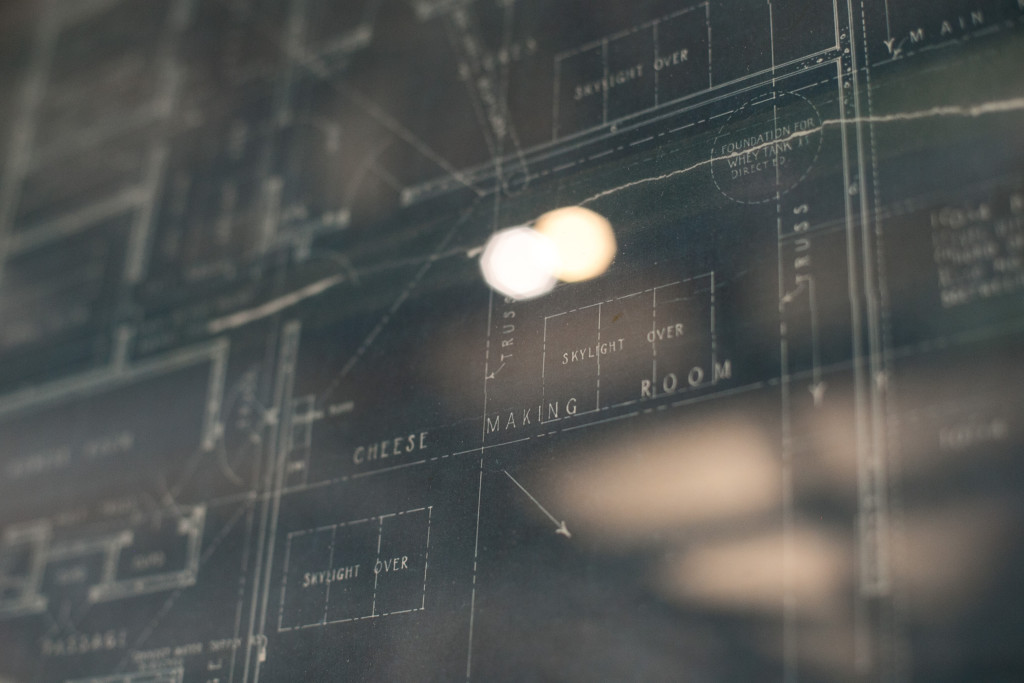
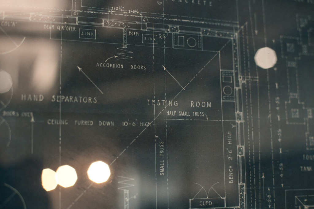
The original blueprints from The Old Dairy Factory are framed and pride of place in the Lounge, paying tribute to the Factory’s history and the renovation process of old to new.
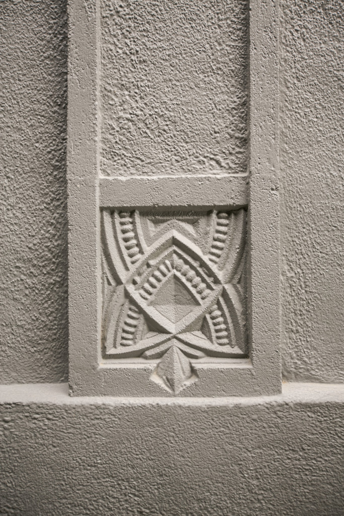
Winner of the New Zealand Institute of Architecture award, the panel noted the sympathetic renovation as a special element, enabling the importance of the cultural heritage values to be protected into the future.
Details:
The Factory | Interior Designer: Wall St Interiors | Photographer: Toni Larsen Photography
The post The Factory appeared first on The Home Scene.
]]>The post My Favourite Room with Blonde and Bone appeared first on The Home Scene.
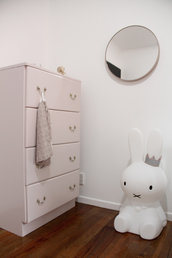
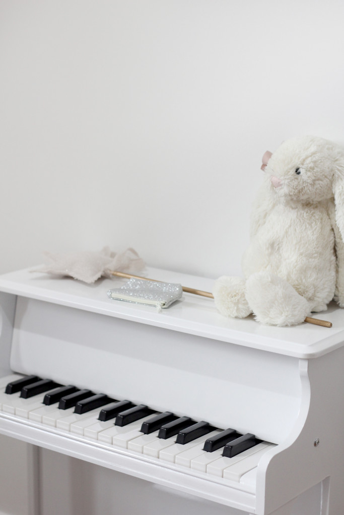
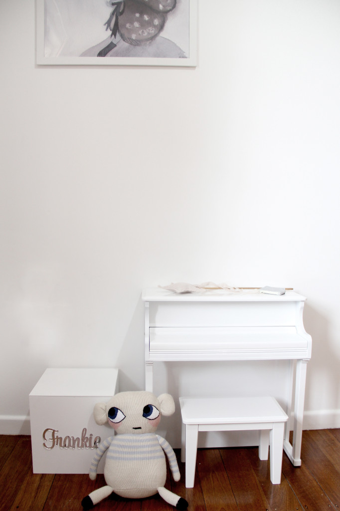
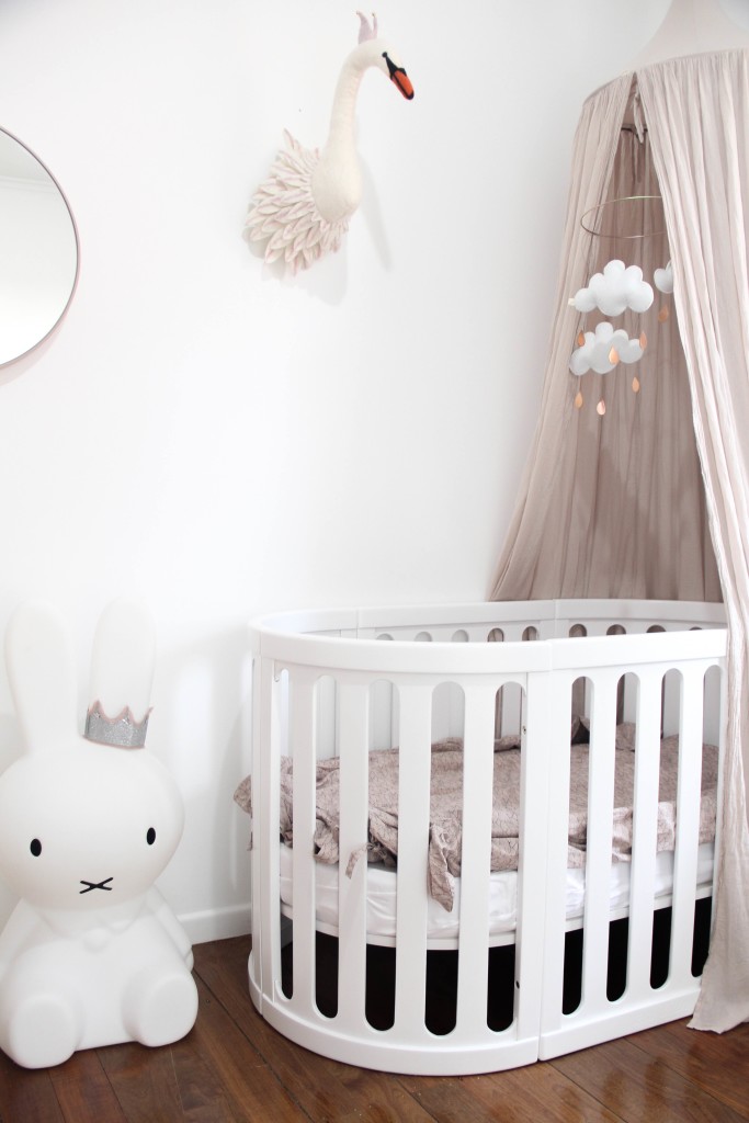
]]>The first in the series features the dreamy nursery designed and styled by the lovely Hannah of Blonde and Bone. One of my favourite Instagram accounts to follow, Hannah styles her home with beautiful Scandinavian design influences. A graphic designer and marketer, Hannah also runs children’s print label, Frankie Says.
+ Where do you live?
We live in Whangarei, Northland which is roughly two hours North of Auckland. Both my husband and I grew up here and really enjoy the slow pace of life and huge selection of beaches Northland has to offer.
+ How long have you lived here?
We are currently renting an older style home which we have been in for two years. We have the perfect amount of country space here with a large backyard and native trees all around us. It really is a peaceful place to live!
+ What is your favourite room in your house?
As we are renting, the only room we have renovated ourselves is our daughters nursery.
+ What do you love about this space?
As much as I love how it looks it also means so much more than a beautiful appearance to me. It is a room full of memories, of stripping wallpaper and painting before she was born and long nights comforting a new baby too. Aside from all of the beautiful memories I have associated with that room, it is such a light, warm and a soft space for our little girl to call her own.
+ Describe Frankie’s room in three words
Simple, light and dreamy
+ How do you spend your days?
I work part time in a design studio, pre pregnancy I was a graphic designer but have now fallen into a graphic design/marketing hybrid role which I really enjoy. The rest of my time I spend working from home which is a mix of graphic design, room styling, product photography and blogging for various stores and labels. My most important job is being a mother to our 9 month old daughter Frankie so balancing work life with this has been something that has taken a while to get use to.
Details:
Website: Blonde and Bone | Instagram: @blondeandbone
The post My Favourite Room with Blonde and Bone appeared first on The Home Scene.
]]>The post Endeans Building appeared first on The Home Scene.
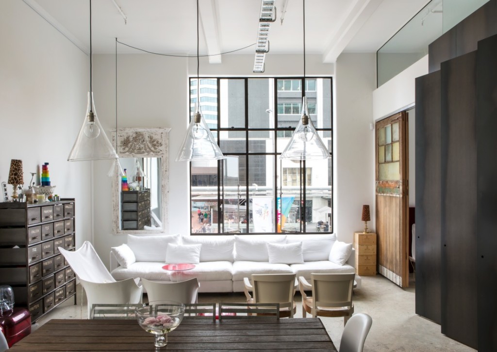
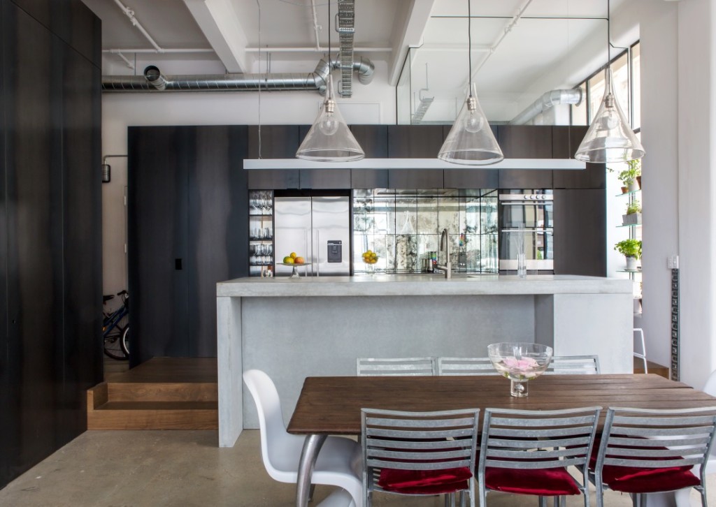
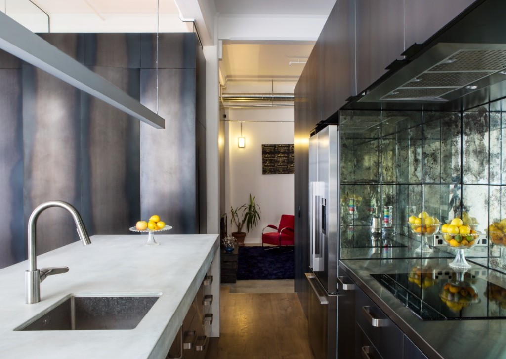
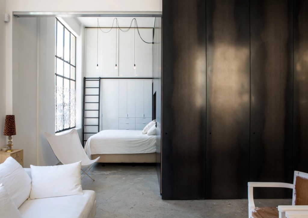
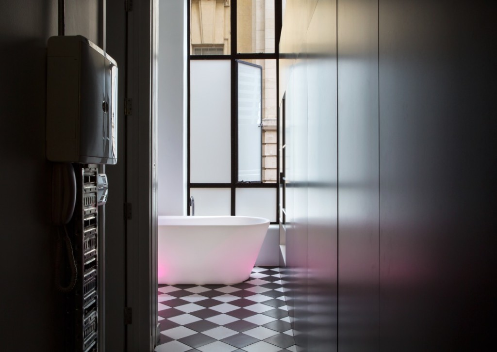
]]>An overall black-and-white scheme ties in features of the original with now. Beautifully designed textural contrast is captured in the interior palette with roughness featured in the concrete floors and columns and smoothness in the clear powder-coated steel.
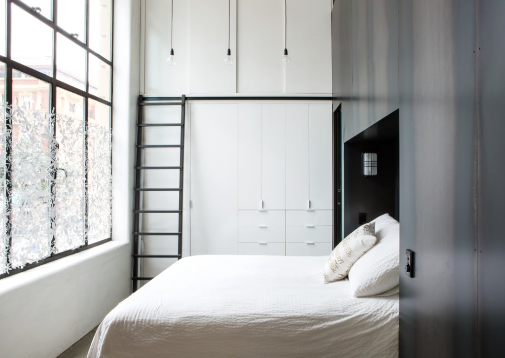
With no opportunity to alter the dimensions of the space, the challenge was to fit a tightly planned programme into the footprint whilst gaining enough light into the core of the apartment from windows on two sides. A four-metre stud and an industrial-strength material palette provided a sense of loftiness and could be upcycled aesthetically.
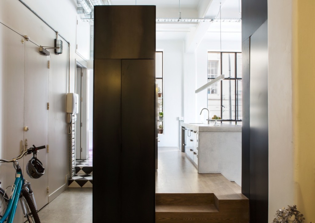
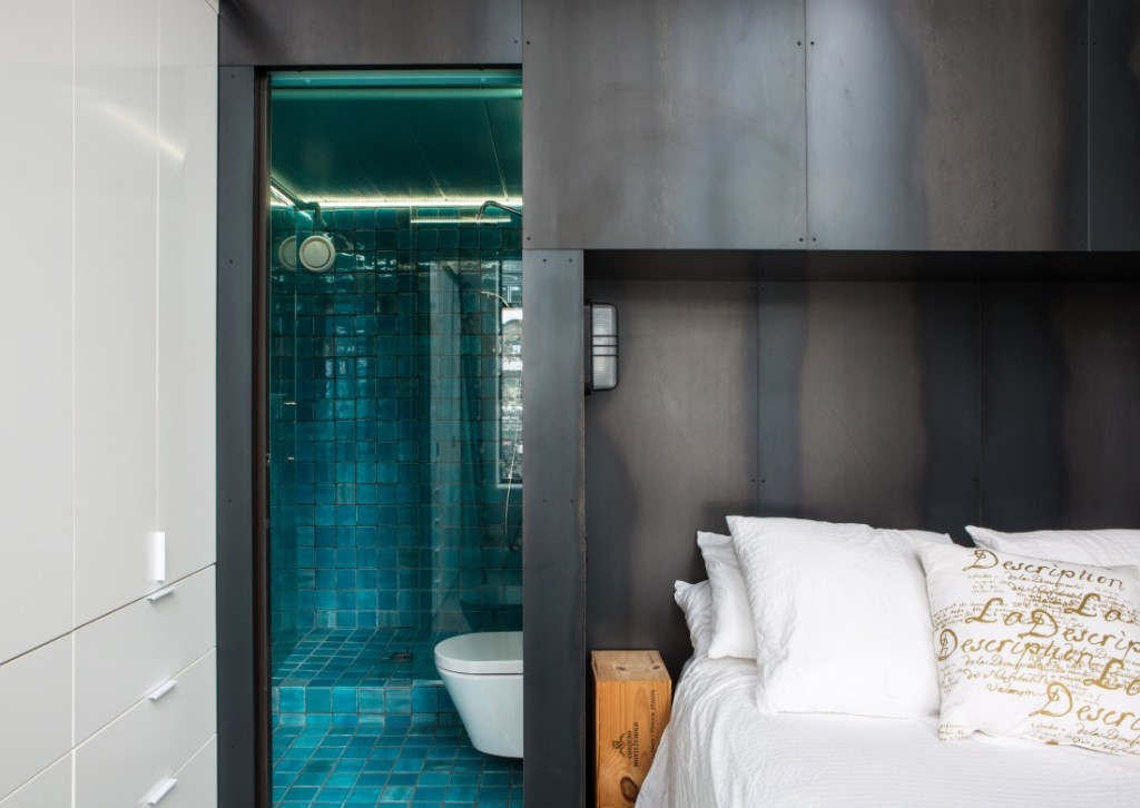
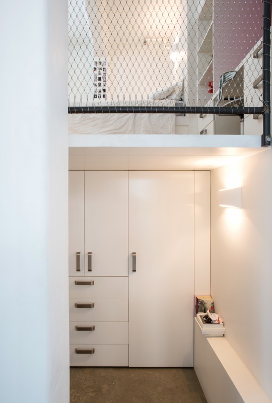
A contemporary insertion, clad in black steel was slotted into the volume to act as bedrooms for the children. This double-height cube at only two metres wide was divided into two – a room for each daughter – then furnished with built-in beds and desks. One room was built as a mezzanine so that an en suite for the master bedroom could slot beneath it.
The owners, who moved from a typical suburban home, are enjoying their city-centred outlook and a new way of living.
Details:
Architect: Dorrington Atcheson Architects | Photographer: Emma-Jane Hetherington |
Source: Archipro |
The post Endeans Building appeared first on The Home Scene.
]]>The post Friday Faves: A pop of colour appeared first on The Home Scene.
]]>———–
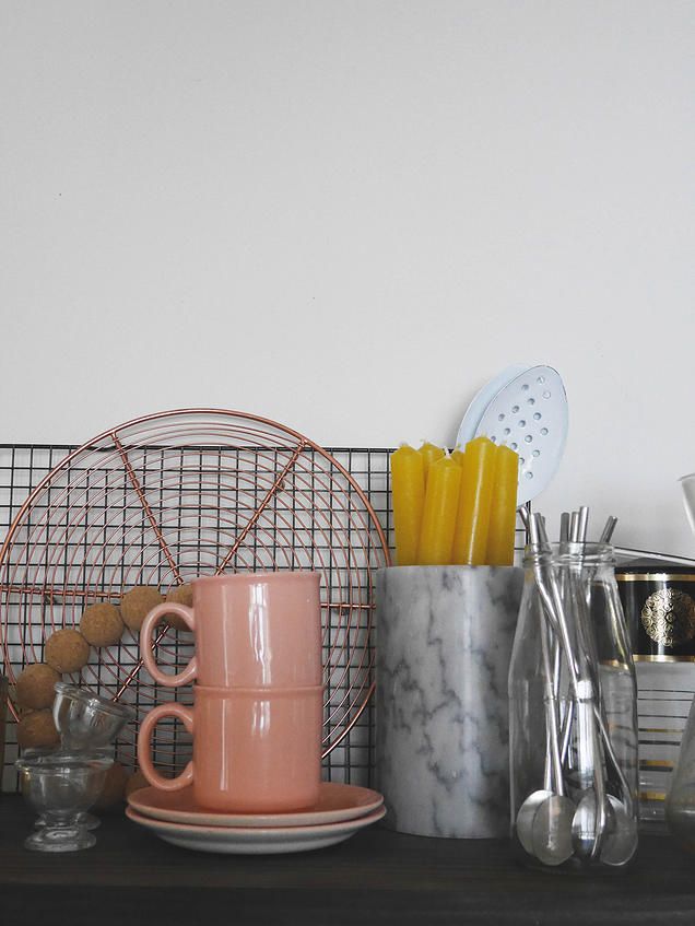
I adore the beautiful peachy pink tones of Amber Armitage’s The Family ceramics collection (our feature image) and not to mention the stunning styling to boot. Almost too good to eat from, Amber’s ceramics would sit pretty out for all to see.
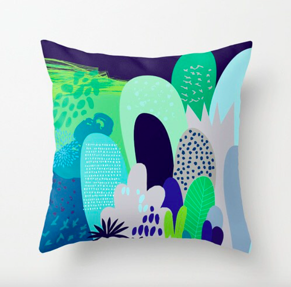
Cloud Nine Creatives new Aztec collection features this cushion that I can see sitting well in my cozy grey armchair in my reading nook.
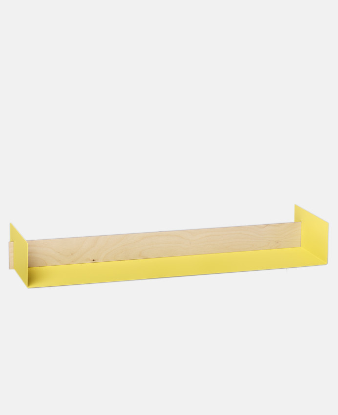
Simple in design with timber features (gets me everytime), this Beam Shelf from Resident GP Homewares will add a pop of zesty yellow to any wall. Display your favourite treasures and admire.
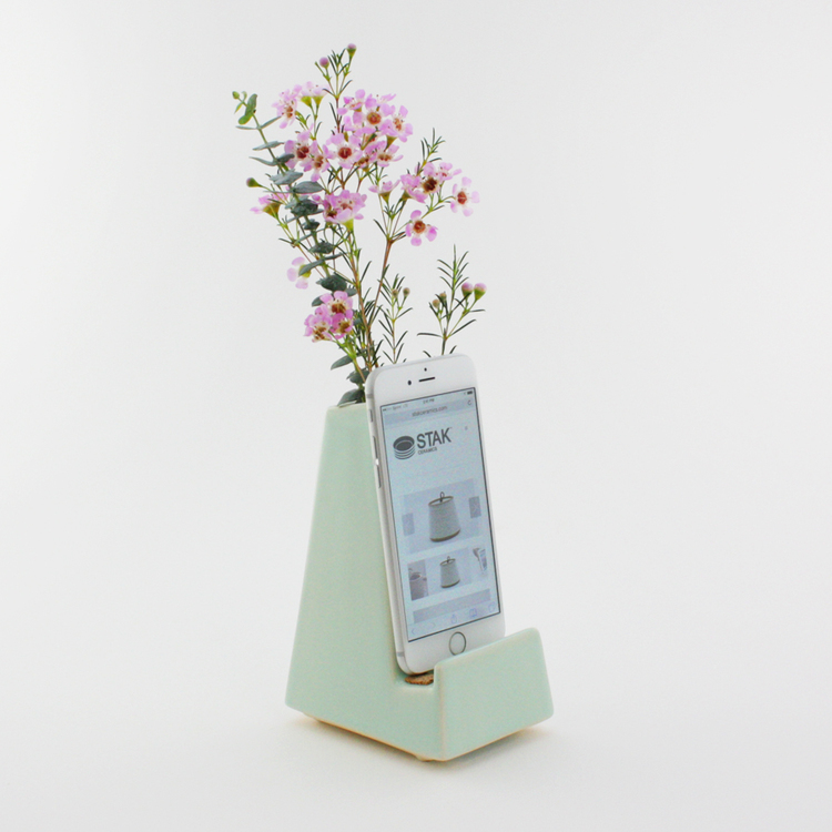
By STAK Ceramics the phone vase is more than just a phone holder. The ingenuity of this idea to create a functional place to store your phone but add beauty to it with a place for fresh cut or dried flowers.
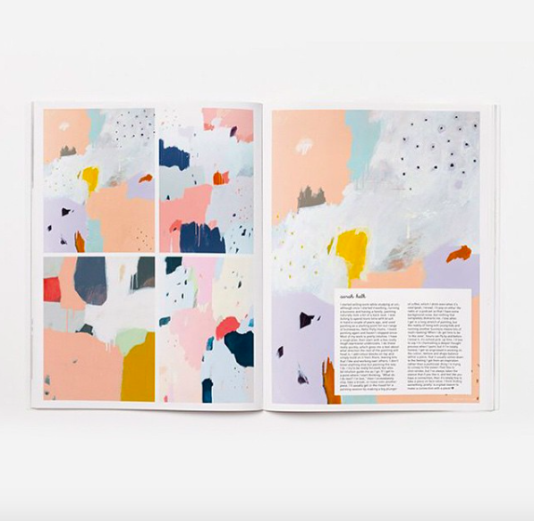
Melbourne artist (and owner of Hello Polly), Sarah Kelk‘s colour and abstract paintings feature in a double page spread for Frankie Magazine with a free pull out poster for your own wall. I’ll be framing mine this weekend pride of place in our entryway.
Happy Friday – Kelly
The post Friday Faves: A pop of colour appeared first on The Home Scene.
]]>The post The Block NZ: The Faves return appeared first on The Home Scene.
]]>Recent announcements around the show include Shelley Ferguson, Managing Editor of Your Home and Garden replacing Shannon Ryan as challenge host, working alongside host Mark Richardson.
Season four, ‘Villa Wars’ will see fans of the show take on former contestants – the ‘favourites’ and turn old dilapidated Villas into restored homes of beauty in the suburb of Sandringham.
What I want to know is, which of the ‘Faves’ from seasons past will be returning?
If you’re anything like me, you’ll have your own favourites you’d love to see return, whether for their personalities or their design and style aesthetic, or perhaps both.
Liken to a horse race, I tune in from the start and during episode one I like to pick who I think will take out the title. All three seasons I’ve picked the winner from the start!
Of the three seasons contestants who would you love to see return as ‘Faves’ to take on the Fans? Let me know who your favourite to return would be in the comments below.
Season Three: The most recent season, featuring Alex and Corban (2014 winners), Jo and Damo, Quinn and Ben, and Maree and James was set in Pt Chevalier, Auckland.
Season Two: Alice and Caleb (2013 winners), Pete and Andy, Loz and Tom, and Alisa and Koan took on four do-ups (two bungalows, one villa, and a 1940s brick veneer and tile) in Takapuna.
Season One: Libby and Ben (2012 winners), Rachel and Tyson, Sarah and Richard, and Ginny and Rhys took on four run down houses in Takapuna.
– Kelly
*Image source: TV3
The post The Block NZ: The Faves return appeared first on The Home Scene.
]]>