The post Mai Mai House appeared first on The Home Scene.
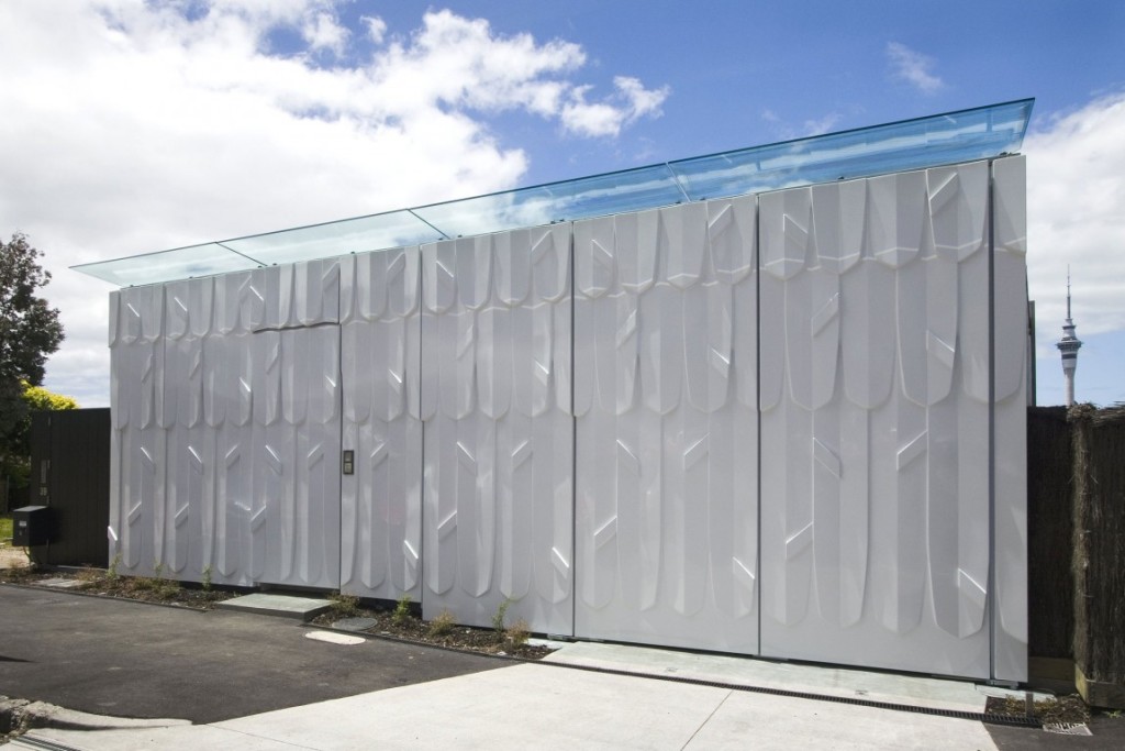
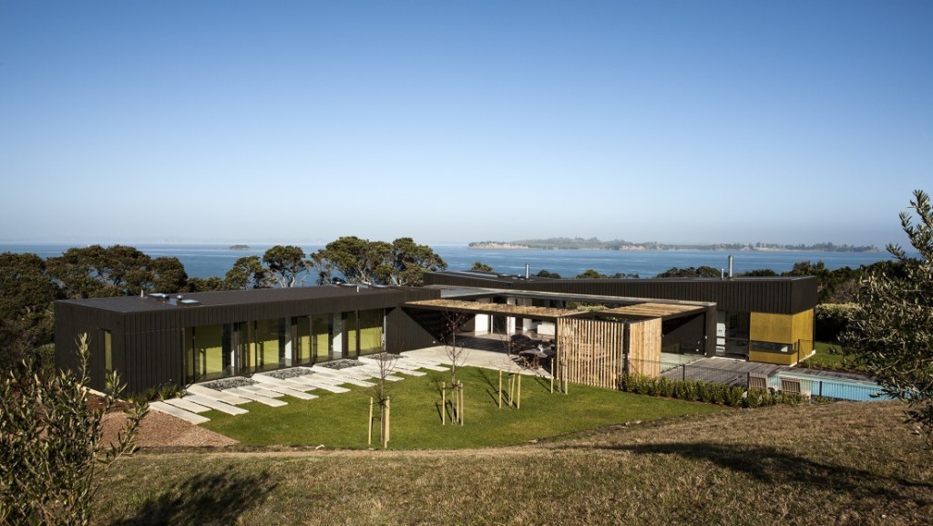
]]>Hence the name Mai Mai house.
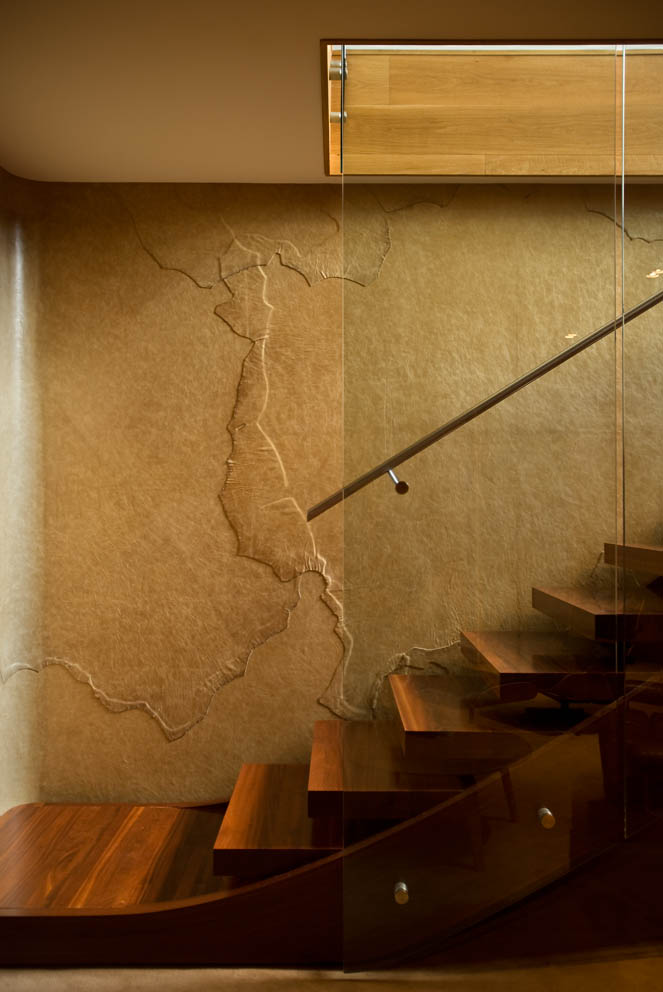
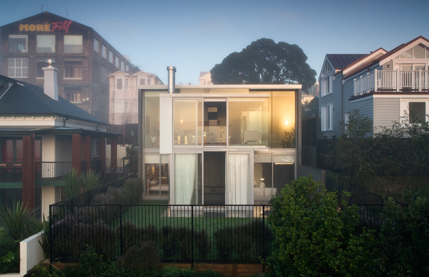
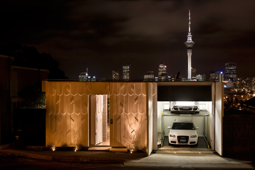
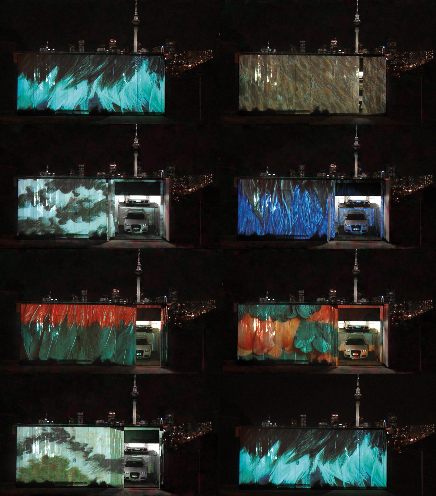
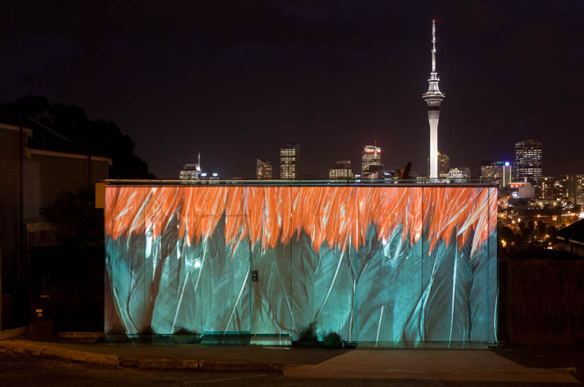
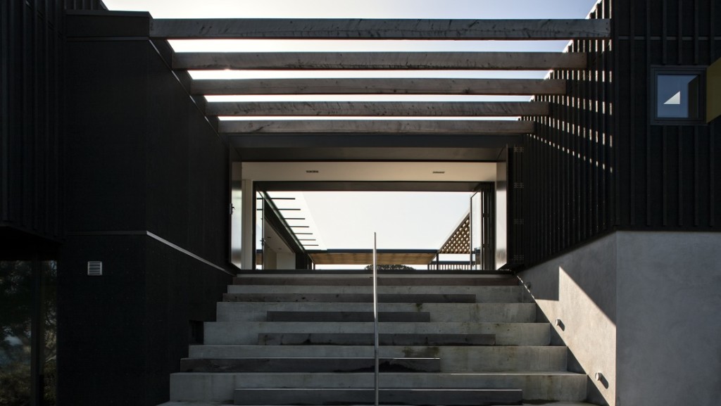
Designed by architect firm Pattersons, a home of contrasts and packing plenty of personality, a feathery motif is projected onto the exterior white fibreglass walls as a reference to the traditional Maori feather cloak.
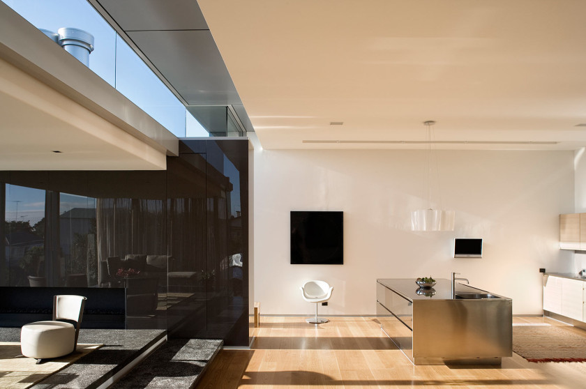
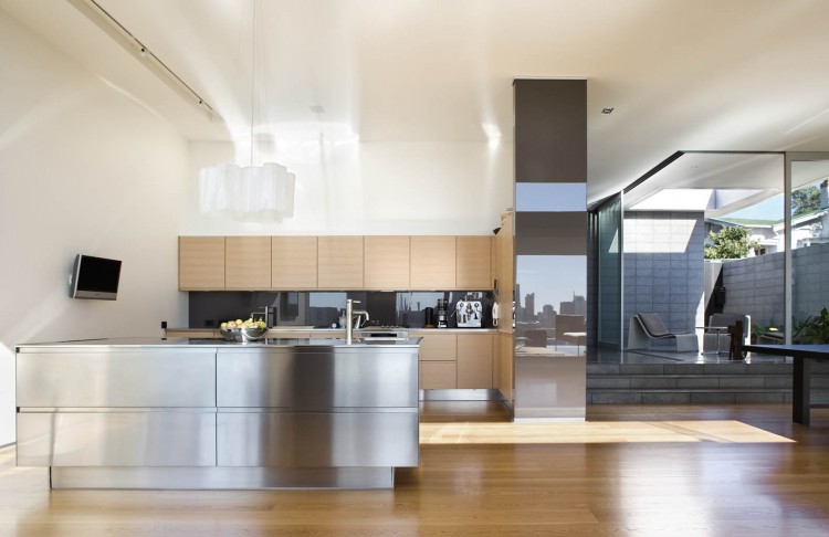
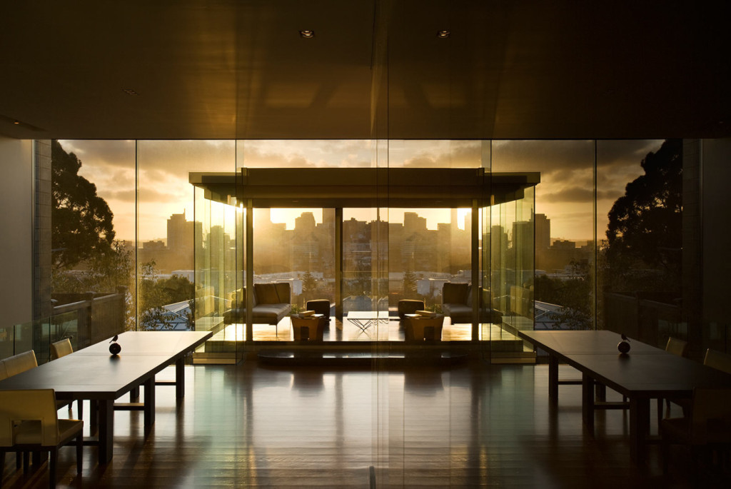
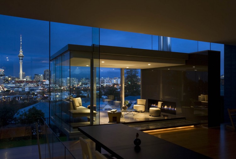
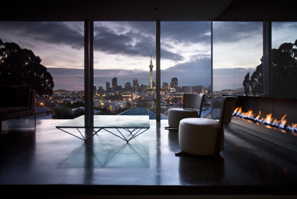
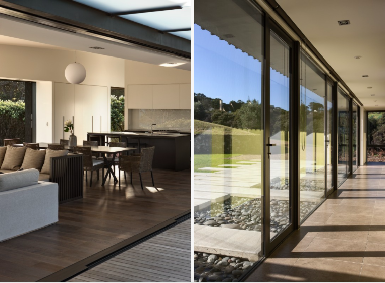
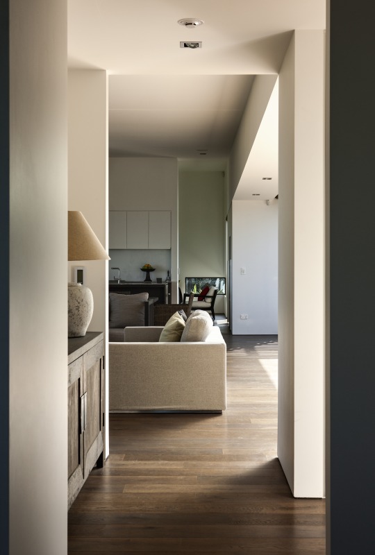
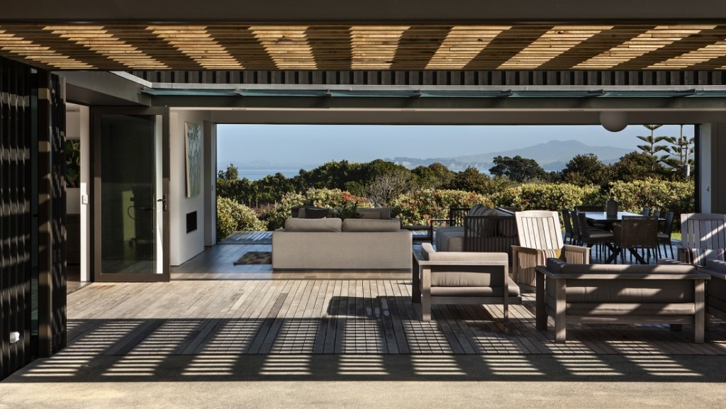
The expansive glass surroundings allow natural light to filter in to the space and create a warm and inviting home. Enjoying spatial living spaces, the stairs lead down to a private cinema room and bedrooms where an interior courtyard is located.
Showing function and art can come together as Pattersons have done with this award winning home.
Details | Architect: Pattersons
– Kelly
The post Mai Mai House appeared first on The Home Scene.
]]>The post The Summer House appeared first on The Home Scene.
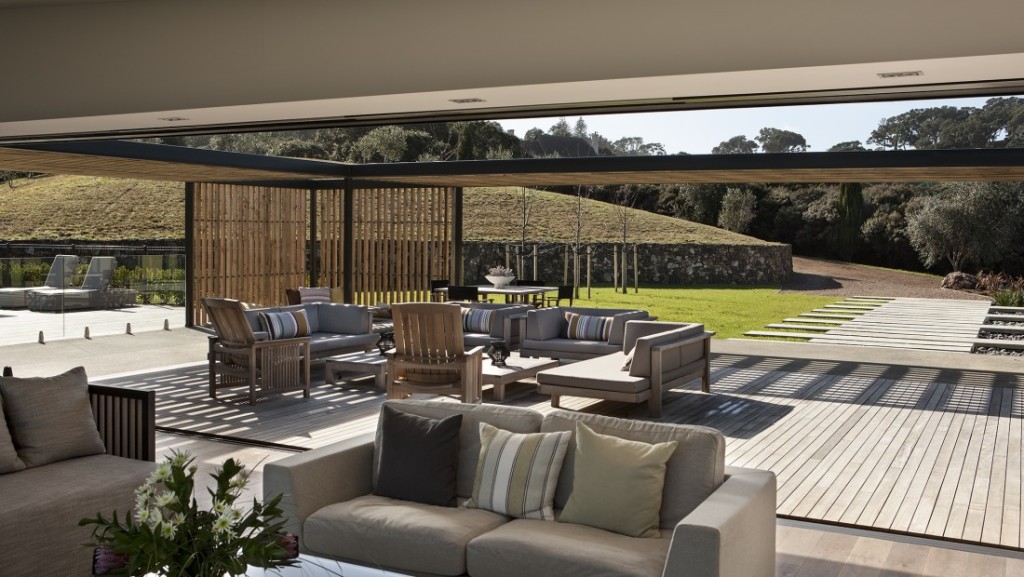
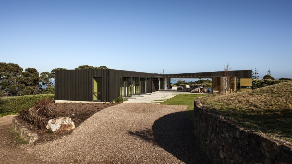
]]>Creating depth in the home, the solid stone walls and plastered concrete blocks anchor the building to its context, while the outdoor living spaces are clad in plywood with vertical and horizontal battens.
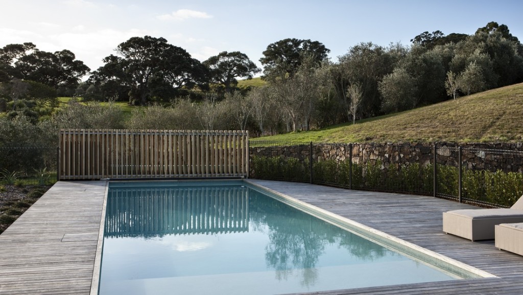
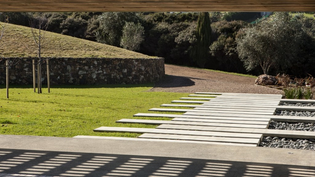
The light filters throughout the home to create a calming, relaxing retreat away from all the hustle and bustle of every day life. The deep colours allow the building to hide amongst the Pohutukawas and the landscaping is minimal so as not to detract from the dominant trees which surround the building platform beautifully.
Happy Monday THS Readers
– Kelly
Details
Source: Archipro | Architect: architex nz
The post The Summer House appeared first on The Home Scene.
]]>The post Icebreaker’s inspiring head office appeared first on The Home Scene.
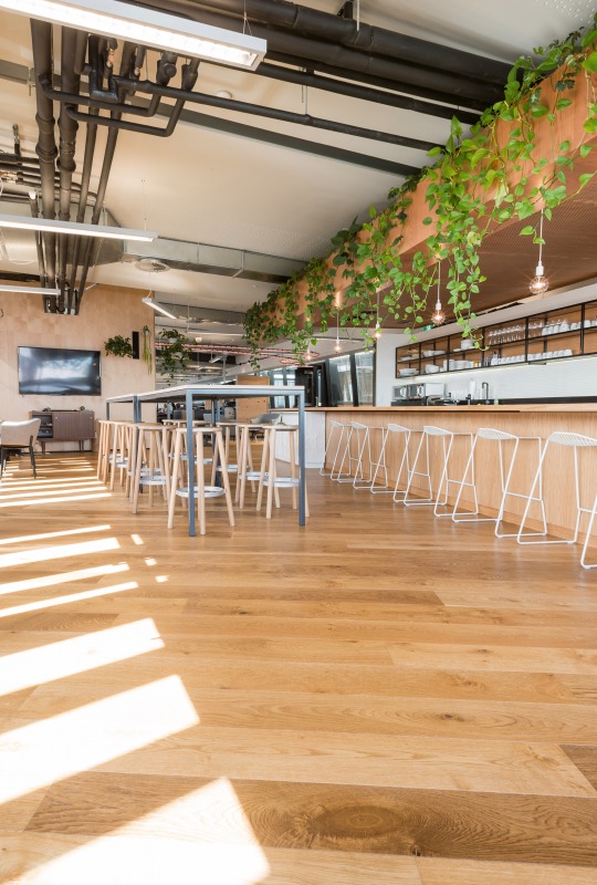
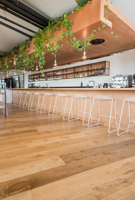
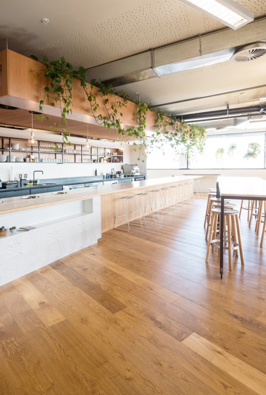
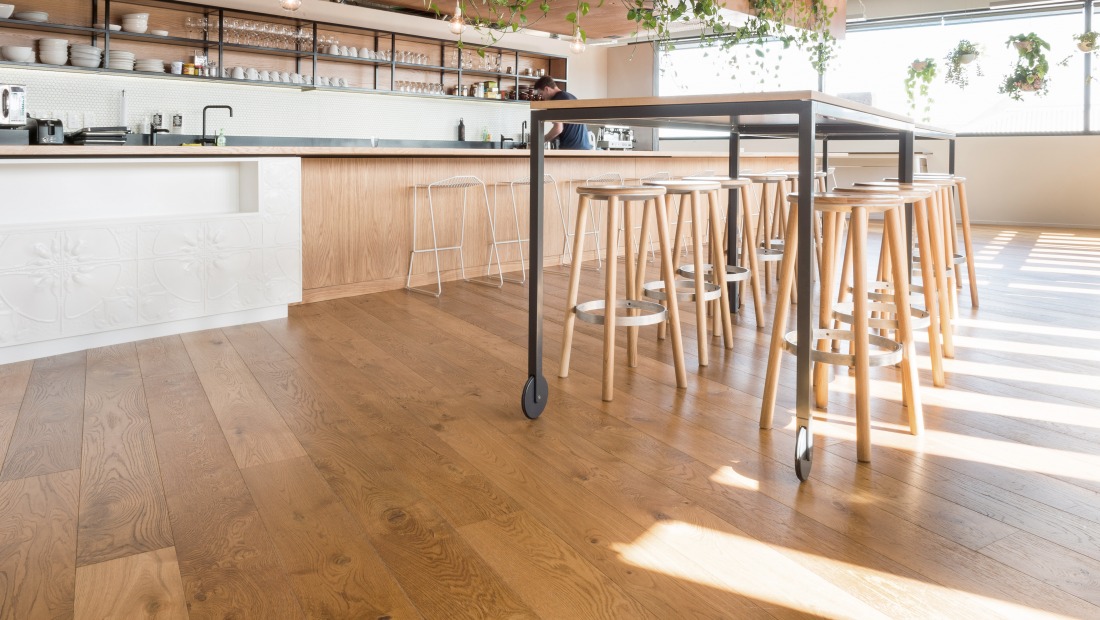
]]>Created with Antique Oak engineered flooring setting the vintage industrial theme throughout, this office has a large dose of charm.
From a business that started as the crazy ambitious goal of developing the world’s first merino layering system for the outdoors, Icebreaker is now a global business in the process.
The over hanging vine draws the eye up to the ceiling, providing colour and life to the open plan office space, offsetting the industrial exposed pipes.
The Baker Stool is perfect for this design, with the ability to mix and match the colours and materials of the seat, legs and foot ring to suit your designated space.
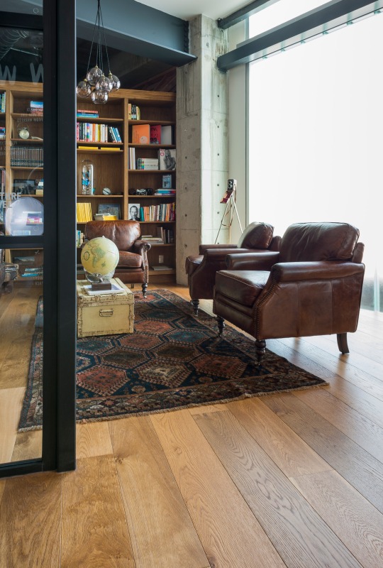
The vintage theme continues through to this separate meeting space, created with comfort in mind. Old leather armchairs combined with the rustic styling of the trunk suitcase, globe and vintage brownie camera perched in the corner on a tripod.
The IMO Kase Table is not only aesthetically pleasing and in keeping with the theme, but provides a wobble free surface for satisfying those morning coffees or late night sketching sessions.
Details: Source: Archipro |
What are your favourite elements from this office that you would love to see in your home?
– Kelly
The post Icebreaker’s inspiring head office appeared first on The Home Scene.
]]>The post Toorak House appeared first on The Home Scene.
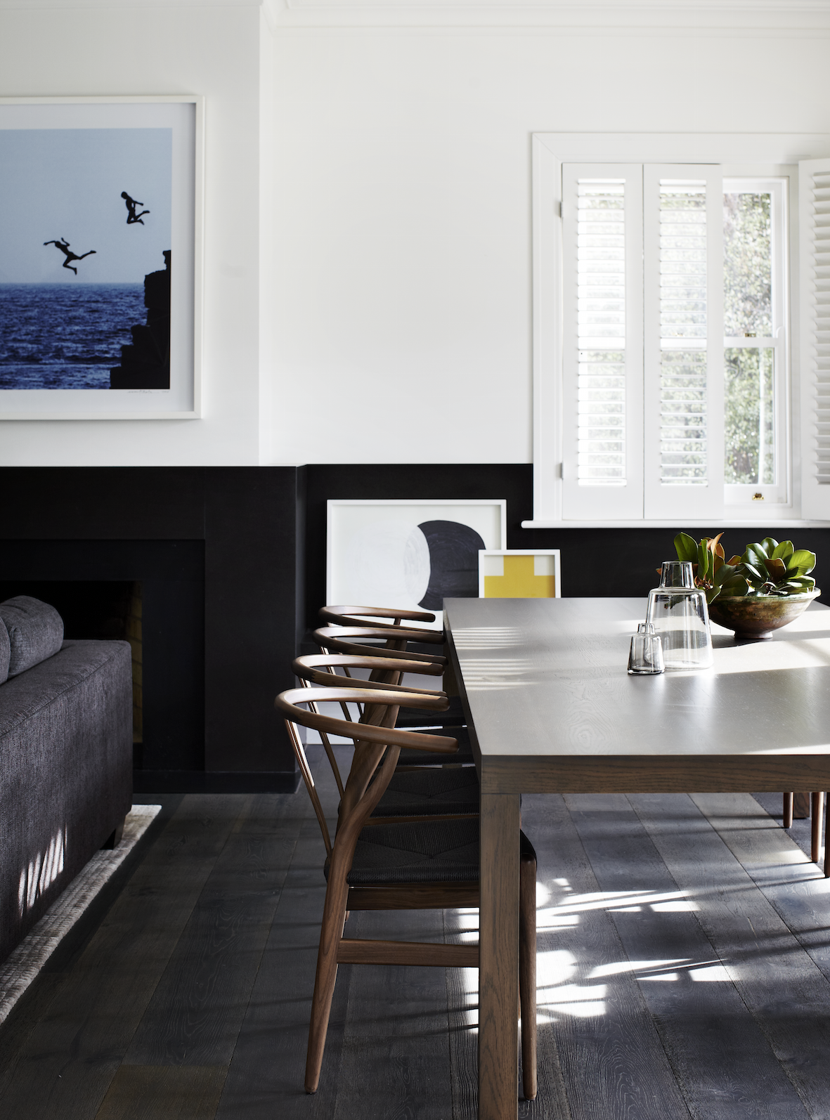
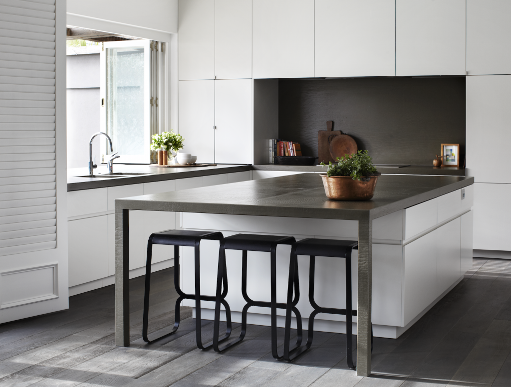
]]>For Toorak house that renovation meant modernising a tired interior and exterior of a large c1934 family house into a light filled, vibrant, clean, classic contemporary home for a busy family of four. Blessed with more than adequate bones, the only structural changes required were to the kitchen and laundry area.
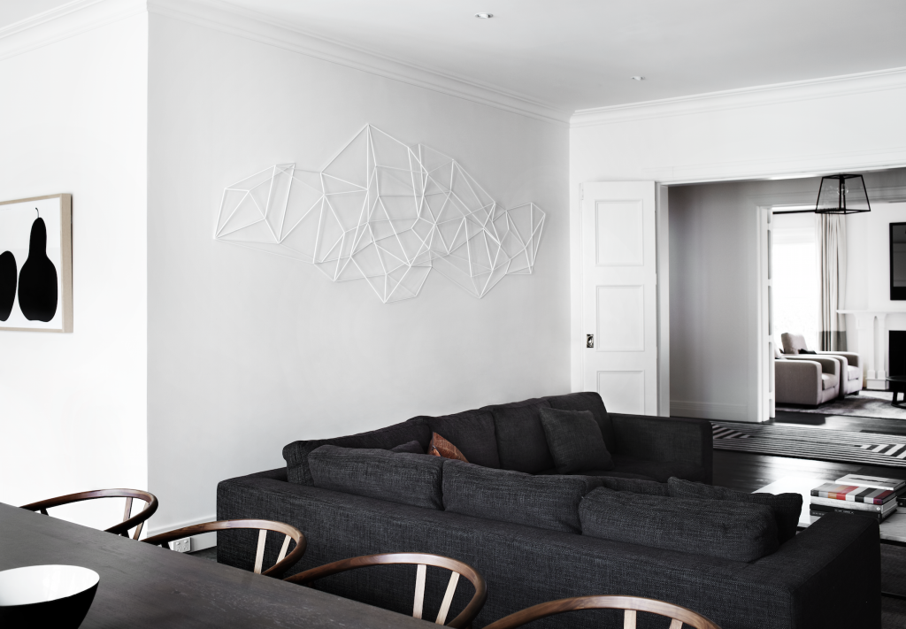
Throughout this beautiful home, architect firm Robson Rak designed and fabricated much of the furniture and furnishings to fit the bespoke brief, which also included a large wall sculpture in the living room by Chris Rak; who’s background in sculpture allows for this multi-disciplinarian approach.
The first floor bedrooms and bathrooms were designed with luxurious materials such as Elba marble vanities and timber joinery and plush woolen carpet to achieve a feeling of quiet sanctuary and luxury.
The formal dining/living rooms were kept in their original state, but modernized with the bespoke fireplace mirror, furnishings, and new American oak floorboards.
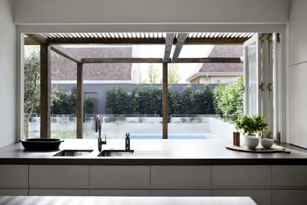
An open-plan kitchen, dining and living area with bi-fold doors open onto a large terrace, revealing a generous outdoor entertaining area framed by a large ‘Sugar Gum’ timber pergola. This act as eaves in summer to keep the sun at bay while in winter the lower sun streams into the house under the slats and the whole living and kitchen area is bathed in northern light throughout the day.
Details: Architect: Robson Rak Architects |
– Kelly
The post Toorak House appeared first on The Home Scene.
]]>The post Gallery of Modern Art, Glasgow appeared first on The Home Scene.
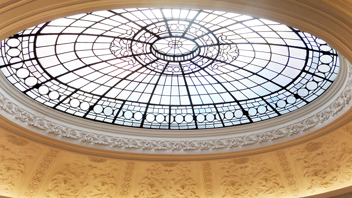
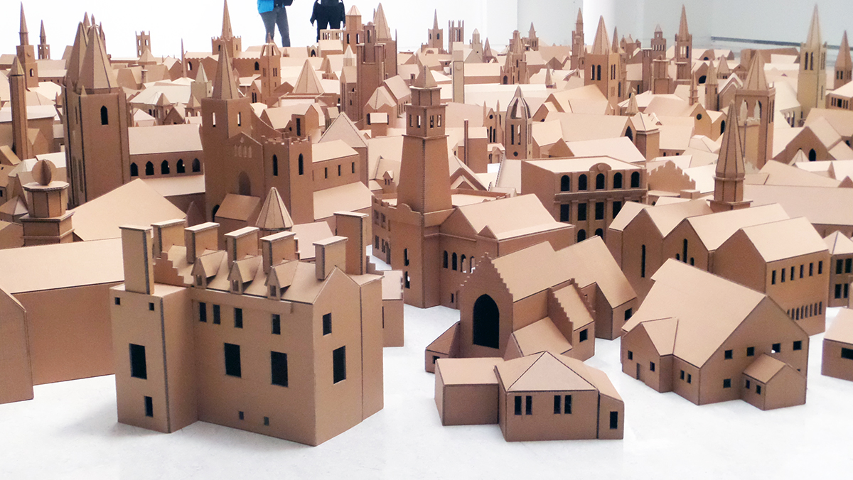
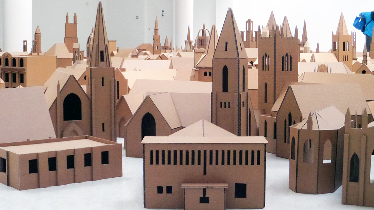
]]>I loved the city of Glasgow and in particular the art galleries and exhibitions. So today, a simple and visual insight to my trip starting with the historical and beautiful Gallery of Modern Art right in the heart of Glasgow city.
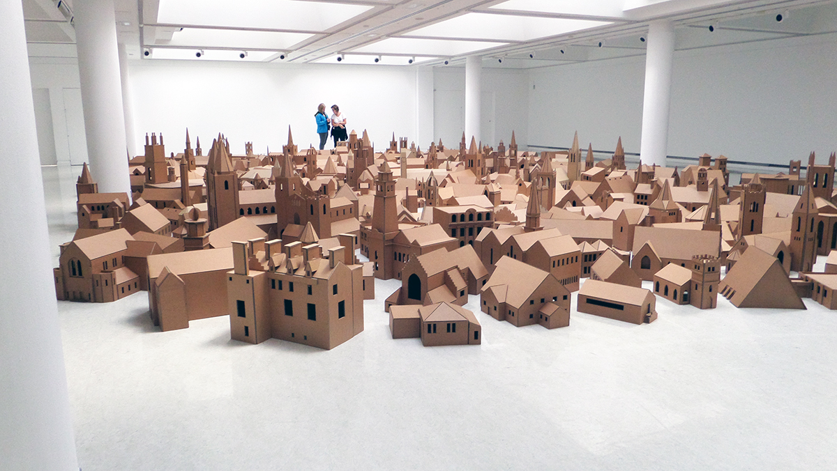
‘Places of Worship’ was a work on display at GOMA by Nathan Coley, overwhelming you as you entered the room at the shear work and intricacy. Coley created 286 spiritual and religious buildings, a reflection of those throughout Scotland, all made by hand from cardboard, taking several years to complete. The work explored how buildings and architecture are two separate things – buildings are purely functional, while architecture is related to feelings and meanings such as sacrifice, truth, power, beauty, life or memory. For him the cardboard buildings unite as one group to form a community.
– Kelly
The post Gallery of Modern Art, Glasgow appeared first on The Home Scene.
]]>The post Pekapeka Beach House appeared first on The Home Scene.
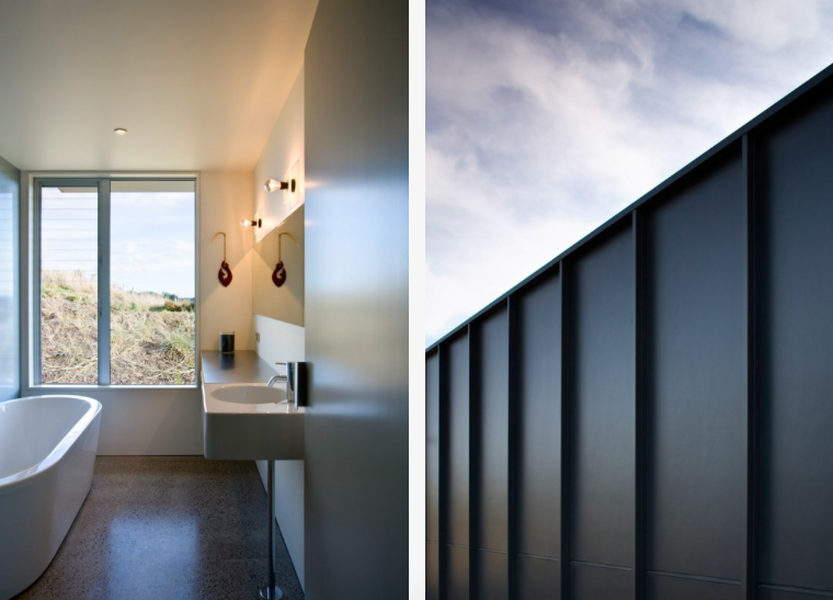
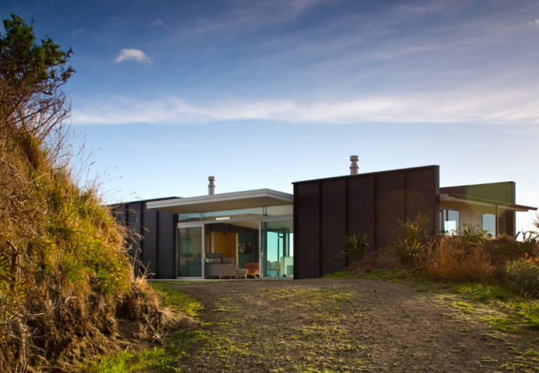
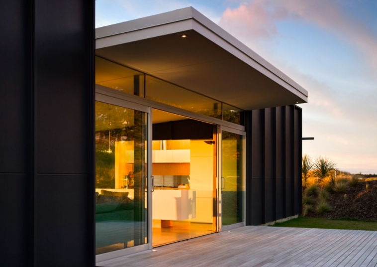
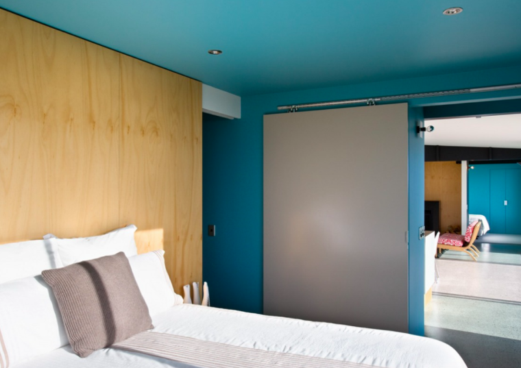
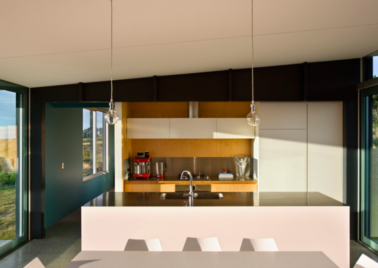
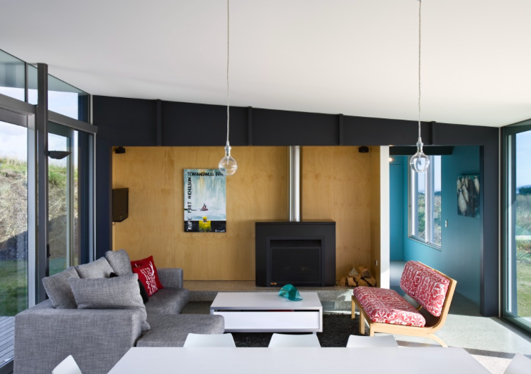
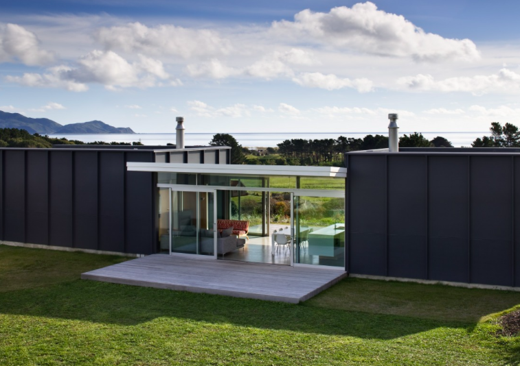
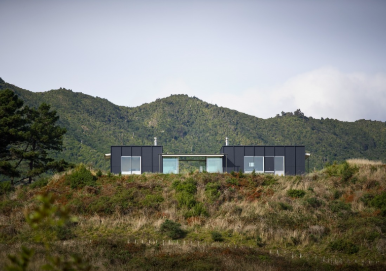
]]>Simple modular construction techniques combine to create a very simple form. The overall layout plan is devised from a rectangular shape, divided into 3 parts with bedrooms at each end to support a floating roof over the living space that exists in between.
This award winning home was designed by Parsonson Architects in Wellington. With all day sun and views like this you can easily see why you’d want to retreat to a beautiful location like this whenever you can.
Details
Architecture: Parsonson Architects | Source (with permission): Archipro | Photography – Simon Devitt |
– Kelly
The post Pekapeka Beach House appeared first on The Home Scene.
]]>The post Malvern House appeared first on The Home Scene.
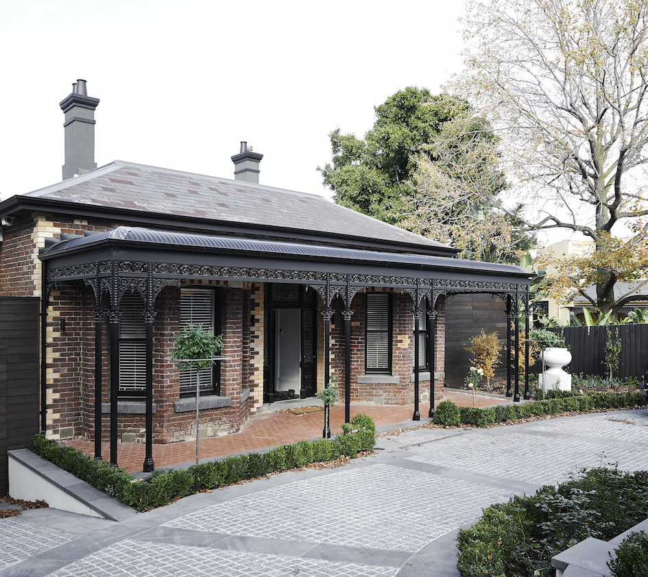
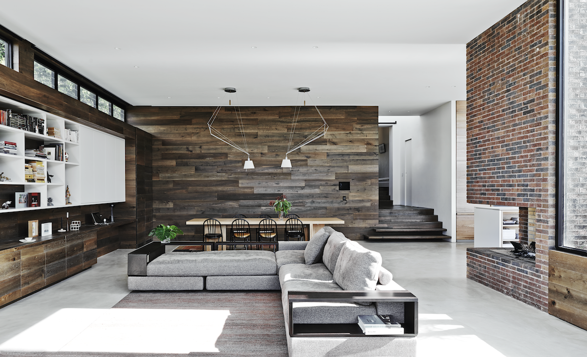
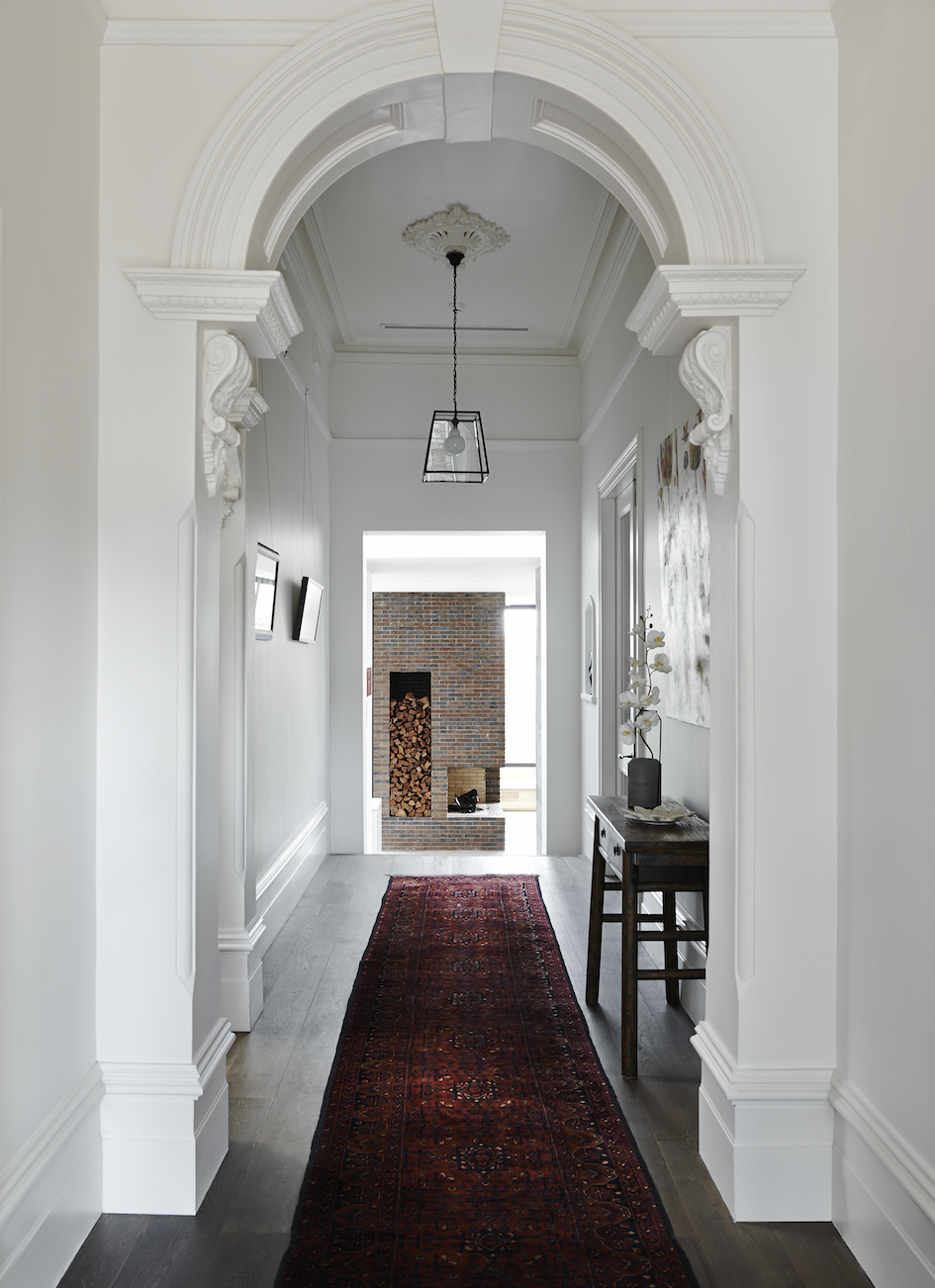
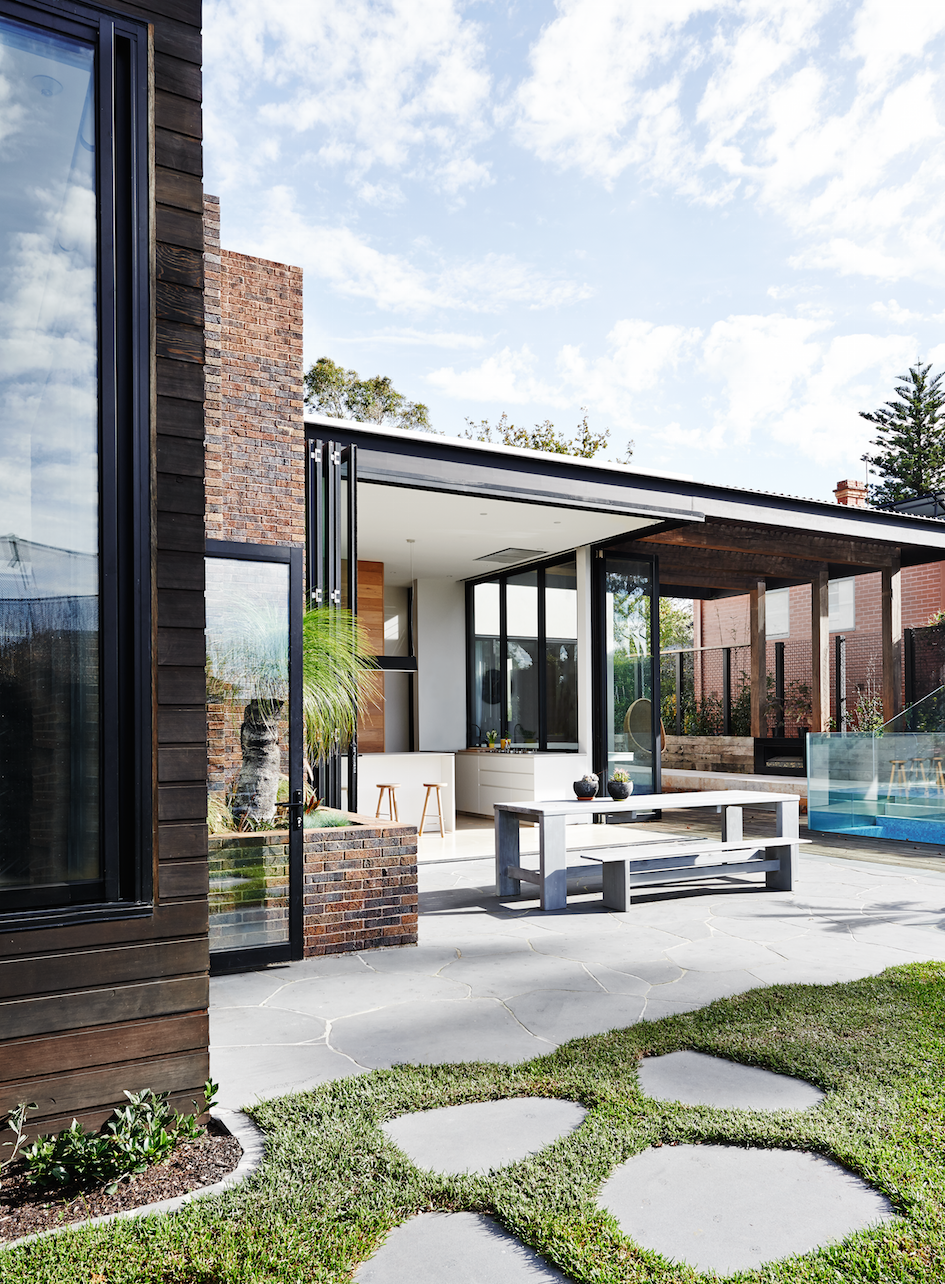
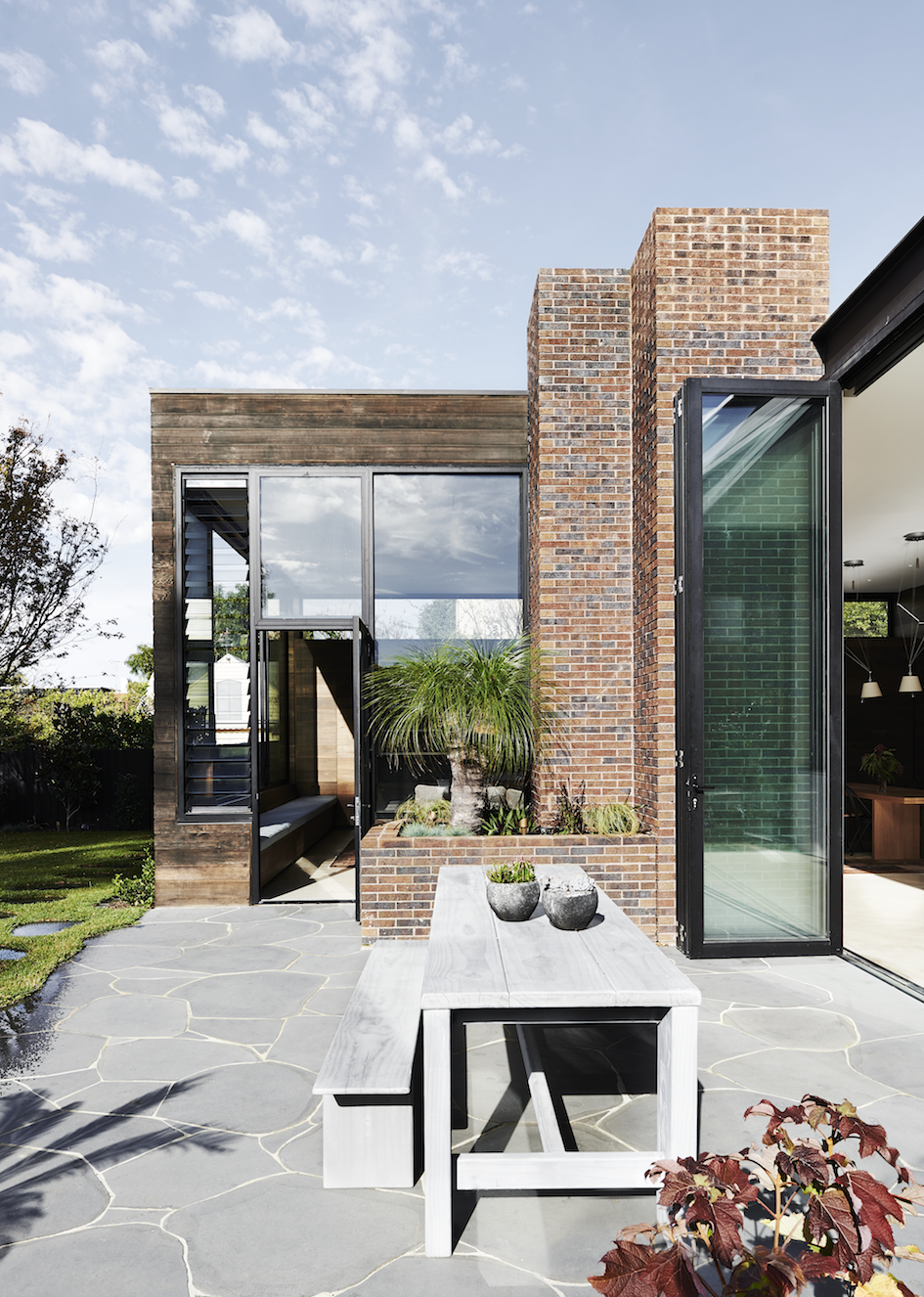
]]>Designed by Robson Rak Architects, the clients initial brief was for a scheme which would see the new rear living spaces opening to the outside, whilst fusing seamlessly with the re-modelled old part of the house.
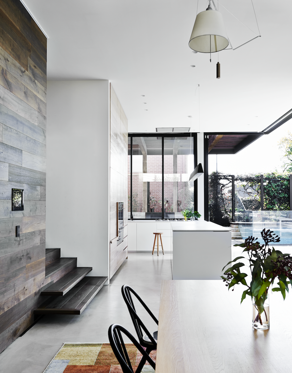
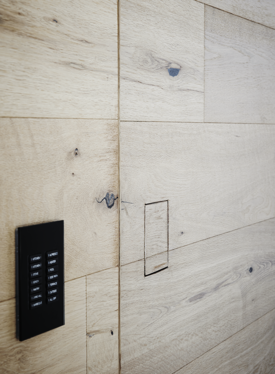
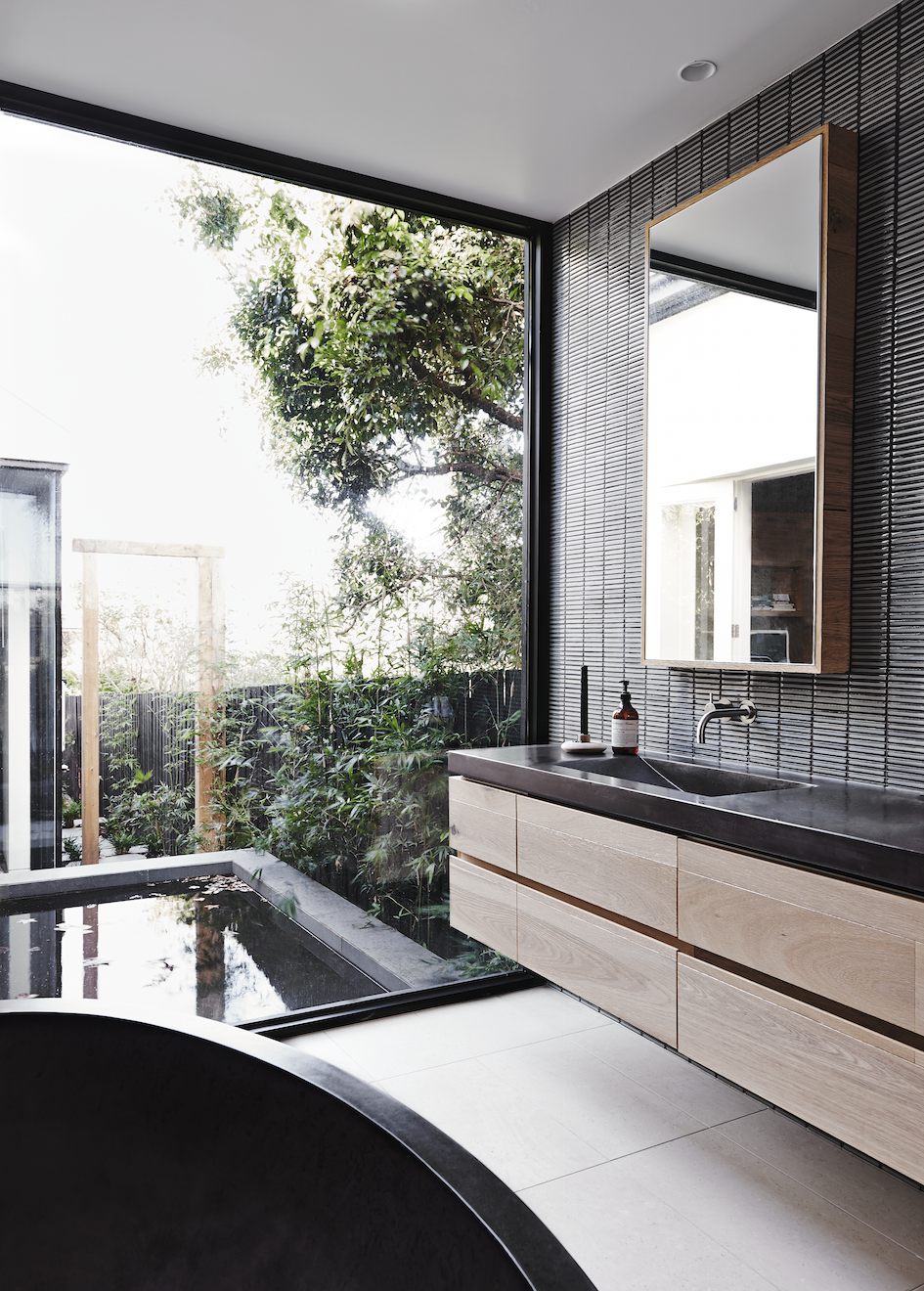
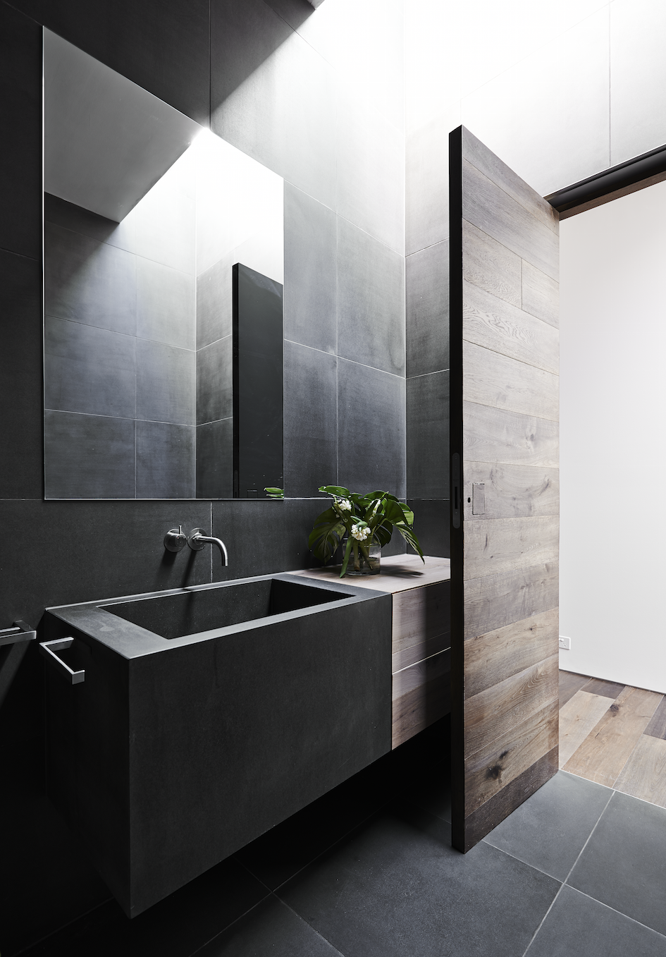
Although the house uses fully automated technology, it’s disguised by a warm, textural palette. A timber ribbon of floor and wall travels through the house creating a harmonious, seamless transition from old to new.
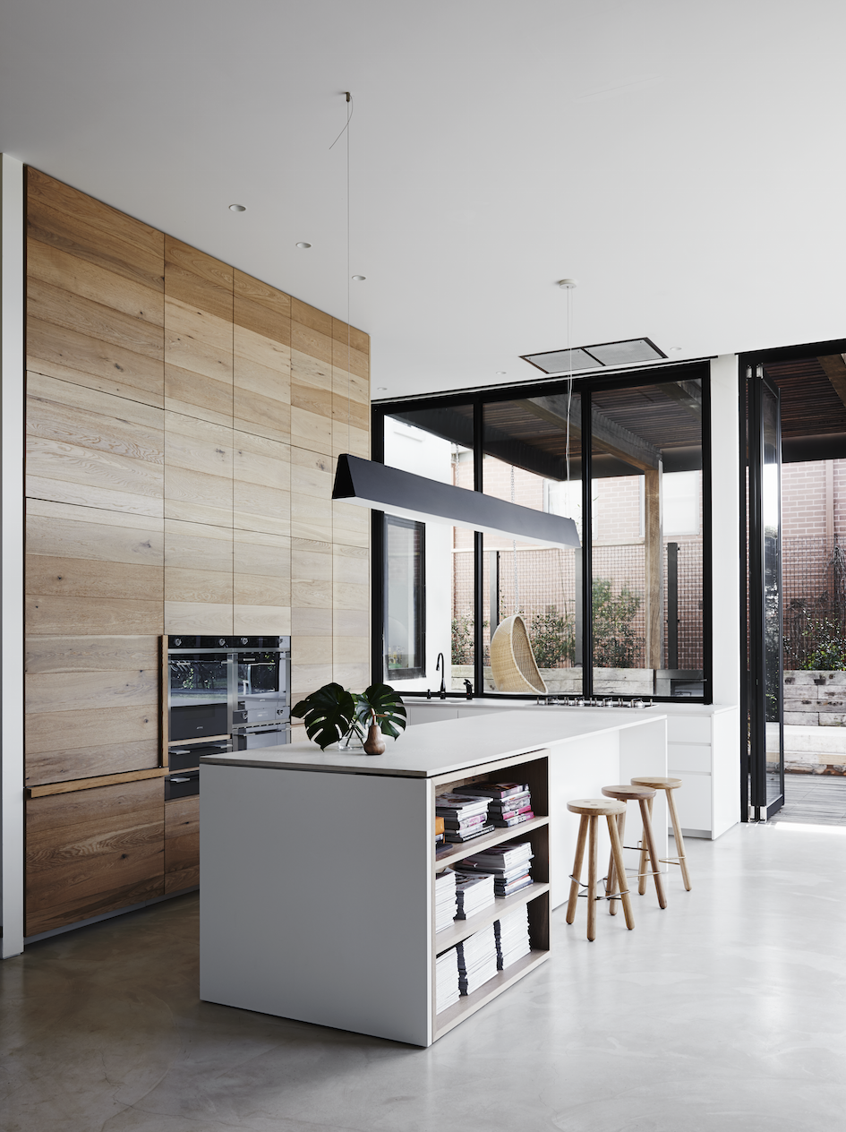
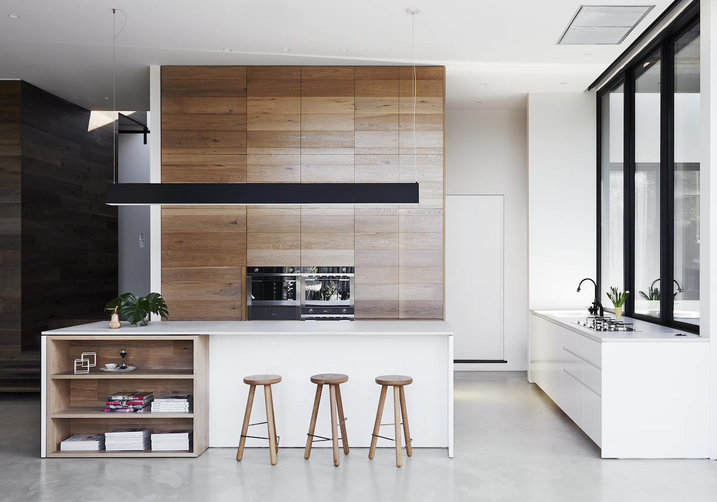
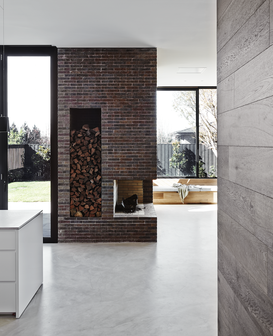
Spaces within the new extension are defined by materiality. The kitchen area achieves its own identity with the use of light oak joinery and pale reconstituted stone for a benchtop. A concrete floor helps define the new extension but also allows the dark oak, light oak and brown brick fireplace to co-exist within the same space. The kitchen area has full-height bi-fold doors allowing for that all desired integration to outside space. A living area with banquette seating has large sliding windows allowing the outside in.
The flooring has been replaced in the original residence with a dark oak which then wraps up onto three walls of the new addition, acting like a ribbon and also creating joinery.
A central feature of this home is the new bespoke brick fireplace. Designed to be viewed as you enter the original residence, the brown brick fireplace is a constant reference and reminder of the brick facade of the Victorian home whilst acting as the central axis for the new areas.
Restored and revived to meet the challenge of another hundred years, within this warm and textured palette hides a house which is fully automated and technologically advanced. This clever automation is disguised within the organic palette of materials and achieves a seamless integration between old and new interior architecture.
– Kelly
Photo credits: Lisa Cohen and Mark Roper
The post Malvern House appeared first on The Home Scene.
]]>The post Restored New York Brownstone meets functional modernity appeared first on The Home Scene.
]]>
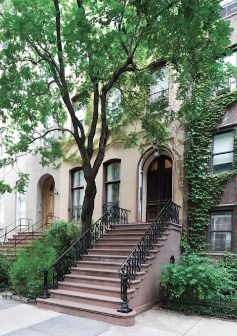
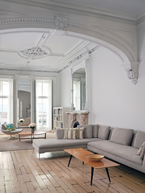
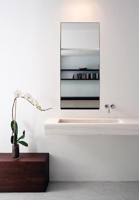
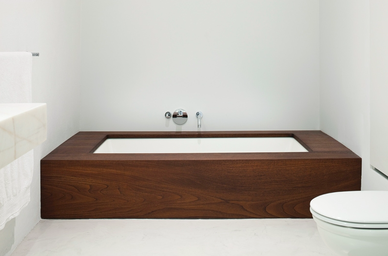
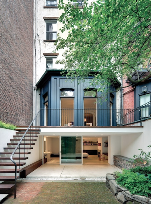
Built in the late 19th century, the homeowners commissioned architect Julian King to restore their townhouse back to her former beauty by retaining original elements and incorporating new materials to create a functional modern home.
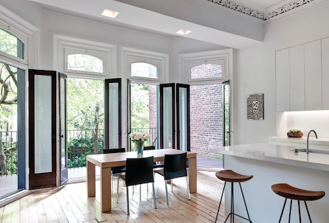
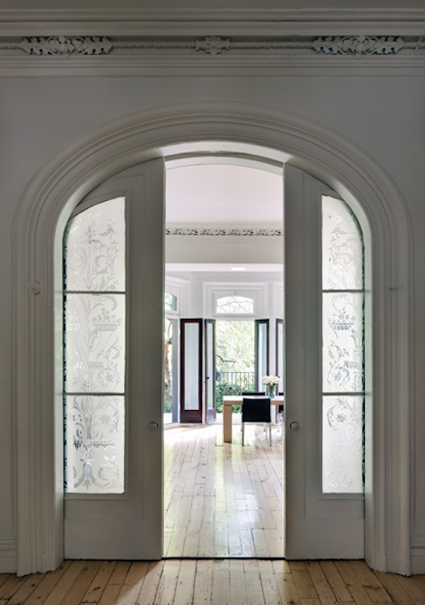
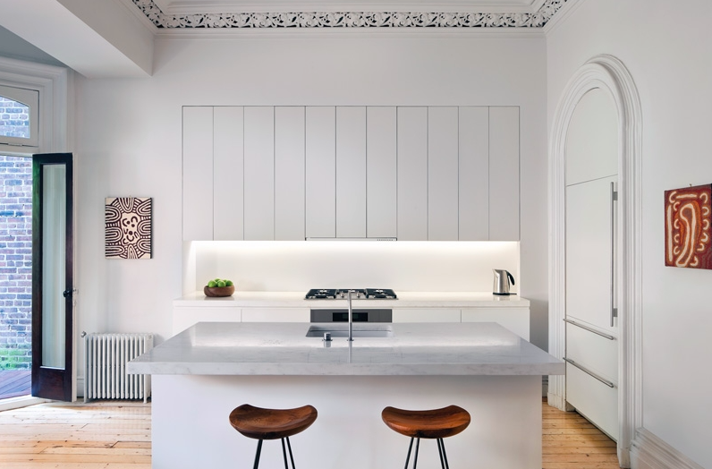
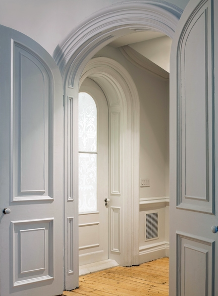
During the restoration process, the gorgeous curves of the original Victorian moulding were retained along with the ornamental crown moulding in the kitchen, refurbishing the scarred pine floors and unearthing a hidden gem – a concealed powder room which was discovered behind a wall during the demolition process.
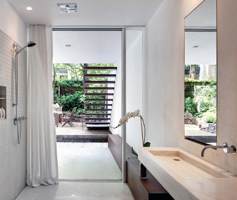
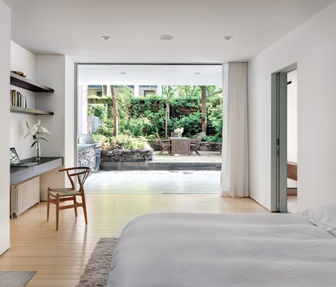
What once contained an awkward layout through prior renovation attempts, is now a light, airy and well thought out space that leaves a feeling of grandeur. This is evident in the floor to ceiling expanse in the master suite that can be left open in the warmer months, creating a seamless extension into the garden.
In true minimalist fashion the house is painted white throughout. “It lets the details pop out,” King says.
A true beauty with minimalist restraint, a home I’d love to call home
–Kelly
The post Restored New York Brownstone meets functional modernity appeared first on The Home Scene.
]]>