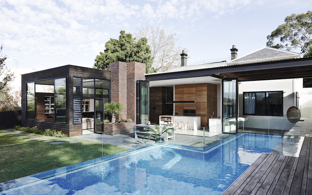
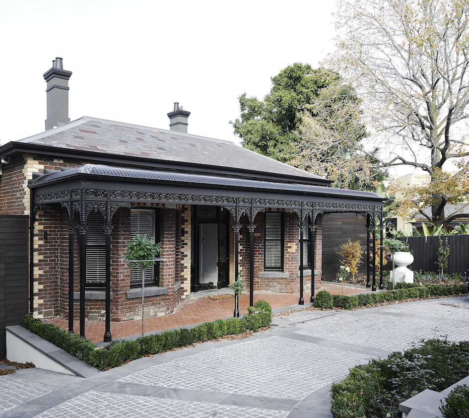
Shortlisted for the Australian Designs awards 2015 and House awards 2015, this tired Victorian residence was given a complete re-design with a new addition completing the vision.
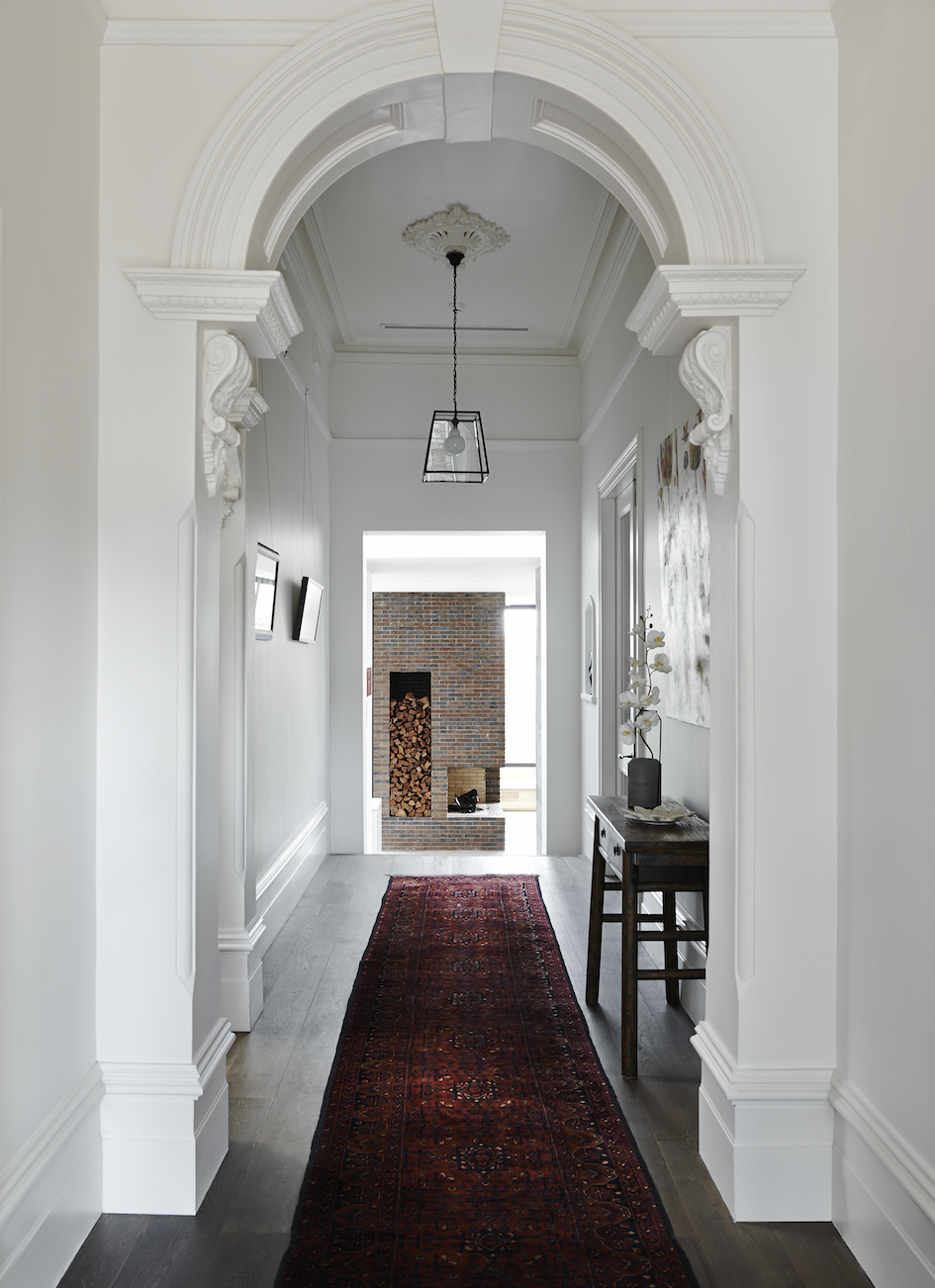
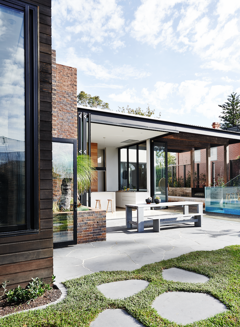
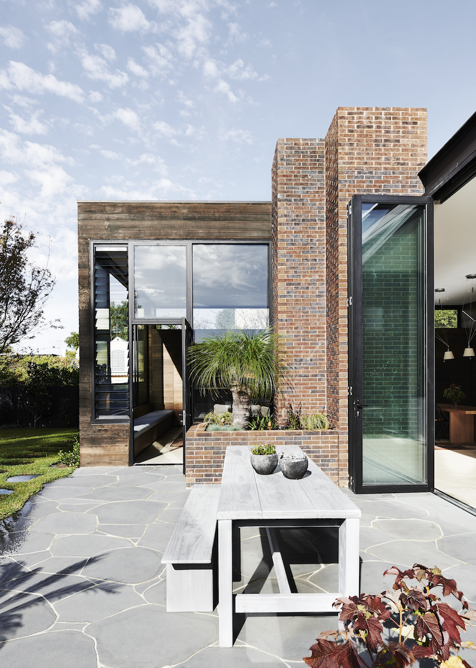
Designed by Robson Rak Architects, the clients initial brief was for a scheme which would see the new rear living spaces opening to the outside, whilst fusing seamlessly with the re-modelled old part of the house.
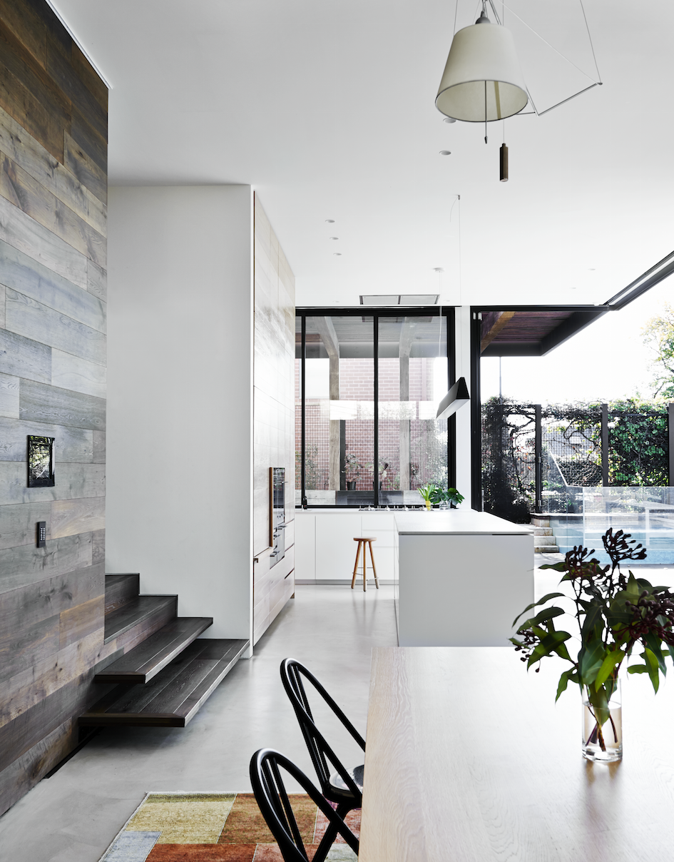
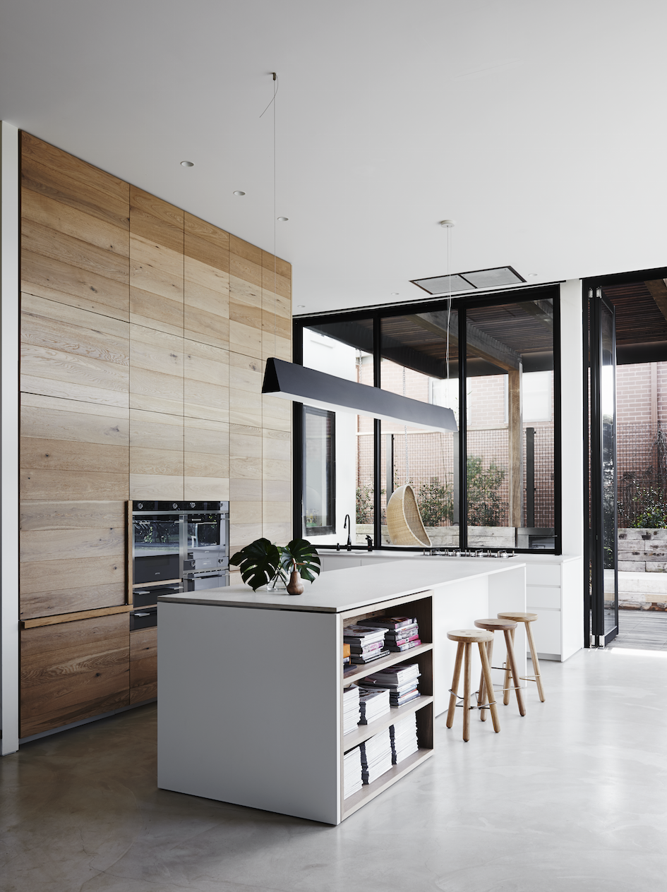
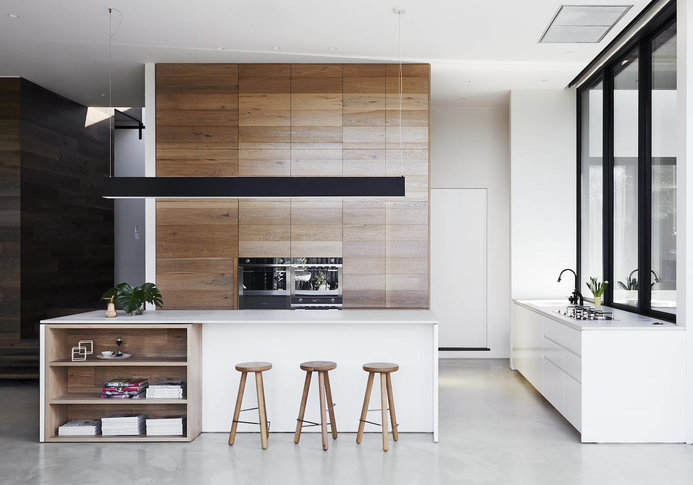
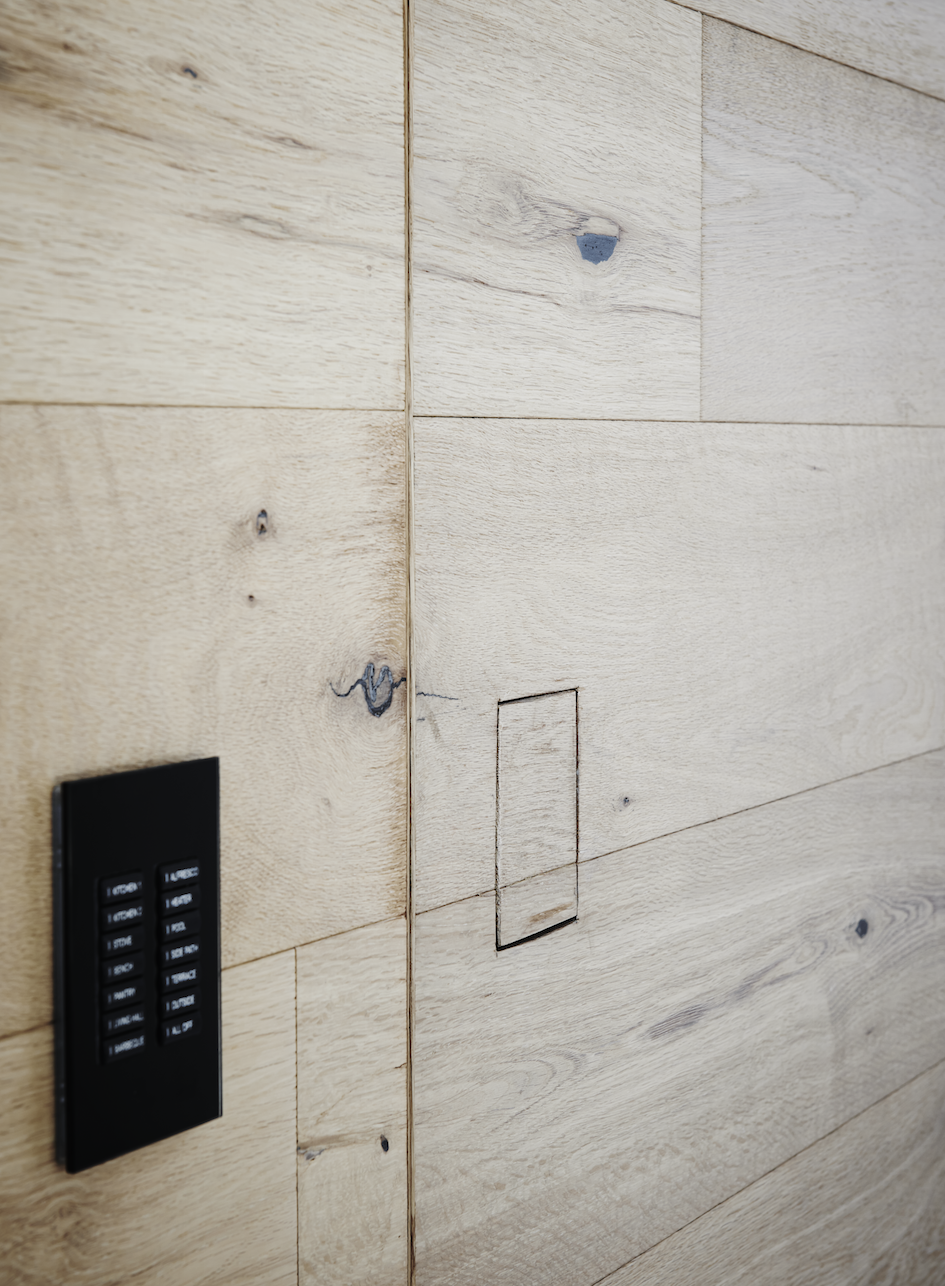
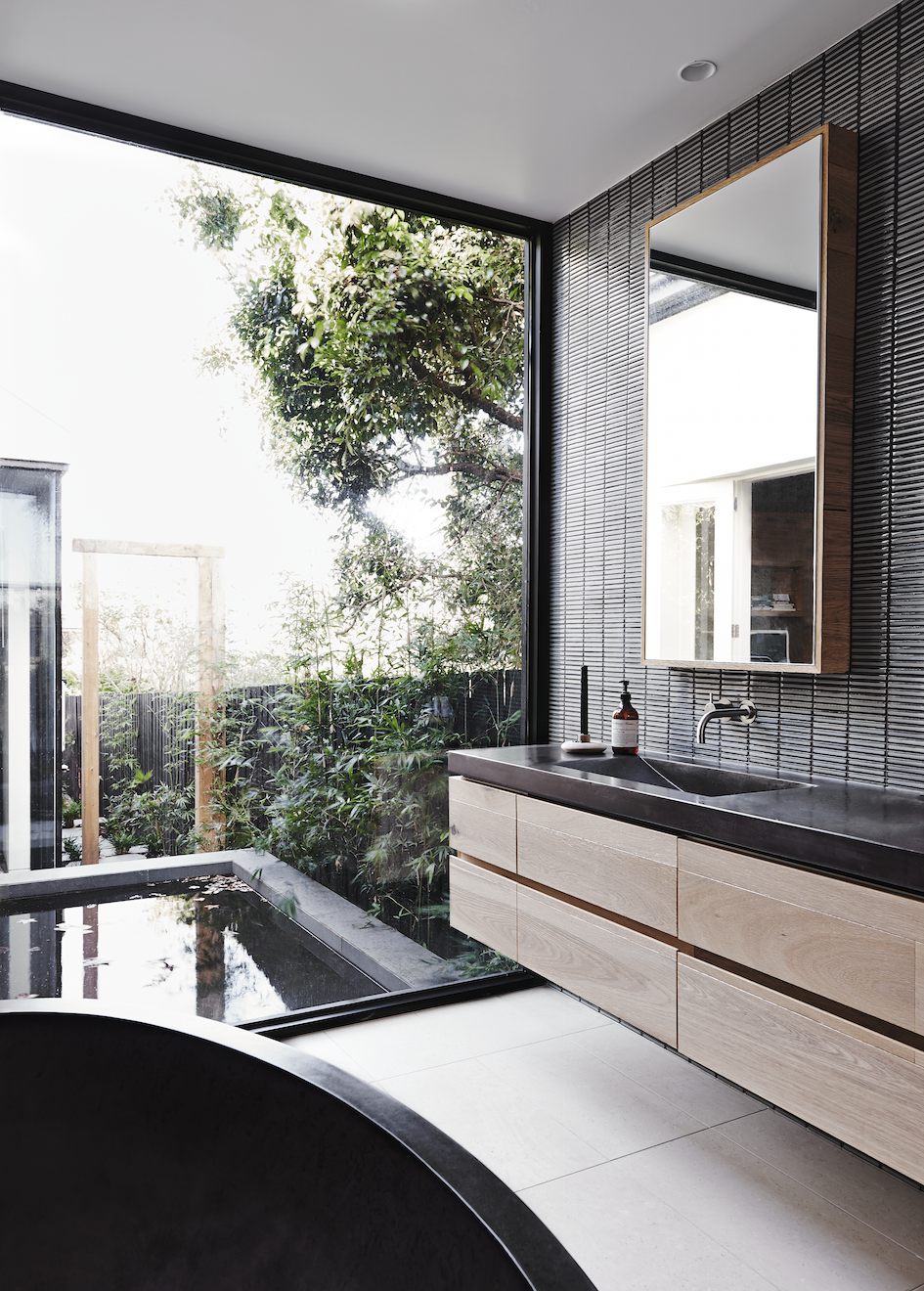
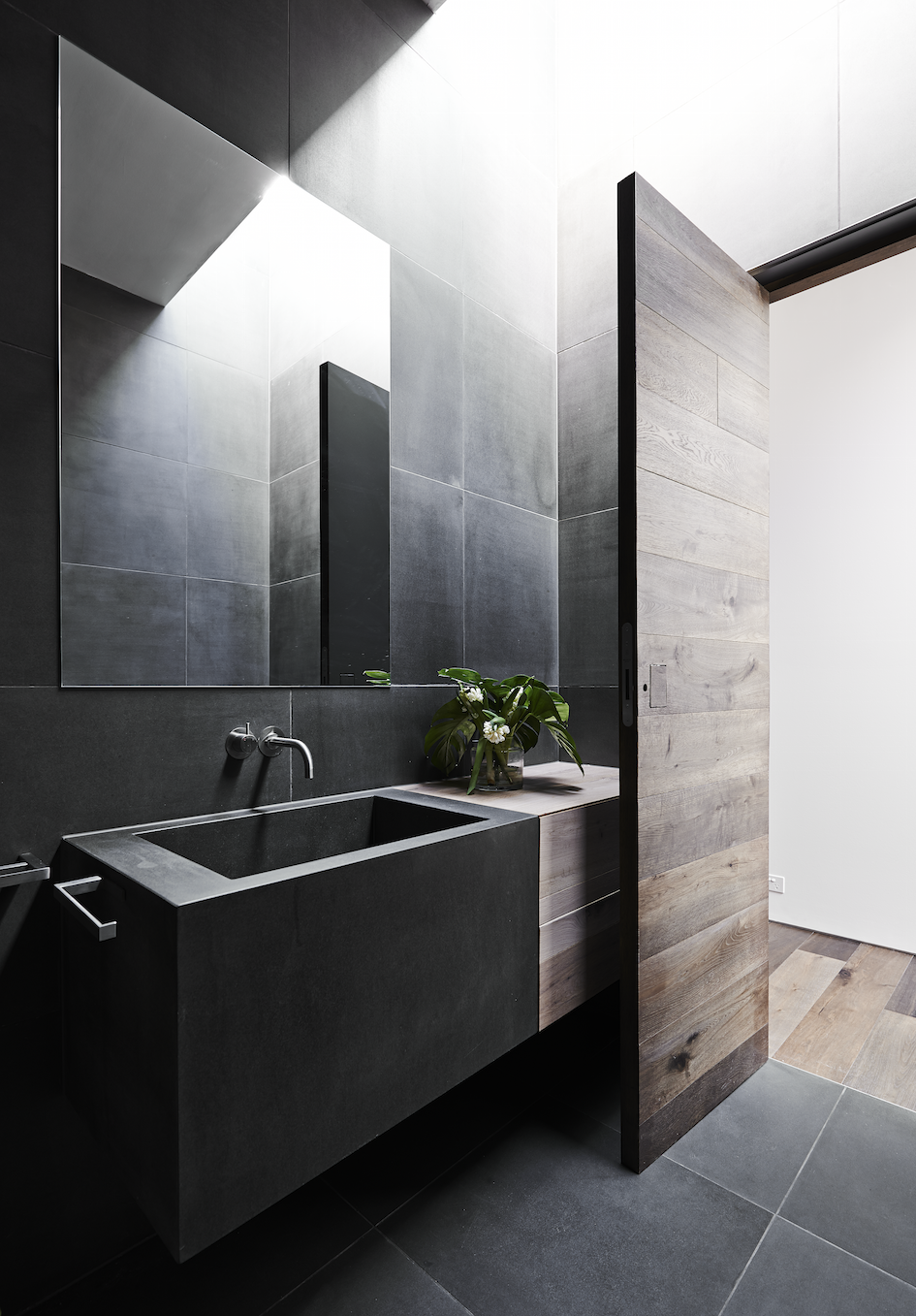
Although the house uses fully automated technology, it’s disguised by a warm, textural palette. A timber ribbon of floor and wall travels through the house creating a harmonious, seamless transition from old to new.
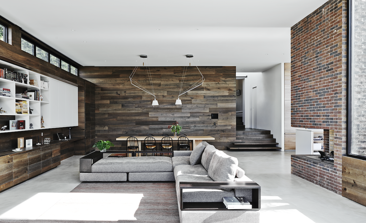
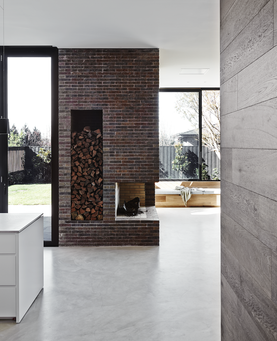
Spaces within the new extension are defined by materiality. The kitchen area achieves its own identity with the use of light oak joinery and pale reconstituted stone for a benchtop. A concrete floor helps define the new extension but also allows the dark oak, light oak and brown brick fireplace to co-exist within the same space. The kitchen area has full-height bi-fold doors allowing for that all desired integration to outside space. A living area with banquette seating has large sliding windows allowing the outside in.
The flooring has been replaced in the original residence with a dark oak which then wraps up onto three walls of the new addition, acting like a ribbon and also creating joinery.
A central feature of this home is the new bespoke brick fireplace. Designed to be viewed as you enter the original residence, the brown brick fireplace is a constant reference and reminder of the brick facade of the Victorian home whilst acting as the central axis for the new areas.
Restored and revived to meet the challenge of another hundred years, within this warm and textured palette hides a house which is fully automated and technologically advanced. This clever automation is disguised within the organic palette of materials and achieves a seamless integration between old and new interior architecture.
– Kelly
Photo credits: Lisa Cohen and Mark Roper

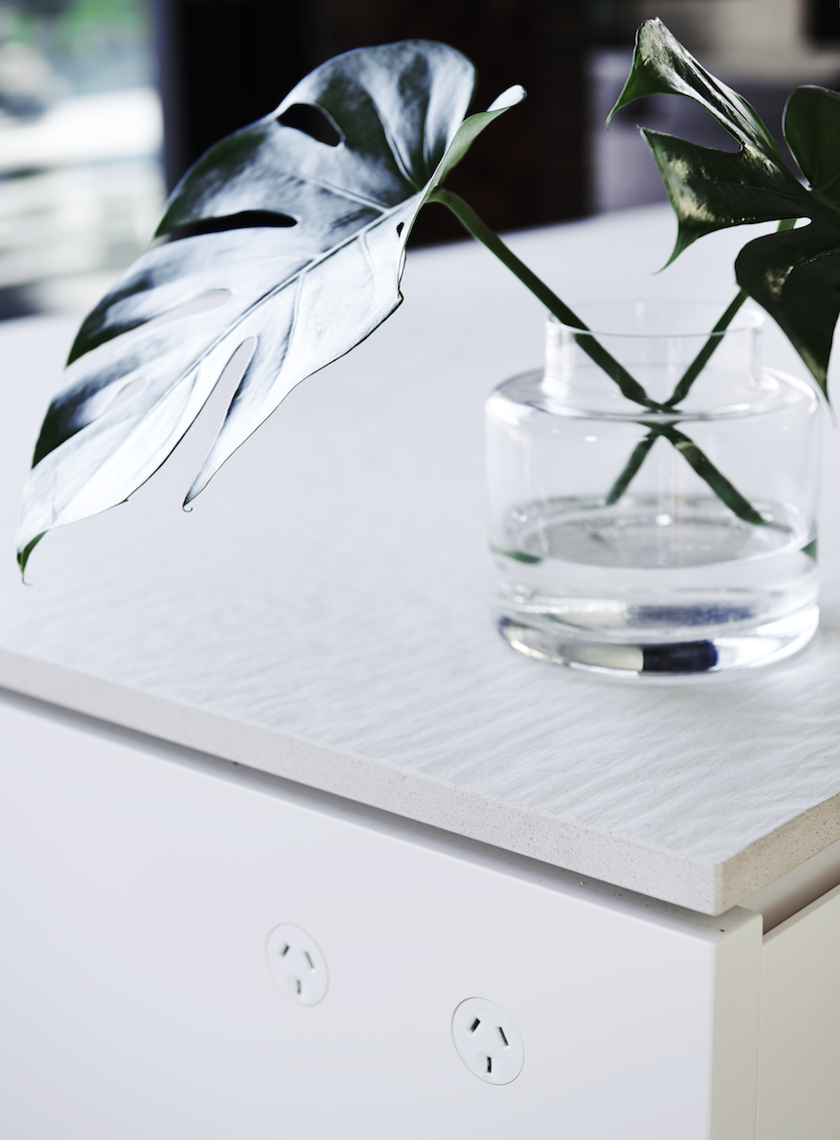



Wow. I’m loving the different textures. Sometimes too many textures can feel a bit like a scrapbook or collage but paired with very sleek lines, this doesn’t have that feeling at all. Also love the carefully thought out power outlets. I live in a 100 year old house and there’s 1 or 2 power outlets per room. It’s a little dodgy when we have 5-10 appliances plugged into each socket!
Agree Genie! They’ve really achieved that seamlessness within the design. It’s funny how something as small as power outlets can be overlooked in a design of even new builds. You often find too in those old homes the power sockets are located within the room in the worst place.