The post BMD Is your friend appeared first on The Home Scene.
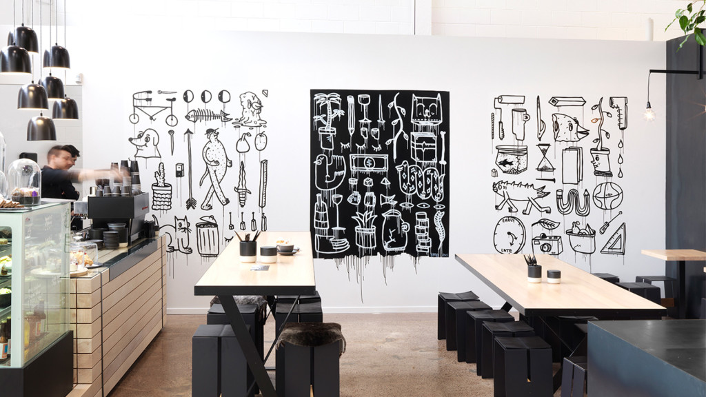
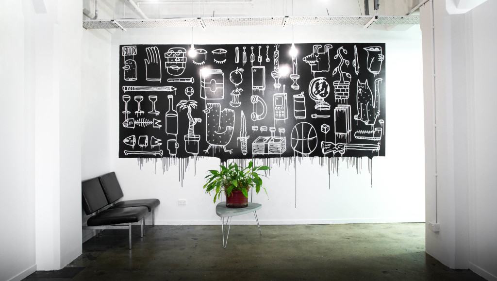
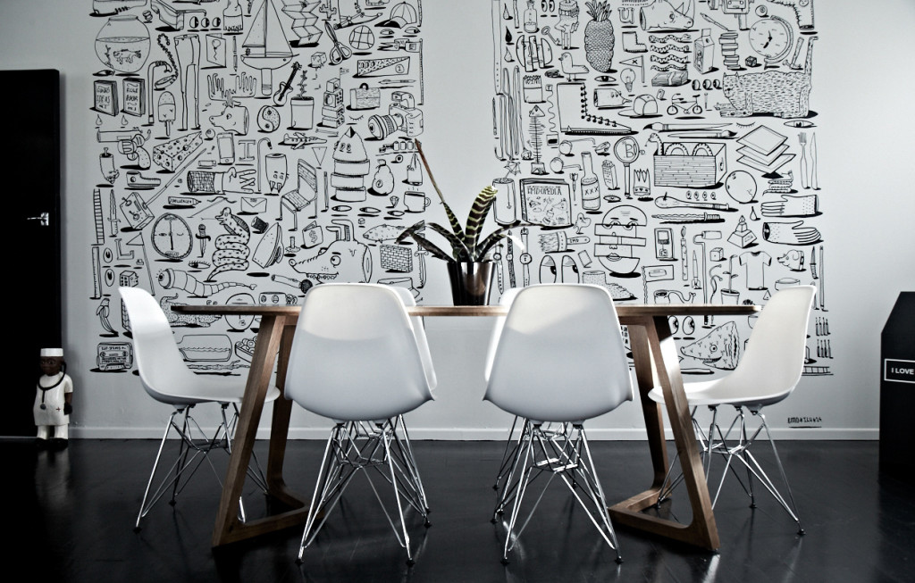
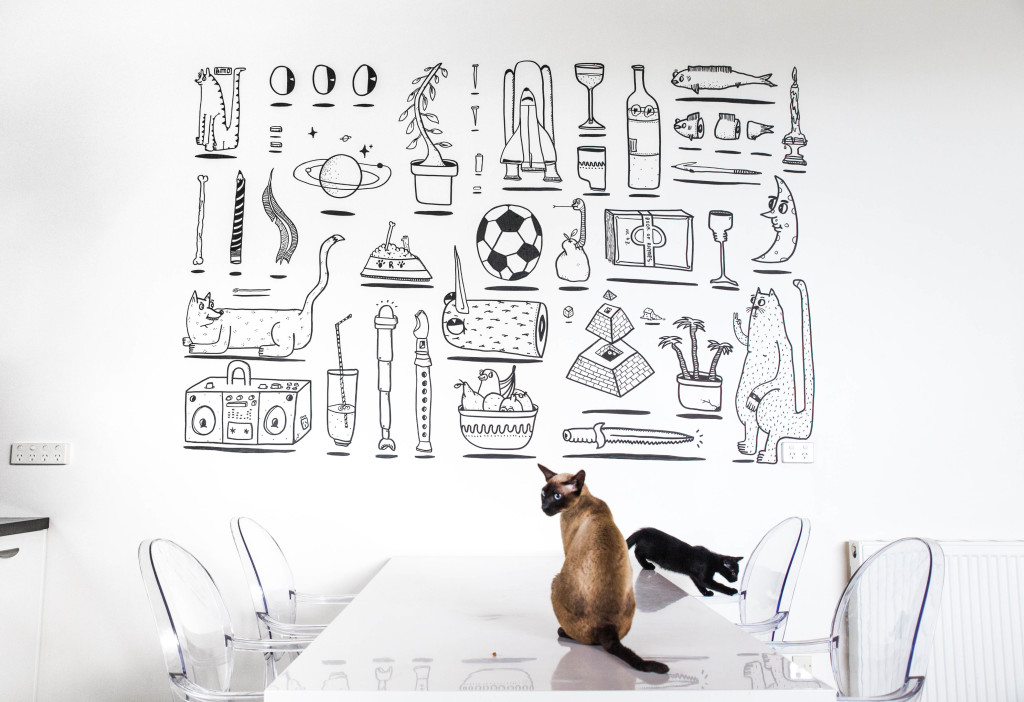
]]>I recently came across BMD Is your friend through instagram and immediately reached out to look at securing their talents in our next home (2016 – you seem so far away). Talking with BMD, I knew I had to feature their talents on THS blog and find a little more about in them in the process.
+ What inspires you?
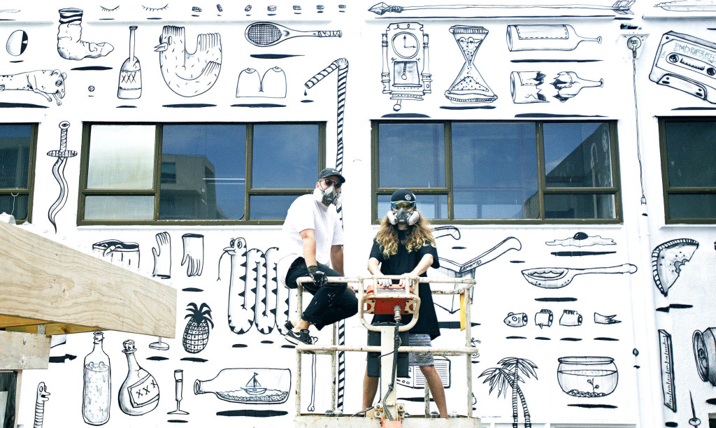
Boring walls are prevalent in New Zealand – inside and outside, these are causing long term creative barriers & hindering innovation in our country.
Thankfully, and you will thank us, we’re here to help. We create unique and stimulating public and private environments to give life to the fine walls of our country and others, to inspire our fellow citizens.
Death to boredom, we say. BMD is our name and creative spaces is our game.
Shelter-by-Matt-Q
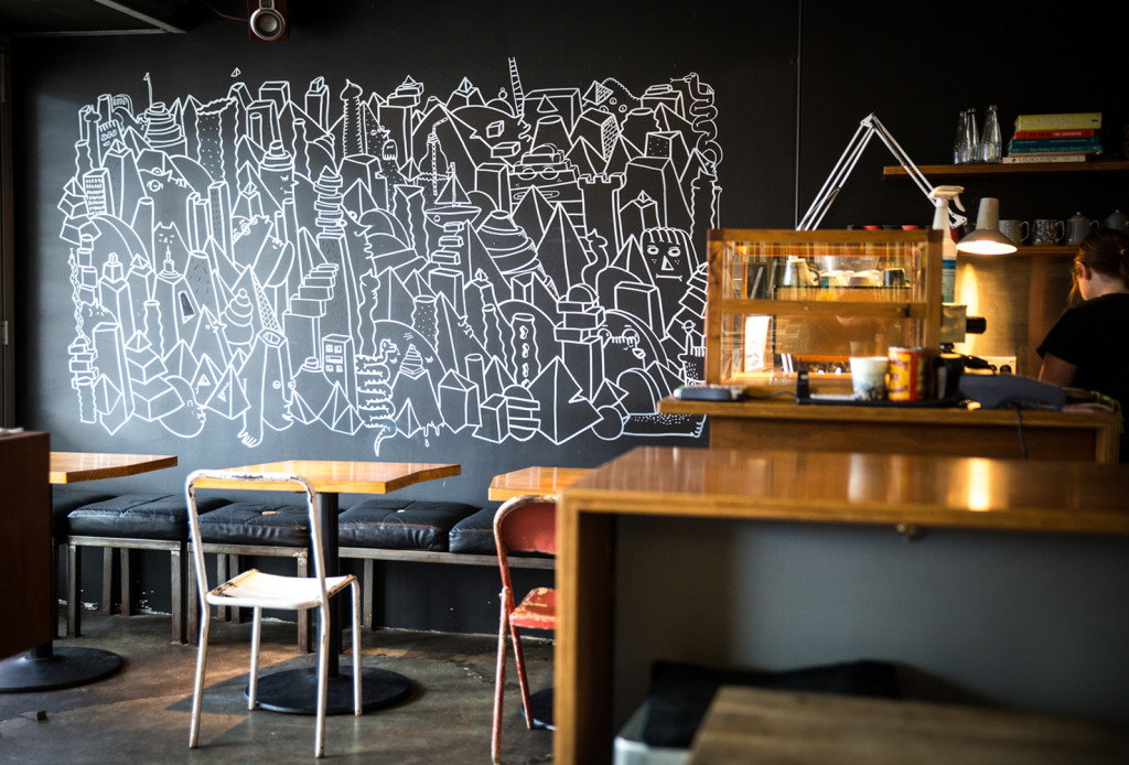
Interior for Run the Red, Photo by Blake Dunlop
I Love Ugly office, Photo by HighSnobity
+What are your highlights from this creative journey you’ve both been on?
You create the world you want to be a part of. You have the ability to change spaces, minds and peoples lives through creative use of public and private space.
+ What do you love most about being a creative?
Waking up and doing what we want everyday. Life’s short, why would you do anything else?
Private commission, Photo by Blake Dunlop
Milkcrate commission, Photo by Blake Dunlop
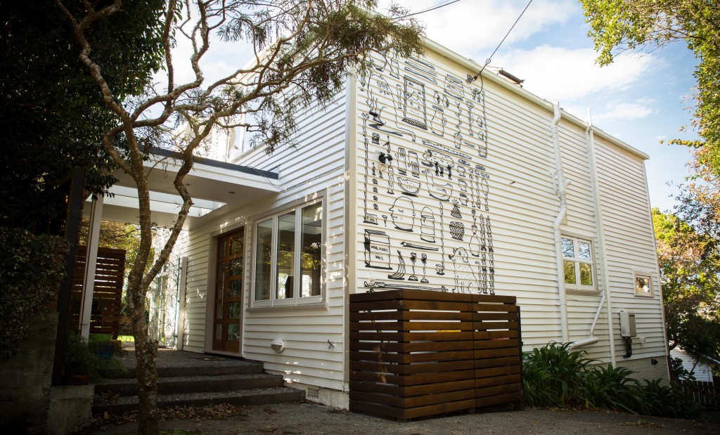
Commissioned Exterior, Wellington, Photo by Blake Dunlop
+ In your own words – how would you describe what you do?
We noticed that there were a three different groups of people using walls – advertisers, vandals and fine artists. We’re a healthy combination of the three. We use wall space to get a message across using the tools of vandals and the finesse of a fine artist.
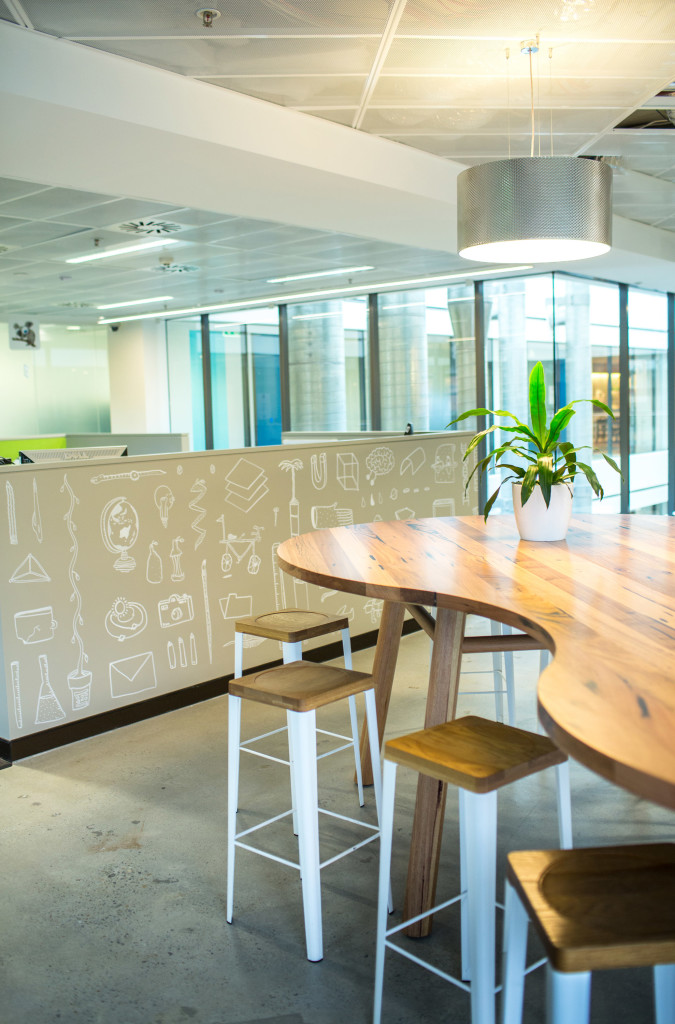
Interior for Google Sydney, photo by Blake Dunlop
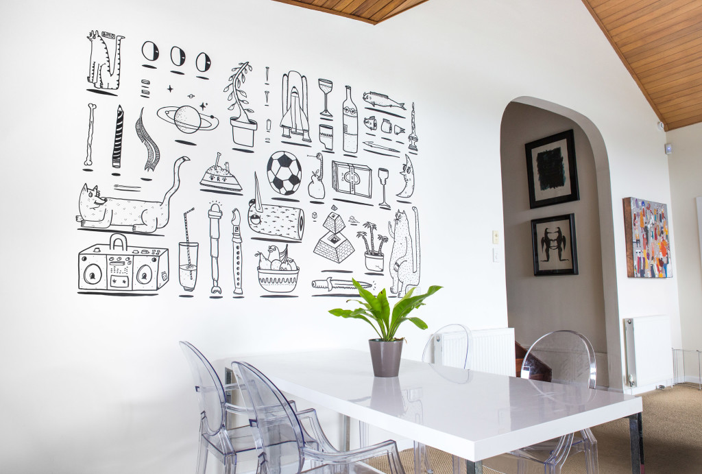
Private commission, Photo by Blake Dunlop
+ Who forms BMD is your friend?
BMD is a two part duo who met in intermediate school, in detention. We think different about spaces, design, art and business.
We produce value by handcrafting visual narratives directly onto walls.
Matter of fact, we’ve created some of the largest scale public artworks in New Zealand, but we’re not here to brag. Some time ago, a light went on and we realised every wall has two sides – an inside and an outside – so our canvas size effectively doubled overnight, and we had to roll up our sleeves to keep up with those pesky boring walls.
Profile, photo by Bianca Brons
Profile, Photo by Charlotte Curd
Cover image:Interior for Accent, Photo by Matt Queree
Follow BMD on Instagram to enjoy their creativity and find them online at bmdisyourfriend.com – get in touch with the guys if you’re wanting to to transform your boring walls.
– Kelly
The post BMD Is your friend appeared first on The Home Scene.
]]>The post Mai Mai House appeared first on The Home Scene.
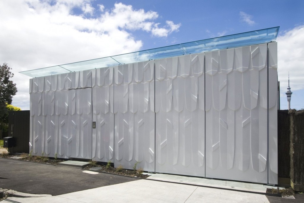
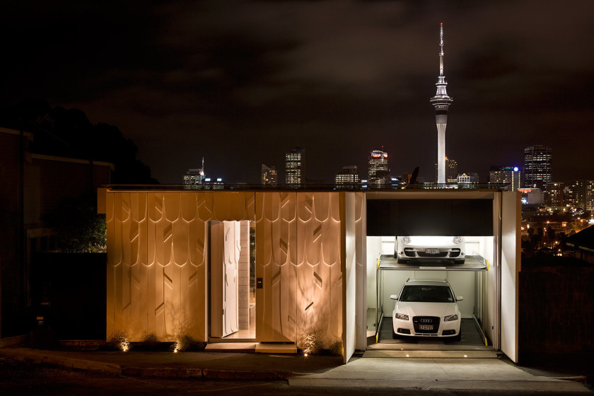
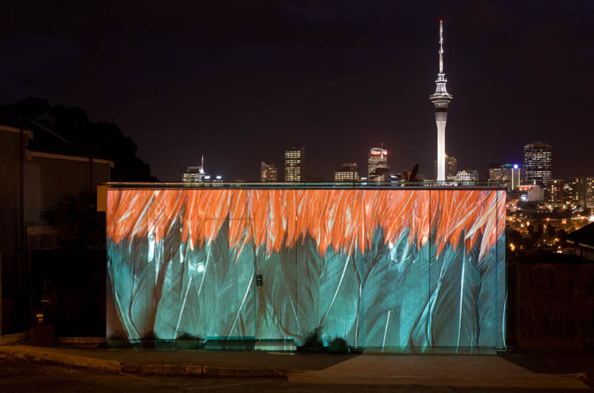
]]>Hence the name Mai Mai house.
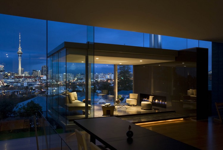
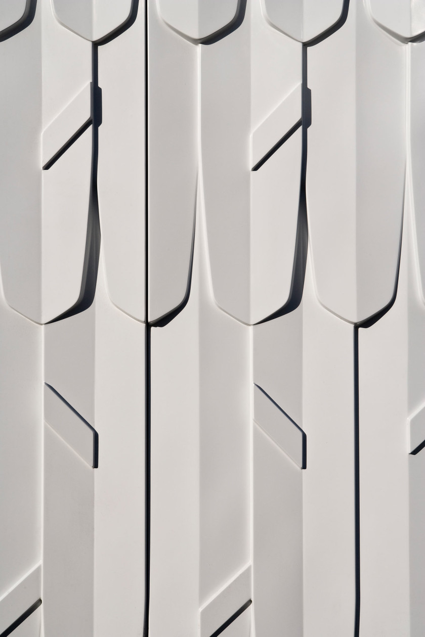
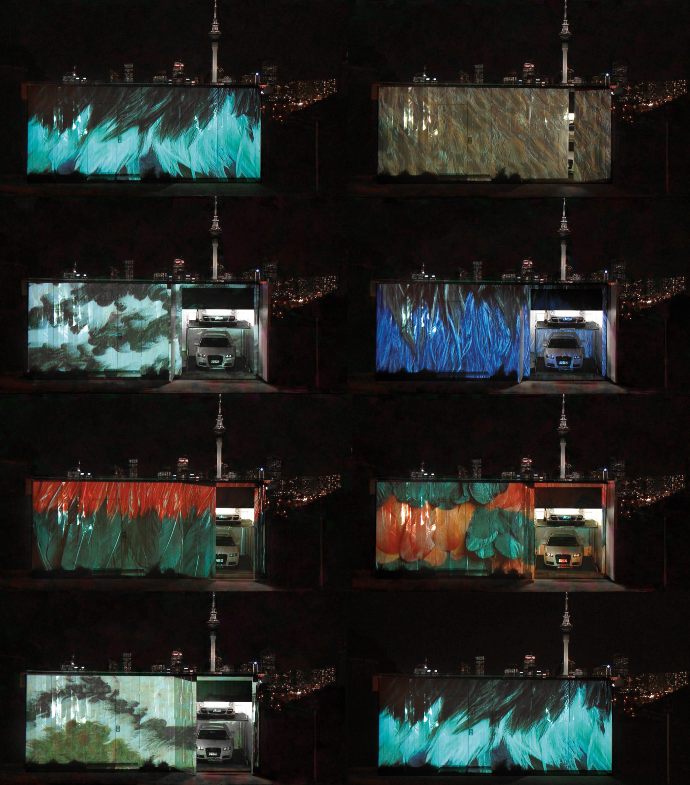
Designed by architect firm Pattersons, a home of contrasts and packing plenty of personality, a feathery motif is projected onto the exterior white fibreglass walls as a reference to the traditional Maori feather cloak.
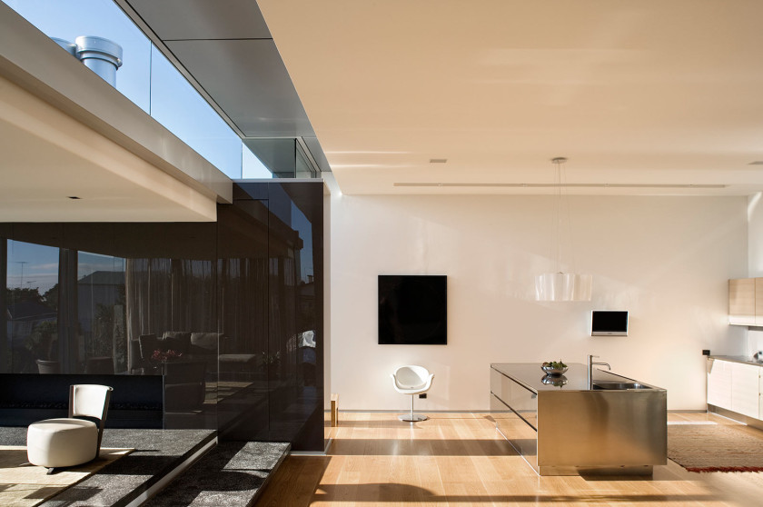
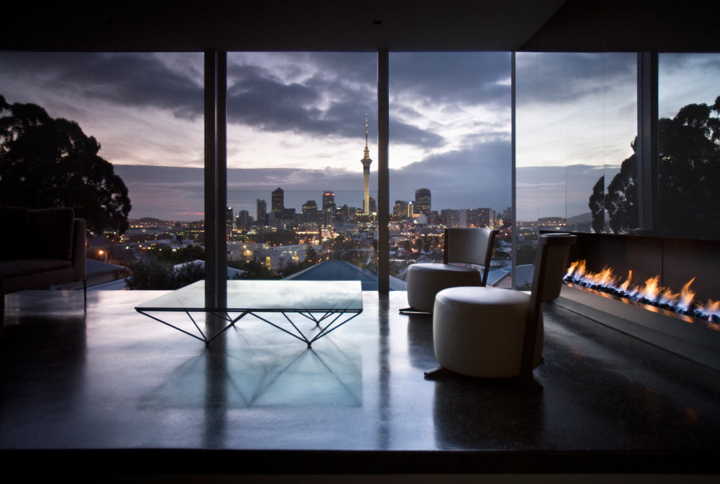
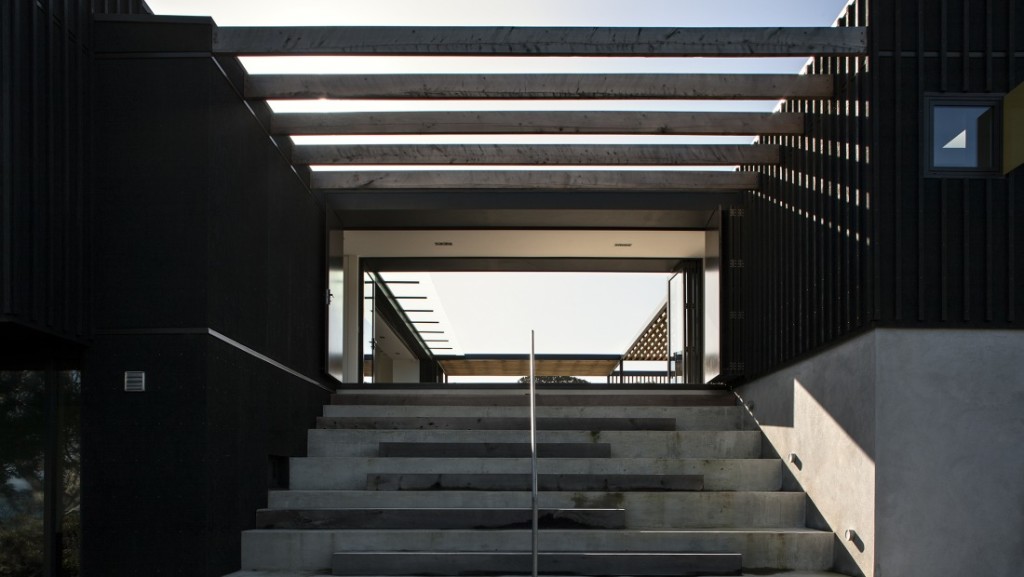
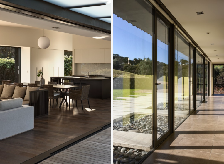
The expansive glass surroundings allow natural light to filter in to the space and create a warm and inviting home. Enjoying spatial living spaces, the stairs lead down to a private cinema room and bedrooms where an interior courtyard is located.
Showing function and art can come together as Pattersons have done with this award winning home.
Details | Architect: Pattersons
– Kelly
The post Mai Mai House appeared first on The Home Scene.
]]>The post The Summer House appeared first on The Home Scene.
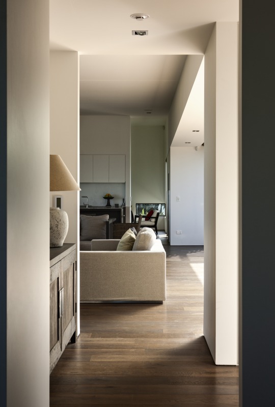
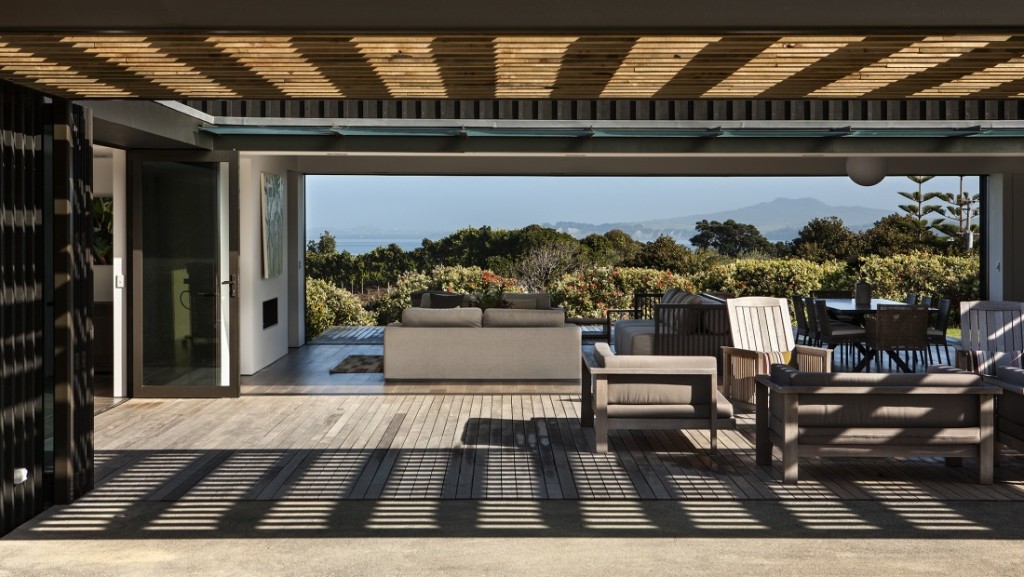
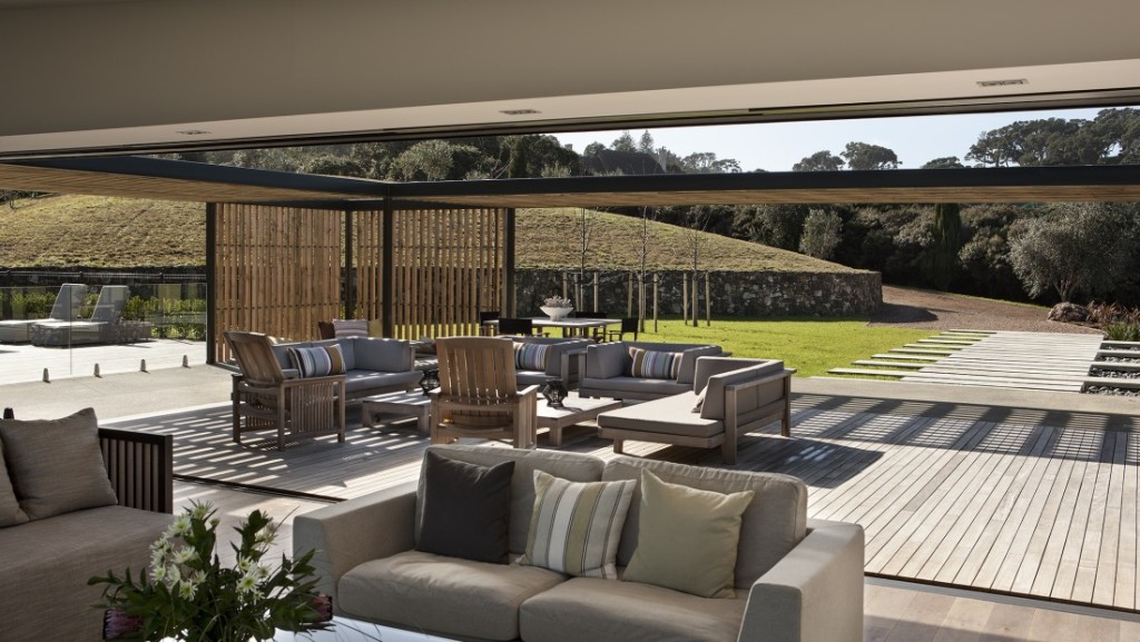
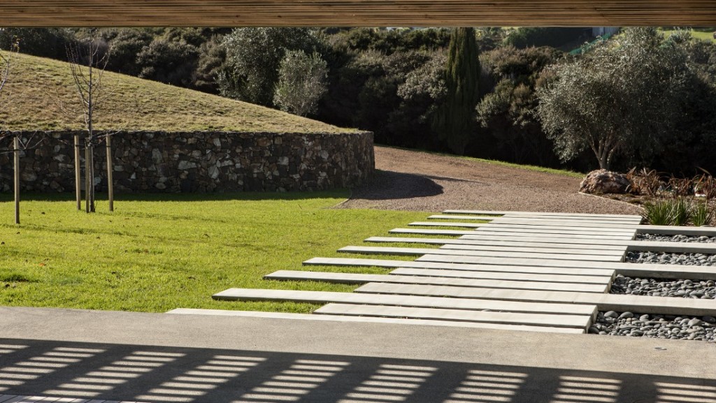
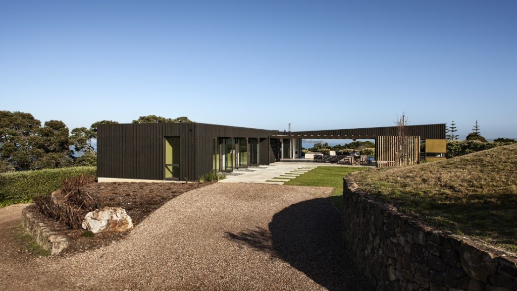
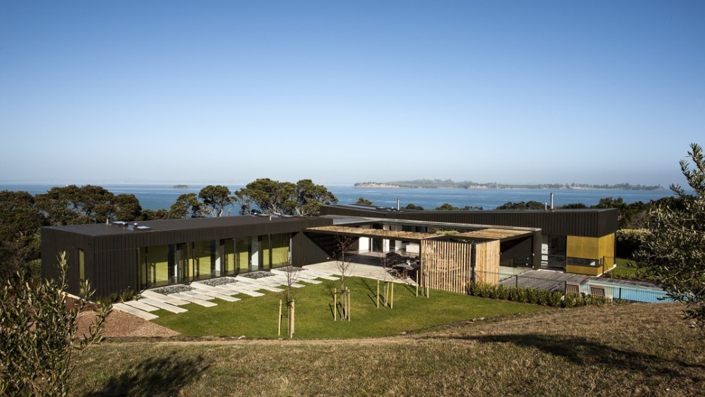
]]>Creating depth in the home, the solid stone walls and plastered concrete blocks anchor the building to its context, while the outdoor living spaces are clad in plywood with vertical and horizontal battens.
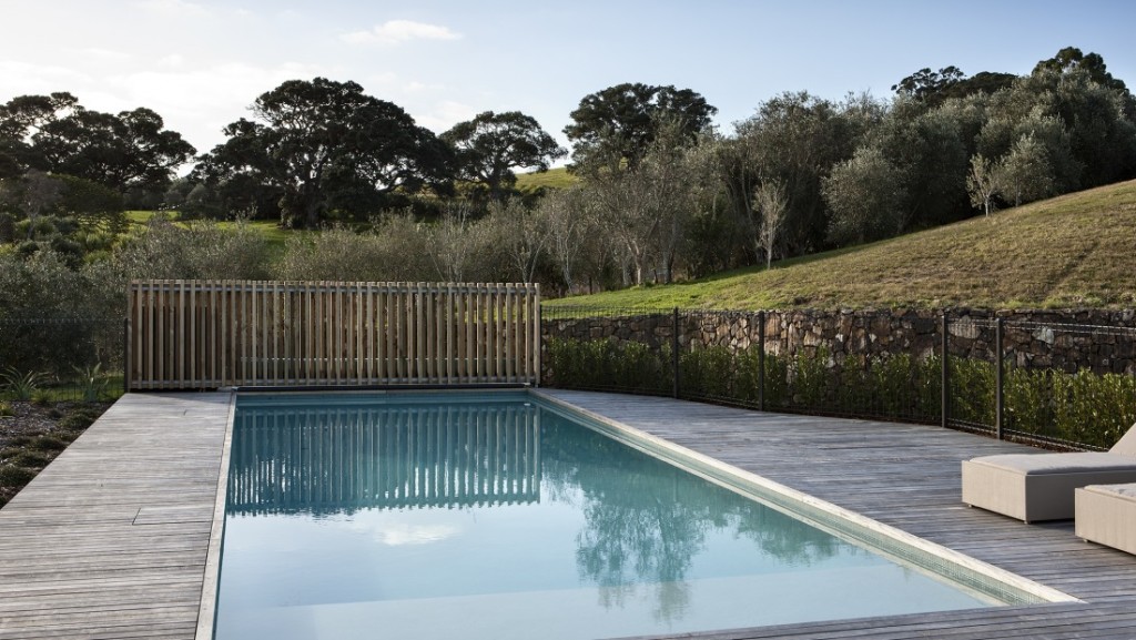
The light filters throughout the home to create a calming, relaxing retreat away from all the hustle and bustle of every day life. The deep colours allow the building to hide amongst the Pohutukawas and the landscaping is minimal so as not to detract from the dominant trees which surround the building platform beautifully.
Happy Monday THS Readers
– Kelly
Details
Source: Archipro | Architect: architex nz
The post The Summer House appeared first on The Home Scene.
]]>The post Icebreaker’s inspiring head office appeared first on The Home Scene.
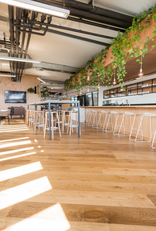
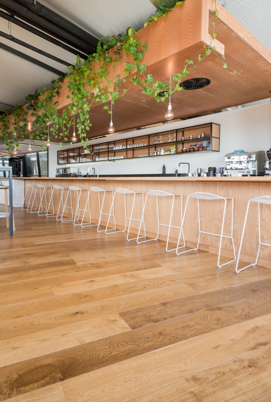
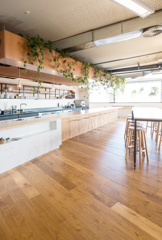
]]>Created with Antique Oak engineered flooring setting the vintage industrial theme throughout, this office has a large dose of charm.
From a business that started as the crazy ambitious goal of developing the world’s first merino layering system for the outdoors, Icebreaker is now a global business in the process.
The over hanging vine draws the eye up to the ceiling, providing colour and life to the open plan office space, offsetting the industrial exposed pipes.
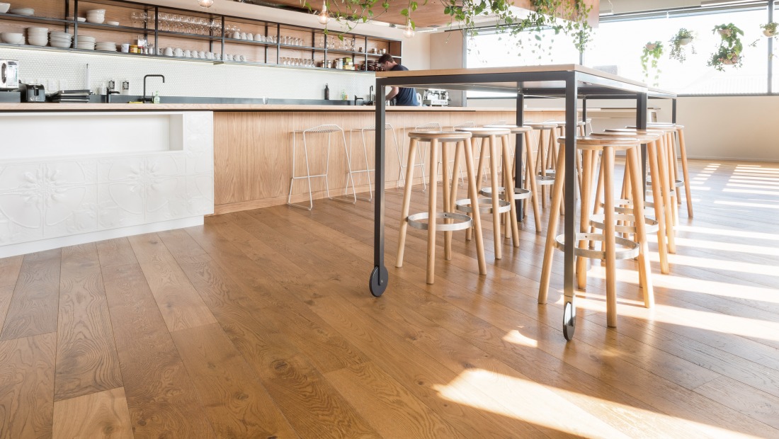
The Baker Stool is perfect for this design, with the ability to mix and match the colours and materials of the seat, legs and foot ring to suit your designated space.
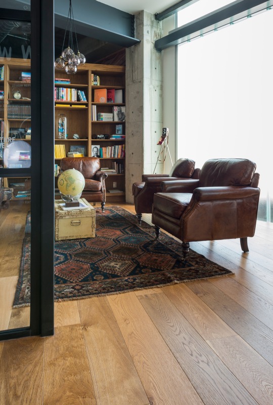
The vintage theme continues through to this separate meeting space, created with comfort in mind. Old leather armchairs combined with the rustic styling of the trunk suitcase, globe and vintage brownie camera perched in the corner on a tripod.
The IMO Kase Table is not only aesthetically pleasing and in keeping with the theme, but provides a wobble free surface for satisfying those morning coffees or late night sketching sessions.
Details: Source: Archipro |
What are your favourite elements from this office that you would love to see in your home?
– Kelly
The post Icebreaker’s inspiring head office appeared first on The Home Scene.
]]>The post Toorak House appeared first on The Home Scene.
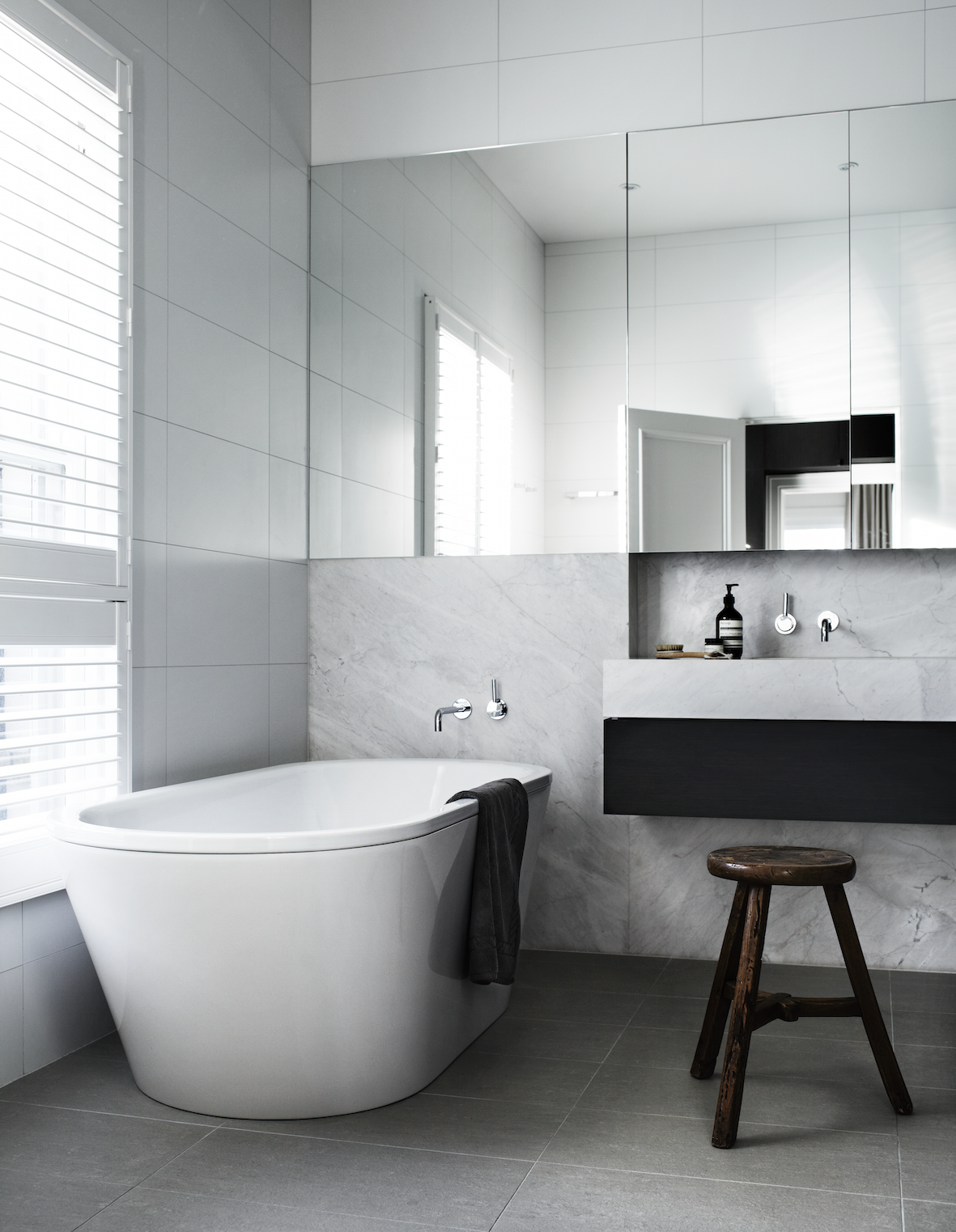
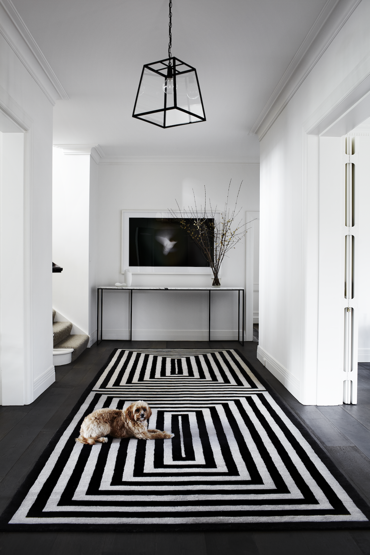
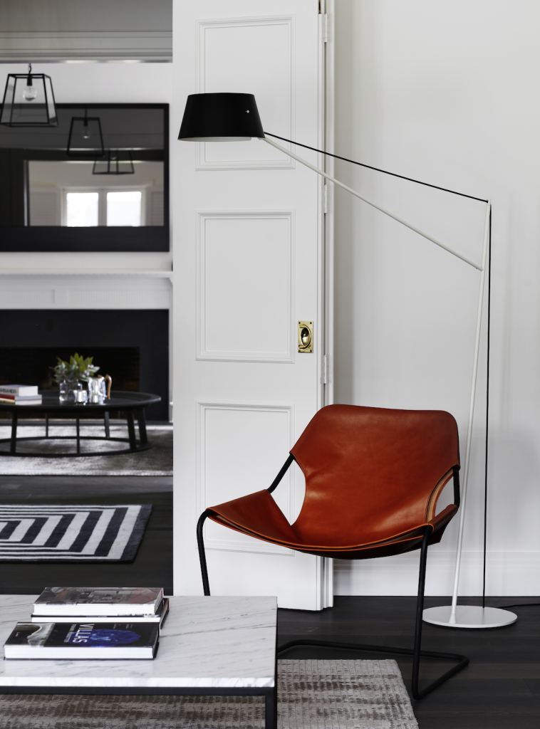
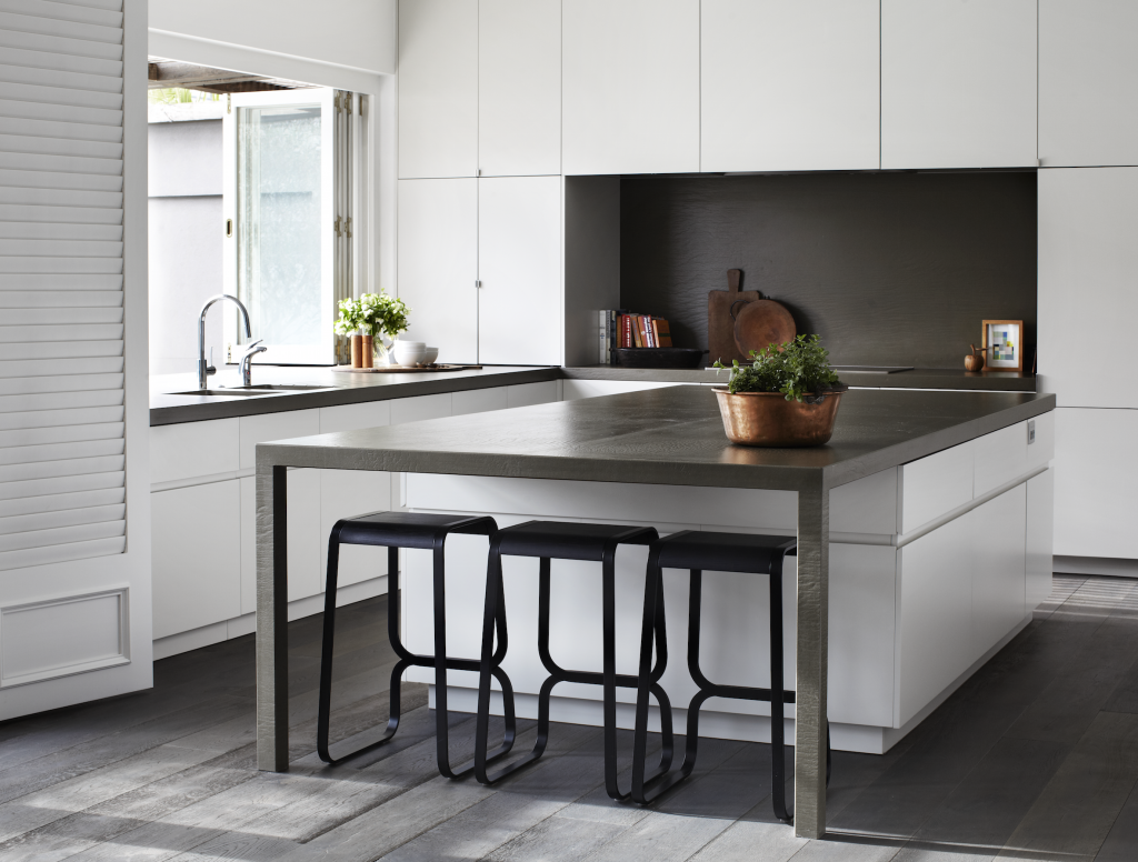
]]>For Toorak house that renovation meant modernising a tired interior and exterior of a large c1934 family house into a light filled, vibrant, clean, classic contemporary home for a busy family of four. Blessed with more than adequate bones, the only structural changes required were to the kitchen and laundry area.
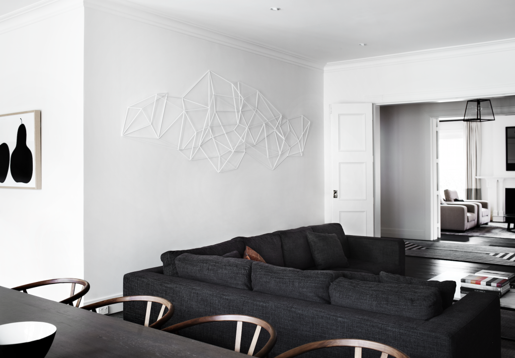
Throughout this beautiful home, architect firm Robson Rak designed and fabricated much of the furniture and furnishings to fit the bespoke brief, which also included a large wall sculpture in the living room by Chris Rak; who’s background in sculpture allows for this multi-disciplinarian approach.
The first floor bedrooms and bathrooms were designed with luxurious materials such as Elba marble vanities and timber joinery and plush woolen carpet to achieve a feeling of quiet sanctuary and luxury.
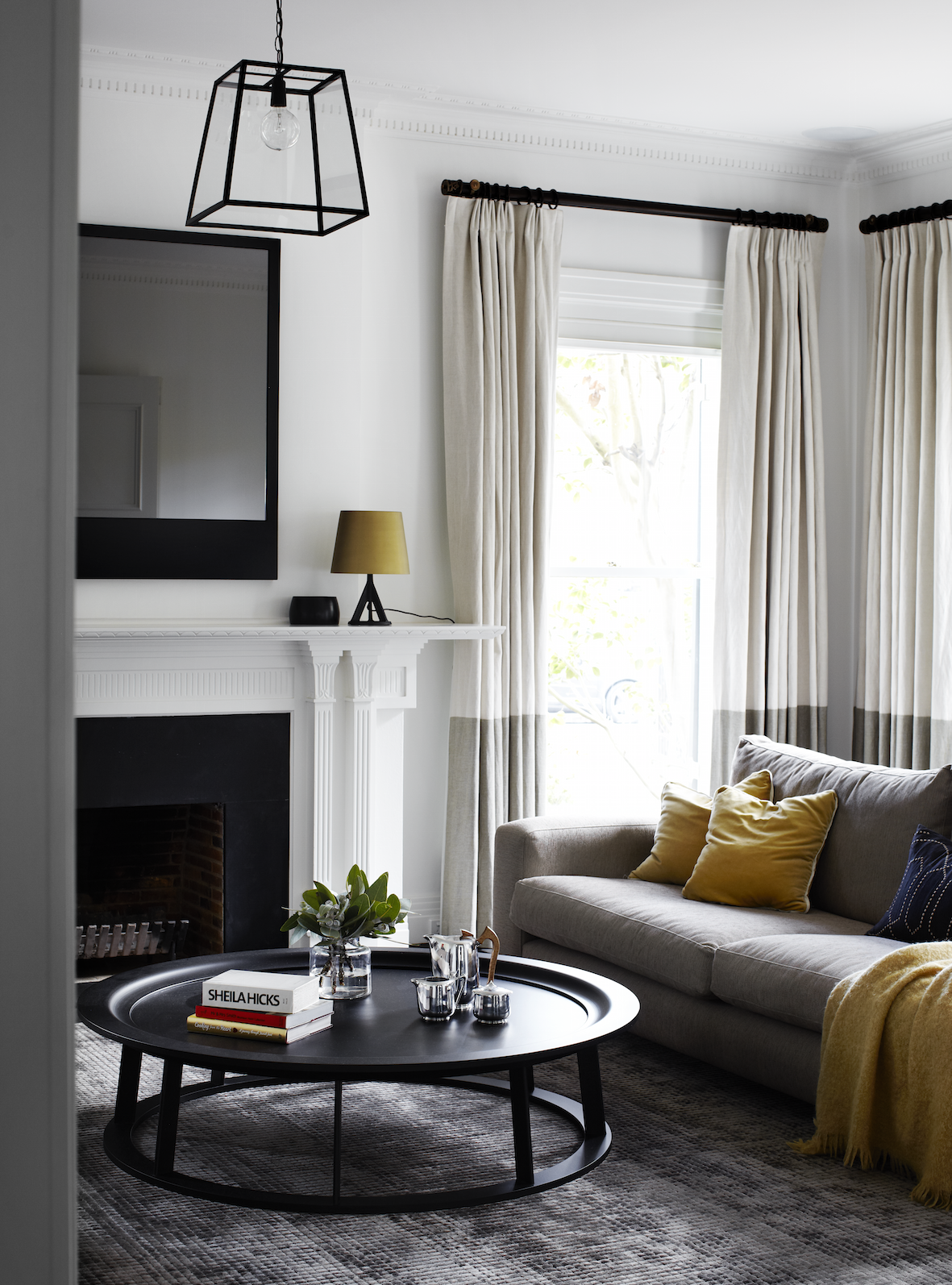
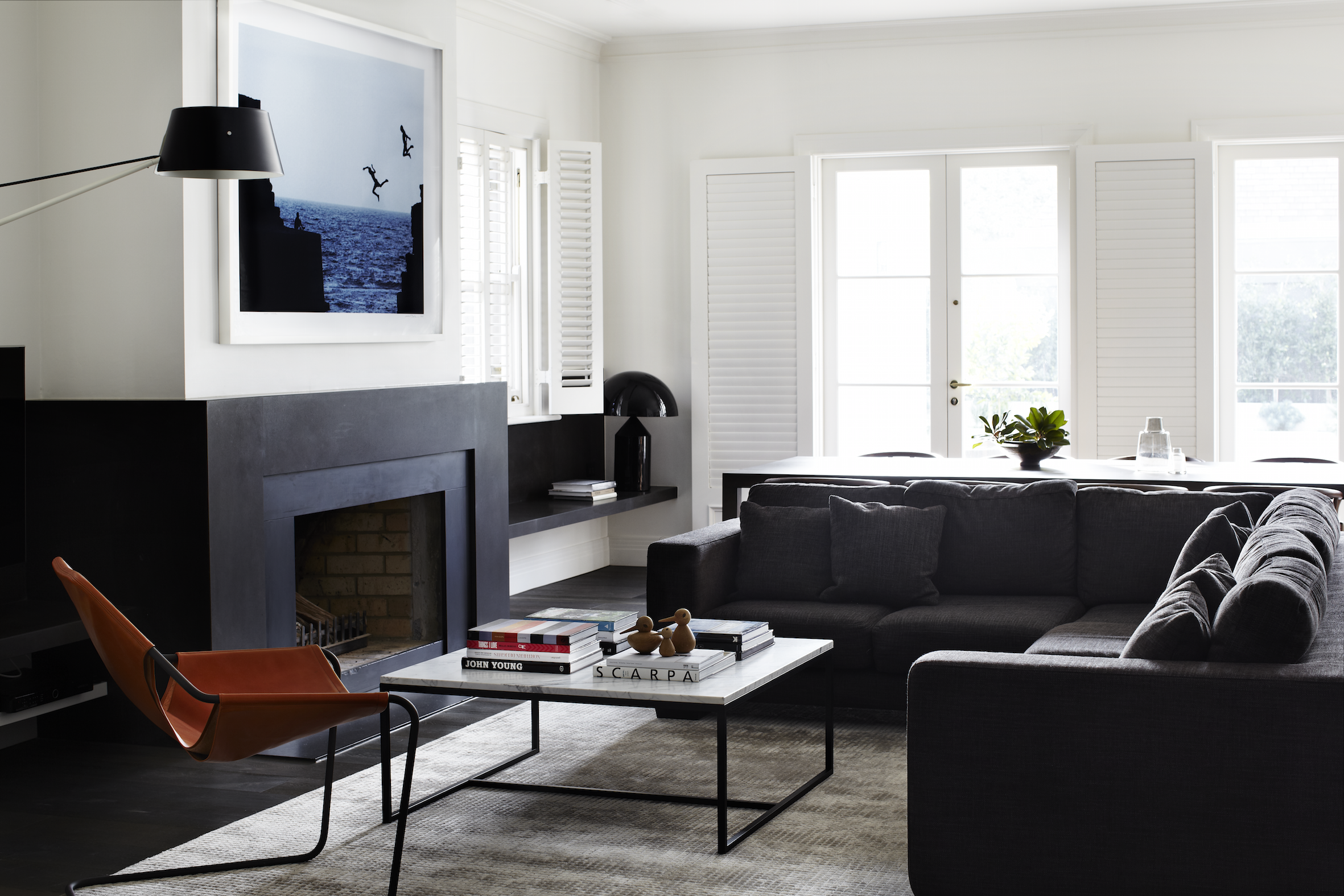
The formal dining/living rooms were kept in their original state, but modernized with the bespoke fireplace mirror, furnishings, and new American oak floorboards.
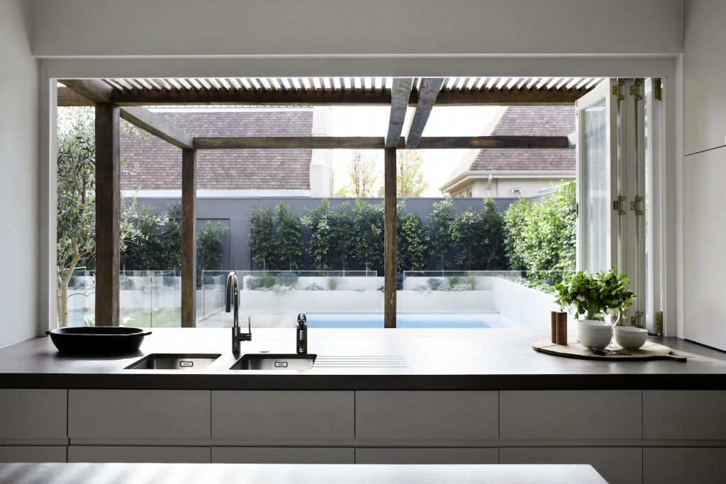
An open-plan kitchen, dining and living area with bi-fold doors open onto a large terrace, revealing a generous outdoor entertaining area framed by a large ‘Sugar Gum’ timber pergola. This act as eaves in summer to keep the sun at bay while in winter the lower sun streams into the house under the slats and the whole living and kitchen area is bathed in northern light throughout the day.
Details: Architect: Robson Rak Architects |
– Kelly
The post Toorak House appeared first on The Home Scene.
]]>The post Loft Living with Scandinavian style appeared first on The Home Scene.
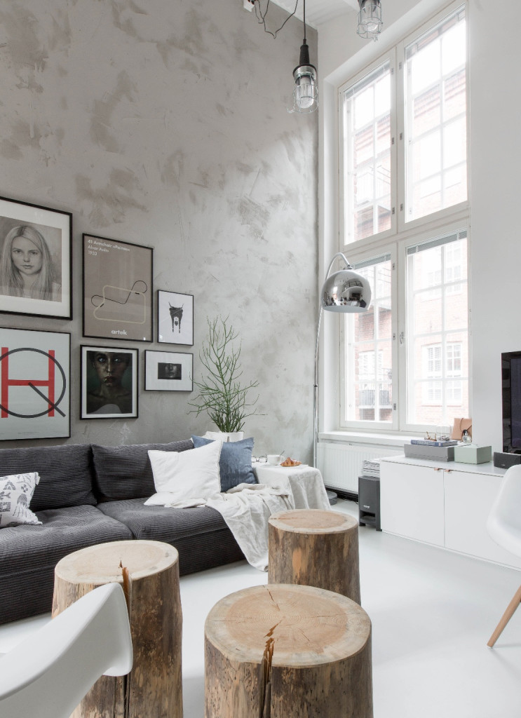
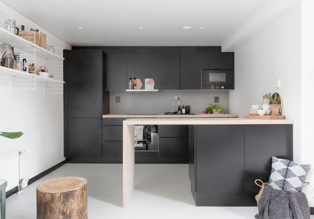
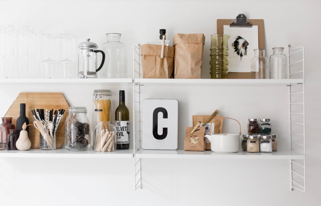
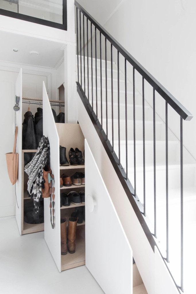
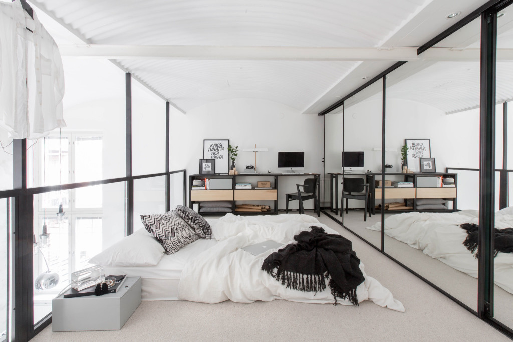
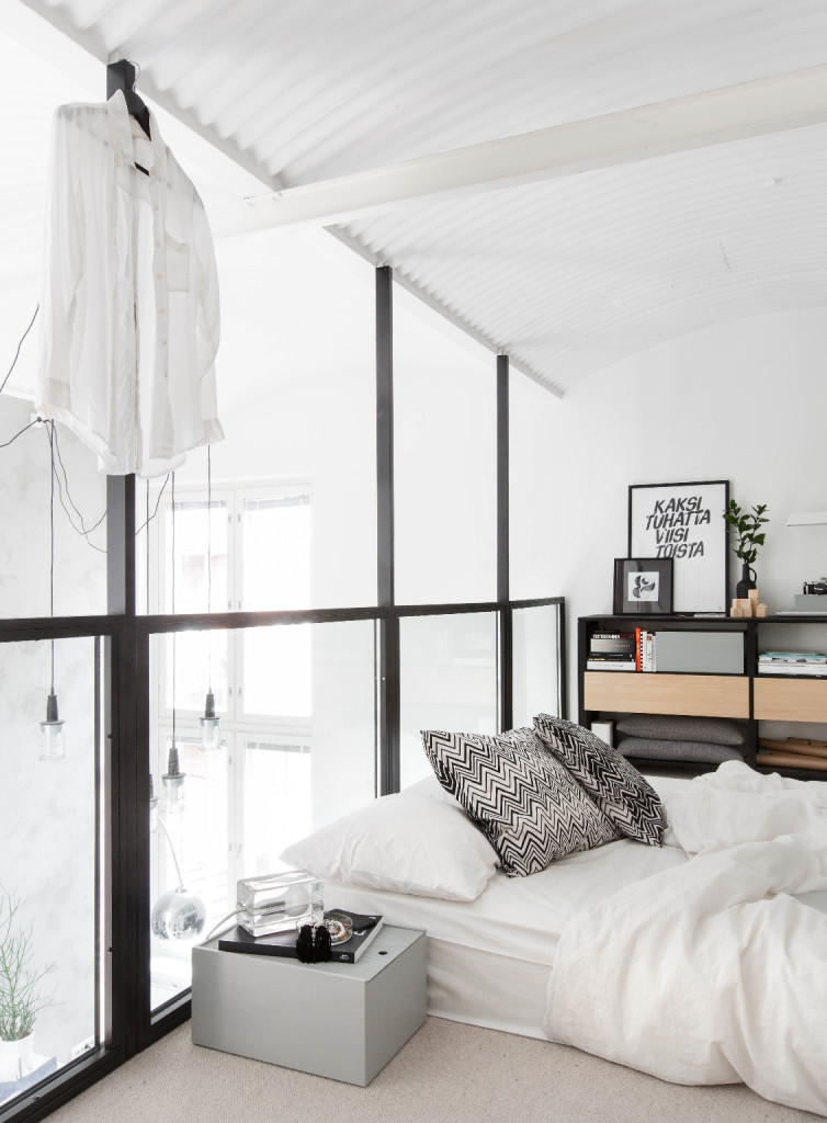
]]>Loft living is all about light, bright and airy spaces, with art prints feature throughout the home for Bo staff member Jutta KodinJutta. Simplistic timber materials add interesting elements which of course caught my eye and my heart.
The old steep stairs were replaced and cleverly utilised the space underneath the stairs, added these pull out wardrobes for coats, jackets and shoes, rather than leaving as wasted space.
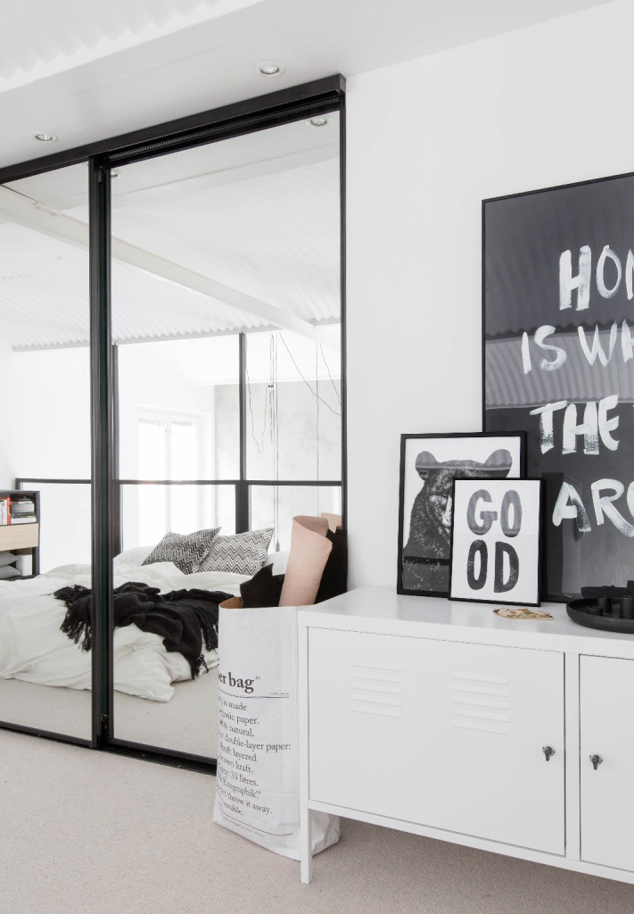
The wall to floor mirrored wardrobes in the main bedroom add space to the room by reflecting the light from the outside windows and creating the illusion of space whilst concealing storage, clothing and ‘stuff’.
What do you love the most about Scandinavian style?
– Kelly
The post Loft Living with Scandinavian style appeared first on The Home Scene.
]]>The post Pekapeka Beach House appeared first on The Home Scene.
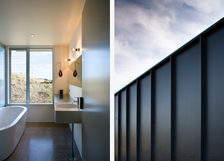
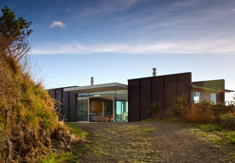
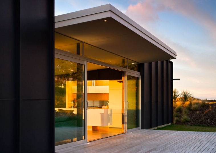
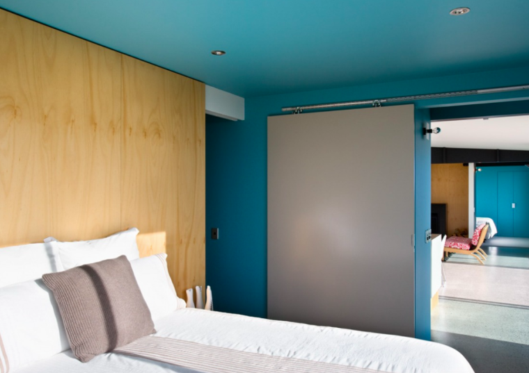
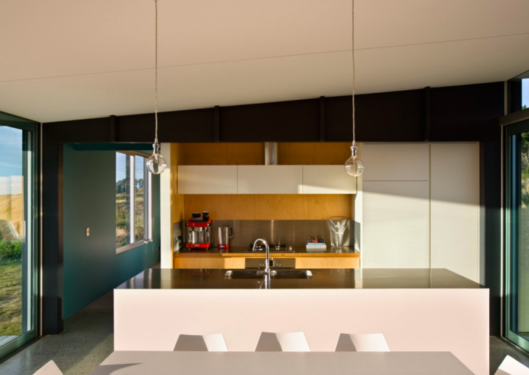
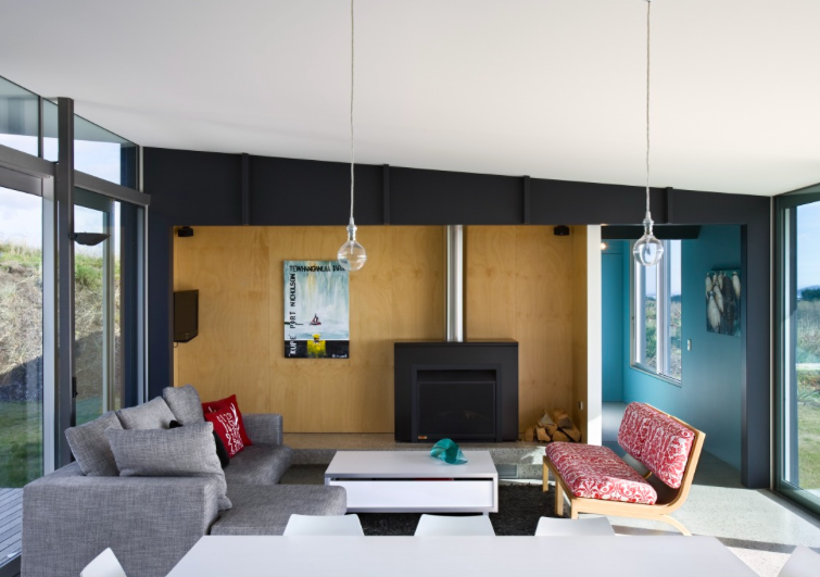
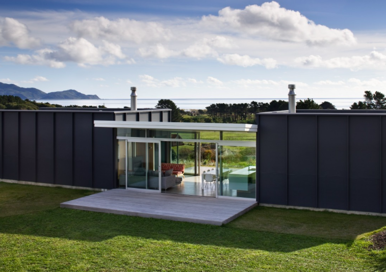
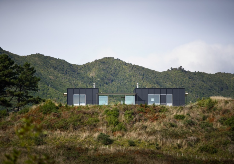
]]>Simple modular construction techniques combine to create a very simple form. The overall layout plan is devised from a rectangular shape, divided into 3 parts with bedrooms at each end to support a floating roof over the living space that exists in between.
This award winning home was designed by Parsonson Architects in Wellington. With all day sun and views like this you can easily see why you’d want to retreat to a beautiful location like this whenever you can.
Details
Architecture: Parsonson Architects | Source (with permission): Archipro | Photography – Simon Devitt |
– Kelly
The post Pekapeka Beach House appeared first on The Home Scene.
]]>The post Typography and Design appeared first on The Home Scene.
]]>What catches my eye when I’m looking for a good spot for coffee or to grab a bite to eat, can often be based on the design aesthetics, space and atmosphere.
These three eateries featured on the blog today are for their use of typography incorporated within their brand, design and interiors to delight and invite, inspire and grab attention to stand out from the crowd.
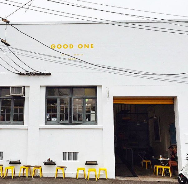
GOOD ONE | PONSONBY
In an old manufacturing building with hand painted signage sits Good One in Ponsonby, Auckland.
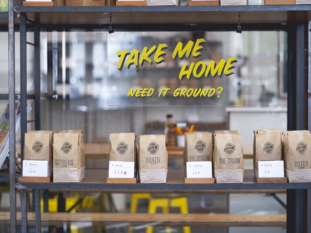
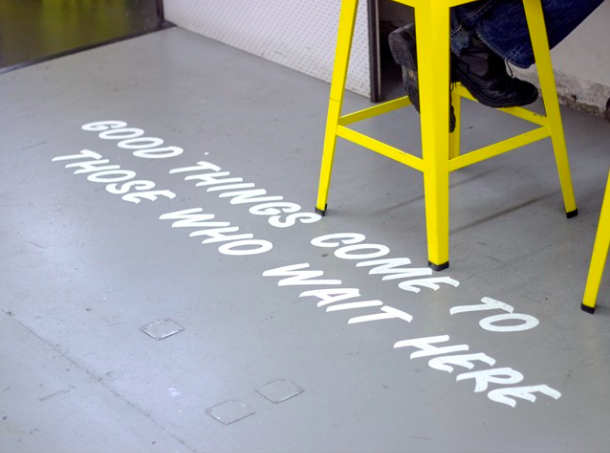
Taking inspiration from early 20th century American automotive packaging, this cafe incorporates clever branding throughout its interior in surprising and delighting ways. I love the splashes of Good One yellow used throughout.
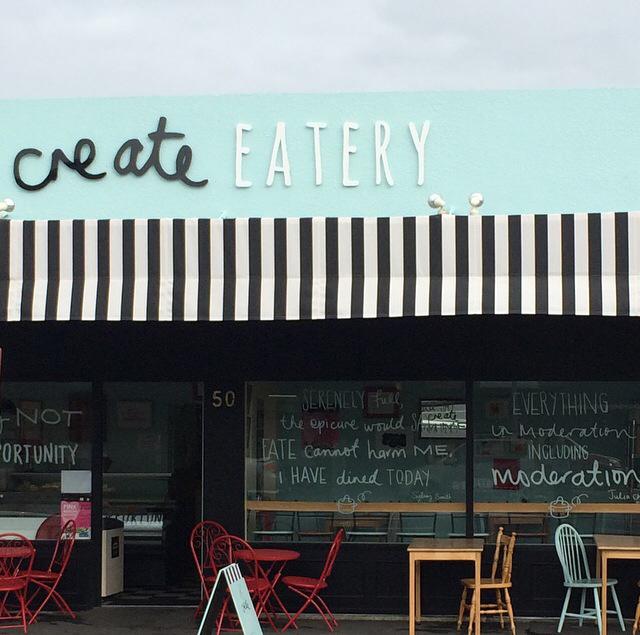
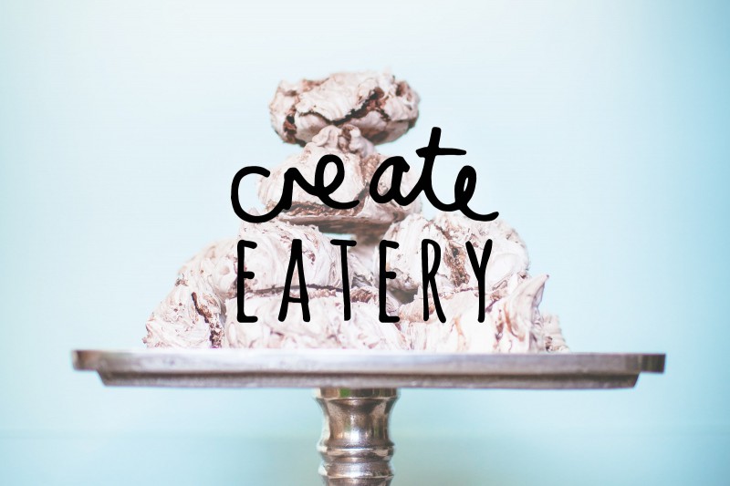
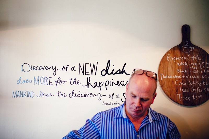
CREATE EATERY | PALMERSTON NORTH
In a little spot in the lower North Island, this sweet eatery uses clever typography design and messaging to complement Create Eatery’s wit and charm.
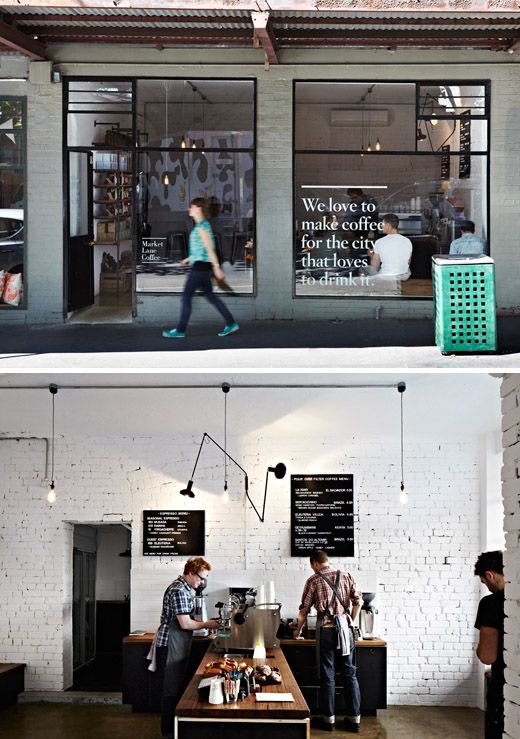
MARKET LANE COFFEE | MELBOURNE
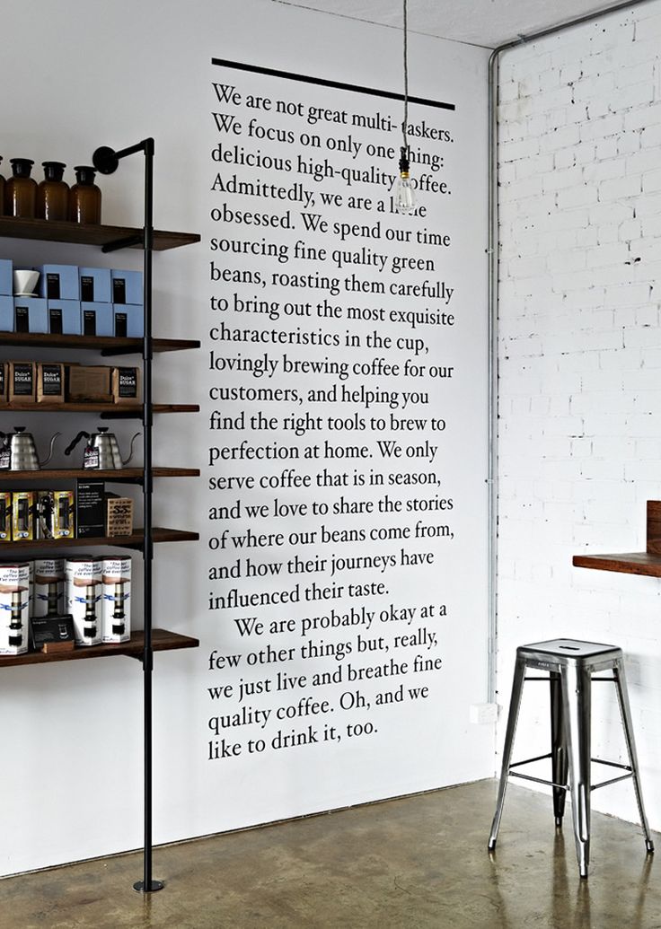
Renowned for its cafe and restaurant scene, Market Lane Coffee in Melbourne shares its philosophy for making good coffee front and centre and to remind its coffee drinker what they truly love to do
Do you have a favourite cafe spot that you love for its design elements (after good food and coffee of course)? Share your favourite local spots with us and we might feature in a future post.
Kelly
The post Typography and Design appeared first on The Home Scene.
]]>The post The Super K’s home transformation appeared first on The Home Scene.
]]>The design and styling aesthetic of Kyal and Kara, otherwise known as the Super K’s, is far and above the best. This duo have a clear love affair with timber, bespoke furniture and minimalistic styling – a couple after my own heart. Although the winners of this series haven’t been aired in New Zealand, I won’t ruin the result for those wanting to follow the series.
The clever pair have taken Kyal’s Diverse Carpentry business and verged further into construction, renovation and styling with their company, ‘Diverse Design and Construct.
While their works speaks volumes. I always love to peer into the home of designers to see how they create the space for themselves.
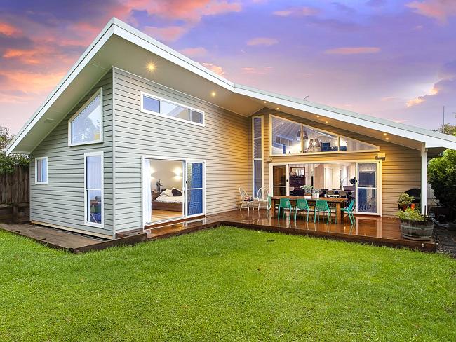
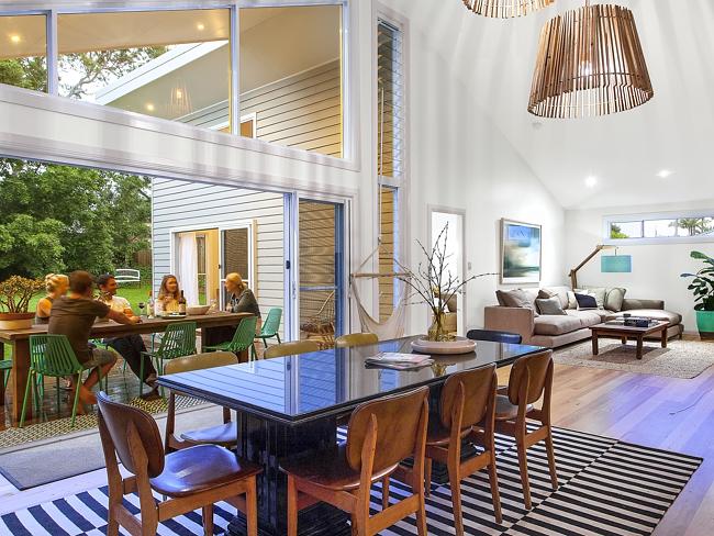
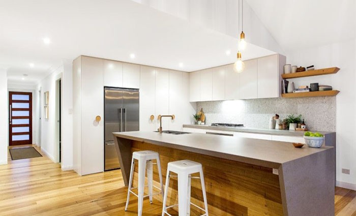
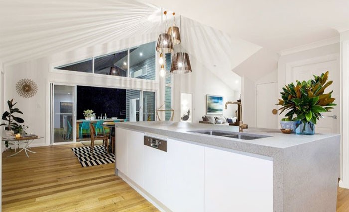
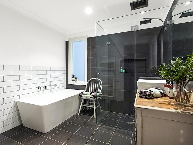
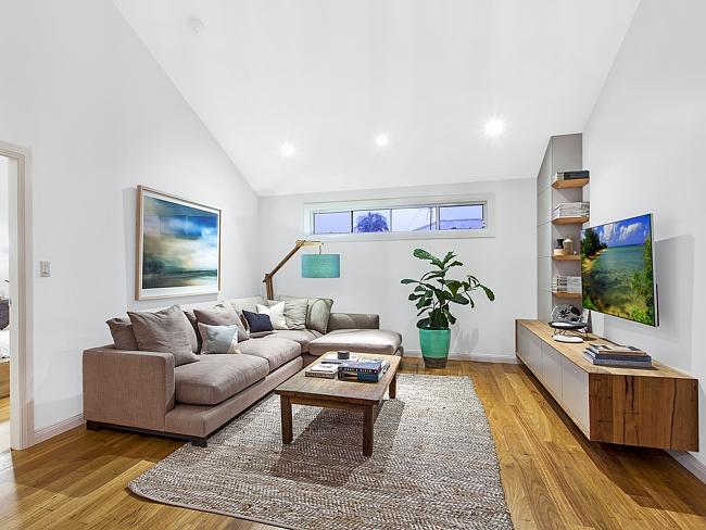
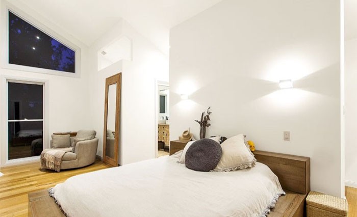
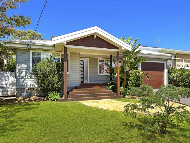
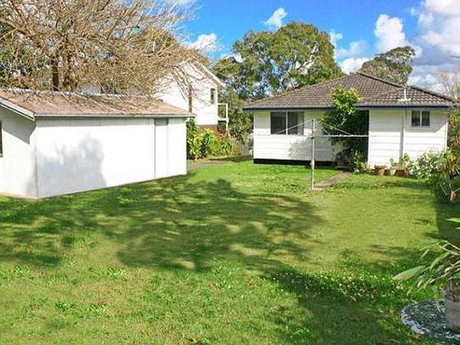
The home the couple purchased in 2008, prior to their The Block debut took three years to renovate and sold for double the median sale price of their area. With soaring high ceilings, light spacious rooms combined with the all important indoor, outdoor entertaining, this four bedroom home received a complete transformation.
The original transformation…
Kelly
The post The Super K’s home transformation appeared first on The Home Scene.
]]>