Admiration for good interior design also lends itself to cafe spots.
What catches my eye when I’m looking for a good spot for coffee or to grab a bite to eat, can often be based on the design aesthetics, space and atmosphere.
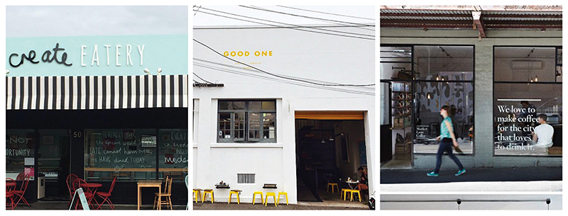
These three eateries featured on the blog today are for their use of typography incorporated within their brand, design and interiors to delight and invite, inspire and grab attention to stand out from the crowd.
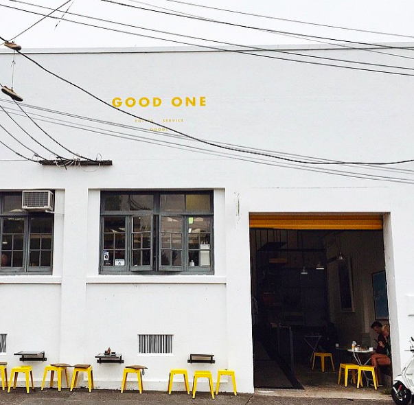
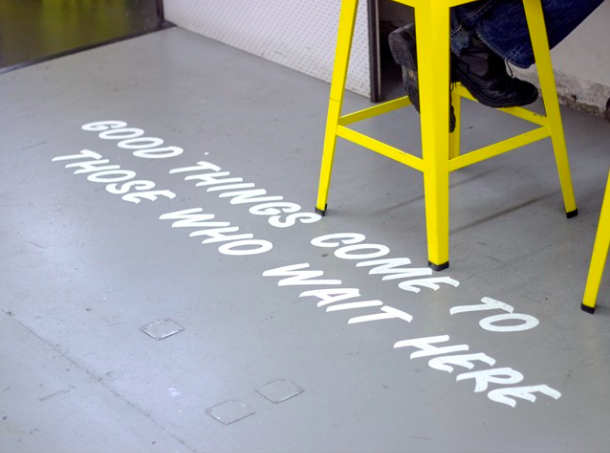
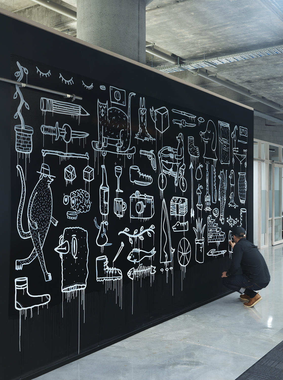
GOOD ONE | PONSONBY
In an old manufacturing building with hand painted signage sits Good One in Ponsonby, Auckland.
Taking inspiration from early 20th century American automotive packaging, this cafe incorporates clever branding throughout its interior in surprising and delighting ways. I love the splashes of Good One yellow used throughout.
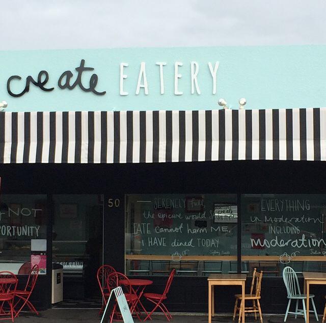
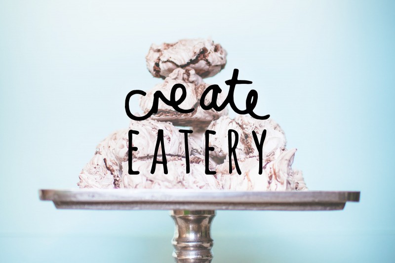
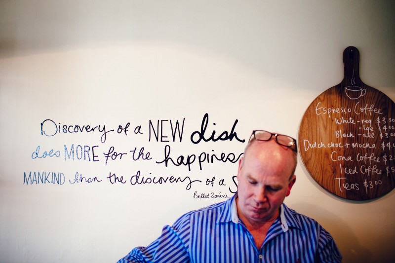
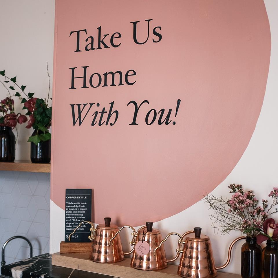
CREATE EATERY | PALMERSTON NORTH
In a little spot in the lower North Island, this sweet eatery uses clever typography design and messaging to complement Create Eatery’s wit and charm.
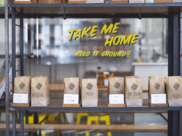
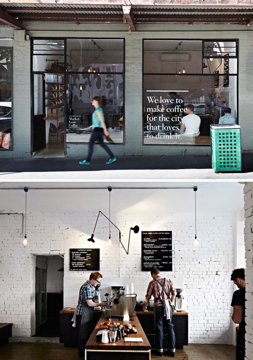
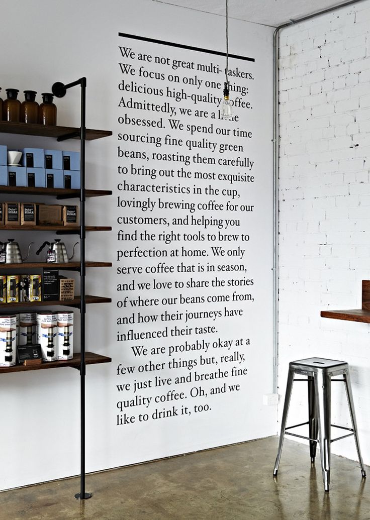
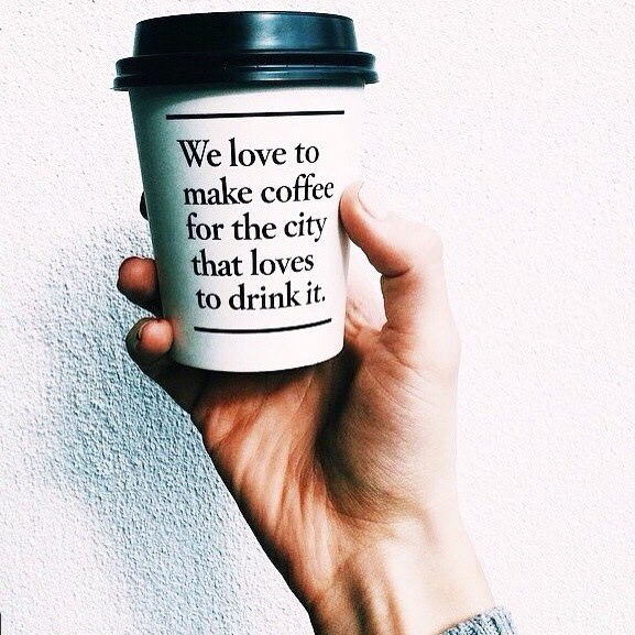
MARKET LANE COFFEE | MELBOURNE
Renowned for its cafe and restaurant scene, Market Lane Coffee in Melbourne shares its philosophy for making good coffee front and centre and to remind its coffee drinker what they truly love to do
Do you have a favourite cafe spot that you love for its design elements (after good food and coffee of course)? Share your favourite local spots with us and we might feature in a future post.
Kelly


I almost did my blog post on typography but changed at the last minute. Love your post though as I have always thought when I eventually get my own home to do something like that on the walls as I think it would look awesome .
Cheers, Paula
That would look really cool – I love doing different and unexpected things creatively in the home!
Dining out and and typography two of my favourite things! I love how typography tells a story even before you read what is written in the words. I’m glad that many places are appreciating the use of typography as a design element now. Beautiful type needs no embellishment.
Perfectly said Genie! Love that you are fellow lover of good typography.
I’ve always loved good design like this and often looked at funny from friends if I comment on it.