The post Christmas Table Setting appeared first on The Home Scene.
]]>This year will be no different.
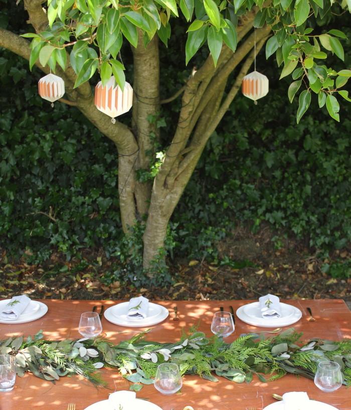
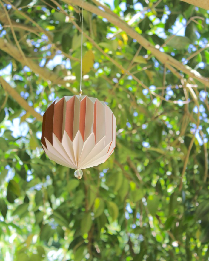
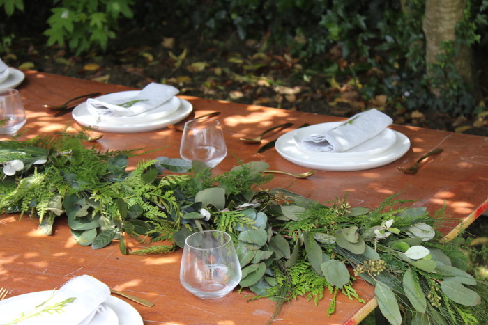
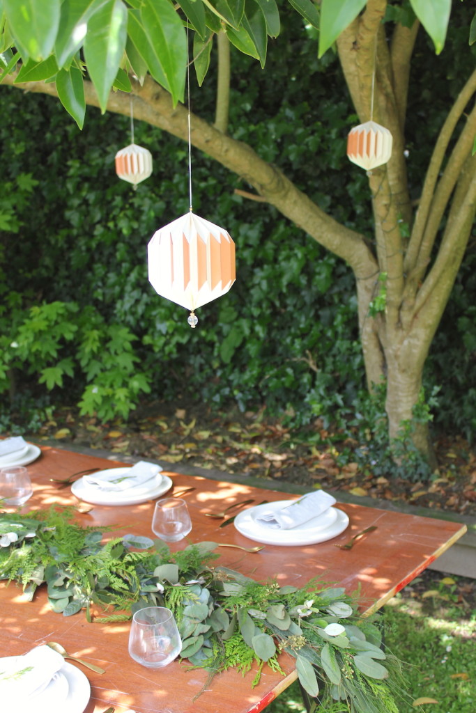
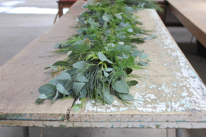
When it comes to our Christmas table setting, I prefer to keep it simple with a laid back, rustic style, taking inspiration from the garden around me. I’ve styled this Christmas setting in our own backyard to show you how creating a simple setting can look just as effective. With some of my favourite tablewares, a few hanging decorations in the trees above and this gorgeous foliage centrepiece created by Amelia Addis, it’s easy to recreate and takes away the fuss.
Details:
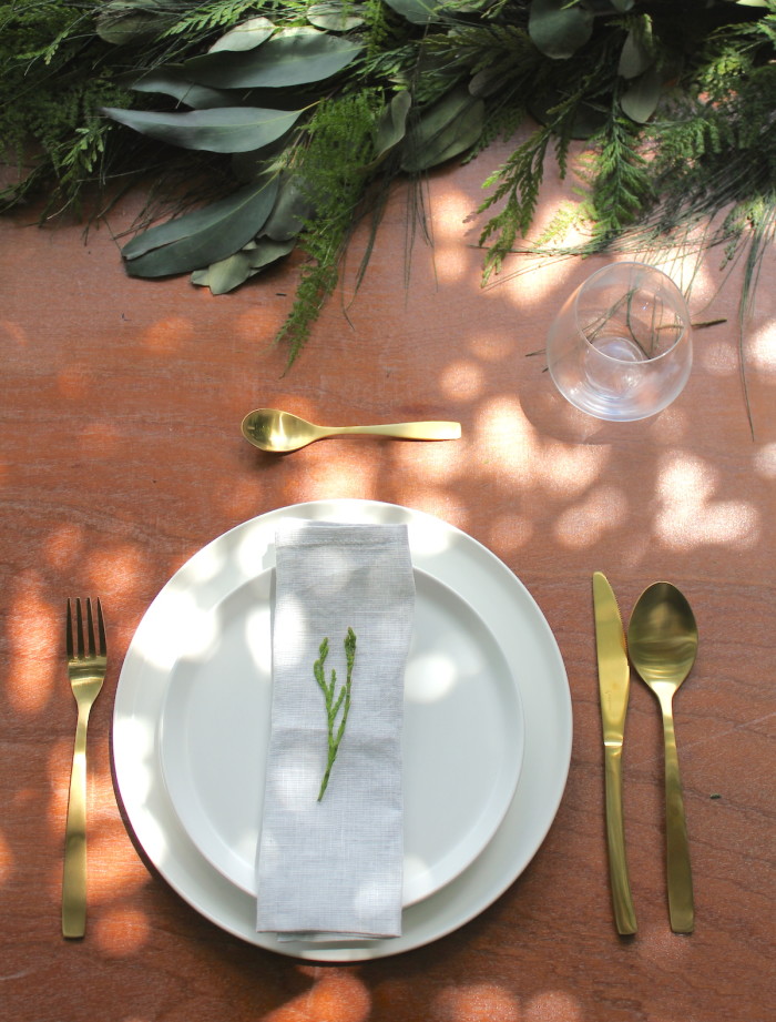
Foliage: Amelia Addis Florist, Aesthetica Sphere Decoration $11.13 (set of 2 – now on sale) Citta Design, Charm 16 piece Cutlery set in Gold $99.00 Freedom Furniture, Dine Linen Napkins in Light Blue $12.90 each Citta Design, Series side plate $9.95 and Series dinner plate $12.95 and Evolve glasses $5.95 Freedom Furniture.
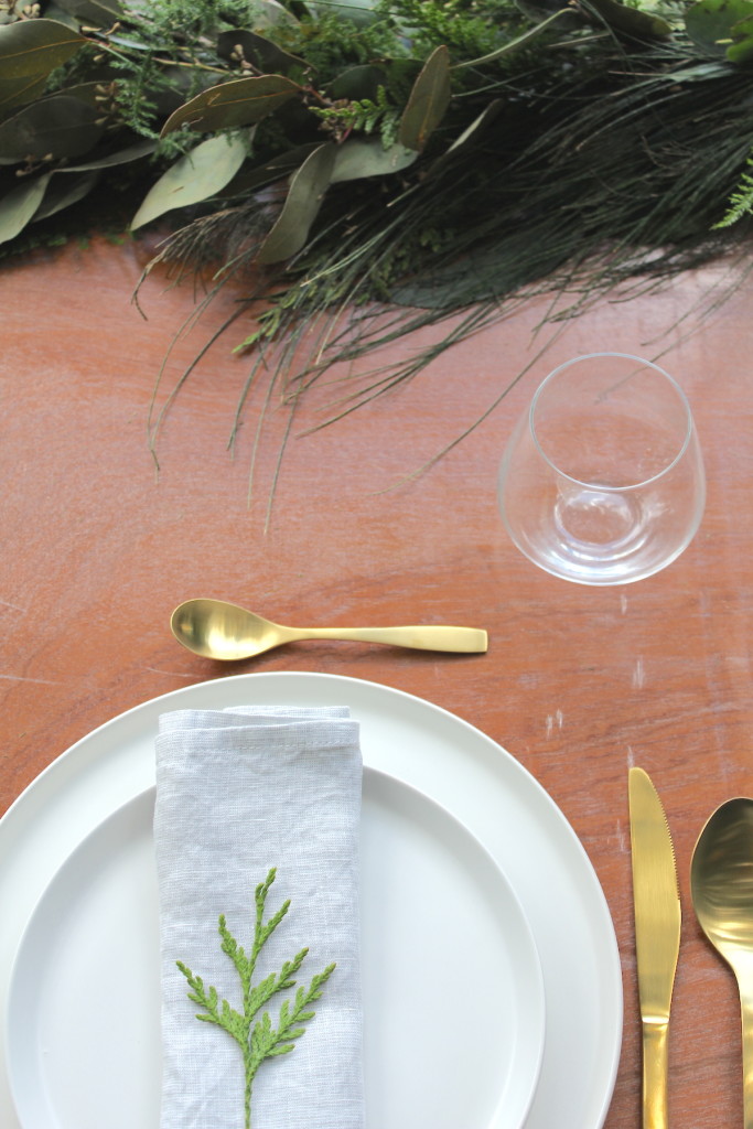
You may want to add more glasses, such as wine glasses for the occasion. You don’t need a fancy outdoor table for the day, I’ve used two trestle tables joined together to create that desired depth and space when so many people come around the table to celebrate. The cool hues of the napkin lends itself well to the green foliage, simple white plates and the luxeness of the gold cutlery and finished off with a cutting of asparagus fern from the centrepiece.
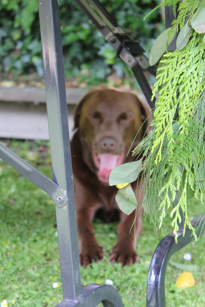
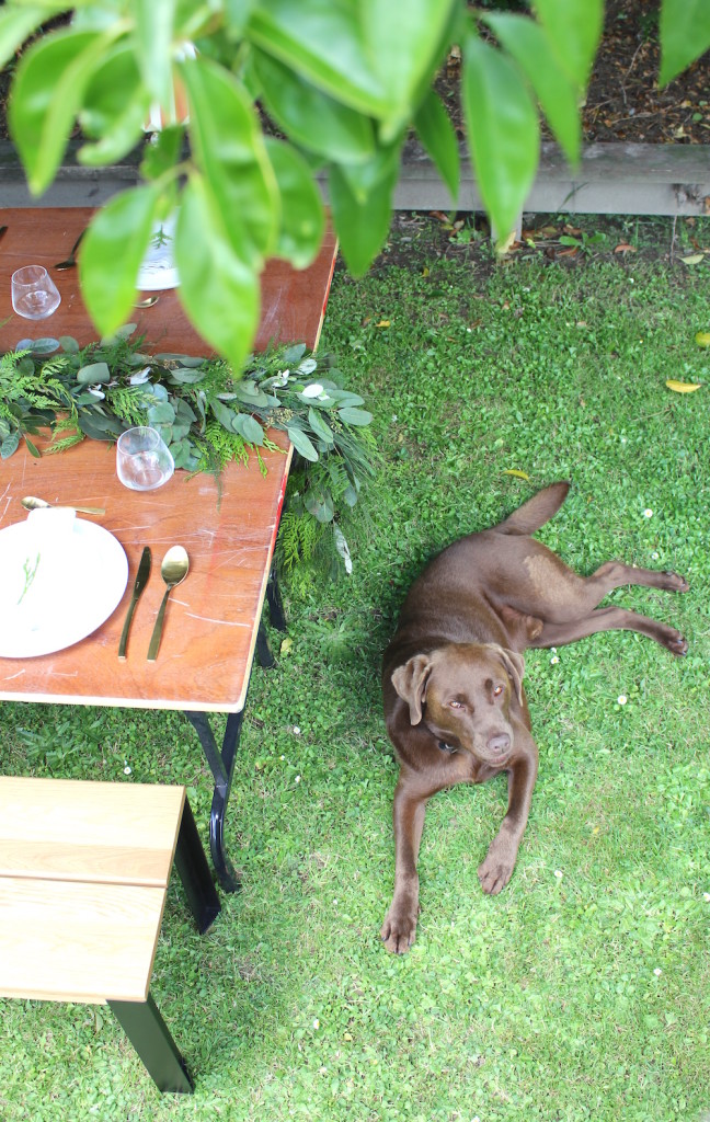
Enjoy a few outtakes below of someone who managed to find himself right in shot as per usual – Diesel our 3yr old Chocolate Labrador.
The post Christmas Table Setting appeared first on The Home Scene.
]]>The post 12 Days of Christmas Giveaway appeared first on The Home Scene.
]]>As well as compiling some of my favourite homewares items, each day I’ll be giving away one item from my THS Gift Guide – 12 days of Christmas giveaway style.
Commencing December 1st and running through till the 12th, one item from the gift guide will be posted on Facebook and Instagram to win. From 8am you’ll only have until the end of that day to enter, so you’ll have to be quick to be in the draw.
The best part of all, one lucky reader will win everything from the previous 11 days all in one big prize on the 12th of December!
And because I’m saying thanks, I’m keeping the entry process easy. Simply comment on the post you wish to enter, telling me who you would love to give the gift to, make sure you’re following THS and the gift company on social and you’re in the draw. You can enter on both FB and IG too and enter each day.
12 Days of Christmas – Gift Guide

I love long summer days, with no where to be, relaxing with a good book. Mocka’s Joey Chairs are a fave of my own boys who love to escape to the back yard with a good book and therefore a must have on my christmas list for any child. Made from 100% cotton canvas, the large Joey chair in Blue/Red is valued at $79.95 and holds up to 80kg. Day 1 – of our 12 Days Giveaway, Congratulations to Cate Marshall
Any interior lover will tell you they adore flicking through the pages of a good home magazine, sourcing inspiration and delighting in uniques spaces. A favourite of mine for its beautiful styling and homes featured, homestyle magazine is always on display on our coffee table. Using our own Fly Buys points to update our magazine subscriptions and homewares is something we often do and something you could do as a gift that keeps on giving each month. Day 6 – of our 12 Days Giveaway, Stephanie Gardner
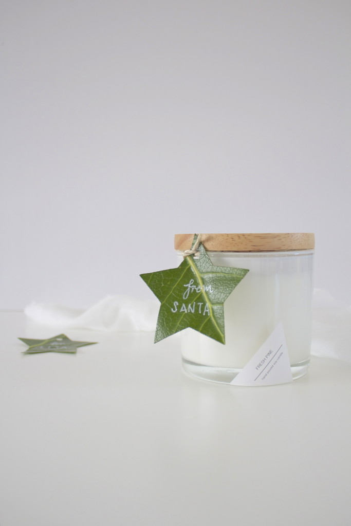
There’s nothing that reminds me more of Christmas than the smell of fresh pine. From the talented creatives behind Bloom Social and released just in time for Christmas, these beautiful fresh pine soy candles make the ideal gift. Hand poured into a beautiful thick wall glass candle jar, finished off with a natural rubber wood lid and placed in a lidded box. With a burn time of 40hours and valued at $35.00, this hand made candle would make a beautiful gift to brighten someone’s day. Day 3 – of our 12 Days Giveaway, Congratulations to Elizabeth Donnelly
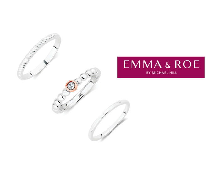
You can never go wrong with jewellery as the perfect Christmas gift for that special family member or friend. This three piece stacker ring set from Emma and Roe by Michael Hill Jeweller will please even the hard to buy for.
Included is the Cubic Zirconia, sterling silver & 10 CT rose gold stacker ring (valued $129 AU); the versatile stirling silver stack ring (valued at $39 AU); and the sterling silver ridged stack ring (valued at $39 AU). Day 7 – of our 12 Days Giveaway, Congratulations to Suzannah Newton
Gift Vouchers are often a go to in our house to make the perfect gift. The Market NZ is a great store to get a voucher from, not only is there range of homewares and gifts endless, you’re also supporter clever creatives from the land of NZ. (Our voucher from The Market NZ valued at $40.00). Day 2 – of our 12 Days Giveaway, Congratulations to Melanie (@melephant28).
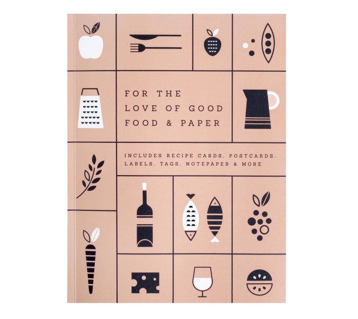
“For the love of good food and paper” is the perfect gift for that foodie lover and entertainer. Featuring Recipe Cards, Notepaper, Table Place Cards, Stickers, Labels, Tags and more, you’ll find everything you could want to get creative. Use it to style your next party or to decorate foodie gifts for friends and enjoy always having the perfect paper tools at hand. Valued at $39.95 Day 8 – of our 12 Days Giveaway, Congratulations to Manaka Cant
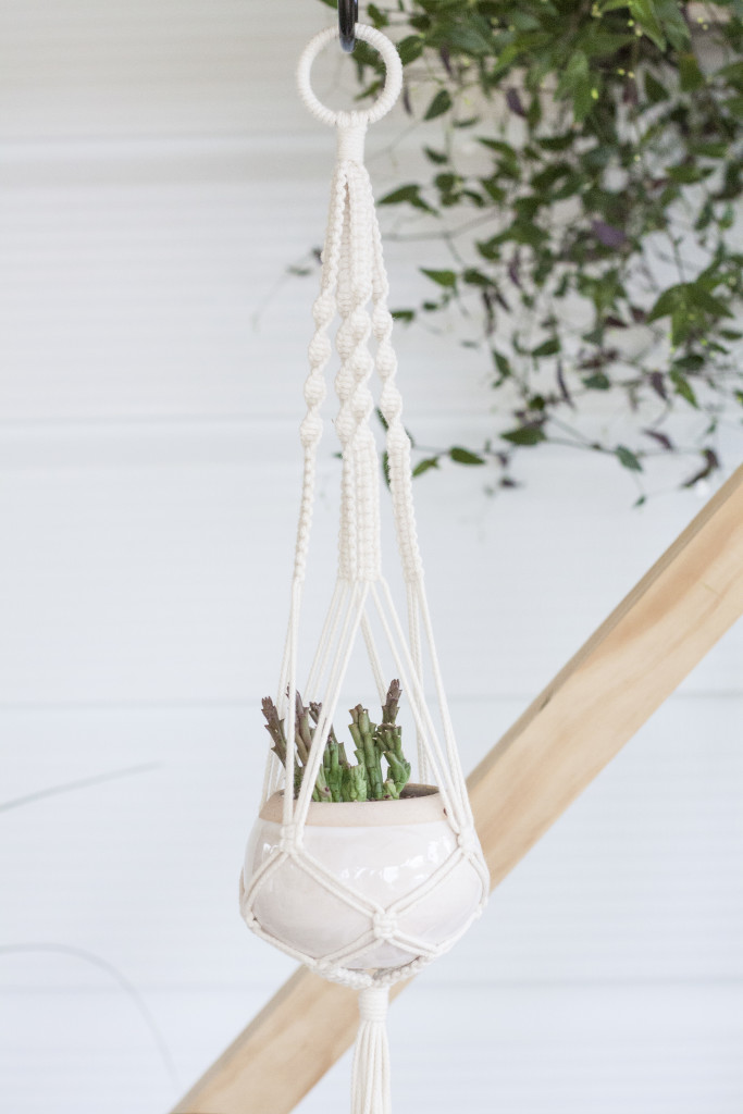
Knotty Bloom’s handcrafted macrame plant hangers are a gorgeous gift idea, giving the gift of greenery to someones life. New Zealand made with natural cotton cord, this medium hoop Plant Hanger from the natural cotton collection, will make a lasting piece that embodies a sense of comfort and care while adding new life to spaces. Valued at $55.00 – Length: 650mm (approximately 2′ 1″) * Pot is not included Day 4 – of our 12 Days Giveaway, Congratulations to Tara Ormond
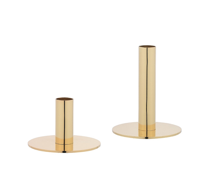
Whether you’re dressing a table for entertaining or brightening up your sideboard, these gorgeous copper Candle holders from Freedom Furniture have a luxe look. We love both sizes for the Farah candle holder at 9cm (valued at $14.95) and the Farah candle holder at 16cm (valued at $19.95). Day 5 – of our 12 Days Giveaway, Congratulations to Lianna de Jong
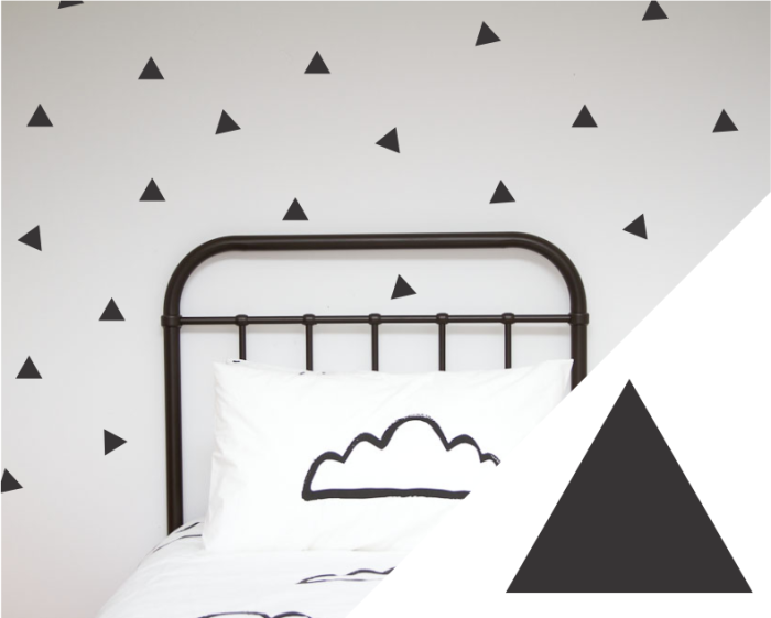
Create a fun space and brighten up any child’s room with these removeable triangle wall decals from unique homewares brand, One Hundred Percent Heart. Featured in our own home, all products are New Zealand designed and of high quality. Valued at $45.00. Day 10 – of our 12 Days Giveaway, Congratulations to Samantha Aschebrock
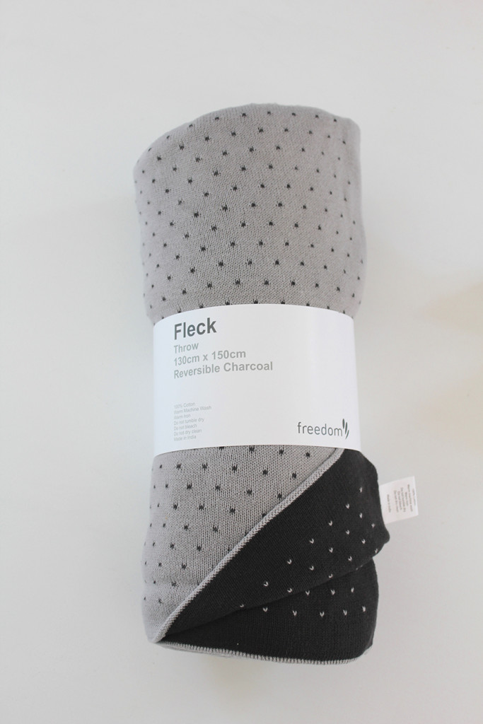
For those cooler nights during summer or snuggling up on the couch, I love a beautifully soft blanket. Freedom Furniture’s Fleck charcoal blanket is a favourite of mine, allowing you to mix up your home styling with its reversible design. Valued at $99.00. Day 9 – of our 12 Days Giveaway, Congratulations to Emma Moore
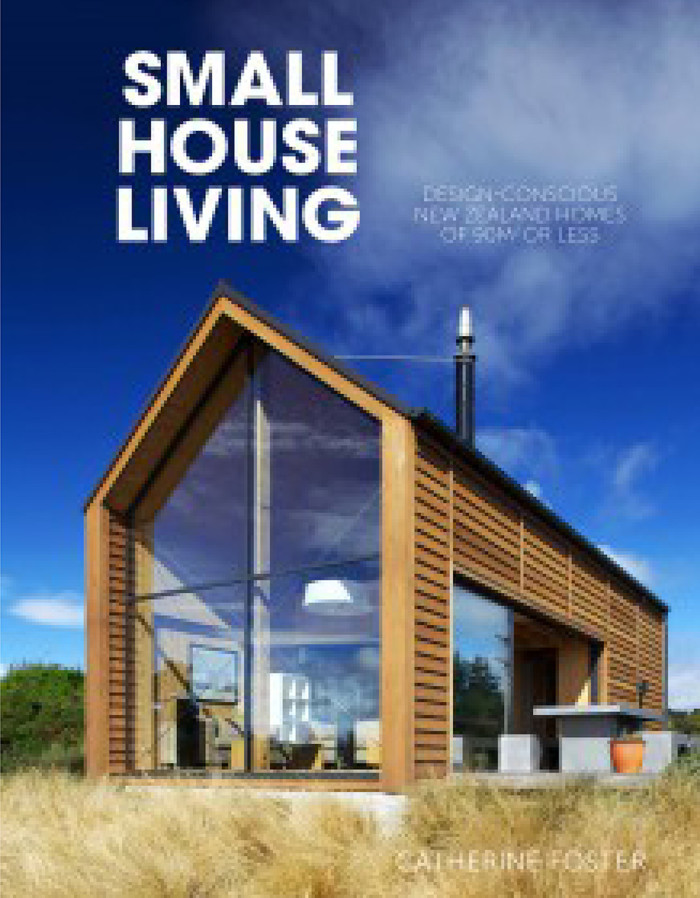
Small House Living by Catherine Foster is a favourite of mine, sitting pride of place on our bookshelf. Showcasing an inspiring collection of homes measuring less than 90m2 from around New Zealand. Family homes, beaches and apartments are included in the line-up and anyone interested in interior design will love this book. Day 11 – of our 12 Days Giveaway, Congratulations to Theresa Te Whaiti
12 Days of Christmas – The Home Scene giveaway
Terms & Conditions:
- THS 12 days of Christmas Giveaway is only open to New Zealand residents.
- Entrants can enter once on Facebook and once on Instagram each day during the giveaway.
- Winners will be randomly selected.
- A new giveaway will run at 8am each from the 1st – 11th of December, closing 11:59pm.
- On 12th of December at 8am, every gift will be run as a giveaway for one lucky recipient and will close 13th December 11:59pm.
- Winners must contact THS through email and provide mailing details. If I don’t hear from the daily winner within 2 days from their name being announced as the winner, I will redraw the giveaway.
- THS can not be held responsible if their are delays in postage due to the busy season.
The post 12 Days of Christmas Giveaway appeared first on The Home Scene.
]]>The post Foliage Centrepiece appeared first on The Home Scene.
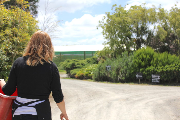
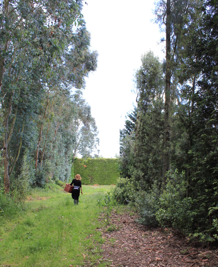
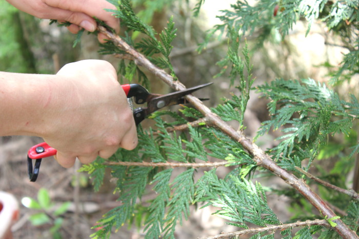
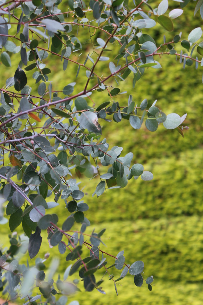
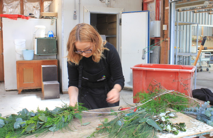
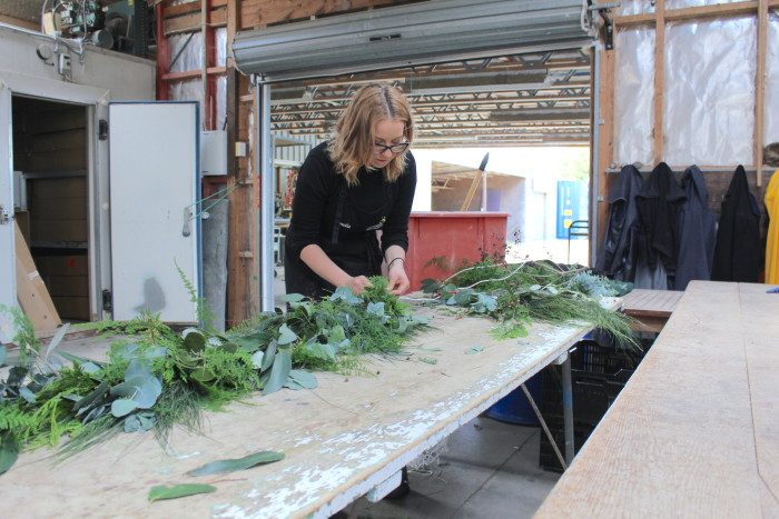
]]>I spent the morning out at one of my local gardens and followed talented florist and friend, Amelia Addis around as she foraged for the right foliage and snapped away while she worked her magic. I love the simple and relaxed style the foliage centrepiece creates.
It’s easy enough to make yourself and for those that wish to recreate the look for their own Christmas table, I’ve included some tips and tricks at the bottom of the post.
Enjoy this visual post and take a look at the complete Christmas Table setting styled in our backyard underneath our evergreen tree.
What you’ll need:
- Length of rope (doesn’t have to be super thick)
- Cable Ties
- Secateurs
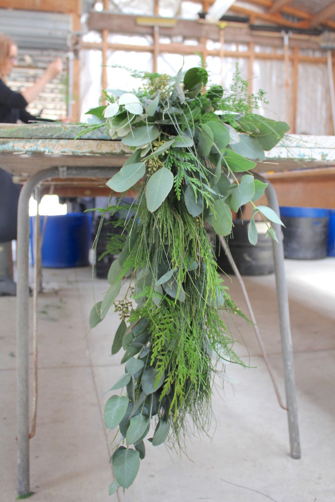
- Firm foliage (we’ve used Eucalyptus gum, Asparagus fern, Conifer and Pine)
When foraging for your foliage, make sure the leaves aren’t too soft, especially if you are making the centrepiece ahead of time and stick to evergreen varieties if you’re unsure if something is mature enough.
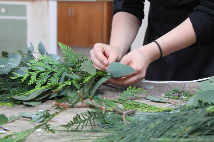
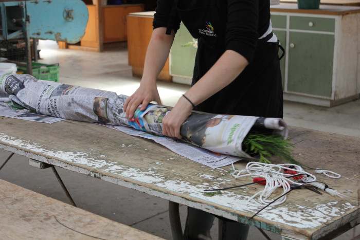
To make the centrepiece, lay out all your foliage and cut into shorter lengths. Take two or three small amounts of different types of foliage and attach them on to the rope, securing with a cable tie.
From there, select a few different pieces of foliage to create a more natural look and lay it on top of the previous section tying it off with a cable tie. Repeat this process all the way down the rope until you reach the end where you need to turn the direction of the foliage around for the last few sections.
Be consistent by using all of the foliage you have all the way through the centrepiece and mix up the varieties for texture and colour.
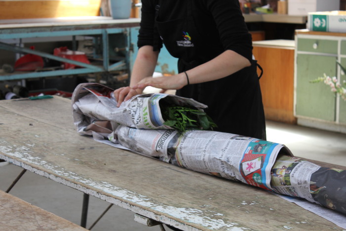
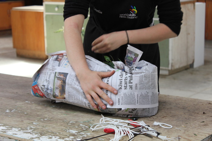
The centrepiece will keep for a few days on the table. Spritz with water every day with a spray bottle. Alternatively you can keep it for up to 5 days by wrapping the centrepiece up, (as per below) soak it in water, place it in a bag and store it in a cold, dark place.
The post Foliage Centrepiece appeared first on The Home Scene.
]]>The post DIY Recessed bedhead appeared first on The Home Scene.
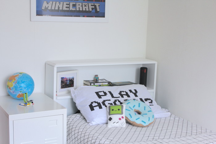
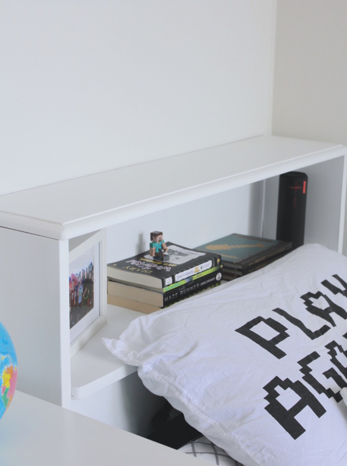
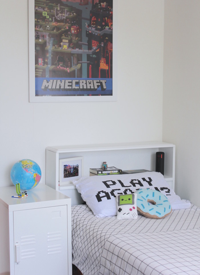
]]>Although Jimmy’s room had been made over, our older son Dylan had been a work in progress while I was still searching for a few key pieces to finish the look of the space. His bed had always looked unfinished and I wanted to find a bedhead that suited his room.
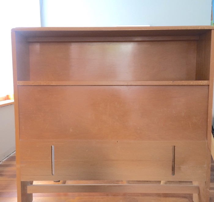
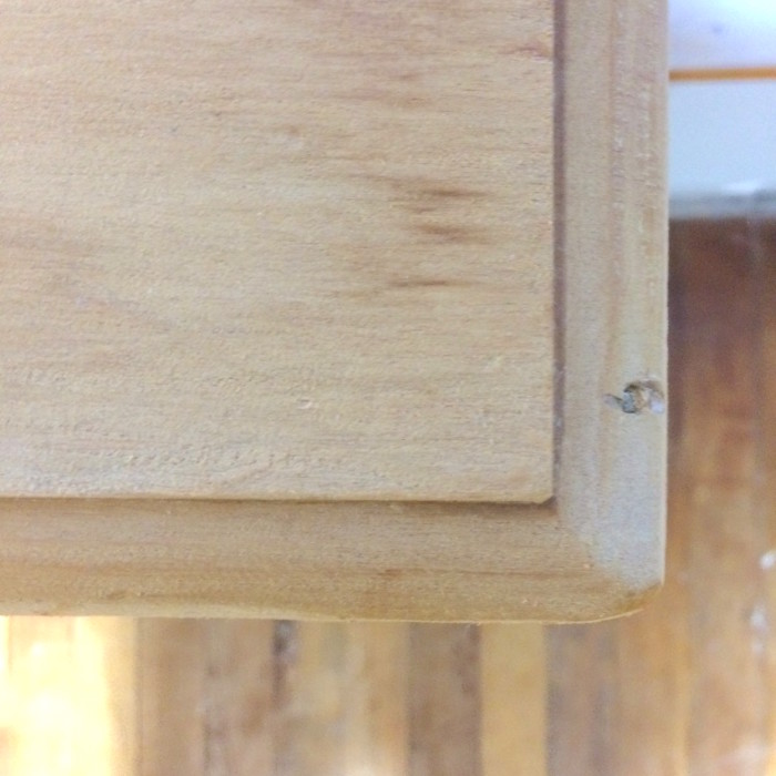
While searching through our local Red Cross, I stumbled across an old timber bedhead with a recessed shelf. The bedhead was the perfect size, and didn’t have any structural damage to it. It was simply in need of a good sanding to remove the yellow tinged varnish and smooth out some of the rough finishes to the timber.
Better yet it was only $5 and if Dylan didn’t like the finished product, we could return it to Red Cross or sell it. Plus a fun weekend project to get stuck in to with the boys and a good excuse to get out the power tools and paint.
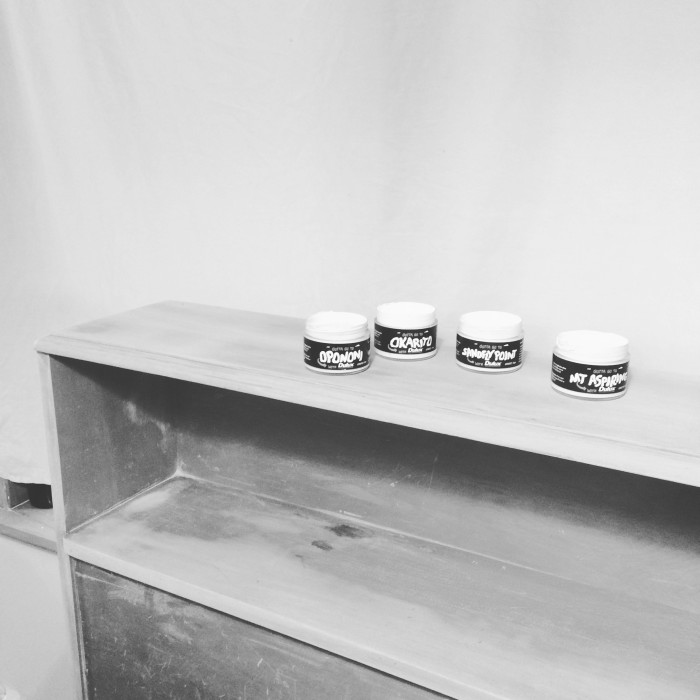
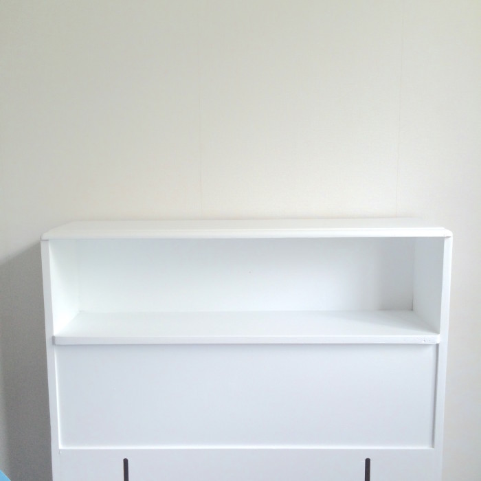
Initially the yellow stain was throwing it off for me and I wasn’t 100% sure if it was going to work. After sanding, priming and painting in Dulux Okarito White, the finished product was better than expected. A cheap project for a total spend of $15 and a great functional piece of furniture that Dylan can style himself.
The post DIY Recessed bedhead appeared first on The Home Scene.
]]>The post Print by George appeared first on The Home Scene.
]]>Her works feature as a firm favourite in our own home, and following her move to New Zealand from the UK, her talents are increasingly becoming known across New Zealand and Australia.
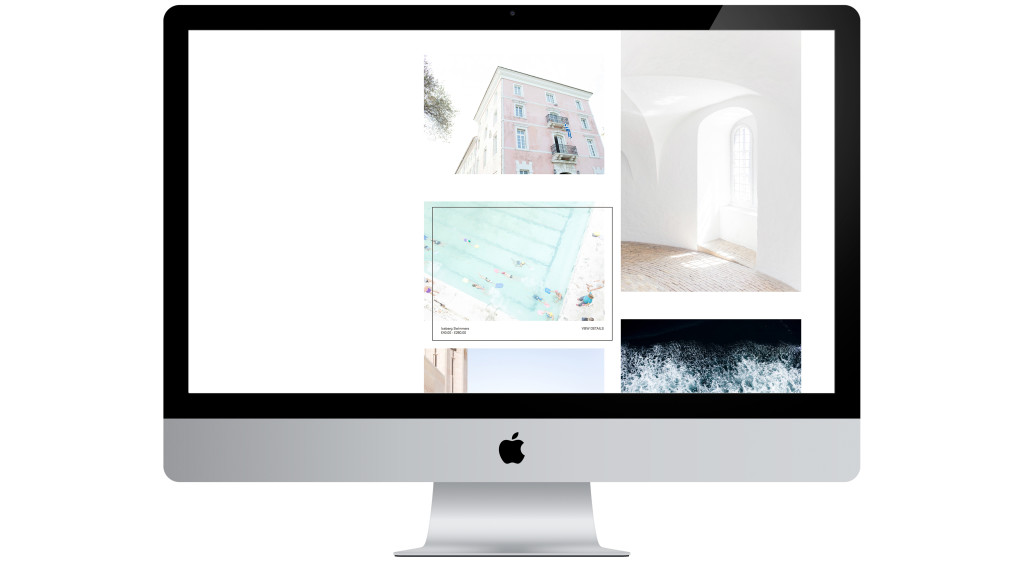
Georgina has become a dear friend since I was introduced to her work, so it is a pleasure to announce the relaunch of Print by George exclusively with THS readers. The relaunch features new works and products (including Christmas cards and wall dots) and an all new website.
I recently chatted with Georgina to find out what inspires her, why the relaunch and what lies ahead for Print by George.
+ Describe the process of creating and launching this new site?
I created my original website myself. It was very much a DIY project to get things up and running as soon as I could, but a year down the line, I felt it needed a facelift by someone with a graphic design eye! Everything needed to work and have an identity and I wanted the labelling, packaging and website to be cohesive.
I did some research and received recommendations for graphic designers and soon met with Auckland based Natasha Mead. Her work seemed to have a particular theme running through it and I just fell in love with it. I knew she would be able to help me achieve what I wanted Print By George to look like.
+ What do you love about the site?
I adore how the whole site has come together, but in particular, the way the products are easy to access on the home page. It makes the browsing and shopping experience simple for even the most computer illiterate person. All the prints and cards are accessible under the one page without having to chop and change with menus.
+ What was the design brief?
It needed to keep buying and browsing easy, yet display the prints in a beautiful way. I hate nothing more than trying to purchase something over the web and it’s one busy, complicated process. I wanted the experience to feel enjoyable, clean and obvious to anyone using the website and wanting to purchase a print or to simply get in contact with me.
+ What inspires you?
My direct surroundings, whether it be social media, the farm, travel, the landscape or light. My camera is attached to my hip these days living out on a farm and in New Zealand! It is so beautiful everywhere I turn that it’s hard not to be inspired on a minute to minute basis!
+ What do you love most about your job?
The freedom of being your own boss! Having said that, it’s a double edged sword – you don’t just stop doing what you love and if something goes wrong, you only have yourself to blame! I often work through the weekends and Mondays are now becoming a thing of past for me, but I love what I do. I love being able to step away from my desk to shoot and have a change of scenery, but if its a wet day, then it’s nice to have the option to stay inside and catch up on emails and admin. Living in New Zealand now with my family and home being back in the UK, the best part is that my work can travel home to England with me and I have no restriction needing to be at the ‘office’.
+ What grand plans do you have in store for Print by George?
Over the next year, I am in the process of planning to launch a limited edition run of framed prints, exclusively for New Zealand customers. I have only just started thinking about it, so won’t be for a little while longer yet, but definitely something I want to offer. I am also hoping to work with more international retailers and get some exclusive prints in stores.
+ Is there anything you haven’t shot yet that you would love to?
There are a thousand places I could list off that I would love to shoot. I love to travel and see different cultures and countries, so I am forever writing a list of the next stop I want to take on my journey. I just need to get over my fear of flying first…
+ Do you have a favourite print?
Trying to cater to all tastes means I have a love/hate relationship with them somedays. I have spent a lot of time trying to work out what I want to sell on the website, but overall I of course love the prints. Some more than others, but a personal favourite for me would be the water ones called “Wake 1′ & ‘Wake 2’. I have one framed up at home and I have always said I want to live by water; now I have my wish…it has a similar calming effect!
+ Career highlights?
You can never tire of seeing and hearing the joy that your work brings to people and it is particularly touching when people buy my prints for a gift to their loved ones.
I have always enjoyed emails popping through from customers with a photo of my work printed and framed, up on their walls. It makes you feel like your hard work and long hours/weeks/months is paying off.
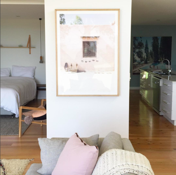 Moroccan print as seen styled by Petite Vintage Interiors for a clients Beach house.
Follow Georgina’s work and head over to admire her gorgeous new site and prints:
Website: printbygeorge.com | Instagram: @printbygeorge | Facebook: Print By George
The post Print by George appeared first on The Home Scene.
]]>The post DIY Marble Bottles appeared first on The Home Scene.
]]>I recently stumbled across the brand Clever Poppy (through that wonderful thing called Instagram) who specialises in creative DIY projects and ready made kits.
I know there are a number of you out there loving the marble trend and would love to try this in your own home so I contacted Julie, the talented creative behind the brand, to try it myself.
Julie created Clever Poppy to allow individuals to create something beautiful for their home, without the hassle of sorting out supplies, instructions and creative planning.
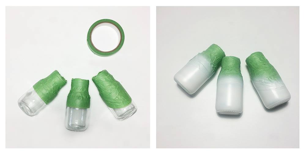
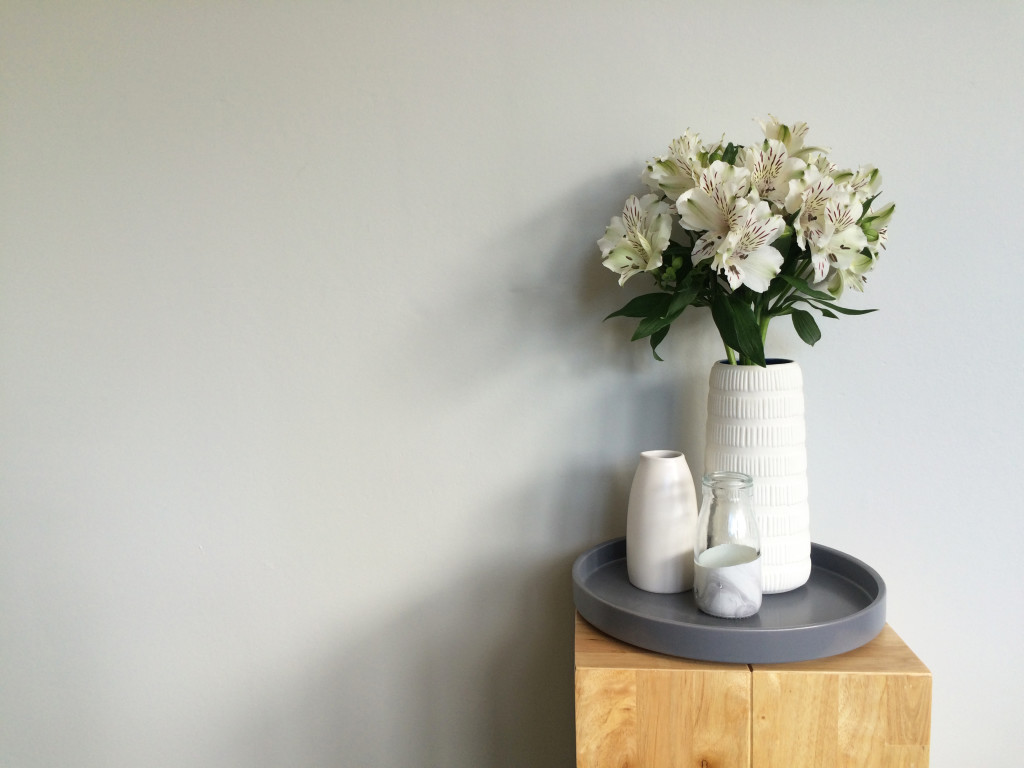
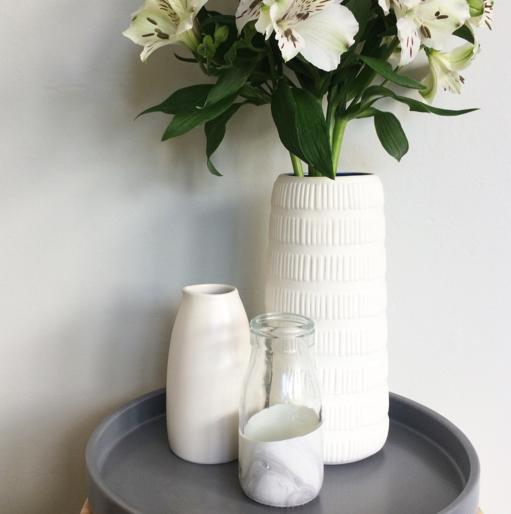
The DIY Marble Bottles kit is a new product just launched. The kit arrives with all the materials you need to complete the project and was incredibly simple to do. Without giving away her secret to the getting this soft marbled look, here’s a wee glimpse at my bottles I created and the finished product, styled in our home.
I love the marble effect on the finished product and that you can play around with the dipping process to create your variations on the effect – however simple or strong you like it to appear.
-Kelly.
The post DIY Marble Bottles appeared first on The Home Scene.
]]>The post My Favourite Room with Unna Burch appeared first on The Home Scene.
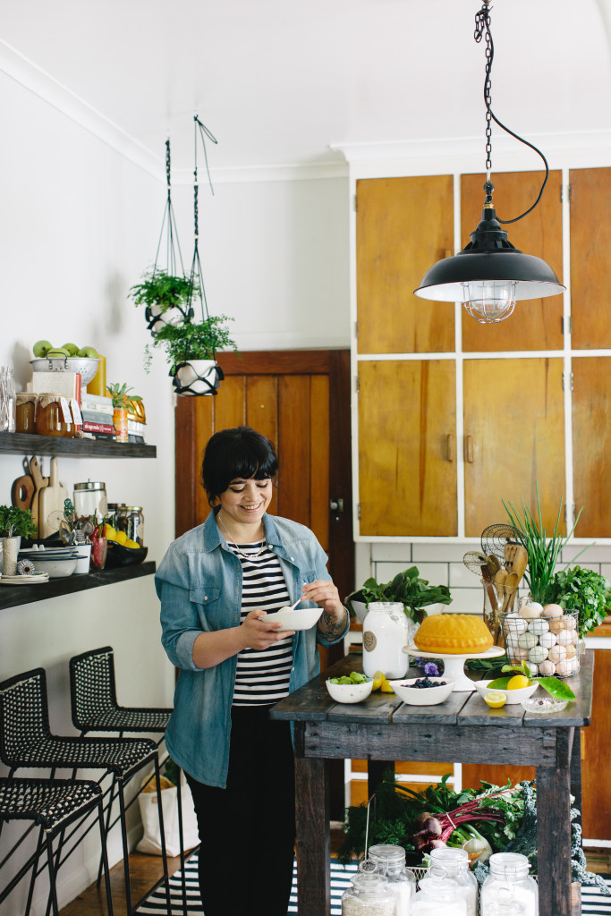
]]>A true fan of Unna’s food philosophy and lifestyle, Unna was a natural to be featured in the My Favourite Room series. Here Unna gives a glimpse in to her favourite room and why this space is so special.
+ What is your favourite room in your house?
I love my Kitchen! You knew I’d say that though, ha.
Benjamin and Elise photography and cover image Tim and Nadine Kelly
+ What do you love about this space?
I love that it is a mixture of old and new with a good measure of DIY in there too. My husband is a builder so he sproosed the space up over a few weekends. He made an awesome trolley/island out of an old work bench, added a wooden top, blow torched it in spots to give it a similar character to the existing framing and stained it all. It’s on castor wheels so it can be moved around, the idea was so that I could push it to natural light if I wanted to in the lounge and photograph on it (but I still prefer shooting on white rather than the wood look ATM).
The wooden cupboards I hated when we first moved in, but they have grown on me. They are a pretty iconic Kiwi kitchen feature. I like them now with the white subway tiles around them, it balances out that old and modern feel. The floating shelves I love; a place to store all my favourite kitchen treasures and styling props (and high enough so the kids cant reach haha). I often change the shelf around to give the kitchen a different look. Always on display is my Wundaire ceramic collection, lots of green plants, old tins and my Grandfathers Leica camera. I also love the black retro stools which live under the shelf. We brought them on trade me for $42 for the trio. The kids or when people come over, pull them up to the trolley and sit with me in the kitchen while I’m cooking.
The thing that pulls the room together for me is the light fitting, adding that extra bit of modern. Its a small kitchen, but I like it. My future kitchen will have a lot more storage and a big walk in pantry! (DREAMS!!!!)
Photography: The Forest Cantina
+ How would you describe this room in three words?
Wooden, modern, kiwi.
Photography: The Forest Cantina
Details:
Book: My Garden Kitchen | Website: theforestcantina.com | Instagram: @the_forest_cantina |
The post My Favourite Room with Unna Burch appeared first on The Home Scene.
]]>The post Yorkelee Prints appeared first on The Home Scene.
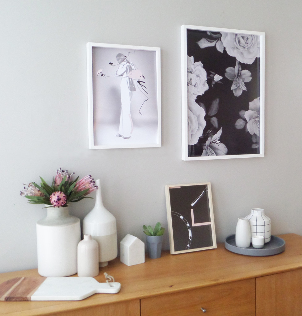
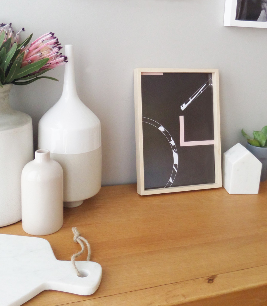
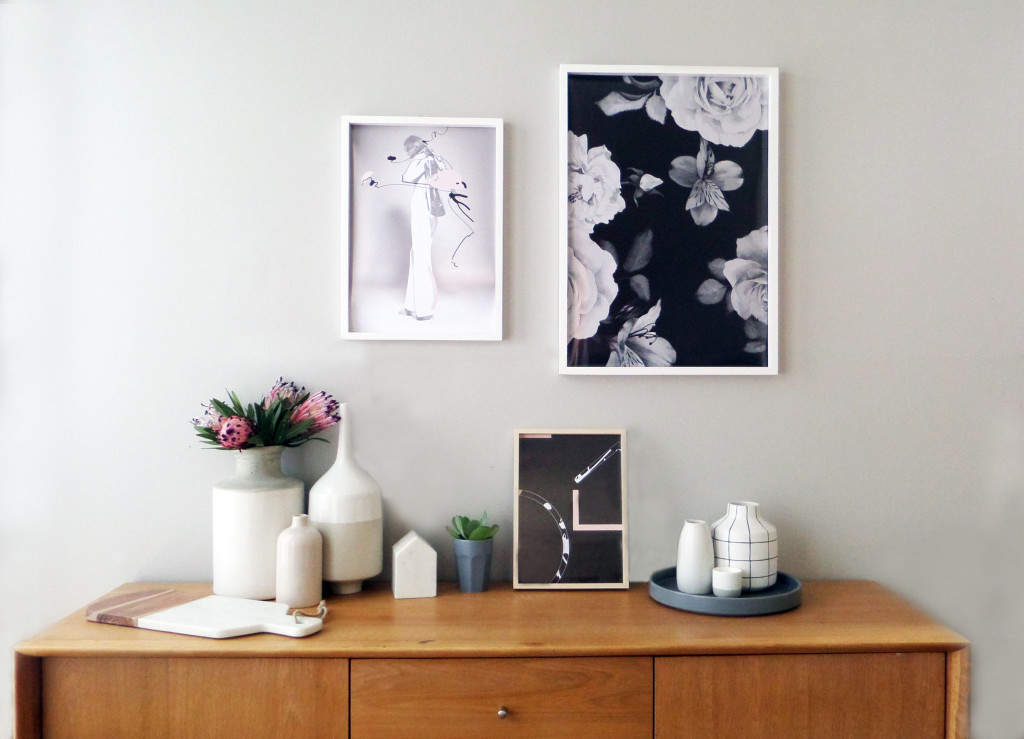
]]>As an extension to the current range, Kate has released three new premium prints and true to her philosophy that everyone deserves to have a stylish interior, these prints are simply stunning. I spoke with Kate on what inspired this new range and had the opportunity to style these prints in my own home.
+ What inspired this new range?
We are all about unique, creative, affordable prints, we have those, lots of them, but our new premium range is about expanding our product offering. This new range comes from wanting to print on higher quality paper stock for some time and my desire to go a little “darker”, designing prints specifically for designers and style enthusiasts.
+ Describe your style aesthetic in three words
Minimalist. Artistic. Refined.
+ What do you love most about what you do?
I love creating and being inspired. I get a real buzz out of designing something people love and it makes my day seeing our designs in customers homes and seeing how happy they are.
+ What might we see in the future from Yorkelee
Lots of collaborations, innovation and creative, progressive designs.
+ How did you got into this business?
I studied graphic design at university for 4 years back in 1999, before moving straight into the advertising industry working for a few different agencies before starting at ZOO Advertising. I worked in various roles at ZOO including Studio Manager and Operations Manager, whilst studying media buying and a diploma of business.
After going on maternity leave from ZOO to have my first child, I feel in love with the relaxed lifestyle of being at home and seeing my little one grow up. I soon wanted more though, after getting bored very easily and always have to be doing something! I started styling our home, it quickly became an obsession and when I couldn’t find the style of prints I wanted at an affordable price, I decided to design my own. It went from zero to a hundred in a matter of months and during this time I realised this was my passion, something I loved and something I wanted to do full time.
Details:
Website: Yorkelee Prints | Instagram: @yorkelee_prints
Yorkelee’s premium prints are available in medium A3 size 297mm x 420mm – $45 AU, large 500mm x700mm – $65 AU, and custom sizes upon request.
The post Yorkelee Prints appeared first on The Home Scene.
]]>The post Tempo Stools styled three ways appeared first on The Home Scene.
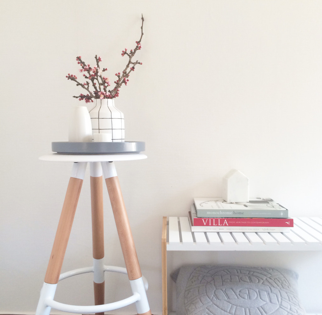
]]>A little styling inspiration for your own home, here are three ways I’ve styled the white Tempo Stool in our home.
Styled alongside the popular Jimmy Stand, I’ve displayed minimalistic vessels on one of my favourite flat ceramic trays and added seasonal cherry blossoms. The Jimmy stand is regularly styled with my new books and use it to store extra cushions and blankets for those times you like to lay on the floor and read in the sunlight.
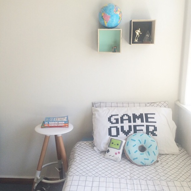
In our oldest son, Dylan’s room, he loves a simplistic style with minimal clutter to provide space for him and his friends to hang out. He loves using furniture in different ways and liked the idea of having a stool as his bedside table. Often bedside tables can get cluttered with ‘stuff’ and using a stool in its place allows you to hold the essentials.
For Dylan, thats a few books he’s currently reading and of course a place to hang his headphones, with his love to chill out and listen to his favourite tunes on his bed in the sun.
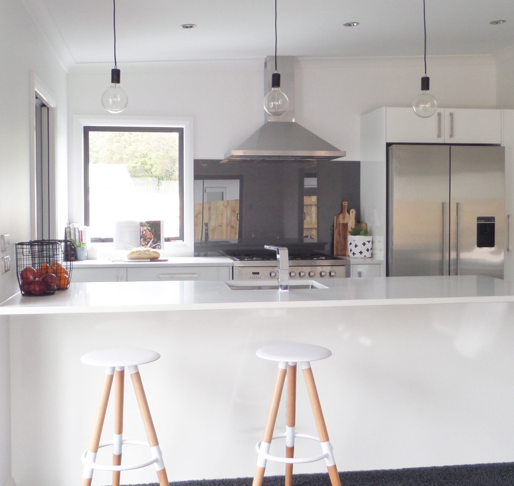
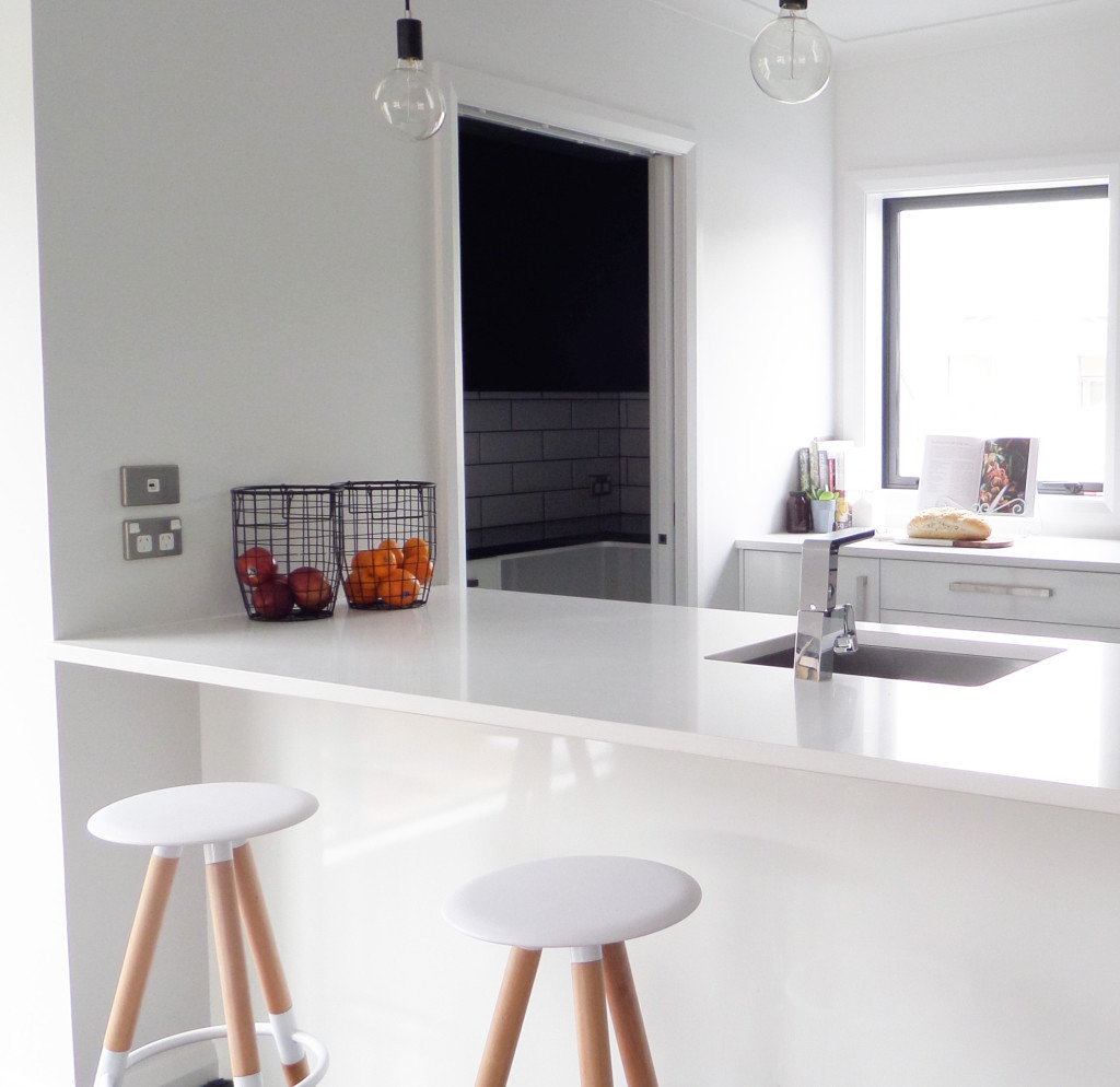
The most obvious space for these beautiful stools to showcase their design and functionality is in the kitchen. The modern design integrates itself seamlessly, here adding a warm, wooden element to the kitchen.
How would you style the tempo stool in your home?
– Kelly
The post Tempo Stools styled three ways appeared first on The Home Scene.
]]>The post My Favourite Room with Blonde and Bone appeared first on The Home Scene.
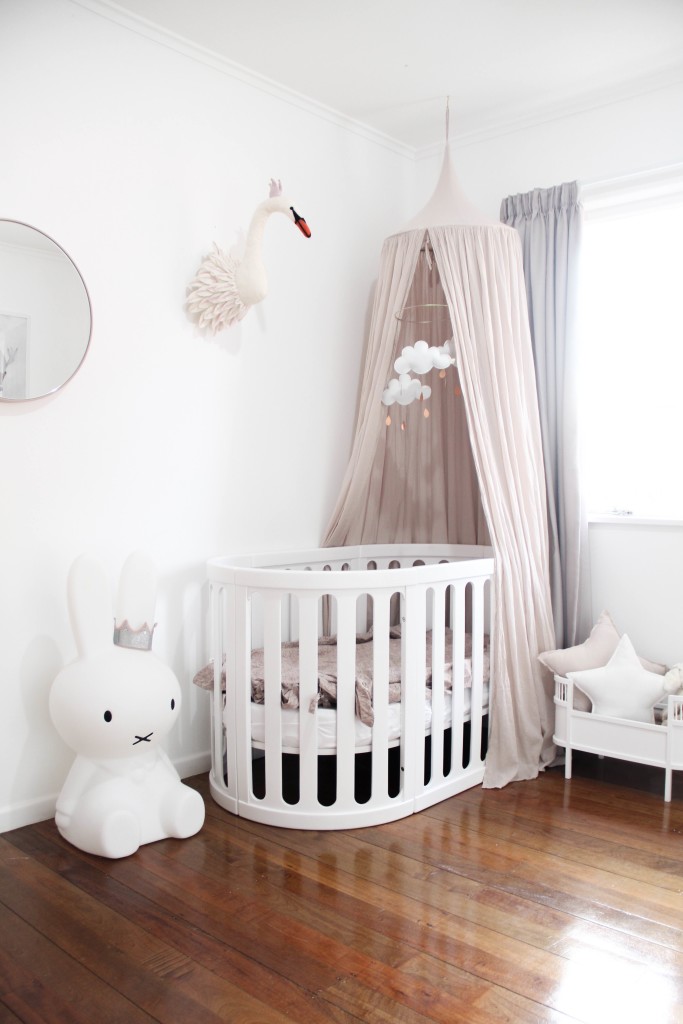
]]>The first in the series features the dreamy nursery designed and styled by the lovely Hannah of Blonde and Bone. One of my favourite Instagram accounts to follow, Hannah styles her home with beautiful Scandinavian design influences. A graphic designer and marketer, Hannah also runs children’s print label, Frankie Says.
+ Where do you live?
We live in Whangarei, Northland which is roughly two hours North of Auckland. Both my husband and I grew up here and really enjoy the slow pace of life and huge selection of beaches Northland has to offer.
+ How long have you lived here?
We are currently renting an older style home which we have been in for two years. We have the perfect amount of country space here with a large backyard and native trees all around us. It really is a peaceful place to live!
+ What is your favourite room in your house?
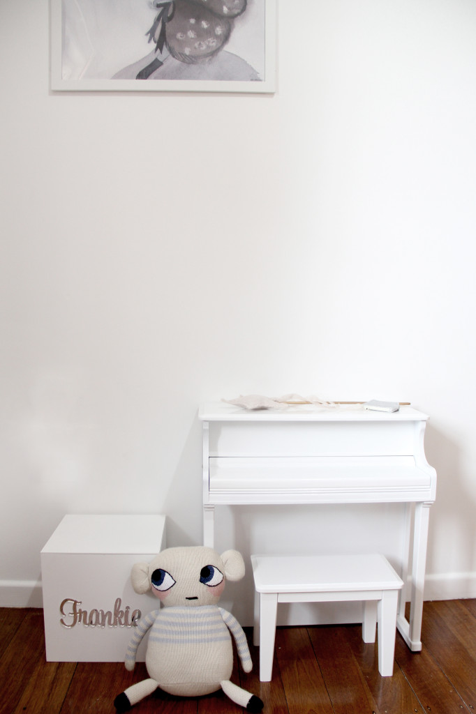
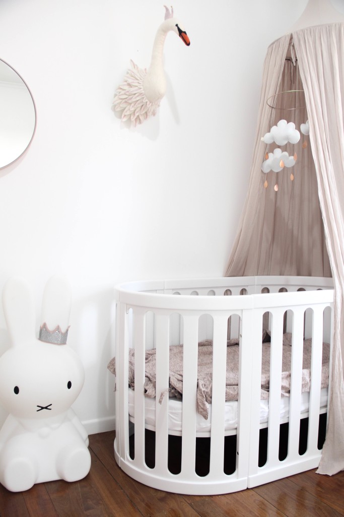
As we are renting, the only room we have renovated ourselves is our daughters nursery.
+ What do you love about this space?
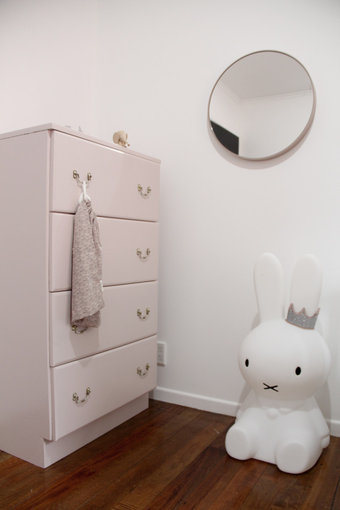
As much as I love how it looks it also means so much more than a beautiful appearance to me. It is a room full of memories, of stripping wallpaper and painting before she was born and long nights comforting a new baby too. Aside from all of the beautiful memories I have associated with that room, it is such a light, warm and a soft space for our little girl to call her own.
+ Describe Frankie’s room in three words
Simple, light and dreamy
+ How do you spend your days?
I work part time in a design studio, pre pregnancy I was a graphic designer but have now fallen into a graphic design/marketing hybrid role which I really enjoy. The rest of my time I spend working from home which is a mix of graphic design, room styling, product photography and blogging for various stores and labels. My most important job is being a mother to our 9 month old daughter Frankie so balancing work life with this has been something that has taken a while to get use to.
Details:
Website: Blonde and Bone | Instagram: @blondeandbone
The post My Favourite Room with Blonde and Bone appeared first on The Home Scene.
]]>