The post My Favourite Room with Live Loud Girl appeared first on The Home Scene.
]]>Originally from the Netherlands and now residing in Dubai, Linda created Live Loud Girl blog in 2014 after travelling the globe and wanting to create a platform to share her inspiration. What started out as a passion project has flourished into a successful interior styling business. From styling rooms for little ones to grown up interior projects, Linda and her team love simplicity while embracing statement pieces and combining vintage with new.
Linda recently spoke with me about her favourite room and what she loves about the space.
+ What is your favourite room
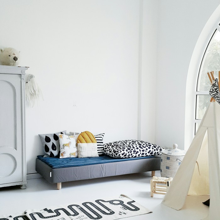
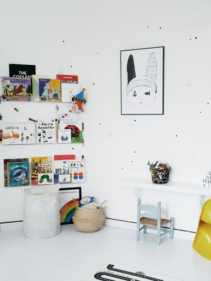
Not an easy question to start with for an interior designer haha, but I guess the room that makes both me and the boys very happy is the playroom. It is Jack (5) and Sam’s (4) own little territory in the house where they hang out after school and in the weekend if we are not at the beach.
+ What do you love about this space?
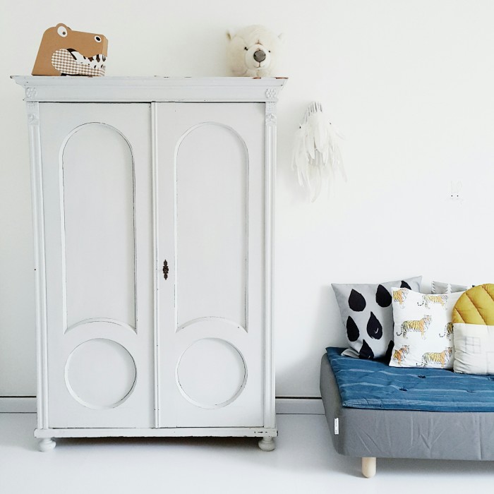
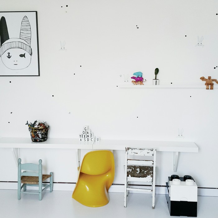
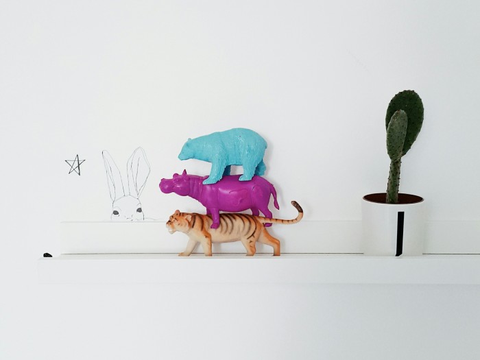
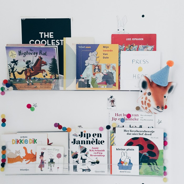
The great thing about having a kids playroom is that it can be changed around according to their style and age. Lucky for me because I just love to do so. This room has a good balance in terms of furniture. There are some items from my own childhood combined with some funky and new accessories.
One of the newest additions in the room is the lounger since I wanted to give my bookworms a place to read. I created this corner by pimping an Ikea bed with birch wooden legs and some mix and match mattress covers. It gives the room a Middle Eastern touch.
+ Describe this space in three words
Dapper, light and playful
+ How long have you lived in this space?
We have lived in the new house for 4 months now as we recently moved neighborhoods. We fell in love with the amount of light in this house, the arched windows and being in walking distance to the beach. For me it was a great opportunity to change around the playroom and update the bedrooms. It has been an ongoing project since somehow I can never find enough time for styling my own home.
+ In your own words, how would you describe what you do for a living
If only I knew… I am a mom, a blogger, the founder of Live Loud Girl and an Instagram addict, in any random order, depending the day. I work when the kids are at school and spend time with them when they are home. And, like with any working parent, that happens like every other never.
My days can be filled with finding the perfect item for a room styling to driving to IKEA five times. That is also what makes my job so much fun, there is never a dull moment. Its all work hard, play hard, Live Loud – Why not?!
Details:
Styling: Linda of Live Loud Girl | Website: liveloudgirl.com | Instagram: @liveloudgirl
Love Linda’s styling in her son’s playroom – what is your favourite element?
The post My Favourite Room with Live Loud Girl appeared first on The Home Scene.
]]>The post Flagship Eatery appeared first on The Home Scene.
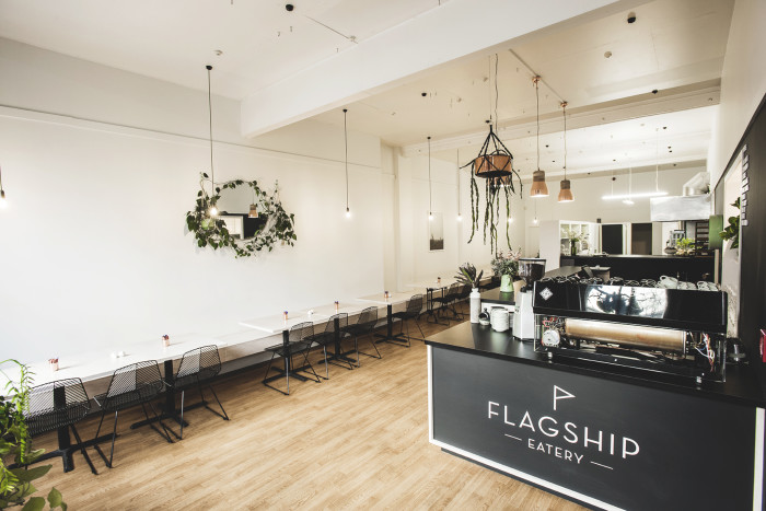
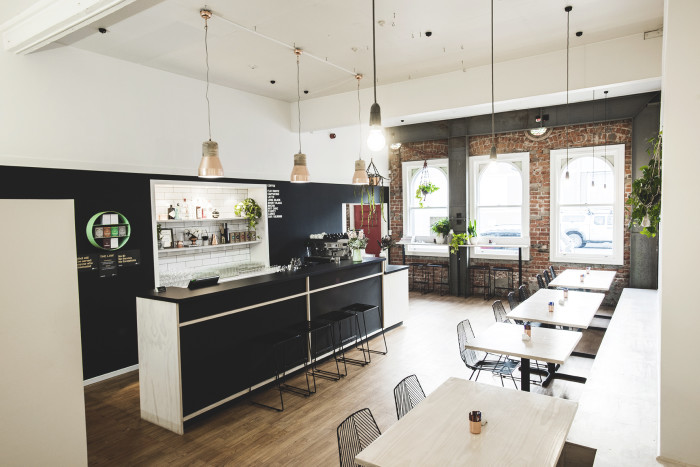
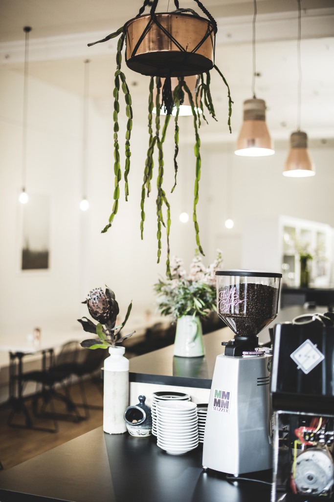
]]>The cafe’s interior hits all the right design features from the exposed brick wall to the blond ply and monochrome details and the abundance of gorgeous plant life throughout. I recently caught up with owners Christine and Tom, who also run neighbouring USSCo restaurant, while back in my home town for Christmas.
Where did you take inspiration from when developing the concept for Flagship Eatery?
Tom and I have spent years eating out at cafes and restaurants around the New Zealand and abroad. We drew inspiration from lots of our favourite places, cafes that felt relaxing to be in and not overly styled. Having a restaurant that stands the test of time is our goal for USSCo so we applied that same approach to designing Flagship – classic, pared-back but easy to update.
What did the design process involve?
The café had been completely stripped by the previous owners which was a blessing as we knew in order for a new business to succeed in that location, it had to have an entirely new identity. There was nothing from the previous café we wanted to retain. The key design focal point of the café is the bar/coffee area so constructing that point of sale took up a substantial portion of our budget.
We worked with Shane Kingsbeer from Kingsbeer Architecture to draw up plans for the bar as it was so important that the builder, joiners, plumbers and electricians were all on the same page. We were on a budget and definitely couldn’t afford mistakes! A huge and costly part of the renovation was setting up the kitchen as there literally weren’t even taps. We needed absolutely everything. The space is small and as an open kitchen design we needed it to be super functional whilst also being visually appealing. We worked closely with Josh Hill from Southern Hospitality in setting up the kitchen and he was really helpful, from assisting us with choosing the right equipment, right down to custom building stainless benches.
How long did the renovation process take?
From when the builders first started until we opened our doors, it took three months. Prior to the building work even starting, we spent two months thinking the project through and planning. Looking back, we are so grateful we had the time to do that as by the time work began, we had refined our ideas and as a result, avoiding any costly mistakes.
Flagship Eatery is housed within the restored Union Steam Ship Co building, what heritage details did you retain internally during the renovation process?
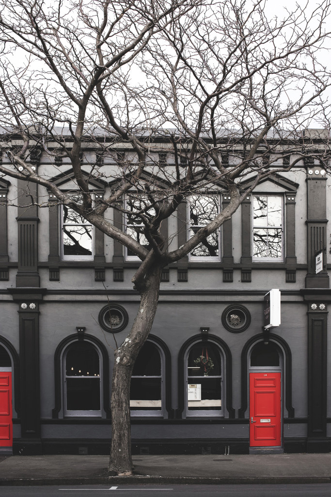
Our landlord did a wonderful job of restoring the entire building 12 years ago with all the best elements retained and enhanced. Inside the front interior of the café is beautiful stained glass portholes, an exposed brick wall and steel reinforcements that all helped guide our design aesthetic.
What are your favourite design details from the finished look?
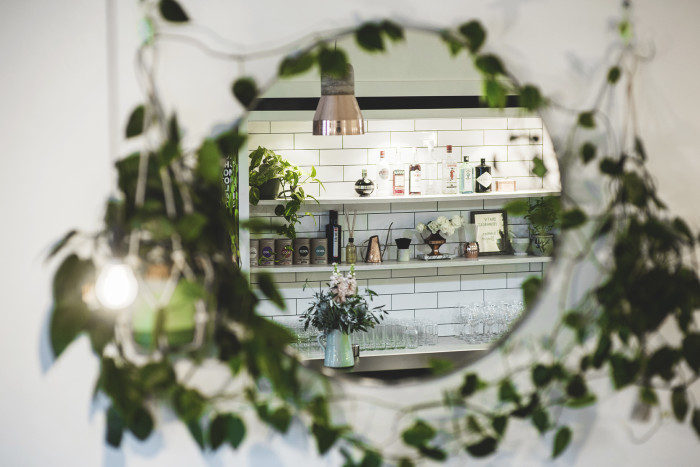
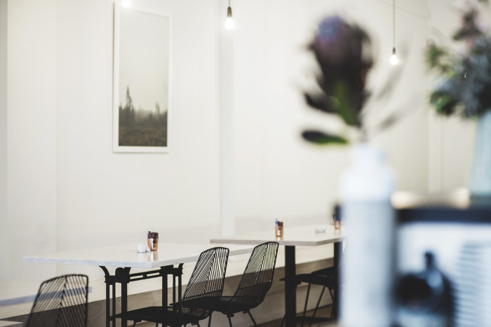
I don’t think there are any overly dominant details to the place, but all of the elements such as the copper accents, blond ply, subway tiles, and monochromatic colour scheme contribute to achieving the clean and fresh aesthetic that we were aiming for. I’m a crazy plant lady so the round mirror surrounded by the heart-leaf philodendrons makes me pretty happy, as I’d been growing them at home for ages before I decided to give them to Flagship. And we also love our Perspex coffee machine from our mates at Flight Coffee.
What are you most looking forward to during Flagship’s first summer?
Hopefully being nice and busy throughout, offering people the numerous visitors from outside of Gisborne a new place to enjoy and selling a few plants and flowers. I recently introduced a small range of house plants and fresh cut flowers through Flagship, a perfect complement to the café, making it look and smell amazing.
Being housed next door to your bistro restaurant, USSCo, how do the two benefit from neighbouring locations?
Ussco customers often asked us about opening for lunch but we thought it could be detrimental to our dinner trade, so it is nice to finally have a daytime offering that doesn’t detract people from dining with us in the evening. Lots of our dinner customers now dine at the café for breakfast and vice versa. Then of course there are the practical benefits like sharing stock across both locations, offering flexibility of hours to our staff and if we run out of anything we have a whole other kitchen next door. It’s super handy!
What’s next in store?
After recently introducing Temple of Flora – the botanical aspect to Flagship Eatery, I hope to expand this business aspect this year. With a 3 year old and 11 month old with a baby on the way, I really enjoy the botanical side of the business so I’m excited to do more with it once things have settled down a bit with the new baby.
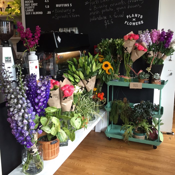
A gorgeous beach town and laid back summer spot, if you find yourself in Gisborne, make sure you drop by Flagship Eatery and tell them THS sent you.
Details:
Design & Styling: Christine & Tom Boyce | Brand Identity: Jaimee Clapham | Joiners/Tiling: Maurice and Shane Clayton| Builders: Wayne Bartram & Torleda Murray | Painters: Mitch Teesedale, Swift Painting | Electrician: Marty Lloyd | Photography: Strike Photography
The post Flagship Eatery appeared first on The Home Scene.
]]>The post Favourite Interiors of 2015 appeared first on The Home Scene.
]]>We take a look back at some of our favourite interiors of 2015.
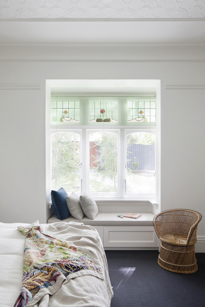
Elwood Residence
Behind the façade of this handsome old Edwardian home unfolds an unexpected contemporary interior, which is both elegant and timeless. Take a tour of Elwood Residence
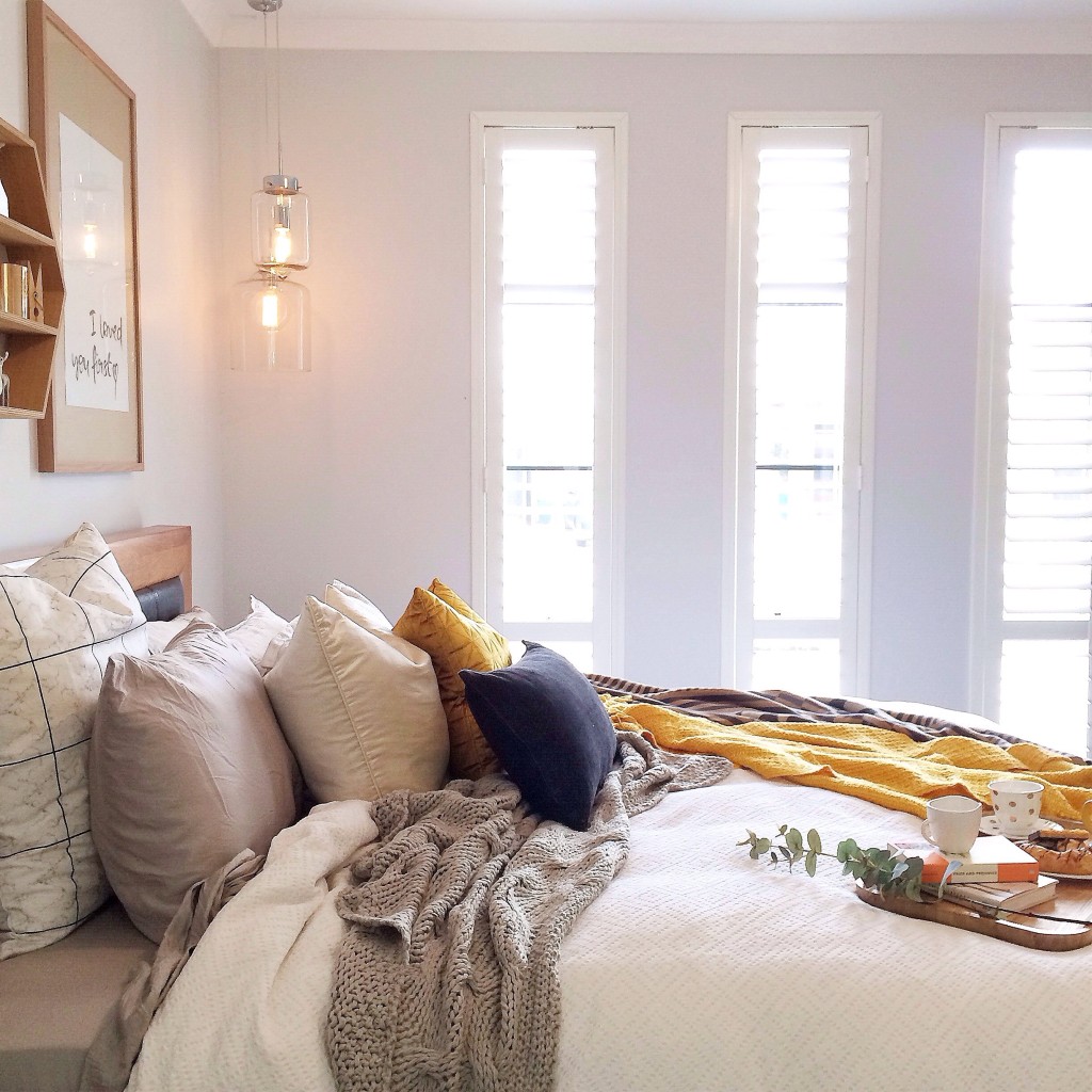
Kyree Meagher
A place to escape and unwind in all its luxurious beauty, welcome to the home of Kyree Meagher, interior stylist for Kyree Interiors. A long time favourite of mine, I was honoured to feature her home as part of the ‘My Favourite Room’ series. Take a Tour of Kyree Meagher’s Favourite Room
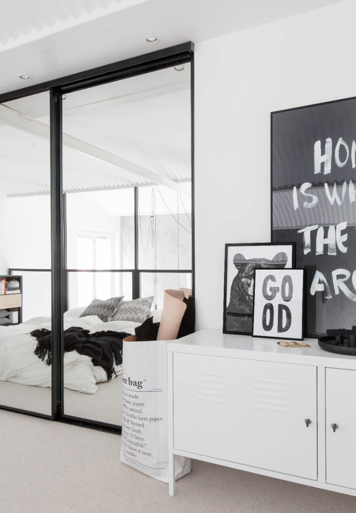
Scandinavian Loft living
Light, bright, airy spaces, and simplistic timber materials caught my eye and my heart in the home of Bo staff member Jutta Kodin Jutta. Take a Tour of Scandinavian Loft Living
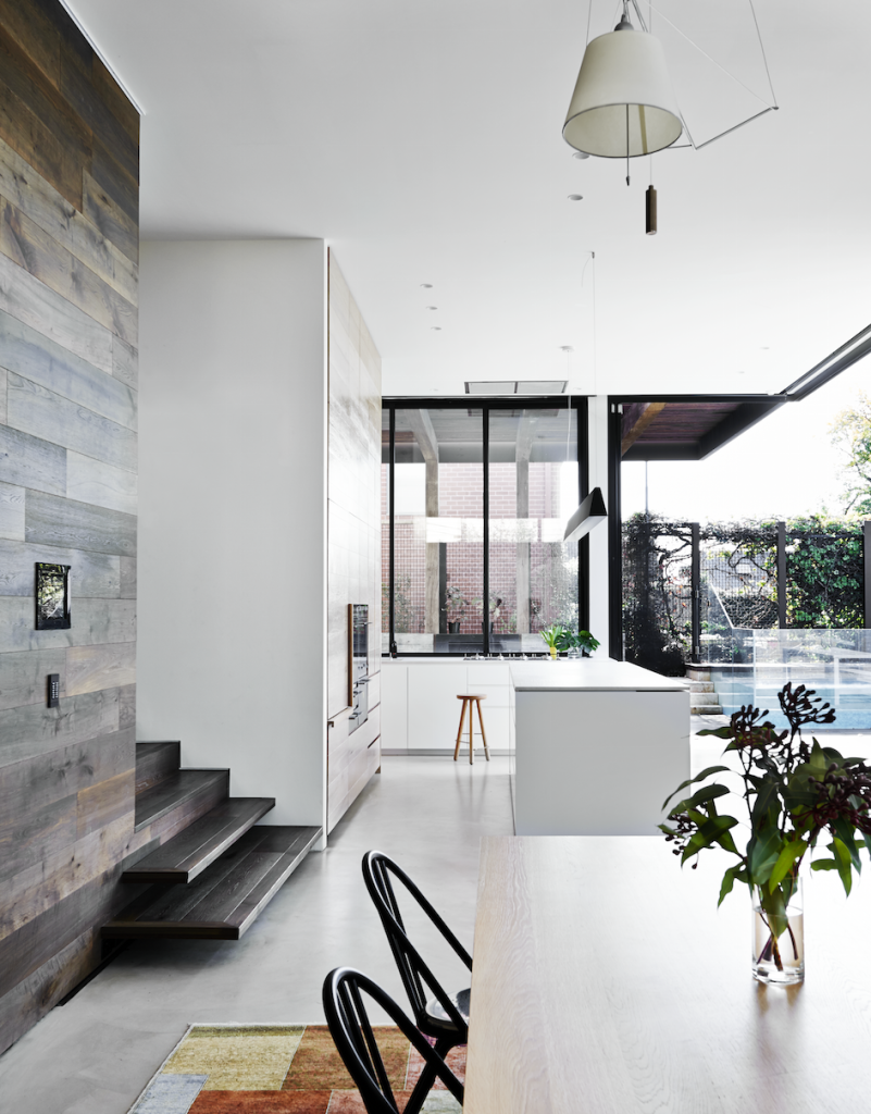
Malvern House
Restorations hold a special place in my heart and this Victorian residence is one of my absolute favourites. Restored and revived to meet the challenge of another hundred years, this warm and textured palette seamlessly integrates between old and new interior architecture. Take a Tour of Malvern House
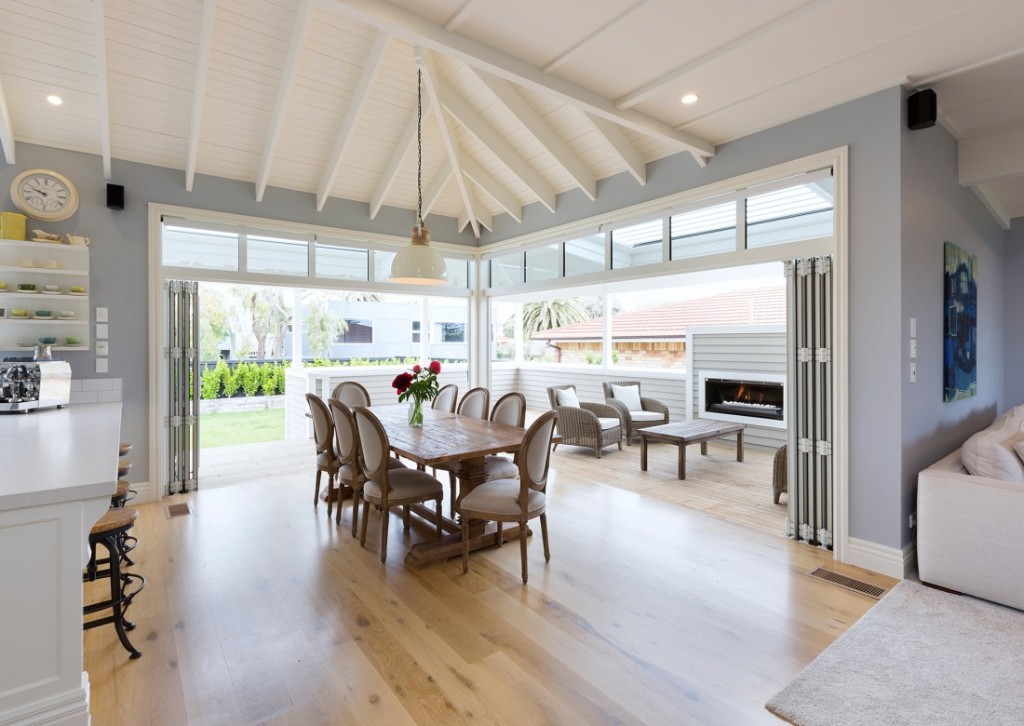
Omanu beach house
Located in the beautiful beach town of Mount Maunganui, this contemporary villa exudes traditional elegance with some surprisingly modern twists. The soft white and pastel colour scheme accentuates the fine details of exposed rafters and sarked ceilings throughout the home, while the interior furnishings create that light and breezy coastal feel. Take a Tour of Omanu Beach House
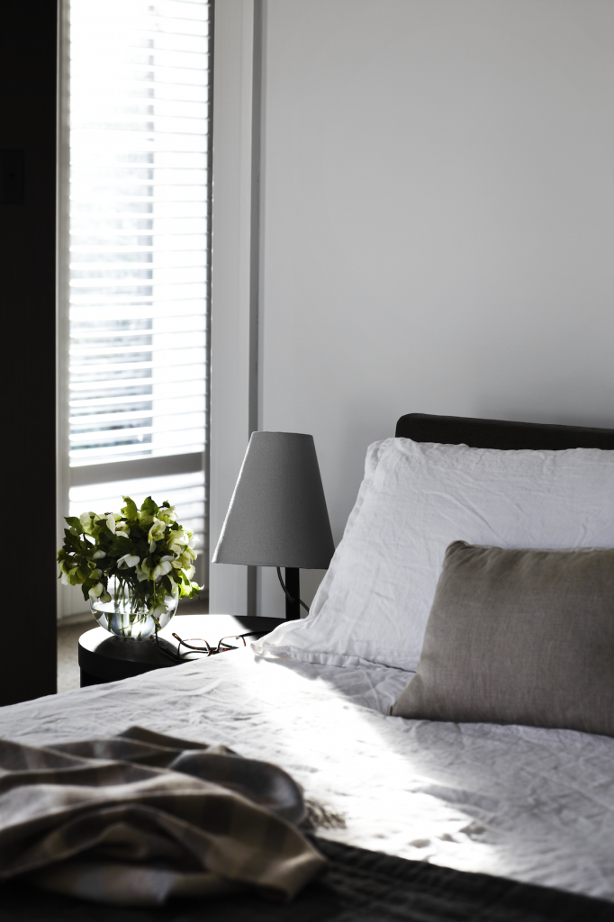
Toorak House
A home renovation to modernise a tired interior resulting in a light filled, vibrant contemporary home for a busy family of four. Throughout this beautiful home, architect firm Robson Rak designed and fabricated much of the furniture and furnishings to fit the bespoke brief, which also included a large wall sculpture in the living room by Chris Rak. Take a Tour of Toorak House
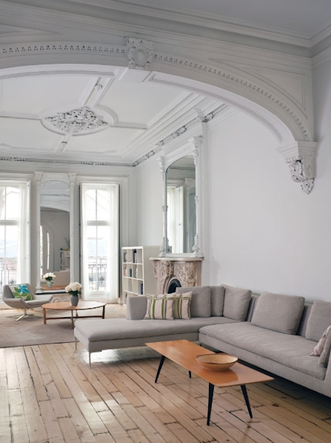
New York Brownstone
A restoration project sure to make any lover of old character and minimalism fall in love and that’s exactly what this five-storey, New York city Brownstone home does. Take a Tour of New York Brownstone
The Factory
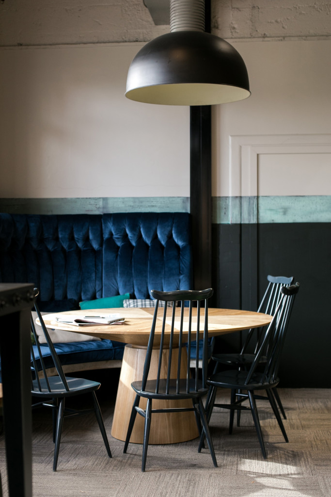
This co-working space had a complete transformation whilst working to the buildings original industrial aesthetic. I love the juxtaposition of textures between the steel legs, concrete base and deep-buttoned velvet all work with the pale elm table, the focal point in the lounge room. Take a Tour of The Factory
Which favourite interior of 2015 has your top pick?
A big thank you to each THS reader for stopping by throughout the year and here’s to a great year ahead in 2016. I can’t wait to see what the year brings – Kelly
The post Favourite Interiors of 2015 appeared first on The Home Scene.
]]>The post 12 Days of Christmas Giveaway appeared first on The Home Scene.
]]>As well as compiling some of my favourite homewares items, each day I’ll be giving away one item from my THS Gift Guide – 12 days of Christmas giveaway style.
Commencing December 1st and running through till the 12th, one item from the gift guide will be posted on Facebook and Instagram to win. From 8am you’ll only have until the end of that day to enter, so you’ll have to be quick to be in the draw.
The best part of all, one lucky reader will win everything from the previous 11 days all in one big prize on the 12th of December!
And because I’m saying thanks, I’m keeping the entry process easy. Simply comment on the post you wish to enter, telling me who you would love to give the gift to, make sure you’re following THS and the gift company on social and you’re in the draw. You can enter on both FB and IG too and enter each day.
12 Days of Christmas – Gift Guide

I love long summer days, with no where to be, relaxing with a good book. Mocka’s Joey Chairs are a fave of my own boys who love to escape to the back yard with a good book and therefore a must have on my christmas list for any child. Made from 100% cotton canvas, the large Joey chair in Blue/Red is valued at $79.95 and holds up to 80kg. Day 1 – of our 12 Days Giveaway, Congratulations to Cate Marshall
Any interior lover will tell you they adore flicking through the pages of a good home magazine, sourcing inspiration and delighting in uniques spaces. A favourite of mine for its beautiful styling and homes featured, homestyle magazine is always on display on our coffee table. Using our own Fly Buys points to update our magazine subscriptions and homewares is something we often do and something you could do as a gift that keeps on giving each month. Day 6 – of our 12 Days Giveaway, Stephanie Gardner
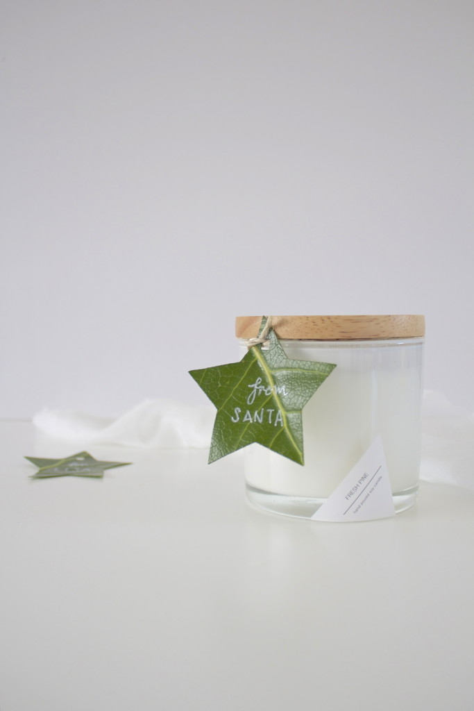
There’s nothing that reminds me more of Christmas than the smell of fresh pine. From the talented creatives behind Bloom Social and released just in time for Christmas, these beautiful fresh pine soy candles make the ideal gift. Hand poured into a beautiful thick wall glass candle jar, finished off with a natural rubber wood lid and placed in a lidded box. With a burn time of 40hours and valued at $35.00, this hand made candle would make a beautiful gift to brighten someone’s day. Day 3 – of our 12 Days Giveaway, Congratulations to Elizabeth Donnelly

You can never go wrong with jewellery as the perfect Christmas gift for that special family member or friend. This three piece stacker ring set from Emma and Roe by Michael Hill Jeweller will please even the hard to buy for.
Included is the Cubic Zirconia, sterling silver & 10 CT rose gold stacker ring (valued $129 AU); the versatile stirling silver stack ring (valued at $39 AU); and the sterling silver ridged stack ring (valued at $39 AU). Day 7 – of our 12 Days Giveaway, Congratulations to Suzannah Newton
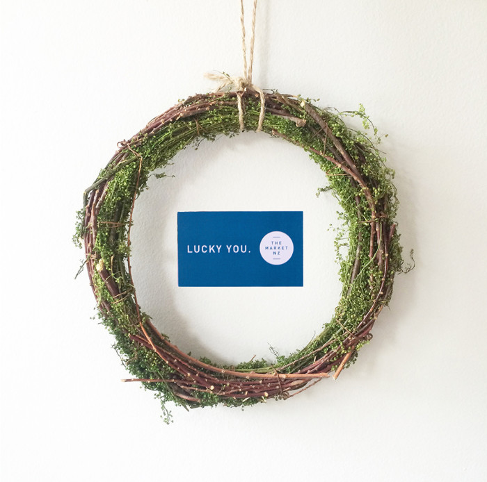
Gift Vouchers are often a go to in our house to make the perfect gift. The Market NZ is a great store to get a voucher from, not only is there range of homewares and gifts endless, you’re also supporter clever creatives from the land of NZ. (Our voucher from The Market NZ valued at $40.00). Day 2 – of our 12 Days Giveaway, Congratulations to Melanie (@melephant28).
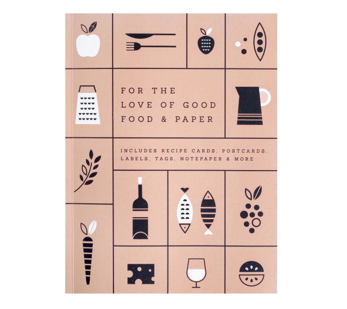
“For the love of good food and paper” is the perfect gift for that foodie lover and entertainer. Featuring Recipe Cards, Notepaper, Table Place Cards, Stickers, Labels, Tags and more, you’ll find everything you could want to get creative. Use it to style your next party or to decorate foodie gifts for friends and enjoy always having the perfect paper tools at hand. Valued at $39.95 Day 8 – of our 12 Days Giveaway, Congratulations to Manaka Cant
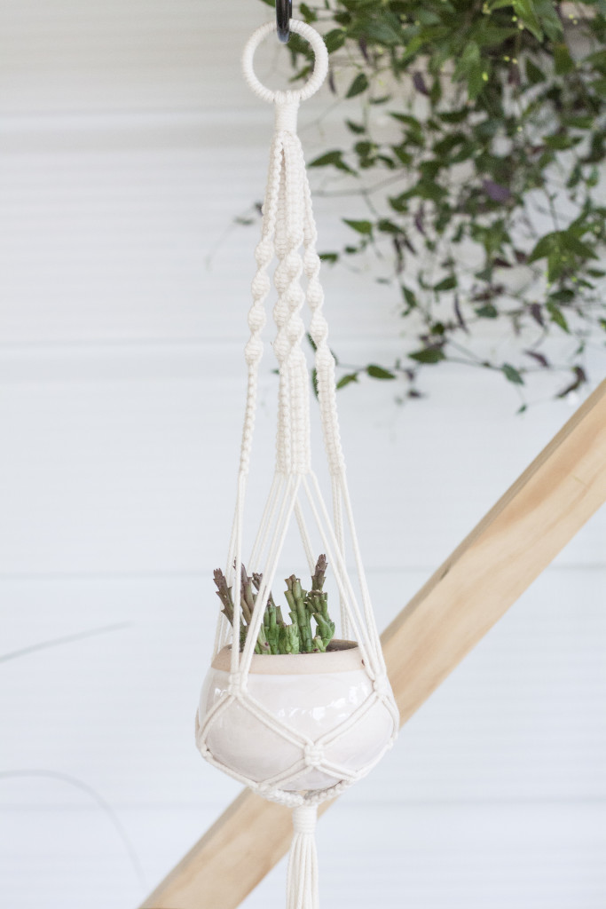
Knotty Bloom’s handcrafted macrame plant hangers are a gorgeous gift idea, giving the gift of greenery to someones life. New Zealand made with natural cotton cord, this medium hoop Plant Hanger from the natural cotton collection, will make a lasting piece that embodies a sense of comfort and care while adding new life to spaces. Valued at $55.00 – Length: 650mm (approximately 2′ 1″) * Pot is not included Day 4 – of our 12 Days Giveaway, Congratulations to Tara Ormond
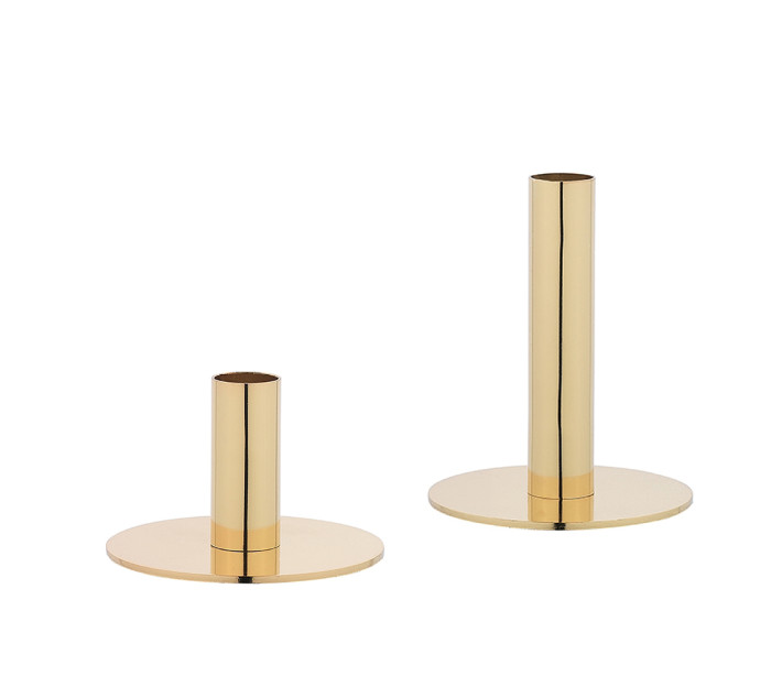
Whether you’re dressing a table for entertaining or brightening up your sideboard, these gorgeous copper Candle holders from Freedom Furniture have a luxe look. We love both sizes for the Farah candle holder at 9cm (valued at $14.95) and the Farah candle holder at 16cm (valued at $19.95). Day 5 – of our 12 Days Giveaway, Congratulations to Lianna de Jong
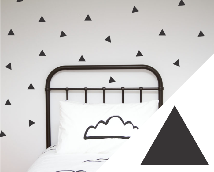
Create a fun space and brighten up any child’s room with these removeable triangle wall decals from unique homewares brand, One Hundred Percent Heart. Featured in our own home, all products are New Zealand designed and of high quality. Valued at $45.00. Day 10 – of our 12 Days Giveaway, Congratulations to Samantha Aschebrock
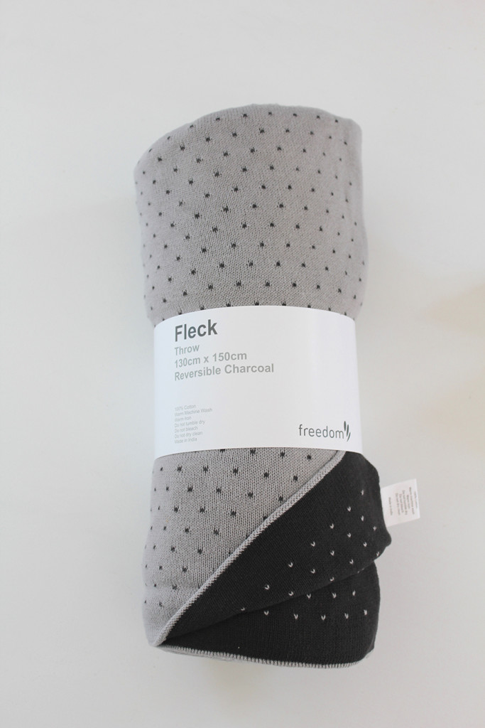
For those cooler nights during summer or snuggling up on the couch, I love a beautifully soft blanket. Freedom Furniture’s Fleck charcoal blanket is a favourite of mine, allowing you to mix up your home styling with its reversible design. Valued at $99.00. Day 9 – of our 12 Days Giveaway, Congratulations to Emma Moore
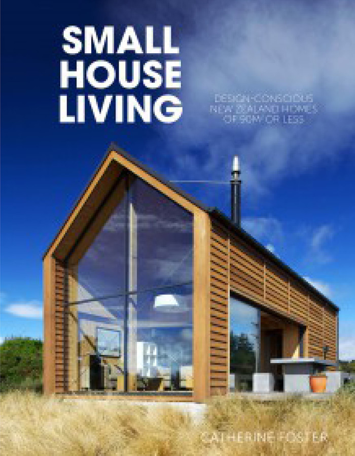
Small House Living by Catherine Foster is a favourite of mine, sitting pride of place on our bookshelf. Showcasing an inspiring collection of homes measuring less than 90m2 from around New Zealand. Family homes, beaches and apartments are included in the line-up and anyone interested in interior design will love this book. Day 11 – of our 12 Days Giveaway, Congratulations to Theresa Te Whaiti
12 Days of Christmas – The Home Scene giveaway
Terms & Conditions:
- THS 12 days of Christmas Giveaway is only open to New Zealand residents.
- Entrants can enter once on Facebook and once on Instagram each day during the giveaway.
- Winners will be randomly selected.
- A new giveaway will run at 8am each from the 1st – 11th of December, closing 11:59pm.
- On 12th of December at 8am, every gift will be run as a giveaway for one lucky recipient and will close 13th December 11:59pm.
- Winners must contact THS through email and provide mailing details. If I don’t hear from the daily winner within 2 days from their name being announced as the winner, I will redraw the giveaway.
- THS can not be held responsible if their are delays in postage due to the busy season.
The post 12 Days of Christmas Giveaway appeared first on The Home Scene.
]]>The post My Favourite Room with Ben Lawry appeared first on The Home Scene.
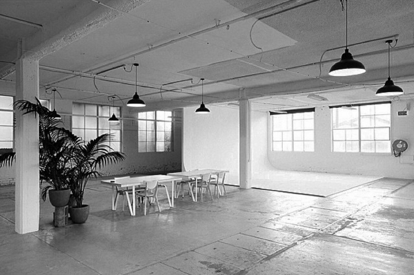
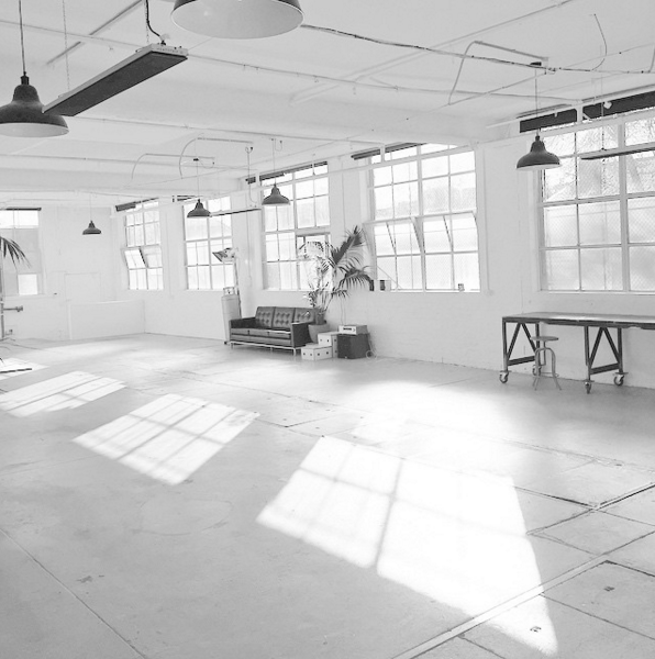
]]>We caught up with Ben Lawry, Founder and Director of ACC to take a look behind the scenes and find out what he loves about the company’s creative space.
+ What is your favourite room?
Our photographic studio downstairs is by far my favourite room! When the natural light breaks through on a sunny afternoon it becomes a creative haven.
+ What do you love about this space?
I love working in a creative studio because it allows us to be surrounded by other amazing creative individuals on a day–to–day basis. This helps in creating a great productive energy and a uplifting vibe!
+ Describe this room in three words
Inspirational, edgy and warehouse conversion!
+ How long has ACC occupied this space?
We moved into XO studio’s just over 12 months ago in August last year.
+ How would you describe what you do for a living?
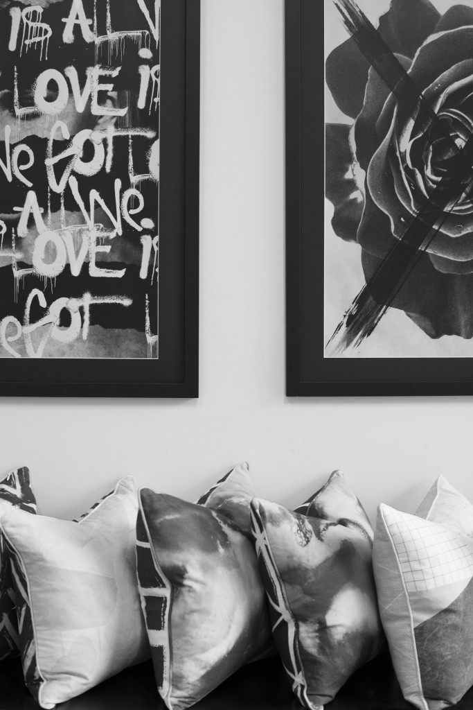
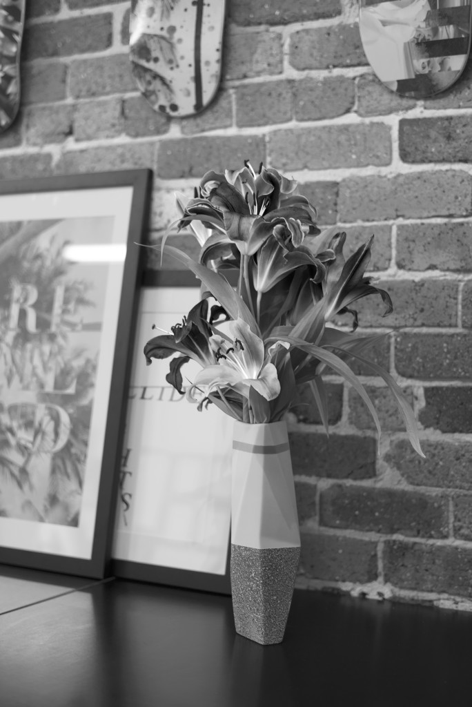
We create and design a range of homewares, with the intention to inspire our customers.
Details:
Website: artclubconcept.com | Instagram: @artclub_concept
The post My Favourite Room with Ben Lawry appeared first on The Home Scene.
]]>The post Print by George appeared first on The Home Scene.
]]>Her works feature as a firm favourite in our own home, and following her move to New Zealand from the UK, her talents are increasingly becoming known across New Zealand and Australia.
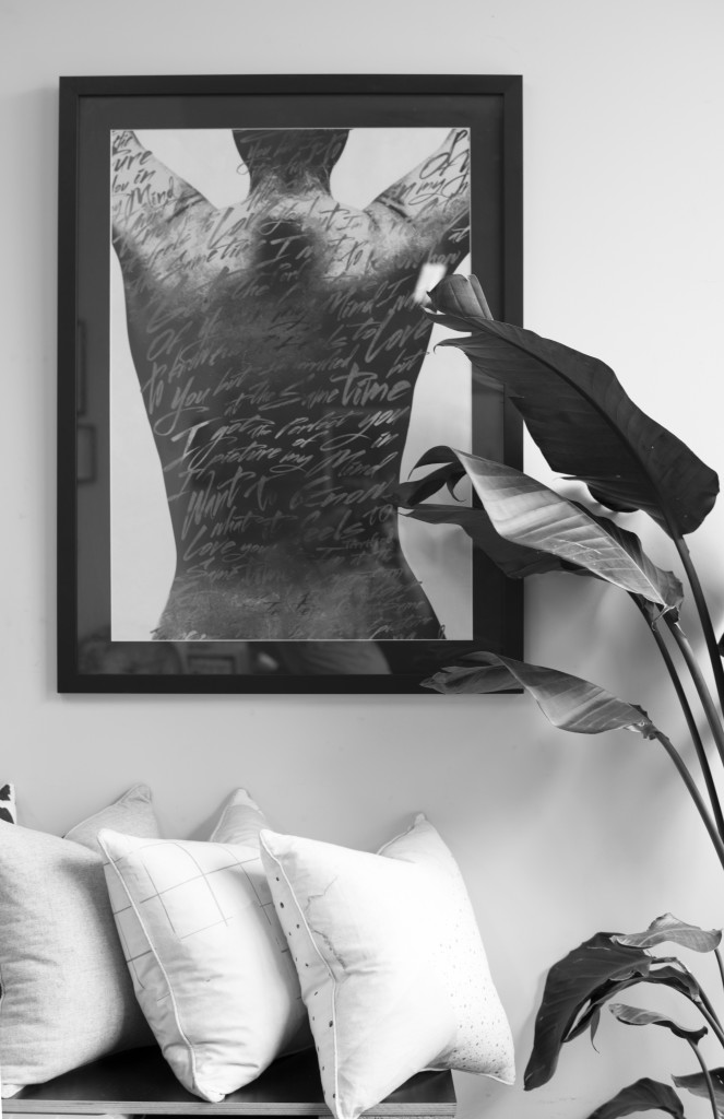
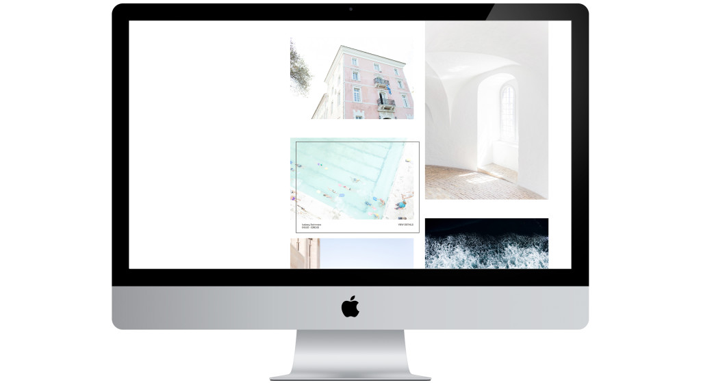
Georgina has become a dear friend since I was introduced to her work, so it is a pleasure to announce the relaunch of Print by George exclusively with THS readers. The relaunch features new works and products (including Christmas cards and wall dots) and an all new website.
I recently chatted with Georgina to find out what inspires her, why the relaunch and what lies ahead for Print by George.
+ Describe the process of creating and launching this new site?
I created my original website myself. It was very much a DIY project to get things up and running as soon as I could, but a year down the line, I felt it needed a facelift by someone with a graphic design eye! Everything needed to work and have an identity and I wanted the labelling, packaging and website to be cohesive.
I did some research and received recommendations for graphic designers and soon met with Auckland based Natasha Mead. Her work seemed to have a particular theme running through it and I just fell in love with it. I knew she would be able to help me achieve what I wanted Print By George to look like.
+ What do you love about the site?
I adore how the whole site has come together, but in particular, the way the products are easy to access on the home page. It makes the browsing and shopping experience simple for even the most computer illiterate person. All the prints and cards are accessible under the one page without having to chop and change with menus.
+ What was the design brief?
It needed to keep buying and browsing easy, yet display the prints in a beautiful way. I hate nothing more than trying to purchase something over the web and it’s one busy, complicated process. I wanted the experience to feel enjoyable, clean and obvious to anyone using the website and wanting to purchase a print or to simply get in contact with me.
+ What inspires you?
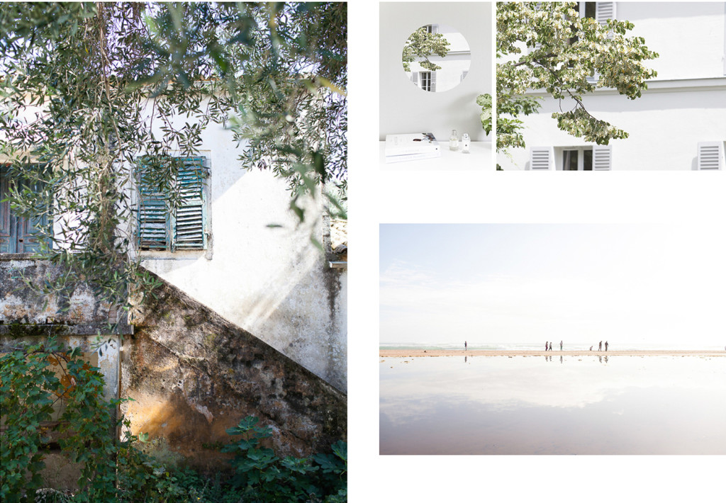
My direct surroundings, whether it be social media, the farm, travel, the landscape or light. My camera is attached to my hip these days living out on a farm and in New Zealand! It is so beautiful everywhere I turn that it’s hard not to be inspired on a minute to minute basis!
+ What do you love most about your job?
The freedom of being your own boss! Having said that, it’s a double edged sword – you don’t just stop doing what you love and if something goes wrong, you only have yourself to blame! I often work through the weekends and Mondays are now becoming a thing of past for me, but I love what I do. I love being able to step away from my desk to shoot and have a change of scenery, but if its a wet day, then it’s nice to have the option to stay inside and catch up on emails and admin. Living in New Zealand now with my family and home being back in the UK, the best part is that my work can travel home to England with me and I have no restriction needing to be at the ‘office’.
+ What grand plans do you have in store for Print by George?
Over the next year, I am in the process of planning to launch a limited edition run of framed prints, exclusively for New Zealand customers. I have only just started thinking about it, so won’t be for a little while longer yet, but definitely something I want to offer. I am also hoping to work with more international retailers and get some exclusive prints in stores.
+ Is there anything you haven’t shot yet that you would love to?
There are a thousand places I could list off that I would love to shoot. I love to travel and see different cultures and countries, so I am forever writing a list of the next stop I want to take on my journey. I just need to get over my fear of flying first…
+ Do you have a favourite print?
Trying to cater to all tastes means I have a love/hate relationship with them somedays. I have spent a lot of time trying to work out what I want to sell on the website, but overall I of course love the prints. Some more than others, but a personal favourite for me would be the water ones called “Wake 1′ & ‘Wake 2’. I have one framed up at home and I have always said I want to live by water; now I have my wish…it has a similar calming effect!
+ Career highlights?
You can never tire of seeing and hearing the joy that your work brings to people and it is particularly touching when people buy my prints for a gift to their loved ones.
I have always enjoyed emails popping through from customers with a photo of my work printed and framed, up on their walls. It makes you feel like your hard work and long hours/weeks/months is paying off.
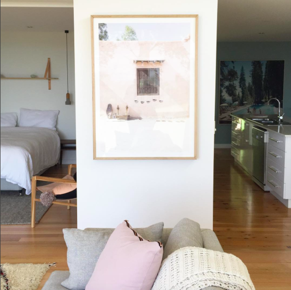 Moroccan print as seen styled by Petite Vintage Interiors for a clients Beach house.
Follow Georgina’s work and head over to admire her gorgeous new site and prints:
Website: printbygeorge.com | Instagram: @printbygeorge | Facebook: Print By George
The post Print by George appeared first on The Home Scene.
]]>The post My Favourite Room with Erin Simpson appeared first on The Home Scene.
]]>
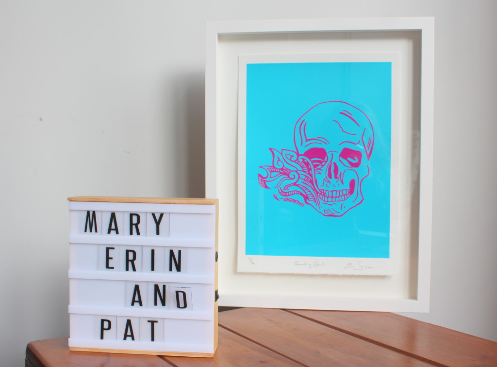
+ What is your favourite room in your house?
Our lounge as it’s the place that inspires us!!
I live with two flatmates, who I regard as family, and together we have built a beautiful environment where we love to entertain and have people over to join our little family!!
+ What do you love about this space?
The round table! It’s the place where we gather for regular round table meetings and come up with the crazy new ideas for each of our careers and personal goals. From there it’s up to us to make them happen and as a team of odd balls I must say we have been pretty successful at doing so.
+ How would you describe the room in three words?
Always, contains, people
+ How long have you lived here?
I’ve owned this house for over 8 years now and it has been a stable for me and my family. I am a strong believer in the saying “build an arc and the people will come” so it is a place for everyone to base themselves when they need to be in Auckland.
I also have another place in Christchurch as alot of children’s television is made down there so I need to travel between the both and that house has 3 graffiti walls painted in the lounge so it’s even more amazing!
+ How do you spend your days?
I’m either writing, researching, filming, running my art business, eating, talking or laughing
Anything else is an added bonus or a conscious decision to put time into.
Obviously the word #filming is very vague as this can range to being up a ladder prepping a wall for top coats, interviewing boys in the rugby field or running amuck, making the most of my eternal youth haha.
Details:
Website: erinsimpson.co.nz | Instagram: @erinsimpson13
The post My Favourite Room with Erin Simpson appeared first on The Home Scene.
]]>The post Armadale House: Part Two appeared first on The Home Scene.
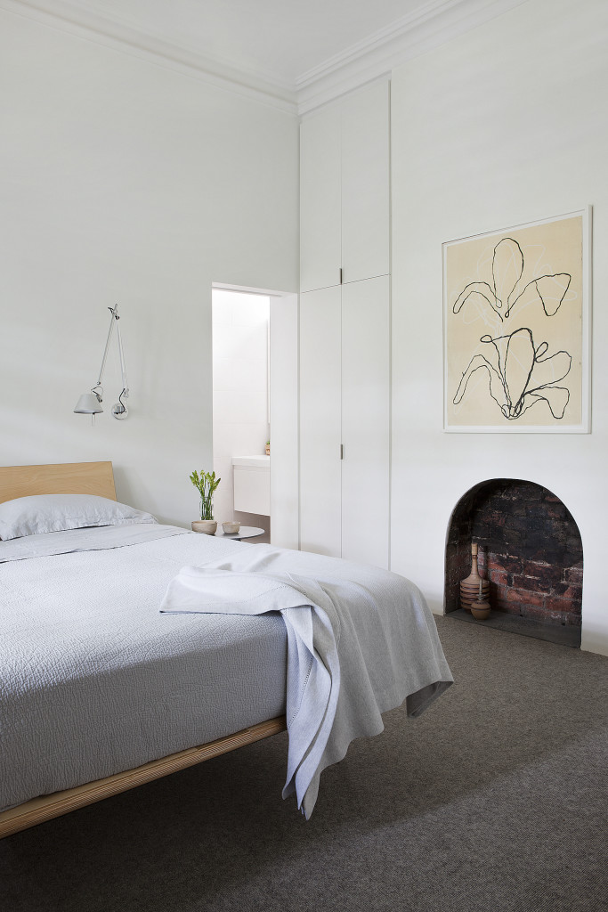
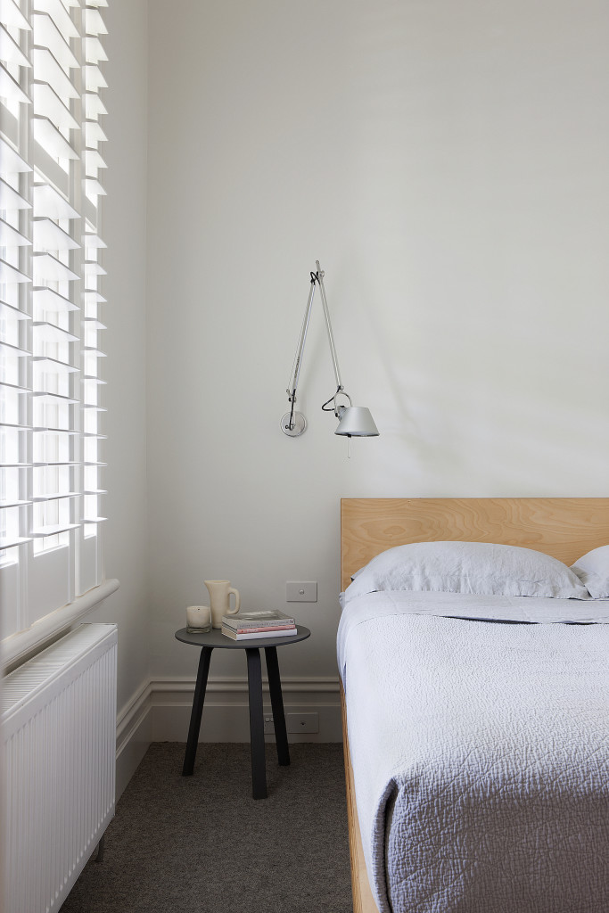
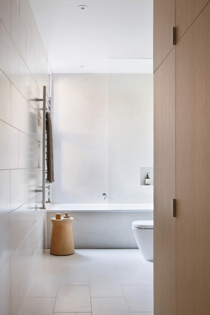
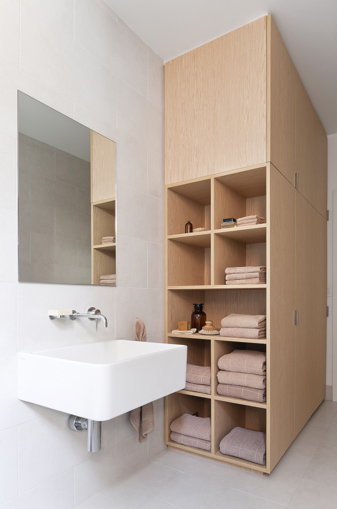
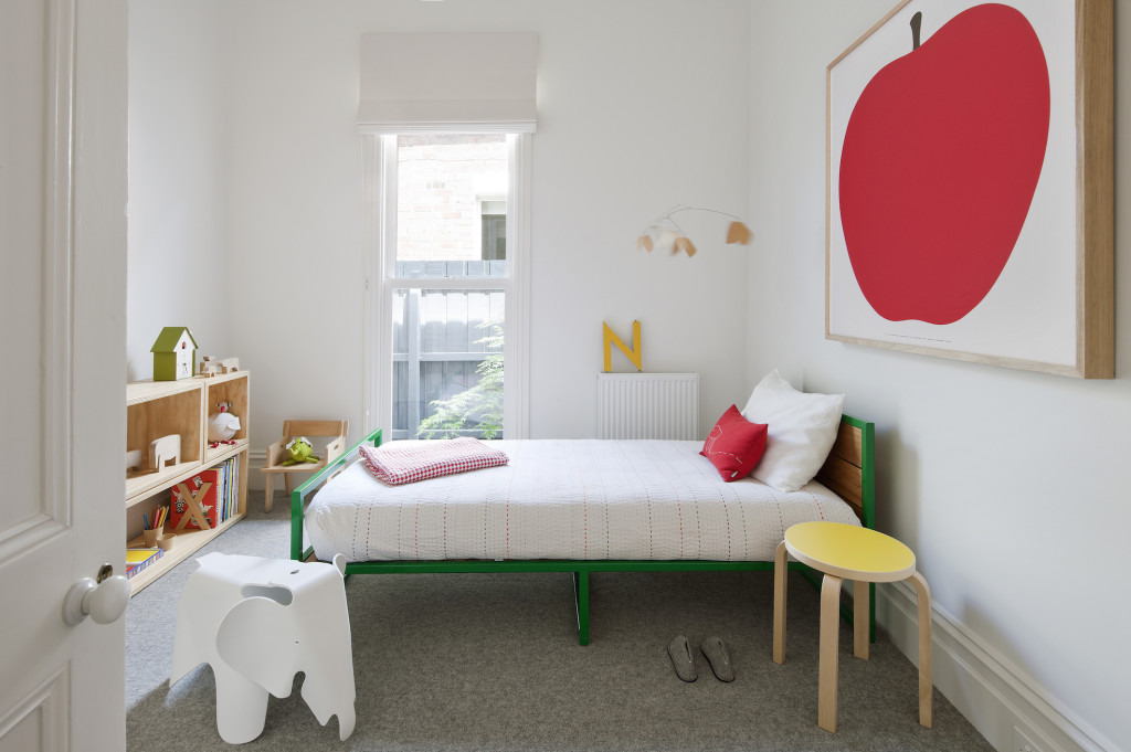
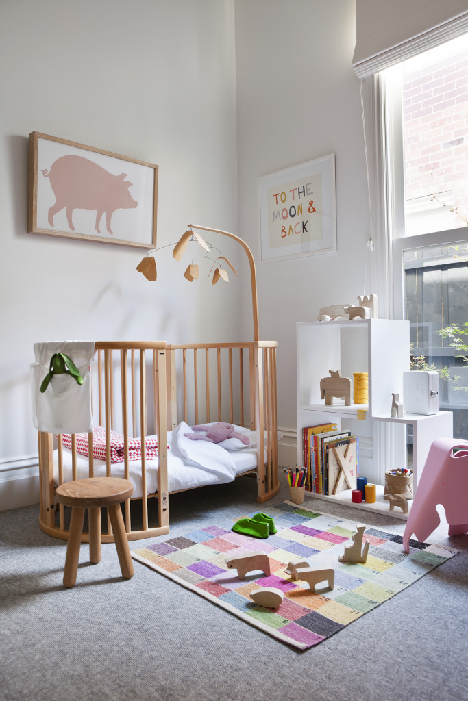
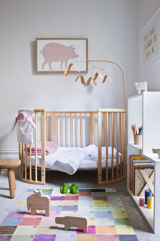
]]>Following on from part one of this beautiful home tour, delight in the simple beauty of the home’s bedrooms and bathroom. With so many beautiful elements to view, it only made sense to feature Armadale house as a two-part blog.
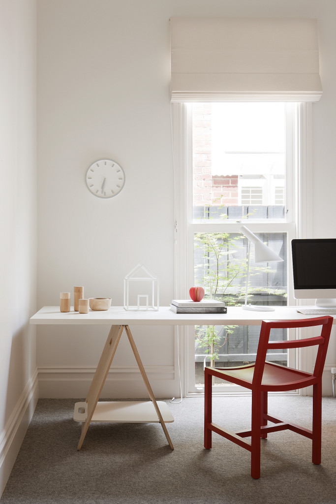
A collaborative design project between Interior Architecture, Made By Cohen and Architecture Robson Rak Architects, the teams design philosophy is bespoke, handcrafted with beautifully executed details. The overall design was kept simple, responding to the modern inner urge to pare back and slow down.
Details were often subtle, creating a subconscious sense of flow and balance within the space, while working with a simple palate of finishes also gave this small home a sense of cohesion.
Simple, understated interior design with natural light filtering throughout and beautiful simple vitrified tile was used in the bathroom.
To view and read more on Armadale House, visit Part One on THS blog.
Details:
Interior Architecture: Made By Cohen | Architecture: Robson Rak Architects | Photographer: Shannon McGrath | Builder: George Investments Pty Ltd | Landscape Designer: Weller Landscapes
The post Armadale House: Part Two appeared first on The Home Scene.
]]>The post Armadale House: Part One appeared first on The Home Scene.
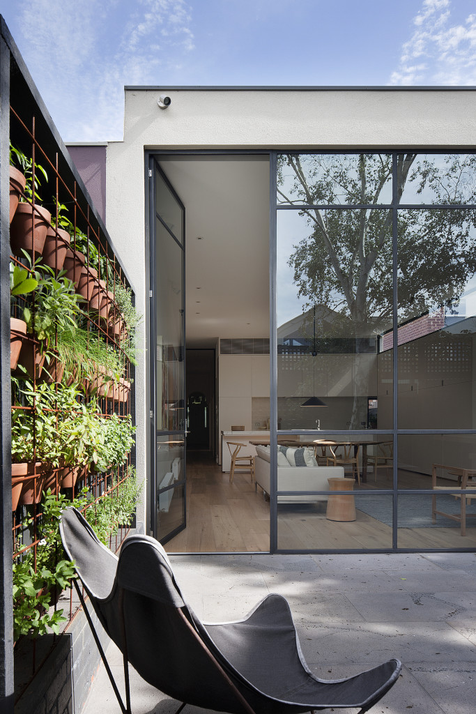
]]>A collaborative design project between Interior Architecture, Made By Cohen and Architecture Robson Rak Architects, the teams design philosophy is bespoke, handcrafted with beautifully executed details.
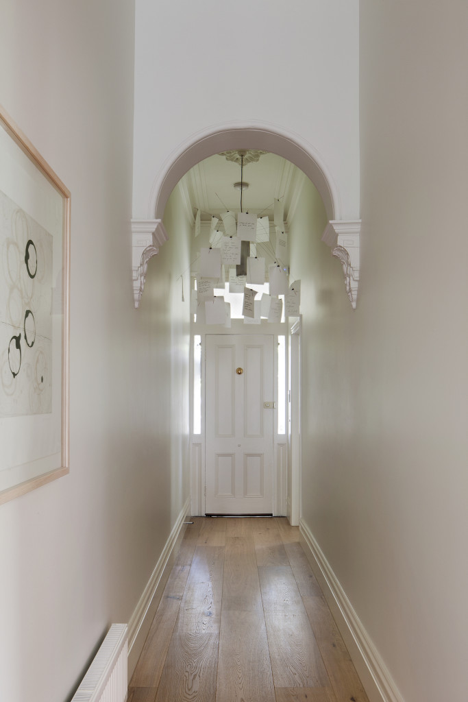
The homeowners wanted to conserve the beauty of their old Victorian building at the front whilst embracing an elegant timeless renovation to meet their long term needs within.
This project gained its rich narrative through the strong collaboration between Interior Architect, Architect, Landscape Designer and Builder. The passion and attention to detail from the builder and his trades really supported the overall ethos behind this design.
During the build, all the original old doors were reused, along with the original skirting boards and bricks to maintain the integrity of the project. In addition, the façade of the building was conserved to respect the existing street character.
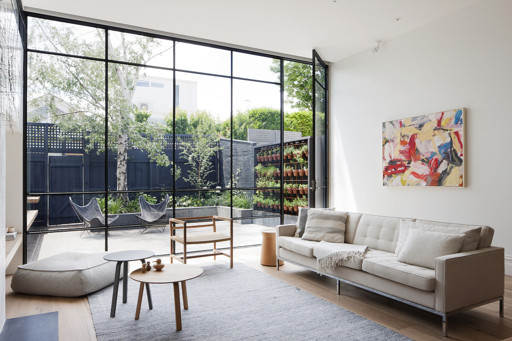
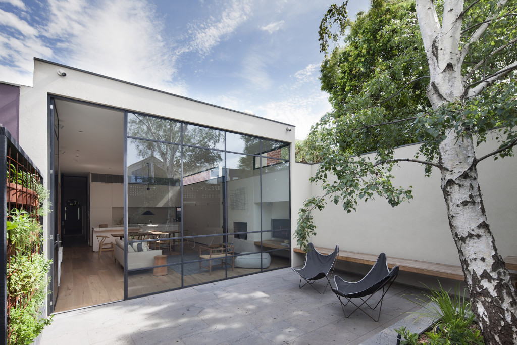
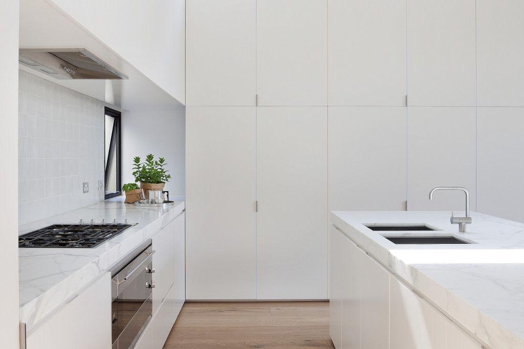
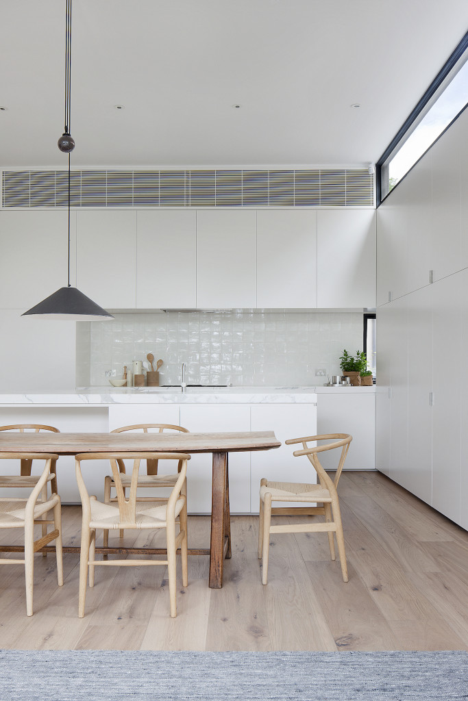
The delicate steel window and door frames on the northern extension played an integral part in making the interior feel larger and more open by blurring the boundaries between the interior and exterior. The transformation of the northern kitchen, living area and courtyard has resulted in a beautiful open, light filled renovation.
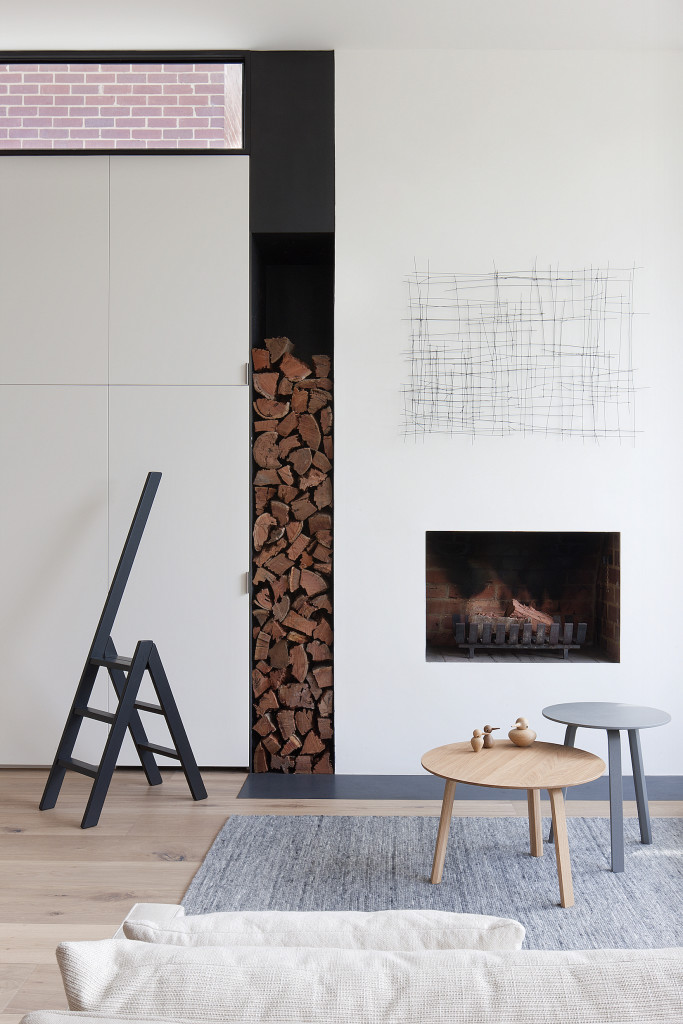
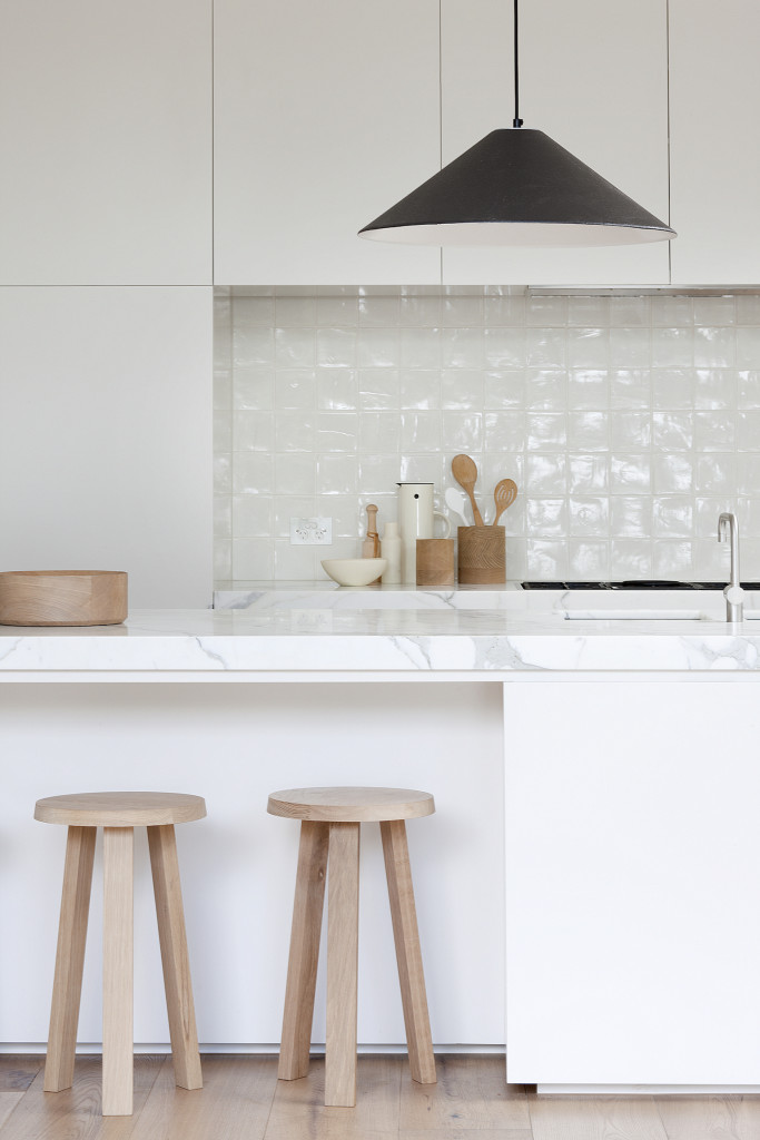
The overall design was kept simple, responding to the modern inner urge to pare back and slow down. Details were often subtle, creating a subconscious sense of flow and balance within the space.
With so many beautiful elements to this home to share with you, Armadale house will feature as a two part blog. Stay tuned for more inspiring imagery to be shared on THS blog later this week, when we take a look at the bedrooms and bathroom that will charm and delight.
Details:
Interior Architecture: Made By Cohen | Architecture: Robson Rak Architects | Photographer: Shannon McGrath | Builder: George Investments Pty Ltd | Landscape Designer: Weller Landscapes
The post Armadale House: Part One appeared first on The Home Scene.
]]>The post My Favourite Room with Susie Cohen appeared first on The Home Scene.
]]>Susie’s residential projects have appeared on THS blog and it’s a pleasure to take a glimpse into a personal project of Susie’s 1920’s converted warehouse in Melbourne, Australia.
+ What was your favourite room when you lived in your warehouse?
I have two favourites…both our bathrooms!!
+ What do you love about these spaces?
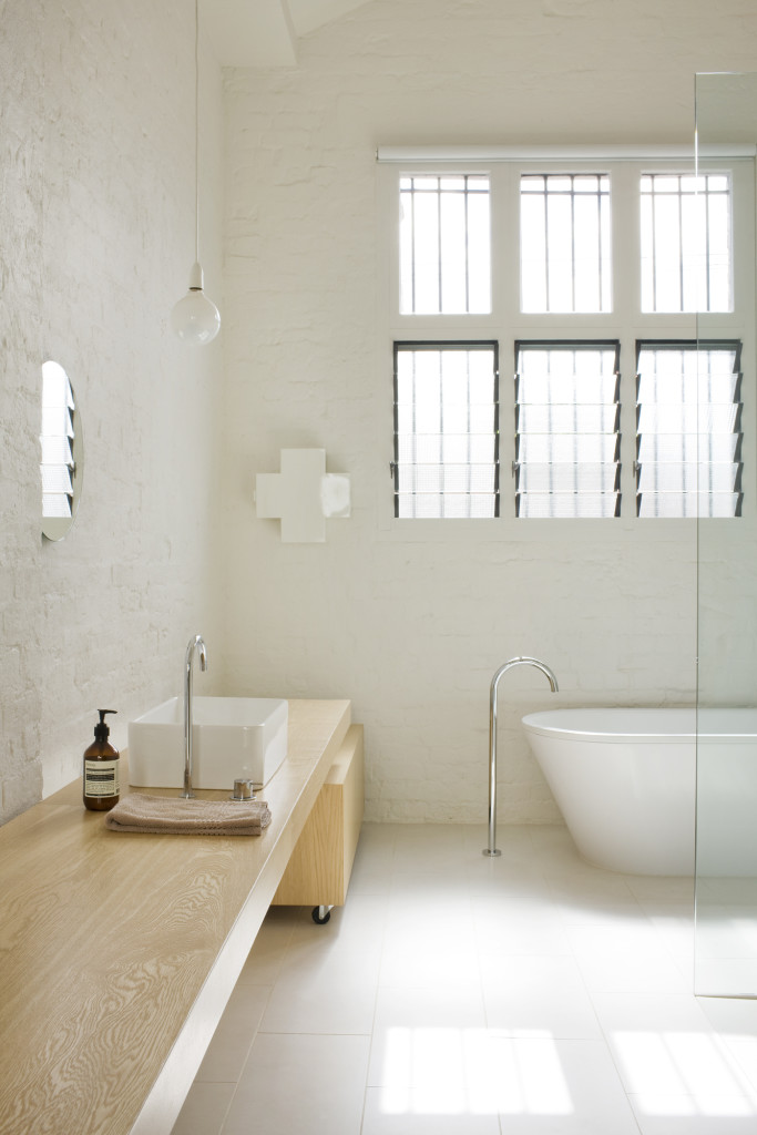
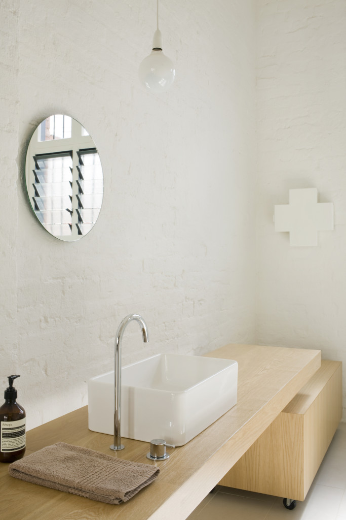
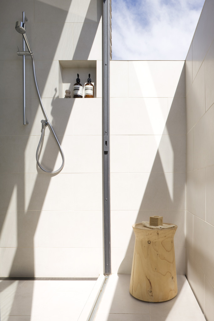
For me a bathroom is no longer just about embracing the functional aspect of cleansing the body, but also the emotional aspect of cleansing the mind. Both the bathrooms in our warehouse celebrated the ritual of bathing. What I loved about these bathrooms was that they were tiled from floor to ceiling in large format tiles (300 x 600mm) which made them feel more like a wet room, they had a simple palate of finishes and both embraced natural light which gave them a sense of calm.
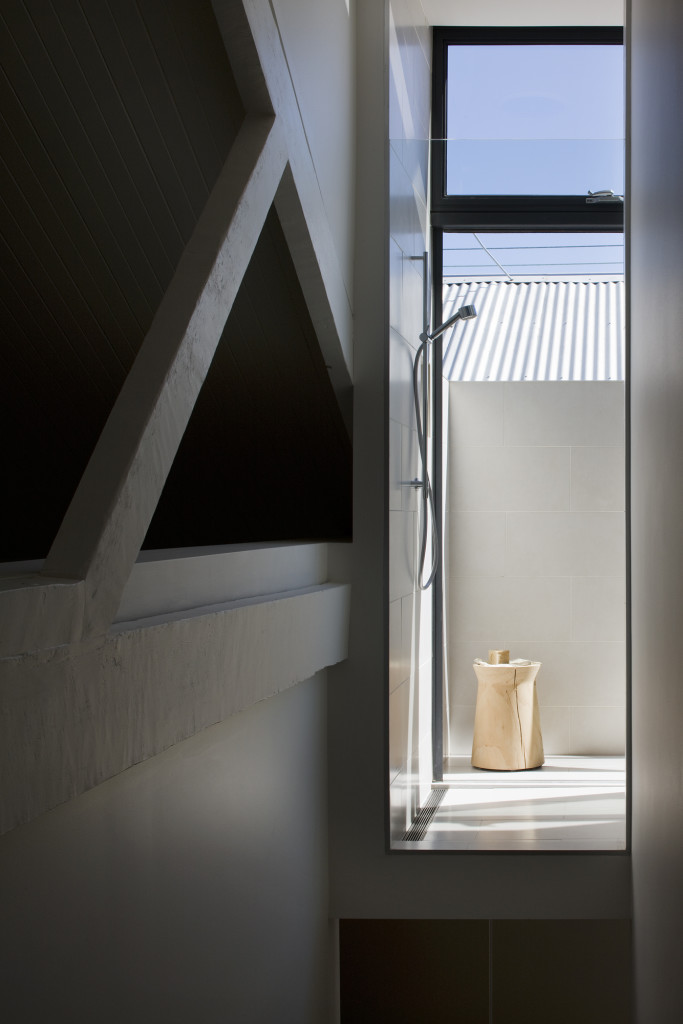
The downstairs family bathroom which included a freestanding bath, was drenched daily in beautiful afternoon sun and had a long oak bench that added texture to the space. The upstairs master ensuite had a shower with a large sliding door which extended the shower from inside to out. On a sunny day you could shower outside in private.
+ How would you describe these rooms in three words?
Calming, sculptural, simple.
+ How long did you live here for?
After converting this beautiful old 1920’s warehouse we enjoyed living here for 5 years.
I am a Melbourne based Interior Architect with a passion for residential projects. I especially love working with old homes as I feel they add a rich narrative to my work. My design practice ‘Made By Cohen’ celebrates life, family and creativity. My designs tend toward simplicity, with great importance placed on beautifully executed details. A strong signature to my work is the use of natural light and honest materials that age gracefully and acquire their own patina over time.
Details:
Website: madebycohen | Instagram: @madebycohen | Photographer: Shannon McGrath
The post My Favourite Room with Susie Cohen appeared first on The Home Scene.
]]>
